TDM 20200: Project 12 Streamlit
Project and Learning Objectives
Make sure to read about, and use the template found on the template page, and the important information about project submissions on the submission page.
Dataset
-
/anvil/projects/tdm/data/nhanes/Nhanes_cvd_raw.csv
The dataset used in this project is the National Health and Nutrition Examination Survey (NHANES) data. It was gathered from the kaggle page.
This is a running survey since 1999 conducted by Centers for Disease Control and Prevention with the aim to gain insights on American’s health and nutrition. It is in combination of interviews, health exams, and laboratory tests. You can learn more about the data from the cdc page.
|
If AI is used in any cases, such as for debugging, research, etc., we now require that you submit a link to the entire chat history. For example, if you used ChatGPT, there is an “Share” option in the conversation sidebar. Click on “Create Link” and please add the shareable link as a part of your citation. The project template in the Examples Book now has a “Link to AI Chat History” section; please have this included in all your projects. If you did not use any AI tools, you may write “None”. We allow using AI for learning purposes; however, all submitted materials (code, comments, and explanations) must all be your own work and in your own words. No content or ideas should be directly applied or copy pasted to your projects. Please refer to GenAI page in the example book. Failing to follow these guidelines is considered as academic dishonesty. |
Questions
So far, some of our projects were implemented in Jupyter Notebook, which is great for general data analysis and exploration. However, it is not the best when it comes to sharing the information with any audience.
Streamlit is an open source framework allowing us to create interactive web apps from Python only. This can provide a faster way to build web applications because it does not require HTML, CSS, or JavaScript. This project will give an introduction to Streamlit while still learning about and analyzing the raw data ourselves; we will build a Streamlit Application that lets anyone interactively explore the dataset.
Question 1 - Introduction to Streamlit & Set Up (2 points)
Before we write application code, we need to understand how Streamlit works. First, it is important to note that every time a user interacts the whole script runs again from top to bottom. This is different from traditional web frameworks that wait for specific events or routes, and this execution model makes developing with Streamlit even faster.
You can check this documentation for some basic concepts of how Streamlit works.
Streamlit should already be installed for us in Anvil, but you can check using (these commands are to be run in terminal):
streamlit --version|
You might be wondering: Streamlit is built on a Client-Server Architecture; this is a network computing model, where the client is our web server that requests resources or services, and the server runs the Python code to process and respond. In another word, the Client in Streamlit is the frontend displaying UI and sends user interactions and Server is the backend running the Python script and sends updated UI back. Later, we are going to run |
Some starting examples
Let’s get started with writing the first app. First display a title:
import streamlit as st

st.title("NHANES Data Analysis")-
st.title()command is pretty self explanatory; this command is designed for creating a main title at the top of the page or a section.
Similarly, we can display text descriptions and simple metrics:
st.write(""" This application explores the NHANES dataset, analyzing factors associated with
heart attack risk. """)
Just save the python file after adding in new components, and refreshing the page will automatically show the changes.
-
st.write()is very versatile because it can accept almost anything you pass in, such as text, dataframes, and other objects or figures. It is also possible to pass in multiple items, in which case the display will be separate and sequential.
Running the Streamlit App
Since Streamlit is designed to run for .py files, we will convert our ipynb file into that format.
|
For Streamlit code, feel free to type into the .py file and run that directly. Other deliverables that require jupyter notebook output should be in the .ipynb. Please submit both .py and .ipynb. |
Once you run the following command in terminal, you should see a new .py file created in your current directory.
jupyter nbconvert --to script your_filename.ipynbNow we are ready to run the Streamlit app.
streamlit run your_filename.pyAbove command starts a local development server. Try opening the localhost URL in your browser.
Normally when you are working locally, clicking the localhost URL should let you see the page directly; however, you will notice that you are unable to connect using the local URL. The browser you opened is looking at your local computer, but we are running the code on Anvil.
To solve this we can use Jupyter Server Proxy. You can think of it as an intermediary between the browser and the server. Try using the URL form below:
https://notebook.anvilcloud.rcac.purdue.edu/user/x-(YOUR USERNAME)/proxy/8501/ #note the `/` at the end of the link, it must be there!(YOUR USERNAME) should be your Anvil user name (it is already on your address bar on the notebook).
Port 8501 generally is a default for running Streamlit (or type in the port number it shows you). Typing "…/proxy/8501/" tells Jupyter server that we want to access whatever is running on the specified port on the machine where the code is executing. The proxy URL forwards the request to Anvil (where Streamlit is running), Jupyter server connects to the localhost:8501 on the machine, then once Streamlit generates the webpage, proxy sends it back to our browser. You receive the response and the app appears for us.
For all outputs in all questions in this project (the streamlit webpage resulting from your code), please include screenshots for the deliverables
-
1a. Run all commands and code. Include a screenshot in your submission.
-
1b. Explain in your own words how Streamlit’s execution model differs from running a Jupyter notebook. What happens when user interaction happens? Are there any advantages that comes with using Streamlit?
Question 2 - EDA & Displaying Data in Streamlit (2 points)
Let’s start with data exploration and cleaning before loading in the data. Please print the head, shape, and columns of NHANES. Just the head itself will reveal to you that there are a lot of missing values (please print the number of NaNs in each column to confirm).
The output will indicate that the dataset has many missing data, which is not abnormal for a health and survey dataset; for instance, there are cases where not all participants complete every single exam. But at the same time, we do not just simply drop all missing values with .dropna(), as that will lead to losing most data. Instead, we will select a subset of the attributes that are actually needed. Here, we will set heart attack as our target, meaning it is the specific outcome or dependent variable we want to understand (which would be further relevant if any prediction tasks were to be done) .
features = ['Age', 'BMI', 'Systolic_BP', 'Diastolic_BP', 'Total_Colesterol', 'C_Reactive', 'Sodium', 'Saturated_Fat']There is another nature of the data we need to take into consideration before working with it. Try running:
for col in ["Heart_attack","Stroke","Angina","Coronary"]:
    print(col)
    print(df[col].value_counts())
    print()
The output is:
Heart_attack
2.0    16553
1.0      421
9.0       66
Name: count, dtype: int64
Above is an example output for 'Heart_attack' only, and you will notice similar output with same coded values for other conditions as well. This is due to a specific coding scheme used by NHANES:
| Code | Meaning |
|---|---|
1 |
Yes |
2 |
No |
7 |
Refused |
9 |
Don’t know |
. |
Missing |
|
You can see more information on the CDC page, and related example CDC’s data file page. |
For our application, we only want a yes (1: heart attack), or no (0: no heart attack), so 7 and 9 are invalid for us and will be dropped.
df = df[df["Heart_attack"].isin([1,2])]Then actually recode into the binary variables:
df["Heart_attack"] = df["Heart_attack"].map({1:1, 2:0})Below is the code to load the data in through Streamlit; because we are just using a Python script, the process is the same as before. An important addition, however, is caching.
Remember that Streamlit app reruns the whole script from beginning to end every time there is user interaction. This means pd.read_csv() reruns the full NHANES dataset. To counteract this, we use @st.cache_data around the data loading function. This makes Streamlit check if there are existing function name, arguments, and code from previous runs that match the current one; this speeds up computation and data loading. Not using this can cause slower performance and unnecessary resource consumption (e.g., through reloading or reprocessing data, CPU, memory, etc).
|
Cache is not valid if the function’s code or input arguments change. |
@st.cache_data
def load_data():
    df = pd.read_csv("/anvil/projects/tdm/data/nhanes/Nhanes_cvd_raw.csv")

    df = df[df["Heart_attack"].isin([1, 2])].copy()
    df["Heart_attack"] = df["Heart_attack"].map({1: 1, 2: 0})

    features = ['Age', 'BMI', 'Systolic_BP', 'Diastolic_BP',
                'Total_Colesterol', 'C_Reactive', 'Sodium', 'Saturated_Fat']
    df_clean = df[features + ["Heart_attack"]].dropna()

    return df_clean
df = load_data()|
As seen in |
Let’s add more content into the webpage:
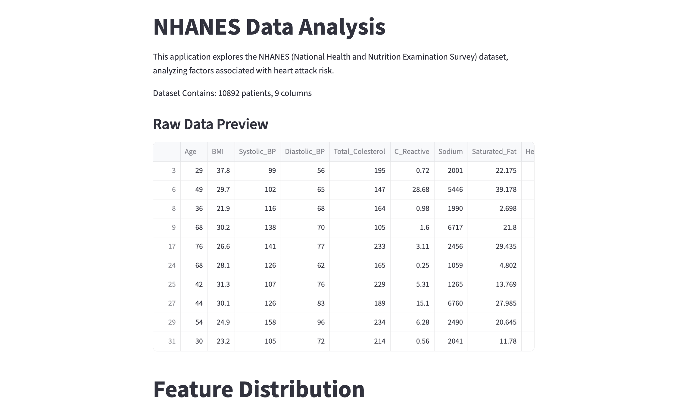
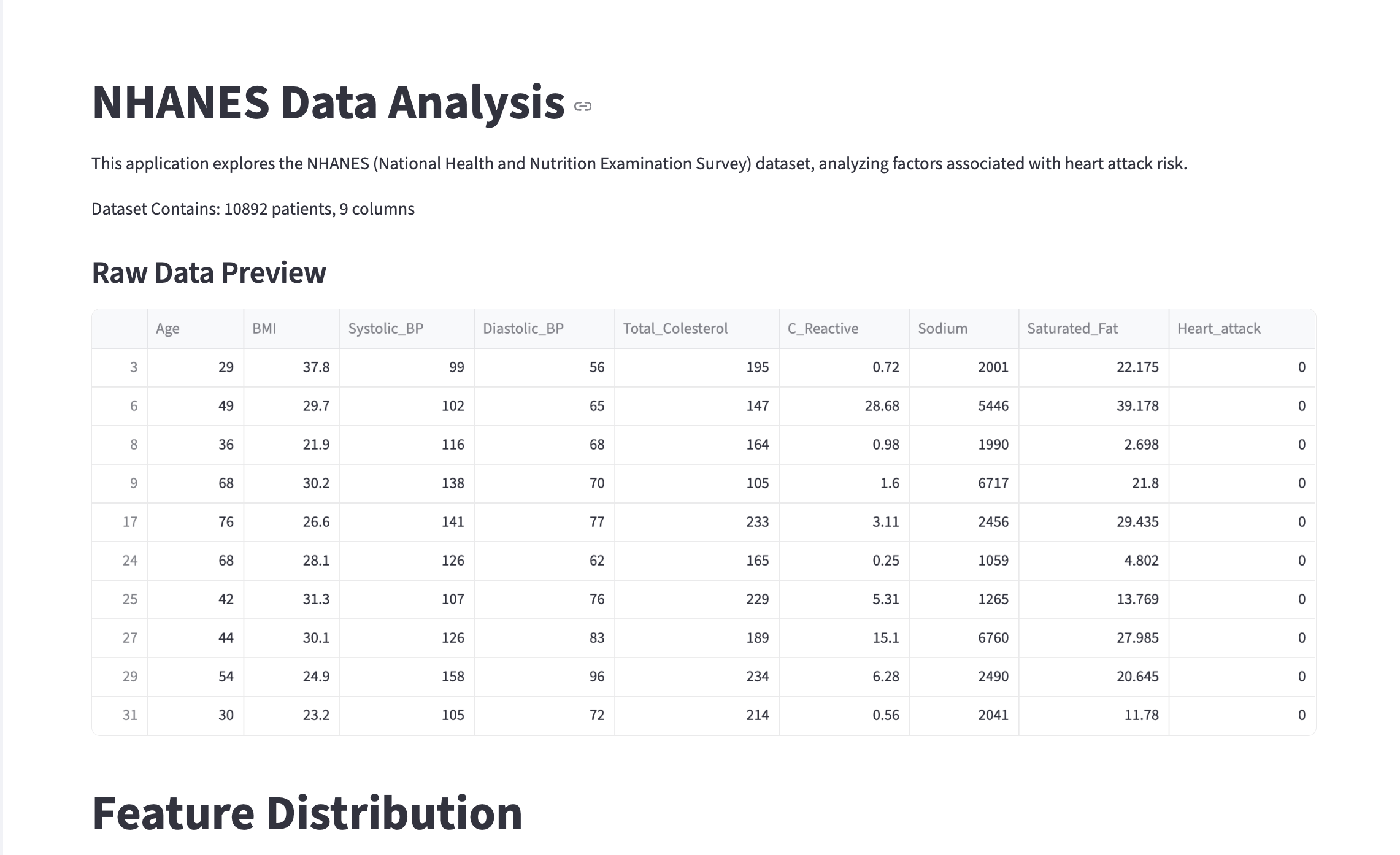
st.write(f"Dataset Contains: {df.shape[0]} patients, {df.shape[1]} columns")# Display head
st.subheader("Raw Data Preview")
st.dataframe(df.head(20))-
st.dataframe(): This is the Streamlit command to display dataframe data in the webpage as an interactive table. Features include manual sorting, formatting columns, searching for specific values, downloading as CSV, etc (try yourself!). This allows more interactivity thanst.write()for dataframes. -
st.subheader(): Creates a smaller heading thanst.title(). There are many other text options in Streamlit! Please see the Text Element Documentation to discover more, and feel free to use them in the project.
Opening the webpage should show you something like the screen recording below:
-
2a. Output of head, shape, and columns of NHANES, and number of missing values for each column. Write a few sentences on your observation of the data.
-
2b. Load in the cleaned dataframe and display the head and shape information through Streamlit. Please add your own comments/documentation of the code, and remember to include screenshots for the resulting webpage.
Question 3 - Widgets & Interactivity (2 points)
So far we have the same content displayed in the webpage every time it is loaded. At this point, we want to let users pick and control what information they want to see. Streamlit has various types of widgets that makes this possible.
We use both Streamlit’s UI components and Python libraries.
import matplotlib.pyplot as plt
import numpy as np
Similar to the previous questions, add in a section title and text for this part:
# Title for this feature
'''YOUR CODE HERE'''
# Add a text - short description of the functionality/feature, or note to users
'''YOUR CODE HERE'''
Layout Using Columns
Let’s work on the proper layout now. By default, Streamlit stacks elements vertically, but we can also choose to place elements side by side.
col1, col2 = st.columns(2)st.columns(n) splits the webpage space into n equal width containers (here, 2) and lets us place elements side by side.
To insert an element into the columns, we can use the with statement. Anything inside the 'with col1' block below will be put inside the first column.
with col1:
    feature = st.selectbox("Select a feature to explore:",
                       options=['Age', 'BMI', 'Systolic_BP', 'Diastolic_BP', 'Total_Colesterol', 'C_Reactive', 'Sodium', 'Saturated_Fat'])

with col2:
bins = st.slider(label="Number of histogram bins:",min_value=10, max_value=100, value=30)-
feature = st.selectbox(…): The widgetst.selectboxcreates a dropdown menu; users can pick one option from the list. This is where the option user picks get saved (for example, 'Age'). This variable 'feature' is assigned to the string value. Again, the script will rerun from the top, and 'feature' has 'Age' for wherever it is used. -
bins = st.slider(…): The widgetst.slidercreates a slider so that users can select value(s) from a predefined numeric data. 'bins' is the variable here, and similar to selectbox, as the user slides the bar, 'bins' update instantly. Also note thatvalue=30sets the default start.
|
|
Please complete the code for visualization.
# Create a new figure (fig) and axes (ax)
fig, ax = '''YOUR CODE HERE'''

# Plot histogram
# Use the 'feature' variable to get the column from the dataframe
# Use the bin value from the slider
ax.hist('''YOUR CODE HERE''')

# Set the plot's title (Distribution of (feature name))
# The title should get updated as the user selects different features.
ax.set_title('''YOUR CODE HERE''')

# Display Matplotlib figure inside Streamlit app
st.pyplot(fig)-
st.pyplot(Matplotlib Figure): As you can see from its paramter, this is a Streamlit function that displays a Matplotlib figure inside a Streamlit application. The figure is rendered into a static image by Streamlit before appearing on the webpage. By default and once rendered, the figure is cleared by the function.
You should be able to see something like the screen recording below:
|
You might notice that the current webpage view is very narrow and does not fit the whole computer screen. This is due to the default Streamlit behaviour, where outputs are centered columns. We can fix this using Add this line to the top of your script so that it is the first Streamlit command called:
|
|
While this introduction covers basics and some important parts of Streamlit alongside working on data analysis, there may be other features or tools you might want to add on; similarly, there are many ways to achieve the same results (for instance, other types of widgets or different layout styles) - feel free to explore more and use them! (in addition to the project requirements). |
Global Filtering with Sidebar
First, add a header using below code, which adds the text to the sidebar panel. The control is separated from main content area.
st.sidebar.header("Filter")Now we filter by Heart Attack Status.
# User selection - this creates a radio button group in the sidebar
choice = st.sidebar.radio("Filter Data by Heart Attack:",
                           options=["All", "'Heart Attack' Only", "'No Heart Attack' Only"])

# Filter dataframe based on user's button selection

# Case: 'Heart Attack' Only
if choice == "'Heart Attack' Only":
    filtered_df = '''YOUR CODE HERE'''
# Case: 'No Heart Attack' Only
elif choice == "'No Heart Attack' Only":
    filtered_df = '''YOUR CODE HERE'''
# Case: All
else:
'''YOUR CODE HERE'''-
Here we implemented a Dynamic UI filter.
st.sidebar.radioserves as an input listener, where script reruns happens based on different radio button clicked by the user. -
For 'Heart Attack' cases, should pick rows where the column is 1, and similarly for 'No Heart Attack' cases, rows with column value 0 should be picked. If 'All' is selected, we use the entire original dataframe.
Remember that in the previous example our histogram used df[features]. We want our sidebar logic to point to the new filered_df and for the histogram to work with the filtered data; you will have to place this block of code accordingly.
-
3a. Code and output for the histogram. Use
st.columns()to placest.selectboxandst.sliderhorizontally above the histogram. -
3b. Code and output for filtering. Please include screenshots for different filtering results.
Question 4 - Feature Relationships & More Streamlit Tools (2 points)
So far we just have a single scrolling page that displays all content simultaneously. Imagine we continued to grow the page and added a lot more information into it, then it would be harder to quickly see and navigate all content. Streamlit provides layout tools that is useful when it comes to organization. In this question, we will use these to visualize feature relationship on our Streamlit webpage, and cover correlation between features and comparisons.
st.tabs() create a tab interface where each tab is separate and only shows one, selected tab at a time.
tab1, tab2, tab3 = st.tabs(["Correlation", "Box Plots", "3rd Tab"])

# Note: we will fill out `3rd Tab` later.
Correlation Matrix
Correlation Matrix shows the correlation coefficients between multiple variables, with each cell for how strongly two variables are related. It ranges from -1 to +1, where -1 represents a perfect negative relationship (as one variable increases, the other decreases), +1 represents a perfect positive relationship, and 0 represents no relationship.
They are very often used in data analysis for various purposes: for us to understand the data more, identifying redundancy, feature selection, and gaining knowledge about multicollinearity (important basis for tasks that follow, such as regression models).
We will use Seaborn's heatmap so you should have below imported. Seaborn is a visualization library in Python based on Matplotlib.
import seaborn as snsWe use 'with tab1' below, and similar to 'with col1', this makes sure all content within the tab1 block appears only when the Correlation tab is active.
with tab1:
    # Title for this section using .subheader()
    '''YOUR CODE HERE'''
    # Brief description of correlation matrix
    '''YOUR CODE HERE'''

    # Correlation Calculation
    corr = filtered_df.corr()

    # Create plot - Matplotlib figure, axes
    '''YOUR CODE HERE'''

    # Heatmap Visualization
    sns.heatmap(corr, annot=True, cmap="Blues")
    ax.set_title("Correlation Matrix")
    plt.tight_layout()
    st.pyplot(fig)
plt.close(fig)-
corr = filtered_df.corr(): This computes the Pearson correlation coefficient (by default) between all columns and returns a new dataframe containing values ranging from -1 to 1 (the correlation coefficients), with rows and columns being the features. Also note that it uses 'filtered_df'. If the user filters for a specific option, for example "Heart Attack Only", then the heatmap will update automatically to show correlation for just that filtered group. -
sns.heatmap(): This is Seaborn’s function to plot a 2D data you pass in as a coloured matrix.-
We passed in the correlation matrix data calculated above by setting 'corr' as the parameter. Since a dataframe is passed in, its column is used for column/row labelling.
-
'annot=True' makes the values appear inside the boxes.
-
'cmap="Blues" sets the Seaborn Heatmaps Colour Scheme
-
Below is the obtained correlation matrix:
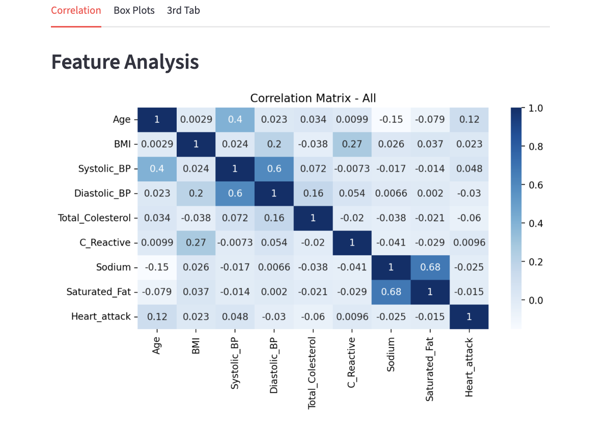
As mentioned before, the values are ranged -1 to 1. We can see that the entire diagonal has the value of 1.0; this is perfect correlation as we are comparing a variable with itself. The colours also distinguish the different ranges of correlation with darker blue representing a higher value, and as it gets lighter the values also decrease.
Take a look at the intersections of Systolic_BP and Diastolic_BP. Other than the diagonal entries, the two intersections have one of the highest correlation value. Although it is not extremely close to 1, it does have a fairly strong relation; this makes sense because although it can not be generalized for everyone, Systolic BP and Diastolic BP measure parts of the same heart cycle and commonly rise and fall together. Similarly, the 0.68 correlation between Sodium and Saturated_Fat implies diet consisting of one usually involves the other as well.
Earlier we noted understanding multicolinearity as one of the important result of EDA and data analysis; the general concept of that is represented here. If you were to work on tasks such as regression later on, characteristics like multicolinearity can create challenges in isolating individual effect on the dependent variable.
Additionally, note that these correlation in the correlation matrix only captures linear relationships; low correlation values do not always means variables are independent.
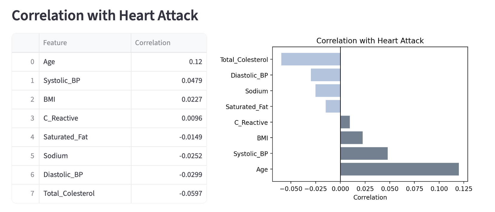
Moving on, now the goal is to add a section for correlation between features and a specific variable (our target), Heart_attack.
|
After this section, you will see that we will be changing the view and information presented if the user decides to filter for a specific group. We will get more into it after this section. Some related ideas:
|
Unfiltered Case - Using Correlation
# Switch based on what filter user selected
 if choice == "All":
    # Correlation with target specifically
    st.subheader("Correlation with Heart Attack")

    target_corr = (corr["Heart_attack"].drop("Heart_attack").sort_values(ascending=False))

    # Create two columns
col1, col2 = st.columns([1.5, 2])-
target_corr-
corr["Heart_attack"]: Here we select the column corresponding to Heart_attack, which gives the correlation of all variables with the target.
-
.drop("Heart_attack").sort_values(ascending=False): Self correlation always produces a value 1 - we remove this. Then, we sort the values from highest to lowest to see the strongest positive relationship first.
-
-
col1, col2 = st.columns([1.5, 2]): [1.5, 2] you see here is width ratio definition. The numbers are relative weights, and here col1 gets 1.5/(1.5+2), approximately 43% of the width, and col2 gets 2/3.5, approximatley 57% of the width. You are free to adjust as you see fit on the screen.
Using the two columns, we want to present a table of correlation values and a bar chart of the correlations.
On the left hand side we have:
# Everything here appears in column 1
with col1:
    # Display dataframe in Streamlit
st.dataframe('''YOUR CODE HERE''')-
To-do:
-
Take 'target_corr' and rename to "Correlation"
-
Convert into a dataframe. You can use .reset_index() which automatically moves index into a column.
-
Rename the column "index" into "Feature"
-
|
We divided up the code a little bit to understand each sections, but note that 'with col1:' and 'with col2:' should be inside 'with tab1:'. |
On the right hand side we have:
# Everything here appears in column 2
with col2:
    fig2, ax2 = plt.subplots(figsize=(6, 4))

    # Show positive and negative correlation using different colours
    colors = []
    '''YOUR CODE HERE'''

    ax2.barh(target_corr.index, target_corr.values, color=colors)
    ax2.axvline(0, color='black', linewidth=1)

    # x-axis label
    '''YOUR CODE HERE'''

    # Chart title
    '''YOUR CODE HERE'''

    plt.tight_layout()

    # Render Matplotlib figure inside Streamlit
    st.pyplot(fig2)
plt.close(fig2)-
To-do:
-
Loop through each value in target_corr.values, and if the value is greater than 0 (positive correlation), set it to a specific colour, and if the value is less than 0 (negative correlation), set it to a different colour than the first. (You can use either for loop or list comprehension!)
-
Add in necessary labels and title.
-
-
.barh(): Using matplotlib, we create a horizontal bar plot. Passing in 'target_corr.index' makes the feature names on the y axis and 'target_corr.values' makes the correlation values on the x axis. We apply the colour condition by setting 'color=color'. Thus, we end up with each bar representing one feature and its length representing the correlation strength. -
.axvline(): We want to visually separate the positive and negative correlations. This function helps draw a reference line at x=0.
Below is the output you can expect to see:
Filtered Case - Average Comparisons
'All' group contains both 0 (no heart attack) and 1 (heart attack), meaning there exists variance in the target. However, once we filter for either 'No Heart Attack' or 'Heart Attack', all individuals in that data has either 0 or 1, leading to no variance. We can not obtain a valid correlation value when variance is zero.
So here, we will focus on some basic analysis and presentation of mean values, changing the view over from correlation we previously did.
Below, we first do the usual setup procedure, and calculate the mean values for both filtered and overall group. (This type of comparison would be useful, for example, if we wanted to easily see which variables increase or is dominating in high risk patients).
Please calculate the mean for the selected column using .mean().
# If Filtering Option is Selected
 else:
    st.subheader(f"{choice}")

    features = ['Age', 'BMI', 'Systolic_BP', 'Diastolic_BP', 'Total_Colesterol', 'C_Reactive',  'Sodium', 'Saturated_Fat']

    # Average calculation for the full, original data
    '''YOUR CODE HERE'''

    # Average calculation for filtered subset
    '''YOUR CODE HERE'''

    col1, col2 = st.columns([1.7, 2])
On the left side, we will present a numerical table of the mean values of each features.
with col1:
    # Text description of this section using st.write()
    '''YOUR CODE HERE'''

    info = pd.DataFrame({"Feature": features,
                         "Group Avg": filtered_avg.values,
                         "Overall Avg": overall_avg.values})

st.dataframe(info)-
We created a Pandas Dataframe by combining the three information into one table. The keys ('Feature', 'Group Avg', 'Overall Avg') become headers for the columns, and the values (features, filtered_avg.values, overall_avg.values) become the rows for the data.
On the right side, we will present a visualization that lets users see the bar plot of the mean values, for both filtered and unfiltered sets. Please see below this code section for more explanation.
with col2:
    # Text description of this section using st.write()
    '''YOUR CODE HERE'''

    fig3, ax3 = plt.subplots(figsize=(8, 6))

    # Specific dataframe for plotting
    df_plot = pd.DataFrame({choice: filtered_avg, 'Overall Average': overall_avg}, index=features)

    # Horizontal bar plot
    df_plot.plot(kind='barh', ax=ax3, color=['lightsteelblue', 'slategrey'])

    ax3.set_xlabel('Average Value')
    ax3.set_title('Filtered vs Overall Average')
    plt.tight_layout()

    st.pyplot(fig3)
plt.close(fig3)-
For
df_plot, we created a new dataframe formatted for the purpose of plotting. The argument passed in is a dictionary and similar to what we did in 'col1' previously, the keys (choice, 'Overall Average') are column headers, and values (filtered_avg, overall_avg) are the numbers. Matplotlib automatically creates a legend using the headers. The parameter 'index=features' is what gives the y-axis label in our horizontal chart using our list of features. This method is useful for comparing specific subsets of data against overall data. -
We should be quite familiar with plotting now; we have used many plotting methods before and
barhis one of them. It works the same way here, creating the horizontal plot in the specified axis (ax3) created earlier withplt.subplots(). We also selected specific colours for the two distinct groups (you are free to pick your own!). -
For the users, this type of visualization provides immediate visual contrast.
-
'Overall Average' in the plot represents the state based on all individuals. The filtered bar (lighter blue in this example) defines characteristics of a certain group, for example, having a significantly longer bar for 'Sodium' in 'Heart Attack Only' group.
-
Below is an example of an expected output and behaviour.
-
4a. Explain how correlation between features are found and what correlation matrix tells us.
-
4b. Write a few sentences on your interpretation of, and new findings from the results in "Correlation with Heart Attack" section and any one of the barplots.
-
4c. All code and output for Correlation and Comparison as mentioned in this question.
Question 5 - Box Plots, Outlier Detection & More Streamlit Tools (2 points)
Histogram showed us the distribution shape. Box Plot is another statistical visualization tool that show similar information, but make outliers very visible. They make distribution comparison across groups side by side very easy to do.
As we did with the first tab, create the section wrapper for tab2. We will create two columns again, such that left column is used for user input and statistics, and right column is used for the plot output.
with tab2:
    st.subheader("Box Plot")
    # Description of this section using st.write()
    '''YOUR CODE HERE'''

    col1, col2 = st.columns([1, 2])
1st Column
with col1:
    # Create dropdown menu
    # box_feature has the selected column name
    box_feature = '''YOUR CODE HERE'''

    # Create checkbox
    split = st.checkbox("Split by heart attack status")

    # Calculations
    Q1 = filtered_df[box_feature].quantile(0.25)
    Q3 = filtered_df[box_feature].quantile(0.75)
    IQR = Q3 - Q1
    outliers = filtered_df[(filtered_df[box_feature] < Q1 - 1.5*IQR) | (filtered_df[box_feature] > Q3 + 1.5*IQR)]

    st.metric("Number of Outliers:", '''YOUR CODE HERE''')
st.metric("Outlier %:", '''YOUR CODE HERE''')-
st.checkbox(): This Streamlit function is used to display a checkbox widget; it returns a boolean value depending on if it is checked or not. The parameter is a text displayed to the user. -
Outlier Calculation Explanation:
-
We first compute the quartiles by dividing the data into 4 equal parts with
.quantile()function . Q1 is the 25% percentile and Q3 is the 75% percentile, meaning 25% of the data and 75% of the data are below the values respectively. -
Then Interquartile Range (IQR) is found, measuring the spread of middle 50% of the data. This is to identify outliers and help analyze skewed data.
-
Standard rule for box plots is applied.
-
-
To-do:
-
Create the dropdown menu using
st.selectbox(); features should be listed in options. -
Get the count of outliers.
-
Calculate the outlier percentage. You can do this by finding the proportion of data points that are outliers to the total number of data points, then convert to percentage. Show two decimal places.
-
2nd Column
Below is the code to implement box plots on the right hand side. It will use the boolean value 'split' we set above to be able to switch between one box plot and a grouped one to compare the difference between heart attack and non heart attack groups.
with col2:
    fig, ax = plt.subplots(figsize=(7, 5))

    # Checked - Separate plots based on heart attack status
    if split:
        groups = [filtered_df[filtered_df["Heart_attack"] == 0][box_feature].dropna(),
                  filtered_df[filtered_df["Heart_attack"] == 1][box_feature].dropna()]
        plot = ax.boxplot(groups, patch_artist=True, labels=["No Heart Attack", "Heart Attack"])
        plot['boxes'][0].set_facecolor('slategrey')
        plot['boxes'][1].set_facecolor('lightsteelblue')

    # Unchecked
    else:
        # One boxplot representing all patients in filtered_df
        '''YOUR CODE HERE'''

    ax.set_title(f"Box Plot - {box_feature}")
    ax.set_ylabel(box_feature)
    plt.tight_layout()
    st.pyplot(fig)
    plt.close(fig)
See below for some explanation:
-
groups = [filtered_df[filtered_df["Heart_attack"] == 0][box_feature].dropna(),
filtered_df[filtered_df["Heart_attack"] == 1][box_feature].dropna()]
: Boolean indexing is used to filter the rows into two groups, where Heart_attack is 0 and Heart_attack is 1. For example, in the first part:filtered_df[filtered_df["Heart_attack"] == 0][box_feature].dropna(),-
filtered_df["Heart_attack"] == 0is a series of True and False values. All rows with non heart attack patients is marked True, and kept. -
[box_feature].dropna()selects only the columns we wanted for graphing and removes NaN values.
-
When 'groups' is passed into the plotting function, Matplotlib goes through the list. It sees group[0] first, calculate the percentiles, and create the first boxplot. This is repeated for groups[1].
-
We then use the boxplot function. Since we can have two distinct plots,
patch_artist=Trueallows us to have distinct chosen colours for the plots. If we do not have this, the plots will just be a blank outline.labelsassign names to X-axis to distinguish groups.
-
5a. All code for Box Plot tab contents as written in the question.
-
5b. Two result screenshots - a single boxplot (feature of your choice) and second one for when "split by heart attack status" is selected.
-
5c. Add data analysis content of your choice in the third tab and using
st.write()add in description and explanation of what you have added. Please comment your code.
Submitting your Work
Once you have completed the questions, save your Jupyter notebook. You can then download the notebook and submit it to Gradescope.
-
firstname_lastname_project12.ipynb
-
firstname_lastname_project12.py
|
It is necessary to document your work, with comments about each solution. All of your work needs to be your own work, with citations to any source that you used. Please make sure that your work is your own work, and that any outside sources (people, internet pages, generative AI, etc.) are cited properly in the project template. You must double check your Please take the time to double check your work. See submissions page for instructions on how to double check this. You will not receive full credit if your |