TDM 10200: Project 12 - Mapping
Project Objectives
Motivation: Maps are another interesting way to view and interact with data. While making maps from location data is a bit more niche than how datasets are generally worked with, it is important to know how to make these sorts of maps as they can help provide some context for data when location is involved.
Context: We have worked with a variety of python libraries before. This project will introduce some that are very useful when you are wanting to show data on a map.
Scope: Python, mapping, geopandas, folium
Make sure to read about, and use the template found on the template page, and the important information about project submissions on the submission page.
Dataset
-
/anvil/projects/tdm/data/formula_1/circuits.csv
-
/anvil/projects/tdm/data/zillow/State_time_series.csv
-
/anvil/projects/tdm/data/tiger/state/tl_2025_us_state.shp (used to create map state shapes)
|
If AI is used in any cases, such as for debugging, research, etc., we now require that you submit a link to the entire chat history. For example, if you used ChatGPT, there is an “Share” option in the conversation sidebar. Click on “Create Link” and please add the shareable link as a part of your citation. The project template in the Examples Book now has a “Link to AI Chat History” section; please have this included in all your projects. If you did not use any AI tools, you may write “None”. We allow using AI for learning purposes; however, all submitted materials (code, comments, and explanations) must all be your own work and in your own words. No content or ideas should be directly applied or copy pasted to your projects. Please refer to GenAI page in the example book. Failing to follow these guidelines is considered as academic dishonesty. |
Formula 1 Circuits
Formula 1 is the highest level of international single-seater auto racing, sanctioned by the Fédération Internationale de l’Automobile (FIA). The "1" in Formula 1 refers to it being the top tier of open-wheel racing with lower tiers such as F2, F3, etc. This motorsport is well-known for its incredible speed, advanced technology, and global fanbase. The races (aka Grands Prix) are held all over the world, reaching every continent except Antarctica.
This dataset is really small - 77 rows, 9 columns. But our goal in using this specific data is to get the locations where the Formula 1 races take place, using the lat and lng columns. There is a name column that will be helpful when we go and look up certain circuits.
Zillow State Time Series
Zillow is a real estate marketplace company for discovering real estate, apartments, mortgages, and home values. It is the top U.S. residential real estate app, working to help people find home for almost 20 years.
This dataset provides information on Zillow’s housing data, with 13212 row entries and 82 columns. We will be using just a select few to learn about mapping in this project. These columns include:
-
RegionName: All 50 states + the District of Columbia + "United States" -
InventoryRaw_AllHomes: median of weekly snapshot of for-sale homes within a region for a given month
United States Census TIGER States
The Topologically Integrated Geographic Encoding and Referencing dataset is used by the United States Census Bureau to describe the features that shape the U.S. This includes a long list of physical and cultural parts of the country, including coastlines, roads, state borders, and many more. The list of these files can be found and downloaded from census page.
The TIGER shapefiles provide information about the entire United States (including Alaska and Hawaii), Puerto Rico, the U.S. Virgin Islands, American Samoa, Guam, the Commonwealth of the Northern Mariana Islands, and the Midway Islands.
We will be looking at the States shapefiles, and limiting this selection to the 50 U.S. states. This dataset is on the smaller side, containing 56 rows, 16 columns. Some of these columns include:
-
STUSPS: two-letter abbreviations for each state’s name -
NAME: the name of each U.S. state or land area -
geometry: shape and coordinates describing the land of each state
Questions
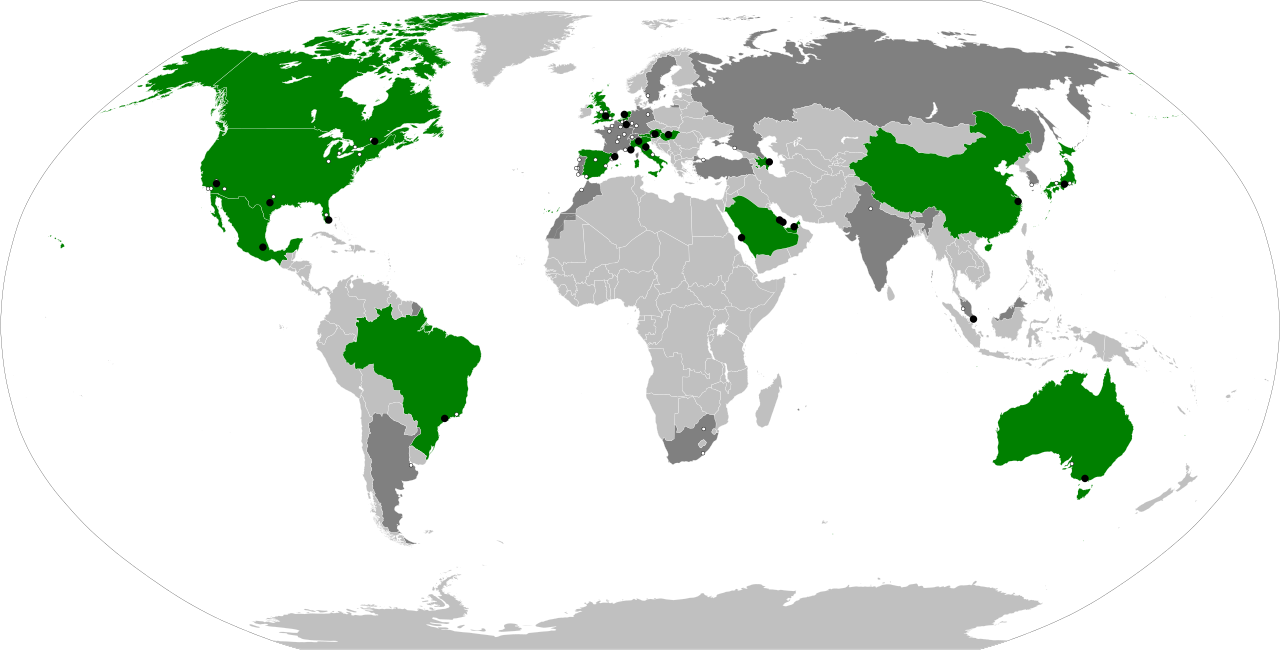
The map above shows the locations of the circuits that have hosted a Grand Prix competition around the world. The green parts are the nations on current year’s Grand Prix schedule, and the circuit locations in each nation are the black points (just a bit hard to see).
|
For this project, you will need to load in a few libraries: |
|
You CAN work through this entire project using 2 cores. However, in Question 5, if you have loaded a lot of maps in your notebook, the environment may slow down. If this happens, restarting the kernel and not running every line, OR using 4 cores can help speed things back up. |
Question 1 (2 points)
Below are three lists, one containing the latitude, the longitude, and the name, for some coordinate pairs. These lat-lng pairs map to 10 of the Indiana State Parks and Lakes properties.
locationsDF = pd.DataFrame({
    "latitude": [
        40.4973294, 39.8840311, 41.3347403, 38.7703088, 39.2980325,
        39.9294967, 39.1933212, 41.5350929, 38.7317623, 39.8683896
    ],
    "longitude": [
        -86.8525167, -87.239568, -85.3986565, -85.4466076, -86.7343327,
        -87.0827666, -86.2268856, -86.3719797, -86.4207084, -86.0219136
    ],
    "Park Name": [
        "Prophetstown", "Turkey Run", "Chain O'Lakes", "Clifty Falls", "McCormick's Creek",
        "Shades", "Brown County", "Potato Creek", "Spring Mill", "Fort Harrison"
    ]
})
Use points = gpd.GeoDataFrame(locationsDF, geometry=gpd.points_from_xy(locationsDF.longitude, locationsDF.latitude), crs="EPSG:4326") to convert the coordinate columns' values to be actual geospatial values that can be mapped (hence the 4326 (meaning EPSG:4326), which corresponds to WGS 84, the standard GPS coordinate system).
Folium is a library that allows python-users to perform data analysis tasks how they might using Leaflet in JavaScript; creating maps for geospatial visualizations, adding many choices for customizablity, and adding layers, popups, and more to mapped data.
Use folium.Map() to create a blank map of the seven continents. Use location=[] and zoom_start= to choose the location that your map focuses on, and how zoomed in it starts. Save this as my_map for future use!
Add circle markers at the locations of each of the ten state parks that have been stored in points.
my_map = folium.Map(location=[39.77, -86.29], zoom_start=6)

for index, row in points.iterrows():
    folium.CircleMarker(
        location=[????],
        radius=????
).add_to(my_map)|
Use either |
1.1 Create the locationsDF that contains the latitude and longitude coordinates.
1.2 Create a map using folium.
1.3 Use the ten state parks locations and show them on the map.
Question 2 (2 points)
Similarly to adding the circle markers in Question 1, use folium.Marker() to add pin icons to each longitude-latitude pair from points.
|
Do not forget to iterate through each row entry to get all of the points! |
Add popup labels to each pin, so they will display when the respective pin is clicked.
|
Customizations for the markers generally go within where you are creating them. |
The popup= attribute of folium.Marker() should be defined to go through each row of 'Park Name'. That way, as the loop is going through and putting pins at the locations, the popups will be created and added to each point in the same order, keeping things from getting tangled.
Taking the locations stored in points, we can string these locations together on the map. Use:
coords = list(zip(df['latitude'], df['longitude']))…to "zip" the latitude and longitude columns together. Printing coords shows these ten pairs of coordinates.
Now, when you are back to your map, you will have already used folium.CircleMarker() and folium.Marker() to show and highlight these individual location points. BUT we will also now use folium.PolyLine(), with locations = coords (and whatever color and lineweight you would like) to draw these lines to connect the points:
folium.PolyLine(locations=????, color=????, weight=????).add_to(????)2.1 Add a pin icon to each of the ten State Parks locations.
2.2 Make functional popups for each pin to display the correct park name.
2.3 Connect the points on the map.
Question 3 (2 points)
Read in the Formula 1 Circuits data:
f1 = pd.read_csv('/anvil/projects/tdm/data/formula_1/circuits.csv')If you look at the .head() of the dataset, you can see that these latitude and longitude columns are called lat and lng, respectively. We are going to create a new dataframe testDF containing just these two columns:
testDF = pd.DataFrame({"Latitude": f1['lat'], "Longitude": f1['lng']})|
In |
Take testDF and plot the pairs of values onto a map.
|
It is important to reinitialize your mapping space.
|
These values are a lot more spread out than those just from the Indianapolis area in Questions 1 and 2. So while this dataset was smaller and somewhat limited on some topics, the number of points we can plot from it is actually a lot to take in at once.
This Wikipedia page lists the Formula 1 racetracks and some further information about each. Choose one of the racetracks, and set up your map to focus in on that specific course, and set the zoom so your choice is clear.
3.1 Show the .head() of testDF to ensure that latitude and longitude columns are correct.
3.2 Plot the points for the locations of the F1 racetracks onto a map (do not zoom in yet).
3.3 Zoom the map in to focus on the location of a specific racetrack.
Question 4 (2 points)
Read in the Zillow State Time Series, and the United States Census TIGER States datasets:
# pandas dataframe
myDF = pd.read_csv('/anvil/projects/tdm/data/zillow/State_time_series.csv')

# geopandas dataframe
states_sf = gpd.read_file('/anvil/projects/tdm/data/tiger/state/tl_2025_us_state.shp')
We will be using the columns InventoryRaw_AllHomes and RegionName from myDF, so make sure to check if they contain NA values, and clean any that occur.
|
When you create
|
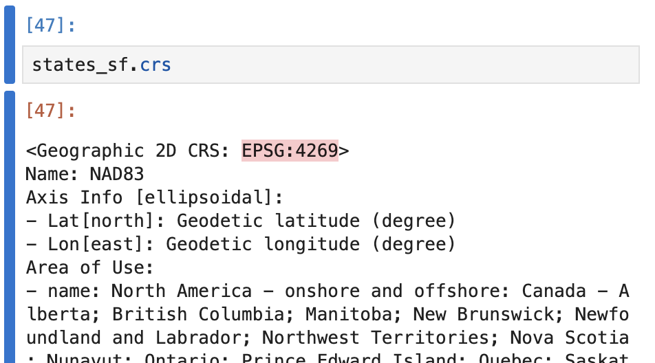
Just like in Question 1, we need to make sure the TIGER coordinates data is in the standard GPS format (EPSG:4326)
Check this using states_sf.crs:
Use states_sf = states_sf.to_crs(epsg=4326) to convert to the correct coordinate system!
Taking myDF_cleaned, we need to clean up some of the entries of RegionName, as they are listed differently here than in states_sf:
-
myDF_cleaned’s 'RegionName':
NewYork -
states_sf’s 'NAME':
New York
Make sure to convert the RegionName column of myDF_cleaned to match the formatting of the NAME column of states_sf:
myDF_cleaned['RegionName'] = myDF_cleaned['RegionName'].str.replace(r"([a-z])([A-Z])", r"\1 \2", regex=True)There is one more problematic part with this column: there are more than one row entry per state. We need to take the average InventoryRaw_AllHomes score across each state. Save this as myDF_avg.
Merge these two dataframes (states_sf and myDF_avg) on the NAME and RegionName columns to create us50_states.
us50_states = states_sf.merge(myDF_avg, left_on='NAME', right_on='RegionName', how='left')
us50_states = us50_states.dropna(subset=['RegionName'])4.1 Clean up some of the rows and columns of myDF as you begin working with it.
4.2 Create states_sf, containing spatial data for the U.S. states map.
4.3 Join the Zillow data with states_sf, and display the .head() and the .shape to ensure the data has been grouped correctly to have 50 row entries.
Question 5 (2 points)
We would like you to start this question with an empty mapping space: my_map = folium.Map(location=[37, -95], zoom_start=3, tiles=None).
The Branca library has a function .LinearColormap(). Within this, you can set colors to be a list of whatever color names/hexes you would like, and a gradient will be created.
Here are a few examples of how you could do this:
cm.LinearColormap(colors=["pink", "green", "purple"])cm.LinearColormap(colors=["#008080", "#adadad"])cm.linear.plasma.scale()There are some more default color gradients you can learn about from the python visualization colormaps page.
Whichever color palette you decide to use, set the vmin to be us50_states['InventoryRaw_AllHomes'].min(), and the vmax to be us50_states['InventoryRaw_AllHomes'].max(), and save this as my_palette.
Now, use .GeoJson(), us50_states as your data, and define a style_function, and tooltip, based on the follow template:
folium.GeoJson(
    df,
    style_function=lambda feature: {
        'fillColor': my_palette(
            feature['properties']['InventoryRaw_AllHomes']
        ),

        # state outline settings
        # color, lineweight, color opacity level (0-1)
        'color': ????,
        'weight': ????,
        'fillOpacity': ????
    },

    tooltip=folium.GeoJsonTooltip(
      # look at the states and inventory counts columns of us50_states
        fields=['RegionName', 'InventoryRaw_AllHomes'],
      # the popup will display these respective labels
        aliases=['State:', 'Inventory:'],
        localize=True
    )
).add_to(my_map)
Once you have your map of the country, displaying the average housing inventory on Zillow across the states, there is just one thing that remains to be done.
Take your color palette (my_palette), and use .caption to have it equal some name to define what the color scale is tracking (Zillow housing inventory).
5.1 Make a blank mapping space.
5.2 Display the interactive map of the country with states showing the average InventoryRaw_AllHomes per region.
5.3 Use my_palette.add_to(my_map) to add your legend to your map, and then re-display your map to reflect these changes.
Submitting your Work
Once you have completed the questions, save your Jupyter notebook. You can then download the notebook and submit it to Gradescope.
-
firstname_lastname_project12.ipynb
|
It is necessary to document your work, with comments about each solution. All of your work needs to be your own work, with citations to any source that you used. Please make sure that your work is your own work, and that any outside sources (people, internet pages, generative AI, etc.) are cited properly in the project template. You must double check your Please take the time to double check your work. See submission page for instructions on how to double check this. You will not receive full credit if your |