TDM 10200: Project 11 - Advanced Plotting
Project Objectives
Motivation: You now know how to make visualizations. In this project, you will get to expand your knowledge of plotting. It is the same dataset throughout, but you get to explore it and the challenges plotting it will bring in unique ways.
Context: We have some practice making plots from datasets. But it is also important to learn how to make these visualizations not just for the sake of plotting, but also for gaining insights and communicating findings clearly.
Scope: Python, boxplots, scatterplots, seaborn, matplotlib
Make sure to read about, and use the template found on the template page, and the important information about project submissions on the submission page.
Dataset
-
/anvil/projects/tdm/data/zillow/State_time_series.csv
|
If AI is used in any cases, such as for debugging, research, etc., we now require that you submit a link to the entire chat history. For example, if you used ChatGPT, there is an “Share” option in the conversation sidebar. Click on “Create Link” and please add the shareable link as a part of your citation. The project template in the Examples Book now has a “Link to AI Chat History” section; please have this included in all your projects. If you did not use any AI tools, you may write “None”. We allow using AI for learning purposes; however, all submitted materials (code, comments, and explanations) must all be your own work and in your own words. No content or ideas should be directly applied or copy pasted to your projects. Please refer to GenAI page in the example book. Failing to follow these guidelines is considered as academic dishonesty. |
Zillow State Time Series
Zillow is a real estate marketplace company for discovering real estate, apartments, mortgages, and home values. It is the top U.S. residential real estate app, working to help people find homes for almost 20 years. This dataset provides information on Zillow’s housing data, with 13212 row entries and 82 columns. Some of these columns include:
-
RegionName: All 50 states + the District of Columbia + "United States" -
DaysOnZillow_AllHomes: median days on market of homes sold within a given month across all homes -
InventoryRaw_AllHomes: median of weekly snapshots of for-sale homes within a region for a given month -
Date: date of entry in YYYY-MM-DD format -
MedianListingPrice_AllHomes: median of the list price / asking price for all homes.

Questions
|
For this project, you will need to load in a few additional libraries: |
Question 1 (2 points)
Read in the Zillow State Time Series dataset as myDF using pandas. In this dataset, the Date column records when the housing data within each row entry was captured. The MedianListingPrice_AllHomes column shows the median listing price for all home types. By grouping these prices by date and region, you can track trends by location over time.
Look at the head of the data. The Date column is in YYYY-MM-DD date format, but only visually. Currently this data is stored as objects (characters) rather than numerical date values. Use pd.to_datetime to create a column that contains these records in datetime format.
myDF['Date'] = pd.to_datetime(myDF['Date'])When working with time series data, it is important to make sure you:
-
convert date values to actual date type,
-
decide the specific time range to include,
-
summarize your measure of interest (mean, median, sum, etc.) per time period.
selected_regions = ["Indiana", "Tennessee", "Utah", "NewHampshire"]There are many entries of each region throughout the RegionName column. Make sure to filter for the occurrences of these values in the column rather than just taking these four values in selected_regions.
Group by Date and RegionName, then summarize the grouped data to find the average MedianListingPrice_AllHomes per region.
# only include the regions of RegionName that are listed in selected_regions
myDF_selected_regions = myDF[myDF['RegionName'].isin(selected_regions)]

# group by the date, then by the region.
myDF_grouped = myDF_selected_regions.groupby(["Date", "RegionName"], as_index=False)

# find the average MedianListingPrice_AllHomes across the date and region pairs
# aggregate myDF_grouped to reflect this
myDF_grouped = myDF_grouped.agg(avg_price=("MedianListingPrice_AllHomes", "mean"))|
You will likely see NaN values in the |
We are going to be using the seaborn library to plot the data as desired, and then polish, customize, and finalize this plot using matplotlib.
sns.lineplot(data=myDF_grouped, x="Date", y="avg_price", hue="RegionName")
plt.title([YOUR TITLE HERE])
plt.xlabel([YOUR X-AXIS LABEL HERE])
plt.ylabel([YOUR Y-AXIS LABEL HERE])
plt.show()|
If you would like to add a grid to your plot, use
|
1.1 Make a new dataframe with Date, avg_price, and RegionName (myDF_grouped in the examples above).
1.2 Create a line plot using sns.lineplot(), showing the average listing prices over time by the values of selected_regions.
1.3 Write 2-3 sentences interpreting your final line plot.
Question 2 (2 points)
Working with myDF (so we do not carry anything over from Question 1) in this question, take a look at the value counts of the RegionName column. There are many regions in this column that have 261 entries each.
|
The main reason we refer to these as "regions" rather than "states" is because there are two imposters: |
When you are working with data, it is important to know how many NA or null values you could run into, as they can easily create issues. Use .isnull().sum() to get the total counts of 'null' values in RegionName, and DaysOnZillow_AllHomes, respectively.
There are no problematic values in RegionName, but there are 8367 null values in DaysOnZillow_AllHomes.
|
We offer you two simple example methods of cleaning myDF’s |
|
When you filter both the |
Boxplots provide a concise, visual summary of the distribution of values within a dataset. This allows us to easily identify key statistical values like the median, quartiles, and outliers.
In Project 10, we used seaborn to make a few boxplots using the Death Records data. Use the sns.boxplot() function to make a boxplot that shows the statistics for the number of days housing listings typically stay on Zillow.
In your boxplot:
-
data = myDF_cleaned -
x = RegionName -
y = DaysOnZillow_AllHomes
…so that we have a "box" for each of the unique regions. This plot should help give us some insight for how long listings in each region typically stay on Zillow.
|
Make sure to label all of your plots with a title, axis labels, and any other customizations you would like to include to improve clarity. |
|
This is a very messy and full plot! |
Fill in the boxplot template below to try to help clear up your plot:
sns.boxplot(data=[my_data], x=[col_1], y=[col_2], hue=[col_1])
plt.title("This is my title")
plt.xlabel("This is my x-axis label")
plt.ylabel("This is my y-axis label")
plt.xticks(rotation=45, ha='right')
plt.show()
There are many of regions shown here. If you zoom in on the x-axis, the labels for the individual boxes are too crowded to be useful. We tried turning the labels so they are displayed at an angle, but the text still overlaps. The colors are not very useful here, either, as many are so close to others that having a legend for this plot would not be too helpful.
|
It does help some to adjust the size of your plotting space like |
2.1 Remove the NA / null / problem values from DaysOnZillow_AllHomes.
2.2 Make a boxplot showing how the number of days listings stayed on Zillow before selling are distributed across the dataset’s regions.
2.3 What are some customizations you added to the very crowded boxplot to try to improve it?
Question 3 (2 points)
The U.S. Census Bureau has a method for dividing the country up into four main regions. The standard names they use are Northeast, Midwest, South, and West. These groups can be found from census page - this helps to understand the lists you should create using the lines:
the_northeast = ['Connecticut', 'Maine', 'Massachusetts', 'NewHampshire', 'NewJersey', 'NewYork', 'Pennsylvania', 'RhodeIsland', 'Vermont']
the_midwest = ['Illinois', 'Indiana', 'Iowa', 'Kansas', 'Michigan', 'Minnesota', 'Missouri', 'Nebraska', 'NorthDakota', 'Ohio', 'Wisconsin']
the_south = ['Alabama', 'Arkansas', 'Delaware', 'DistrictofColumbia', 'Florida', 'Georgia', 'Kentucky', 'Louisiana', 'Maryland', 'Mississippi', 'NorthCarolina', 'Oklahoma', 'SouthCarolina', 'Tennessee', 'Texas', 'Virginia', 'WestVirginia']
the_west = ['Alaska', 'Arizona', 'California', 'Colorado', 'Hawaii', 'Idaho', 'Montana', 'Nevada', 'NewMexico', 'Oregon', 'Utah', 'Washington', 'Wyoming']
Each should contain just the names of the states within that U.S. region.
Create conditions, which will contain all of the occurrences within RegionName in myDF_cleaned, each sorted into one of the U.S. regions. Use the .isin() function to sort the column based on whether or not each value was in region 1, then region 2, and so on.
# replace each "list_" with your region lists!
conditions = [myDF_cleaned['RegionName'].isin(list_1),
              myDF_cleaned['RegionName'].isin(list_2),
              myDF_cleaned['RegionName'].isin(list_3),
              myDF_cleaned['RegionName'].isin(list_4)
             ]
Define choices to be a list of whatever you would like these four U.S. regions to be called in your new column. It is important that this list is defined in the same order as conditions was, otherwise, the names will not be applied correctly.
Use NumPy’s .select() function to take the conditions and choices to create a new column in myDF_cleaned called NewRegions.
Within np.select(), you can set the 'default' value to be whatever you want. In this case, it would make sense to use "Other" to account for DistrictofColumbia, and UnitedStates.
Make a boxplot to reflect how long listings stayed on Zillow by region, using the U.S. Census Bureau Regions as your box categories.
3.1 A new column NewRegions which splits the country’s states into four regions.
3.2 Boxplot showing how the number of days listings stayed on Zillow before selling are distributed across the regions determined by the U.S. Census Bureau.
3.3 Read a bit about the housing market in each region. Reflect (2-3 sentences) on why you think the box for certain regions may be higher or lower than others.
Question 4 (2 points)
There are two columns in this Zillow dataset that appear very similar: DaysOnZillow_AllHomes, and InventoryRaw_AllHomes. They do have some key differences that help us understand why we can use both of them together without the data being redundant:
| Column Name | Focus | Based On | What This Tells You |
|---|---|---|---|
DaysOnZillow_AllHomes |
Selling speed |
Homes sold that month |
Market demand (buyer activity) |
InventoryRaw_AllHomes |
Supply level |
Homes listed in that month |
Market supply (availability) |
Using seaborn, make a scatterplot to show the relationship between these columns.
Something interesting that is relatively easy to do with scatterplots is to add in an informative value to determine the color of the plot. Set the plot’s 'hue' to be NewRegions. This is good because it helps separate the plot somewhat, but it is still visually overwhelming.
The alpha value controls the opacity (transparency) of colors in digital visuals. It can be helpful to adjust this in our scatterplot (to 0.5, 0.2, etc.) to lighten the intensity of the plotted points, and to provide insight into how densely the points are distributed.
There are a lot of different ways you can customize a plot. However, it is easy to do this badly. Here are some examples of differently customized scatterplots:
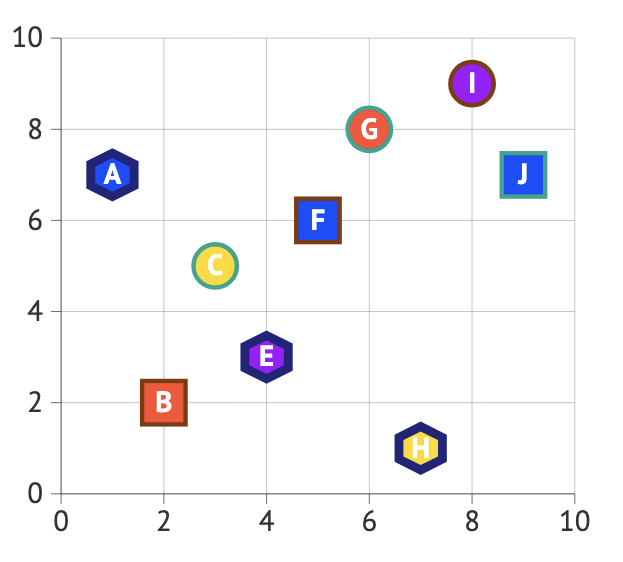
Using both colors and shapes to represent the same groups is redundant and can confuse the reader. It adds unnecessary visual complexity without improving clarity. A single clear distinction (either color or shape) would be enough.
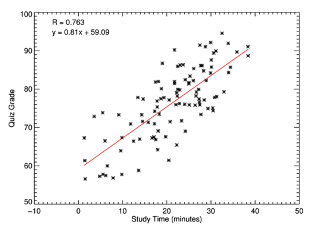
The axis includes negative values for minutes, which is not meaningful in this context. This suggests either an error in the data or poor axis scaling. Axes should reflect realistic and interpretable values.
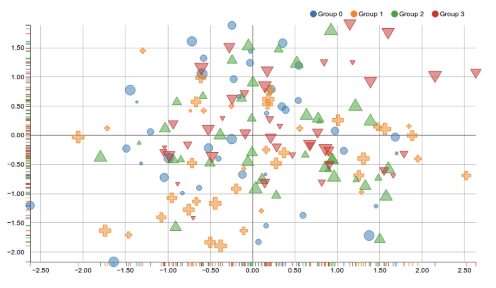
This plot combines multiple visual elements, different shapes, colors, and letters inside markers, without providing any explanation of what they represent, making it difficult for the viewer to interpret the data. The absence of a legend means it is unclear whether these features indicate groups, labels, or something else. At the same time, the design is overly cluttered: large markers, thick outlines, and embedded text draw attention away from the actual relationship between the variables. Instead of helping the reader understand patterns in the data, these choices create confusion and visual overload, reducing the effectiveness of the plot.
4.1 What do the DaysOnZillow_AllHomes and InventoryRaw_AllHomes columns represent? How are they related?
4.2 Plot the supply and demand of houses on Zillow, distinguishing the plotted points by which region they belong to.
4.3 What are some ways you can think of to create a terrible plot? What are some better practices to use instead of these?
Question 5 (2 points)
Just like in some of the previous questions, sometimes it is helpful to subset the data you plan to plot to make your visualization clearer. BUT, in this question, we are going to make the plot, and split the data within the plotting function. We have been using .scatterplot() in the previous question. Now, we’re going to use .relplot().
|
|
To begin, create a relational plot of DaysOnZillow_AllHomes and InventoryRaw_AllHomes, with NewRegions as the hue. It is important that we add more to this:
-
col- how many columns (or plots) there should be. We’re going to set this to "NewRegions", so there is a plot for each region, -
col_wrap- how many plots can be shown in a row before appearing on a new line, -
kind- what sort of plot this is. Here, try using "scatter".
Save your plot (from .relplot()). It is very cool that we are able to save the plots, and then use other functions on the saved plot object.
my_plots = sns.relplot([my_plotting_content])

# title for each plot
# col_name = each of the plots = the different regions
my_plots.set_titles("{col_name}")
my_plots.set_axis_labels("Buyer Activity", "Supply / Availability")
plt.tight_layout()
plt.show()5.1 Make relational scatterplots to represent the supply / demand of the houses on Zillow per each U.S. region.
|
Since the dataset used in this question contains time series data, it would require more advanced visualization techniques and different approaches for proper analysis. Here, it is used only for practice purposes. For further practice and more appropriate time series visualizations, readers are encouraged to explore additional resources.
|
Submitting your Work
Once you have completed the questions, save your Jupyter notebook. You can then download the notebook and submit it to Gradescope.
-
firstname_lastname_project11.ipynb
|
It is necessary to document your work, with comments about each solution. All of your work needs to be your own work, with citations to any source that you used. Please make sure that your work is your own work, and that any outside sources (people, internet pages, generative AI, etc.) are cited properly in the project template. You must double check your Please take the time to double check your work. See submission page for instructions on how to double check this. You will not receive full credit if your |