TDM 10100: Project 11 - Advanced Plotting 2
Project Objectives
Motivation: Now you have some comfort working with ggplot(). For this project, you get the opportunity to ensure knowing how to make good plots, and how to avoid bad plots. The differences may not be as clear as you would assume, so it is important to continue to expand your knowledge of this topic.
Context: We have some practice making plots using ggplot(). Now, we will explore other types of plots and ways to optimize them so they are easier for the viewer to understand.
Scope: R, ggplot2, boxplots, scatterplots, lineplots, heatmaps
Dataset
-
/anvil/projects/tdm/data/zillow/State_time_series.csv
-
/anvil/projects/tdm/data/flights/subset/1997.csv
-
/anvil/projects/tdm/data/zillow/Metro_time_series.csv (used in examples)
|
If AI is used in any cases, such as for debugging, research, etc., we now require that you submit a link to the entire chat history. For example, if you used ChatGPT, there is an “Share” option in the conversation sidebar. Click on “Create Link” and please add the shareable link as a part of your citation. The project template in the Examples Book now has a “Link to AI Chat History” section; please have this included in all your projects. If you did not use any AI tools, you may write “None”. We allow using AI for learning purposes; however, all submitted materials (code, comments, and explanations) must all be your own work and in your own words. No content or ideas should be directly applied or copy pasted to your projects. Please refer to the-examples-book.com/projects/fall2025/syllabus#guidance-on-generative-ai. Failing to follow these guidelines is considered as academic dishonesty. |
Zillow State Time Series
Zillow is a real estate marketplace company for discovering real estate, apartments, mortgages, and home values. It is the top U.S. residential real estate app, working to help people find home for almost 20 years. This dataset provides information on Zillow’s housing data, with 13212 row entries and 82 columns. Some of these columns include:
-
RegionName: All 50 states + the District of Columbia + "United States" -
DaysOnZillow_AllHomes: median days on market of homes sold within a given month across all homes -
InventoryRaw_AllHomes: median of weekly snapshot of for-sale homes within a region for a given month
There is a second Zillow dataset used in this project: Metro Time Series. We provide some example lines of code for you to run in Question 5 that use this dataset. From this Metro Time Series dataset, we will be using a few select columns:
-
Date: date of entry in YYYY-MM-DD format, -
AgeOfInventory: median number of days all active listings have been current, updated weekly. These medians get aggregated into the number reported by taking the median across weekly values, -
DaysOnZillow_AllHomes: median days on market of homes sold within a given month across all homes, -
MedianListingPrice_AllHomes: median of the list price / asking price for all homes.
Flights
The flights dataset is huge, with files from 1987 to 2023, each with respective subset datasets just to make the data reasonable to work with. The flights datasets provides numerous opportunities for data exploration - there are 5,411,843 rows from 1997 alone! These subsets contain information about when each flight took place, as well as different factors like how long they took, specifics like flight numbers, and more. There are, of course, empty or messy values, but there is so much data that this does not make too much of an impact for what we will be doing.
There are 29 columns and millions of rows of data. Some of these columns include:
-
Month: numeric month values, -
AirTime: flight time, in minutes, -
ArrDelay: flight arrival delay time in minutes, -
DepDelay: flight departure delay time in minutes, -
Origin: abbreviation values for origin airport.
Introduction
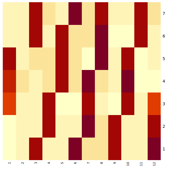
If you will recall when we were working with the flights dataset in Project 5, Question 5, we made a heatmap to display the total time flights spent in the air for each day of the week across the months of the year. This heatmap is shown below, on the left. There are some very noticeable patterns in this heatmap, and we thought we could explain this a bit more for you, as we are continuing to work with this same dataset in this project.
The red sections of the heatmaps reflect the days of the week for each month that had the highest times flights spent in the air. These patterns of the highest total flight times in the left plot come from the days of the week in the months where there were more than 28 days. For example, February, in 1997, had 28 days. January had 31 (as always). This is 3 more days than were in February, hence the 3 red blocks in the January column, showing a higher total air time because of those 3 extra days.
This is reflected across all of the months of the year. Months with just 30 days - such as April - have 2 extra days (2 more than the 28 in February), while months with 31 days have 3 extra days.
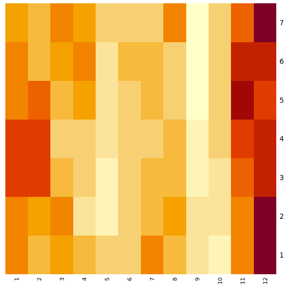
The plot on the right shows a different way at looking at the air times per day of the week across the months. This plot shows the average flight time spent in the air, whereas the plot on the left shows the total air time. Looking at the average here instead of the total flight times can help us to understand how flights were distributed throughout the year differently than our method before.
Questions
Question 1 (2 points)
We have a little bit of experience with the Zillow State dataset from questions 4 and 5 from Project 10. The main reason we are using this dataset rather than the Zillow Metro dataset is because of a column called RegionName. This column contains entries for each of the 50 states (+ 'District of Columbia' and 'United States'). Read the Zillow data:
myDF <- read.csv('/anvil/projects/tdm/data/zillow/State_time_series.csv')|
When you filter both the |
If we wanted to compare how long houses were typically listed on Zillow, it would not be too hard to do this. Boxplots provide a concise, visual summary of the distribution of numeric values for different levels of a categorical variable within a dataset. Boxplots allow us to easily identify key statistical values like the median, quartiles, and outliers.
In ggplot2, you define what dataset you’re using, and set the values for your x, y, and (sometimes) fill. For this particular boxplot, we want to use:
-
x = RegionName -
y = DaysOnZillow_AllHomes -
fill = RegionName
…so that we have a "box" for each of the unique regions. This plot should help give us some insight for how long the listings within each region are typically staying on Zillow.
|
Please make sure to label all of your plots with a title, axis labels, and any customizations you would like to include to improve clarity. |
There are A LOT of regions shown here. If you zoom in on the x-axis, the labels for the individual boxes are too crowded to be useful. We could turn these labels so they are displayed on an angle and hope this fixes things, but we look at the legend and find that it is also not very helpful. There are too many items being colored in the default gradient, and it is hard to tell values apart from each other when using this legend as a reference for reading the plot.
|
It does help some to adjust the size of your plotting space like |
The U.S. Census Bureau has a method for dividing the country up into four main regions. The standard names they use are Northeast, Midwest, South, and West. These groups can be found here - this helps to understand the vectors you should create using the lines:
the_northeast <- c('Connecticut', 'Maine', 'Massachusetts', 'NewHampshire', 'NewJersey', 'NewYork', 'Pennsylvania', 'RhodeIsland', 'Vermont')
the_midwest <- c('Illinois', 'Indiana', 'Iowa', 'Kansas', 'Michigan', 'Minnesota', 'Missouri', 'Nebraska', 'NorthDakota', 'Ohio', 'Wisconsin')
the_south <- c('Alabama', 'Arkansas', 'Delaware', 'DistrictofColumbia', 'Florida', 'Georgia', 'Kentucky', 'Louisiana', 'Maryland', 'Mississippi', 'NorthCarolina', 'Oklahoma', 'SouthCarolina', 'Tennessee', 'Texas', 'Virginia', 'WestVirginia')
the_west <- c('Alaska', 'Arizona', 'California', 'Colorado', 'Hawaii', 'Idaho', 'Montana', 'Nevada', 'NewMexico', 'Oregon', 'Utah', 'Washington', 'Wyoming')
Make sure that, when you are splitting the values of RegionName by the four standard regions, that you sort the actual values of the column rather than just by four labels that match the vector names.
Make a new boxplot to reflect how long listings stayed on Zillow by region, using the U.S. Census Bureau Regions as your box categories.
1.1 Boxplot showing how the number of days listings stayed on Zillow before selling are distributed across the dataset’s regions.
1.2 Boxplot showing how the number of days listings stayed on Zillow before selling are distributed across the regions determined by the U.S Census Bureau.
1.3 Read a bit about the housing market in each region. Reflect (2-3 sentences) on why you think the box for certain regions may be higher or lower than others.
Question 2 (2 points)
There are two columns in this Zillow dataset that seem very similar: DaysOnZillow_AllHomes, and InventoryRaw_AllHomes. They do have some key differences that help us understand why we can use both of them together without the data being redundant:
| Column Name | Focus | Based On | What This Tells You |
|---|---|---|---|
DaysOnZillow_AllHomes |
Selling speed |
Homes sold that month |
Market demand (buyer activity) |
InventoryRaw_AllHomes |
Supply level |
Homes listed in that month |
Market supply (availability) |
Make a geom_point() plot to show these columns against each other. Something interesting that is fairly easy to do with scatterplots is to add in an informative value to determine the color of the plot. Try adding the NewRegions column to this plot. What does this help us see?
Just like in Question 1, sometimes it is helpful to subset the data you hope to plot to make your visualization clearer. We can do this by using NewRegions to visualize the supply and demand of homes across each part of the country.
In addition, the patchwork library known for being the 'Composer of Plots'. It can be used in base R, but its main usage is for plots made in ggplot2.
Say you have two plots, p1 and p2, each variable storing a ggplot object (a plot). When using the patchwork library, you can display these plots next to each other simply by running p1 + p2. There are other libraries that have similar capabilities, but you can find more information on utilizing patchwork here.
Additionally, if you would prefer to merge the points of two or more plots together into one plot rather than displaying the plots alongside each other, you can! Just like when creating a normal plot in ggplot2, you will need to declare your plotting space.
|
In many examples usages of |
In this plot, you will be using geom_point() functions, one for the data points from the midwest, and the other for those from the south.
2.1 Scatterplot showing the supply vs demand of homes across all the country. Explain your reasoning for why you did/didn’t plot the region "Other" here.
2.2 Use the patchwork library to display the scatterplots of at least two regions (subsets of the plot in 2.1) next to each other.
2.3 Scatterplot comparing the supply vs demand of (at least) two regions. This plot should have each regions' points plotted with a separate geom_point() function.
Question 3 (2 points)
Read in the Flights dataset:
myDF <- read.csv('/anvil/projects/tdm/data/flights/subset/1997.csv')|
Use 4 cores for this data since there are over 5 million rows in this dataset. If you are already using the server in notebook, select File >> Hub Control Panel >> Stop My Server (click once and wait a little). Then, select "Start My Server" (start with 4 cores). |
The Flights dataset has these two columns tracking flight delay: DepDelay, and ArrDelay. DepDelay is the delay pushing back the flight takeoff time from the origin, and ArrDelay is the amount of time that the flight is late to landing at the destination. Filter out NA values:
myDF_clean <- myDF %>%
  filter(!is.na(DepDelay) & !is.na(ArrDelay))
Now, to actually use these columns, we can compare them as the efficiency of the flights across each month of 1997.
|
You are not required to use |
This is an example of how you may want to reshape the Flights data to compare the ArrDelay, DepDelay, and Month columns:
summaryDF <- df %>%
    select(col_1, col_2, col_3) %>%
    pivot_longer(cols = c(col_1, col_2)) %>%
    group_by(col_3, name) %>%
    summarise(mean = mean(value),
        high = mean(value) + sd(value),
        low  = mean(value) - sd(value))
Your resulting summaryDF should have rows that display like (for the third month):
| Month | name | mean | high | low |
|---|---|---|---|---|
3 |
ArrDelay |
7.311369 |
35.26029 |
-20.63756 |
3 |
DepDelay |
8.433000 |
35.30937 |
-18.44337 |
|
The |
pivot_longer() "turns" the ArrDelay and DepDelay columns. The column names ArrDelay and DepDelay become the values of the new name column, and their values (per month after group_by()) get stored in the new value column. From the value column, you will create the high and low columns that show the typical variation of delays for each month.
When you have the correct data structure (summaryDF here), geom_ribbon() can make it really easy to visualize the variance of your data. Make sure to utilize the new high and low columns when declaring the maximum and minimum values for the y-range of the ribbon plot. Each layer of the ribbon area should correlate to one of the geom_line() paths tracking the mean delay time in this plot:
3.1 Display the first 5 rows of summaryDF. Explain (1-2 sentences) what is shown in this dataframe.
3.2 Plot the mean value and standard deviation of the departure and arrival delays by month.
3.3 What else (besides standard deviation) could you calculate and show through a ribbon plot? How would this change the shape of what is shown?
Question 4 (2 points)
In Question 3, we calculated and visualized the average departure and arrival delays for each month in 1997. We reshaped the data so both delay types could be displayed in the same plot. For each month and delay type, the mean delay is shown, along with one standard deviation above and below the mean line.
That plot used all of the flights in the dataset. Now, let’s filter to only include the flights departing from the Phoenix Sky Harbor International Airport (PHX). If you’re looking at the dimensions of the summarized data, you might notice that there are still 24 rows, 5 columns, just as before. But the values are different: having filtered for a specific airport, this new summarized data is more refined than the first summaryDF we created. The values may have improved or worsened, but the data is still grouped the same.
Plot the PHX data to make another line-and-ribbon plot.
Choose 2-3 more flight origins and make a plot specific to each, filtering your data to include just the flights from that origin.
|
When you’re making layered plots, it can be useful to be mindful about the order in which you are plotting things. If you plot the lines BEFORE the ribbon layers, you will need to adjust the alpha values of the ribbons, else the lines will be hidden. Plotting the broader background first and the finer details afterward helps to ensure that the key information remains clear and visible. |
Try arranging your outputted plots together. You can use some of the methods we mentioned in the article in Question 2. The patchwork library makes this fairly easy and very customizable.
-
The arrangements can be as simple as
p1 + p2 + p3 + p4(grid square layout by default) -
They can be more complicated like:
wrap_plots(A = p1, B = p2, C = p3, design = "AABB\n#CC#") -
Or something else entirely
4.1 What sort of patterns in the delay types across the plots do you notice?
4.2 Compare (2-3 sentences) the differences and patterns you noticed between your plots from the flights of the different origins,
4.3 Test a few arrangements for displaying your plots together (you may need to adjust your plotting space size ratio).
Question 5 (2 points)
|
Read in the myDF ← read.csv('/anvil/projects/tdm/data/zillow/Metro_time_series.csv') |
Good plots can tell you a lot of useful information. Bad plots… Not only are they often confusing and messy, they can also show you things that have hidden parts that make the data display false.
A good data visualization makes the story clear, accurate, and easy to interpret. It isn’t just about how it is displayed. The data behind it also must be accurate and correct for what the plot is claiming to show.
Example prompt: "Make a plot that shows the comparison of inventory age to days listed on Zillow". (You do not have to figure out how to do this !)
Run these two example plots in your notebook. Determine which is good and which is bad, and explain your reasoning. (You may have to adjust the names according to how you have read in the Zillow Metro dataset)
Example Plot #1:
myDF_clean <- myDF %>%
  filter(!is.na(AgeOfInventory), !is.na(DaysOnZillow_AllHomes))

ggplot(myDF_clean, aes(x = AgeOfInventory, y = DaysOnZillow_AllHomes)) +
  geom_point(alpha = 0.4, color = "#559c4b") +
  geom_smooth(color = "#58135c") +
  labs(title = "Inventory Age vs Days Listed on Zillow",
       x = "Age of Inventory (days)",
       y = "Days on Zillow (All Homes)") +
  theme_minimal()
Example Plot #2:
myDF_bad <- myDF_clean %>%
    filter(AgeOfInventory > quantile(AgeOfInventory, 0.50))

ggplot(myDF_bad, aes(x = AgeOfInventory, y = DaysOnZillow_AllHomes)) +
  geom_point(color = "green", shape=12, size=4) +
  geom_smooth(formula = y ~ poly(x, 10),
              se = FALSE,
              color = "#91b500",
              linewidth = 5) +
  labs(title = "inventory age vs days listed on zillow!! full data definitely nothing missing",
       x = "age oF inveNTory",
       y = "dAys on zilloW") +
  theme_dark()
Some of the features that are good vs bad in those plots are fairly clear. While it is pretty clear which of these is the bad plot, sometimes there are bad plots with the actual purpose of making you believe something you shouldn’t. The people who make these plots have to be careful to shape the data and the outputted plot just so to make you believe what they’re showing you.
(Load this example to prepare the Zillow data for plots #3 and #4!)
# Shape the data for example plots!
library(lubridate)

myDF_time <- myDF %>%
  filter(!is.na(Date), !is.na(MedianListingPrice_AllHomes)) %>%
  mutate(new_date = as.Date(Date, format = "%Y-%m-%d")) %>%
  group_by(new_date) %>%
  summarize(avg_price = mean(MedianListingPrice_AllHomes, na.rm = TRUE)) %>%
  ungroup()

myDF_time2 <- myDF_time %>%
  filter(new_date >= min(new_date) + months(30), new_date <= max(new_date) - months(40))
Example Plot #3:
ggplot(myDF_time2, aes(x = new_date, y = avg_price)) +
  geom_line(color = "#2a6ac9", size = 1.2) +
  labs(title = "Listing Price Rises Consistently Over Time",
       x = "Date",
       y = "Listing Price") +
  theme_minimal() +
  scale_y_continuous(limits = c(min(myDF_time2$avg_price) - 10000,
                                max(myDF_time2$avg_price) + 10000))
Example Plot #4:
ggplot(myDF_time, aes(x = new_date, y = avg_price)) +
  geom_line(color = "#9e510d", size = 1) +
  labs(title = "Listing Prices Generally Rises Over Time",
       x = "Date",
       y = "Average Listing Price") +
  theme_minimal()
It is a running joke in the data science community that pie charts are evil.
This is an example of a very basic pie chart (sampled from the r-graph-gallery ggplot2 Piechart page):
data <- data.frame(
  group=LETTERS[1:5],
  value=c(13,7,9,21,2)
)

ggplot(data, aes(x="", y=value, fill=group)) +
  geom_bar(stat="identity", width=1) +
coord_polar("y", start=0)5.1 What are some key components for making a good plot? What about a bad plot? Explain for example plots #1-4.
5.2 How do your observations about the plots relate to your listed key points of plot quality?
5.3 Take the example pie chart. Do your best to make it completely useless and bad to look at. Explain what you did and how it helps to worsen this chart.
Submitting your Work
Once you have completed the questions, save your Jupyter notebook. You can then download the notebook and submit it to Gradescope.
-
firstname_lastname_project11.ipynb
|
You must double check your You will not receive full credit if your |