TDM 40100: Project 9 - Introduction to Time Series - Part 2 (NOAA Monthly Climate Data)
Project Objectives
In this project, you’ll explore and model monthly climate trends in Indianapolis using an Augmented Regressive model and SARIMAX, a type of ARIMA model that can handle seasonal patterns.
Dataset
-
/anvil/projects/tdm/data/noaa_timeseries2/monthly_avg_df_NOAA.csv
|
Use 4 cores for this project. |
|
If AI is used in any cases, such as for debugging, research, etc., we now require that you submit a link to the entire chat history. For example, if you used ChatGPT, there is an “Share” option in the conversation sidebar. Click on “Create Link” and please add the shareable link as a part of your citation. The project template in the Examples Book now has a “Link to AI Chat History” section; please have this included in all your projects. If you did not use any AI tools, you may write “None”. We allow using AI for learning purposes; however, all submitted materials (code, comments, and explanations) must all be your own work and in your own words. No content or ideas should be directly applied or copy pasted to your projects. Please refer to the-examples-book.com/projects/fall2025/syllabus#guidance-on-generative-ai. Failing to follow these guidelines is considered as academic dishonesty. |
Introduction

“Roads? Where we’re going, we don’t need roads.”
Back to the Future
Time series forecasting is not just number crunching, it is the closest thing we have to a crystal ball. By recognizing patterns across time, we can uncover hidden structures in the data, anticipate what’s coming, and even influence decisions before events unfold. It’s not magic, it’s just cool math behind the scenes.
Climate is not random, it follows patterns, some obvious and others subtle. When we zoom out from daily weather reports and look at broader climate trends, we start to see the underlying patterns of our weather. In this project, we will work with nearly two decades of monthly-aggregated climate data from Indianapolis (2006–2024), sourced from the National Oceanic and Atmospheric Administration (NOAA).
This time, the focus shifts from day-to-day fluctuations to monthly averages, a scale better suited for modeling long-term behavior and seasonal trends. The dataset includes:
-
Monthly_AverageDryBulbTemperature_Farenheit: Our main target variable—how warm or cold it was on average each month.
-
Monthly_Precipitation: Total rainfall and snowmelt.
-
Monthly_AverageRelativeHumidity: Average monthly moisture in the air.
-
Monthly_AverageWindSpeed: Wind patterns that may influence temperature or storm formation.
-
Monthly_Snowfall: A key seasonal indicator in the Midwest.
The power of time series forecasting lies in its ability to take these past patterns and use them to make educated predictions about the future. In this project, you’ll start off with building an AR (autoregressive) model and then you’ll learn how to build a type of ARIMA (autoregressive integrated moving average) model. Specifically, a SARIMAX (seasonal autoregressive integrated moving average with exogenous regressors) model that incorporates not just past temperature values, but also external predictors like humidity and precipitation.
You will clean and transform the data, test for stationarity, evaluate model performance, and ultimately forecast future climate trends for Indianapolis. The goal? To understand not only what the temperature was, but what might be next. We are going to try to predict the future!
Questions
Question 1 - Get to Know the Data (2 points)
1a. Load the dataset and display the first 5 rows to get a sense of the structure. Save it as monthly_df.
import pandas as pd
monthly_df = pd.read_csv("/anvil/projects/tdm/data/noaa_timeseries2/monthly_avg_df_NOAA.csv")
1b. Check the number of rows columns and check for missing values. Hint: you can use .shape and .isnull().sum().
1c. Create a time series line plot of Monthly_AverageDryBulbTemperature_Farenheit over time using the code below. Make sure to label the plot.
import matplotlib.pyplot as plt

monthly_df['DATE'] = pd.to_datetime(monthly_df['DATE'])
plt.plot(monthly_df['DATE'], monthly_df['Monthly_AverageDryBulbTemperature_Farenheit'])
plt.title("______") # For YOU to fill in
plt.xlabel("_____") # For YOU to fill in
plt.ylabel("_______") # For YOU to fill in
plt.grid()
plt.show()
1d. In 1–2 sentences, describe any trends or seasonality you observe in the plot.
Question 2 - Understanding Lag through AR (2 points)
Time series models are different than other models. From forecasting stock prices to anticipating weather patterns, people attempt it constantly. But when we narrow our focus to short-term forecasting, predicting the near future based on recent historical data—the task becomes more manageable.
Take, for example, your plot of average monthly temperature. One thing you will notice right away is that observations from month to month are not independent. Instead, they are correlated with one another! This is known as autocorrelation, when values close together in time tend to be similar.
This feature distinguishes time series data from other datasets you have likely seen, where each row can typically be treated as an independent observation. In time series, the order of the data matters. Patterns, cycles, and trends can all emerge over time—and understanding those structures is the key to effective forecasting.
Why Autoregressive (AR) Models?
Autoregressive (AR) models are a natural starting point for time series forecasting. At their core, they use past values to predict the future. An AR model assumes that recent values carry useful information about what comes next.
These models are simple, interpretable, and often surprisingly effective, especially when patterns persist over time. In this project, we will start with AR models to help introduce foundational ideas like lags, autocorrelation, and stationarity—concepts that carry through to more advanced models.
Lag in Time Series
In time series analysis, we assume that the past influences the future. This makes time-based data different from other datasets—observations are not independent, and patterns often persist over time.
A lag is simply a previous value of the same variable:
-
Lag 1 → the value one time step ago
-
Lag 2 → the value two time steps ago
-
Lag n → the value n time steps ago
By including lagged values in a model, we give it memory. This lets the model "remember" past behavior and use that memory to explain current outcomes.
The AR(1) Model: A First Look at Autoregression
One of the simplest models that uses lags is the autoregressive model of order 1, or AR(1). It assumes the current value depends on the previous value, plus some random noise. We use only the previous value to predict the current one:
Yₜ = ϕ × Yₜ₋₁ + εₜ,
where
-
Yₜ is the current value,
-
Yₜ₋₁ is the value one step before,
-
ϕ is the autoregressive coefficient (how much we “trust” the past),
-
εₜ is random noise.
This equation may look daunting, but all it suggests is that today’s value is largely a continuation of yesterday’s, with some variability added in! Think of it like saying: “This month’s temperature depends on last month’s temperature — plus some noise.”
Let’s look at how autocorrelation looks like in our data:
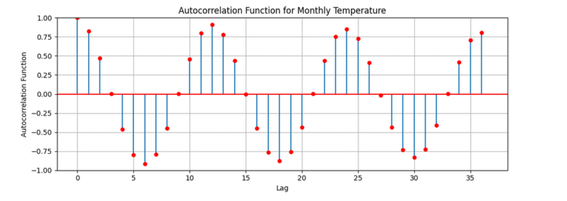
The figure above is the autocorrelation for Monthly_AverageDryBulbTemperature_Farenheit across months where one lag is one month. We observe a clear seasonal pattern, with strong positive correlations at lags of 12, 24, and 36 months. This indicates a strong yearly seasonality in monthly average temperatures. Notice that the autocorrelation at lag 0 is exactly 1, since a variable is always perfectly correlated with itself. At lag 1 (one month in the past), the autocorrelation is around 0.80, indicating a strong relationship between this month’s temperature and the previous month’s.
Understanding this concept of lag is foundational before jumping into more complex models like SARIMAX!
We will start by fitting an AR(1) model to see this in action. This foundation will help you better understand how more complex models work.
2a. Convert the DATE column to datetime format, then sort the DataFrame by DATE in ascending order using the code below. Print the first five rows of the sorted DataFrame using .head().
monthly_df['DATE'] = pd.to_datetime(monthly_df['DATE'])

monthly_df = monthly_df.sort_values('DATE').reset_index(drop=True)
2b. Create a new DataFrame that compares each month’s average temperature to the previous month’s. Include Date, Current, and Previous columns. Output the first five rows. Then in 1-2 sentences, describe the relationship between consecutive months in one sentence.
Use the partial code below for question (2b). Take a moment to understand what the function is doing, and then complete the section labeled "For YOU to FILL in":
monthly_comparisons = []

for i in range(1, len(monthly_df)):
    date = monthly_df.loc[i, 'DATE']
    current_temp = monthly_df.loc[i, 'Monthly_AverageDryBulbTemperature_Farenheit']

    # Get the previous month’s temperature
    previous_temp = ___  # For YOU to FILL in:

    row = {'Date': date, 'Current': current_temp, 'Previous': previous_temp}

    monthly_comparisons.append(row)

# Once your list is complete, turn it into a DataFrame
comparison_df = pd.DataFrame(monthly_comparisons)
2c. Using your DataFrame from 2b, create a scatterplot with the Previous month’s temperature on the x-axis and the Current month’s temperature on the y-axis. Include axis labels and a title.
Hint: You can use .scatter() from matplotlib.pyplot to make your plot.
2d. After creating the plot in 2c, describe the relationship you observe in 1–2 sentences: does the current temperature appear to depend on the previous one? Is the pattern linear, scattered, or something else?
Question 3 - ARIMA and Stationarity
Why are we using ARIMA now?
By now, you have seen that temperature data is not random. Some months are correlated with each other. Some months are warmer than others, and these shifts often repeat each year. But how can we predict the future based on what we have seen?
We may use ARIMA model which is one of the most widely used tools for time series forecasting. It stands for:
-
AR – AutoRegressive: Uses past values to predict the future,
-
I – Integrated: Removes trends by differencing the data,
-
MA – Moving Average: Uses past errors to improve predictions.
So why are we using it here?
-
We’re working with monthly climate data, which often shows both trend and seasonal behavior.
-
The data is recorded at regular time intervals, which ARIMA is well-suited for.
-
Unlike black-box models, ARIMA gives us an interpretable framework—we can understand what is driving our predictions.
Before jumping into the full ARIMA model, we started with just understanding autocorrelation. Why?
Because the autocorrelation lays the foundation for how time series models “remember” the past. It helped us:
-
Build intuition around the idea of lagged values (past influencing present),
-
See whether yesterday’s weather helps predict today’s.
ARIMA models are flexible and interpretable. They work best when the future depends linearly on the past.
But there’s one important assumption that ARIMA makes: stationarity.
Why stationarity matters?
In time series modeling, stationarity means the statistical properties of the data like its mean, variance, and autocorrelation stay consistent over time. This consistency helps ARIMA detect patterns and relationships more reliably. If the series shows a trend or changing variance, ARIMA may struggle to learn anything meaningful. The model might misinterpret those trends as patterns it needs to learn, leading to poor forecasts. That is why before using ARIMA, we need to test whether our series is stationary. If it is not, various methods, such as data transformation and differencing, can be used to achieve stationarity.
How do we know if our series is stationary?
We may use the Augmented Dickey-Fuller (ADF) test to check. We need to set a hypothesis to test our claim such as
-
Null hypothesis (H₀): The series is non-stationary (it has a unit root).
-
Alternative hypothesis (H₁): The series is stationary.
This test will provide a p-value to test the alternative hypothesis. If the p-value is less than significance level (generally it is 0.05), we reject the null hypothesis and say: “It looks stationary!”
Think of the ADF test as a screening step. If our series fails the test, that’s a sign it may need transformation before modeling.
How do we make it stationary?
One of the most common fixes is differencing. This just means subtracting each value from the one before it. If your data has an upward or downward trend, differencing helps flatten that trend by shifting the focus to changes rather than levels.
Here is a way to think about it:
-
The original series tells you the actual temperature each month.
-
The differenced series tells you how much the temperature changed from one month to the next.
By focusing on change over time instead of absolute values, we reduce the impact of long-term trends and stabilize the series. This is exactly what ARIMA needs to detect real, repeatable patterns, making it more likely to produce accurate forecasts. Understanding whether your data is stationary and knowing how to make it so is a key step before using ARIMA. It is part of the model’s logic, and it is what sets the stage for meaningful, interpretable time series predictions.
Train, Test Split in Time Series
When building forecasting models like ARIMA—or any model for time series data we must always keep in mind the order of time. In time series, past events influence future outcomes, so the order of observations matters. So, we cannot shuffle rows freely when splitting the data into test and train parts.
That is why we always split the data chronologically:
-
Training set: The earlier portion of the data, where the model learns historical patterns.
-
Testing set: The later portion, used to evaluate how well the model can predict unseen future values.
This principle applies to all time series models—whether you are using ARIMA or Long short-term memory (LSTM). You must never let the model "peek" into the future while training.
Example:
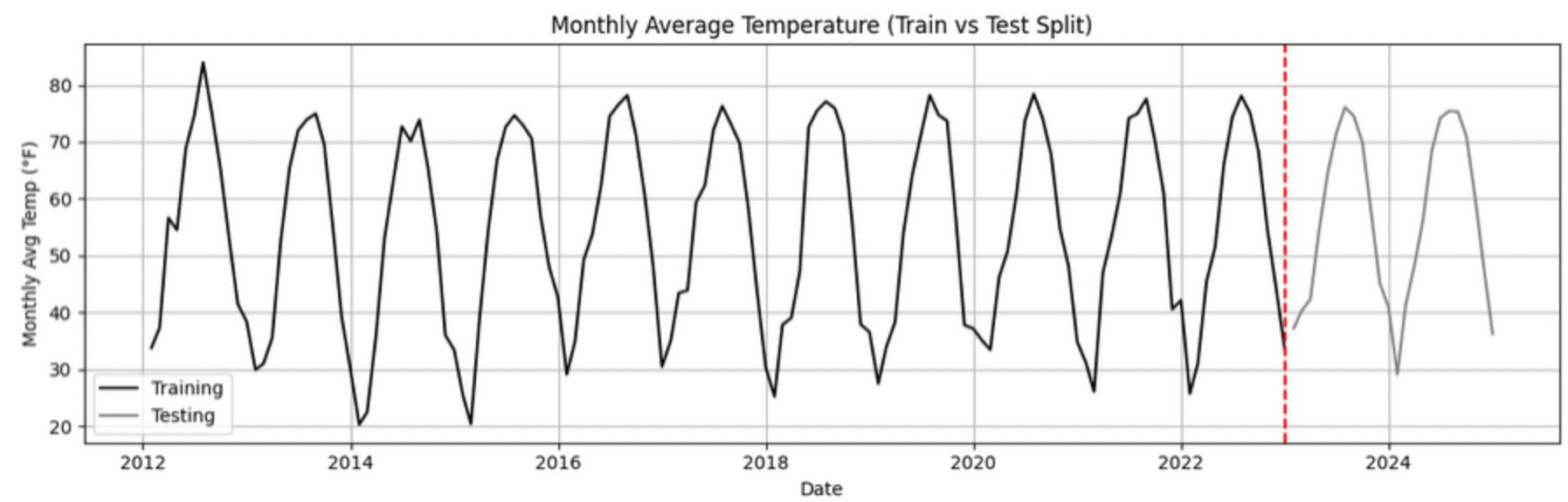
Let’s say we have monthly temperature data from January 2012 to December 2024. Here’s an example of a 50/50 split:
-
Training set: January 2012 to December 2022,
-
Testing set: January 2023 to December 2024.
This setup simulates a real-world scenario: we train using data up until 2022, and then test how well the model can forecast what comes next.
Why This Matters:
-
It gives a realistic estimate of how well your model will perform on future data.
-
This avoids training your model on the entire dataset, then using part of that dataset to test your model (which is also known as data leakage).
-
It ensures your model learns to generalize from historical patterns only.
Time-aware train/test splitting is fundamental to reliable time series forecasting.
Question 3 (2 points)
3a. Split the data into training and testing sets and print the first 5 rows for the training and test set.
-
Training set: January 2012 to December 2022,
-
Testing set: January 2023 to December 2024.
Note: We will only test for stationarity on the training set since ARIMA models are fit using this data. If the training set is non-stationary, the model may produce poor or misleading forecasts.
Use the code below to complete the split and print the first five rows of your training and test sets:
import pandas as pd
monthly_df['DATE'] = pd.to_datetime(monthly_df['DATE'])

train = monthly_df[
    (monthly_df['DATE'] >= '2012-01-01') &
    (monthly_df['DATE'] <= '2022-12-31')].copy()

test = monthly_df[
    (monthly_df['DATE'] >= '2023-01-01') &
    (monthly_df['DATE'] <= '2024-12-31')].copy()
3b. Run the ADF test on the training set’s Monthly_AverageDryBulbTemperature_Farenheit column using the adfuller() function from statsmodels. Print the ADF Statistic and p-value. Then, in 1–2 sentences, explain whether the series appears stationary based on the p-value.
-
If the p-value is greater than 0.05, we fail to reject the null hypothesis — this suggests the series is not stationary.
-
If the p-value is 0.05 or below, the series is likely stationary.
You may use the partial code below to guide your approach:
Hint: adf_result is a tuple. The first value is the ADF statistic, and the second is the p-value.
Use type(adf_result) or help(adfuller) if you’re unsure what the function returns.
from statsmodels.tsa.stattools import adfuller

adf_result = adfuller(train['Monthly_AverageDryBulbTemperature_Farenheit'])
print(f"ADF Statistic: {adf_result[.....?]}") # For YOU to FILL in
print(f"p-value: {adf_result[......?]}") # For YOU to FILL in
3c. Apply first-order differencing to the Monthly_AverageDryBulbTemperature_Farenheit column in your training data, and create a plot of the result.
Hint: Use the .diff() method to compute first-order differences. Fill in train[…] with your target variable Monthly_AverageDryBulbTemperature_Farenheit and use matplotlib.pyplot to create the plot.
You may use the code below to guide your approach:
import matplotlib.pyplot as plt

train['Temp_diff'] = train['...'].diff() # For YOU to fill in

plt.plot(train['DATE'], train['Temp_diff'])
plt.title("....") # For YOU to FILL in
plt.xlabel("") # For YOU to FILL in
plt.ylabel("....") # For YOU to FILL in
plt.grid(True)
plt.show()
3d. Now that you have applied first-order differencing, run the ADF test again, this time on the differenced series. In 1–2 sentences, compare the result to your original test.
Has the p-value dropped below 0.05? If so, your series is now stationary and ready for ARIMA modeling.
Use the code below to guide your approach:
from statsmodels.tsa.stattools import adfuller
temp_diff_clean = train['Temp_diff'].dropna()

# Run ADF test
result_diff = adfuller(temp_diff_clean)

# Print results
print("ADF Statistic (differenced):", result_diff[0])
print("p-value (differenced):", result_diff[1])
3e. In 1–2 sentences, explain why testing for stationarity on the training set is an essential step before fitting an ARIMA model.
Question 4 – Fit a Baseline ARIMA Model (2 points)
You have done the groundwork: explored the data, visualized trends, and confirmed stationarity by differencing. Now let’s fit a baseline ARIMA model using only the temperature data, no seasonality or external variables yet.
Why start here?
By fitting a basic ARIMA model first, we create a simple benchmark. This allows us to later evaluate whether adding seasonality or extra predictors (as we’ll do with SARIMAX) actually improves performance.
What is ARIMA?
ARIMA is a classic model used in time series forecasting. It stands for:
-
AutoRegressive (AR): The model uses the relationship between a variable and its own past values. Example: If last month was hot, this month might also be hot (Not always!).
-
Integrated (I): Differencing is used to remove trends and make the series stationary, a key assumption for ARIMA models. Example: If temperatures are gradually rising due to climate change, differencing helps focus on short-term patterns rather than long-term trends.
-
Moving Average (MA): The model incorporates past forecast errors to improve predictions. Example: If last month’s forecast was too low, the model may adjust this month’s prediction upward.
Even though ARIMA doesn’t handle seasonality or external factors, it’s still a powerful tool, especially when you’re just using one time series. You can find more information about the ARIMA function in python here.
4a. Define the Target Variable.
What are you trying to predict? Save the name of that column (as a string) in a variable called target_col.
4b. Run the code below to prepare the training data by resetting the index and extracting your target variable.
train = train.reset_index(drop=True)
y_train = train[target_col]
4c. Fit an ARIMA(1,1,1) model by running the code below and visualize the results. Write 1–2 sentences describing what your plot shows. How well does the ARIMA model match the trend?
import matplotlib.pyplot as plt
from statsmodels.tsa.arima.model import ARIMA

# Fit the ARIMA model
arima_model = ARIMA(y_train, order=(1, 1, 1))
arima_fit = arima_model.fit()

# Get fitted values
fitted_values = arima_fit.fittedvalues

# Align y_train and DATE to the fitted_values index
y_aligned = y_train.loc[fitted_values.index]
date_aligned = train['DATE'].loc[fitted_values.index]

# Plot
import matplotlib.pyplot as plt
plt.figure(figsize=(12, 5))
plt.plot(date_aligned, y_aligned, label='Actual', color='blue')
plt.plot(date_aligned, fitted_values, label='Fitted', color='orange', linestyle='--')

plt.title(".....") # For YOU to fill in
plt.xlabel("....") # For YOU to fill in
plt.ylabel("....") # For YOU to fill in
plt.legend()
plt.grid(True)
plt.tight_layout()
plt.xticks(rotation=45)
plt.show()
4d. Use the mean_absolute_error() function to assess the model’s performance. Make sure to fill in the mean_absolute_error function with the appropriate values. See documentation for the function here.
from sklearn.metrics import mean_absolute_error

actual = y_train
predicted = fitted_values

mae = mean_absolute_error(_____, _____) # For YOU to FILL in
print(f"Mean Absolute Error: {mae:.2f}°F — on average, the model's predictions are off by this many degrees.")
4e. Briefly explain one limitation of ARIMA for this problem by writing 1-2 sentences (hint: think about seasonality or other weather factors).
Question 5 - Build and Fit the SARMIAX Model (2 points)
Before we fit the SARIMAX model we need to know why.
SARIMAX model stands for: Seasonal AutoRegressive Integrated Moving Average with exogenous regressors.
Let’s break this down:
-
AutoRegressive (AR): The model uses past values of the series to predict future ones. You all know that now!
-
Integrated (I): It handles trends in the data by differencing the series.
-
Moving Average (MA): It incorporates past forecast errors to refine predictions.
-
Seasonal: Adds AR, I, and MA terms to capture repeating patterns (such as yearly cycles).
-
Exogenous variables (X): Allows us to include other relevant predictors (like precipitation or humidity) that could help explain temperature fluctuations.
In simpler terms, SARIMAX is ARIMA with upgrades. It is capable of handling both seasonality and outside influence, making it a great fit for weather data, which often involves repeated yearly patterns and multiple interrelated climate variables.
Why not just use ARIMA? Because ARIMA models the temperature series using its own past behavior. SARIMAX, on the other hand, lets us incorporate exogenous variables that could explain those shifts more accurately.
In this question, you will begin setting up your SARIMAX model by defining:
-
Your target variable (the thing you are trying to predict — temperature), and
-
Your exogenous variables (the predictors you think influence that target — humidity, wind, precipitation, and snowfall).
Once that is set, we will be ready to fit the model and see how well it captures patterns in the training data.
What are we asking SARIMAX to do?
We want this model to:
-
Learn how temperature changes over time
-
Capture repeating seasonal trends (e.g., January is colder than July)
-
Use other variables that help explain temperature fluctuations
Model Configuration
We will start with these parameters:
order = (1, 1, 1)
seasonal_order = (1, 1, 1, 12)
order = (1, 1, 1) — Non-Seasonal Part
-
1(AR): Uses the previous value in the series (AutoRegressive) -
1(I): Applies first-order differencing to remove trends (Integrated) -
1(MA): Uses previous forecast error to improve predictions (Moving Average)
seasonal_order = (1, 1, 1, 12) — Seasonal Part
-
1(Seasonal AR): Looks at the same month in the previous year -
1(Seasonal I): Applies seasonal differencing to remove yearly patterns -
1(Seasonal MA): Uses past seasonal forecast errors to improve predictions -
12: Indicates the seasonal pattern repeats every 12 steps (months)
This setup helps us tackle both short-term changes and long-term seasonal trends, while also accounting for outside conditions giving us a much better model for forecasting temperature.
5a. Load the libraries you will need.
Before we build our model, let’s make sure we have the right tools. In this step, you will import:
-
SARIMAXfrom statsmodels — the modeling engine we will use, -
mean_absolute_errorfrom sklearn.metrics — to evaluate how accurate our predictions are, -
Standard Python libraries for data and plotting (NumPy, pandas, matplotlib),
-
A warning filter to clean up cluttered output.
Run the cell below to import everything:
import warnings
import numpy as np
import pandas as pd
import matplotlib.pyplot as plt

from statsmodels.tsa.statespace.sarimax import SARIMAX
from sklearn.metrics import mean_absolute_error

warnings.filterwarnings("ignore")
5b. Fit a SARIMAX model using the configuration below. Write 1-2 sentences on why we are including seasonal_order=(1, 1, 1, 12) here?
Note: You are building a SARIMAX model to predict temperature. This model should:
-
Use the most recent temperature trends,
-
Learn from past seasonal cycles (e.g., last year’s January helps predict this January),
-
Incorporate other weather features that may influence temperature in exog_cols.
exog_cols = [
    'Monthly_Precipitation',
    'Monthly_AverageRelativeHumidity',
    'Monthly_AverageWindSpeed',
    'Monthly_Snowfall']

X_train = train[exog_cols]

model = SARIMAX(
    y_train,
    exog=X_train,
    order=(1, 1, 1),
    seasonal_order=(1, 1, 1, 12))

model_fit = model.fit(disp=False)
5c. Now that you have fit the SARIMAX model, evaluate how well it captures the patterns in your training data. Use the code below to create a line plot comparing the actual training values to the model’s fitted values. Then write 1–2 sentences to answer: How well does the model capture the overall trend and seasonality? Does the fitted line generally follow the structure of the actual temperature series?
Note: This plot will help you visually assess whether the model is detecting key trends and seasonal behavior in temperature over time.
fitted_values = model_fit.fittedvalues

plt.figure(figsize=(14, 6))
plt.plot(train['DATE'], y_train, label='Actual (Train)', color='blue')
plt.plot(train['DATE'], fitted_values, label='Fitted (Train)', color='orange', linestyle='--')

plt.title('....?') # For YOU to FILL in
plt.xlabel('....?') # For YOU to FILL in
plt.ylabel('....?') # For YOU to FILL in
plt.xticks(rotation=45)
plt.legend()
plt.grid(True)
plt.tight_layout()
plt.show()
5d. Use the code below to calculate the Mean Absolute Error (MAE) to assess performance on unseen data (test dataset). Print the test MAE (rounded to two decimals), and in 1–3 sentences, explain what it tells you and why testing on new data is essential.
You may use the code below to calculate the MAE:
y_test = test[target_col]

forecast = model_fit.forecast(steps=len(test), exog=test[exog_cols])

from sklearn.metrics import mean_absolute_error
mae_test = mean_absolute_error(y_test, forecast)

print(f"Mean Absolute Error (Test Set): {mae_test:.2f}°F — this means the model's predicted temperatures are, on average, about {mae_test:.2f}°F away from the actual values.")
Question 6 – Forecast Into the Future (2 points)
You have evaluated your SARIMAX model on the test set (January 2023–December 2024). But what happens after that?
In this final question, you will use the model to forecast temperatures for 12 additional months into the future (January–December 2025) — going beyond your available data. This is the power of time series modeling: using patterns from the past to make educated guesses about what lies ahead.
6a. Create a new DataFrame called future_df that includes future values for exogenous variables. Then, forecast temperatures for January–December 2025 using your SARIMAX model. Print the predicted values.
You may use the code below to guide you:
# Use last 12 rows of exogenous data as a placeholder for 2025
future_exog = test[exog_cols].tail(12).copy()

# Forecast 12 months beyond the test set
future_forecast = model_fit.forecast(steps=12, exog=future_exog)

# Create a date range for the future forecast
future_dates = pd.date_range(start='2025-01-01', periods=12, freq='MS')

# Combine dates with predictions
future_df = pd.DataFrame({'DATE': future_dates, 'Forecasted_Temp': future_forecast})
6b. Create a final plot that shows the actual temperatures from the full dataset, your test set predictions (2023–2024), and the future forecast (2025). Clearly label each axis. Write 1–2 sentences on how your forecast behaves: Does it follow expected seasonal patterns? Does it appear reasonable based on past trends?
Use the code below to and fill out the necessary sections.
plt.figure(figsize=(14, 6))

plt.plot(monthly_df['DATE'], monthly_df[target_col], label='.....?', color='blue') # For YOU to FILL in

plt.plot(test['DATE'], forecast, label='.....?', color='orange', linestyle='--')  # For YOU to FILL in

# Plot future forecast
plt.plot(future_df['DATE'], future_df['Forecasted_Temp'], label='....?', color='green', linestyle='--')  # For YOU to FILL in

plt.title(".....")  # For YOU to FILL in
plt.xlabel(".....")  # For YOU to FILL in
plt.ylabel("....")  # For YOU to FILL in
plt.xticks(rotation=45)
plt.legend()
plt.grid(True)
plt.tight_layout()
plt.show()
6c. In 2–3 sentences, reflect on how well the model predicted into the future. Did the SARIMAX model predict as you expected?
Some explanations in this project have been adapted from Introduction to Statistical Learning in Python, Springer Textbook.
Submitting your Work
Once you have completed the questions, save your Jupyter notebook. You can then download the notebook and submit it to Gradescope.
-
firstname_lastname_project9.ipynb
|
You must double check your You will not receive full credit if your |