TDM 20200: Project 4 - Visualization
Project Objectives
Throughout the Data Mine projects so far, we have explored multiple datasets and applied many visualization and analysis techniques. These methods helped us summarize, analyze, and communicate our insights obtained from the data.
However, it is also common to have the necessity for the ability to select, filter, and explore multiple aspects of a dataset dynamically. This project introduces interactive data visualization using Plotly and Jupyter widgets, allowing users to directly interact with options and elements. This makes it easier for others to simultaneously explore and gain perspectives on multiple, yet specific parts of the data, while having even more presentation methods.
Make sure to read about, and use the template found on the template page, and the important information about project submissions on the submission page.
Dataset
Olympics dataset at: /anvil/projects/tdm/data/olympics/athlete_events.csv
|
If AI is used in any cases, such as for debugging, research, etc., we now require that you submit a link to the entire chat history. For example, if you used ChatGPT, there is an “Share” option in the conversation sidebar. Click on “Create Link” and please add the shareable link as a part of your citation. The project template in the Examples Book now has a “Link to AI Chat History” section; please have this included in all your projects. If you did not use any AI tools, you may write “None”. We allow using AI for learning purposes; however, all submitted materials (code, comments, and explanations) must all be your own work and in your own words. No content or ideas should be directly applied or copy pasted to your projects. Please refer to GenAI page in the example book. Failing to follow these guidelines is considered as academic dishonesty. |
Questions
In this question, and following questions, we will carry out interactive visualization, where users can explore different aspects of the information provided through the dataset. Question 1 focuses on the Olympic medal count change over time for each countries. Instead of a static plot, users will have control through dropdown menu.
Question 1 (2 points)
Load in the data using:
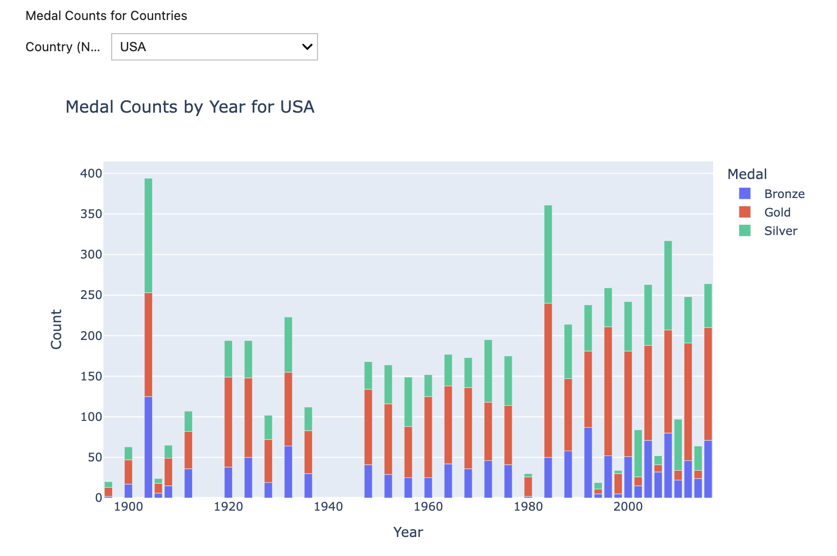
df = pd.read_csv("/anvil/projects/tdm/data/olympics/athlete_events.csv")Before we get started, let’s create the plots using matplotlib, which we are very familiar with at this point. The chart shows the number of Gold, Silver, Bronze medals won by USA per Olympic year.
usa = df[(df["NOC"] == "USA") & (df["Medal"].isin(["Gold", "Silver", "Bronze"]))]
medals = usa.groupby(["Year", "Medal"]).size().unstack()

medals.plot(kind="bar", figsize=(10, 5))

plt.xlabel("Year")
plt.ylabel("Medal Count")
plt.title("USA Olympic Medal Count by Year")
plt.legend(title="Medal")
plt.tight_layout()
plt.show()
While matplotlib is great for simple, static visualizations, it does not provide the interactivity we are looking for. We will use plotly to achieve this.
Below are the imports used:
import pandas as pd
import ipywidgets as widgets
from ipywidgets import Dropdown, Button, Output, VBox

from IPython.display import display

import plotly.express as px
import plotly.io as pio
Note that ipywidgets are imported to use the widget framework. Widgets are Python objects that can be used to create interactive GUIs representable in notebooks and browsers.
pio.renderers.default = "notebook"plotly.py usually autodetects renderers initially; however, we set the default renderer to notebook to ensure that displays are correct and interact properly within the notebook output.
# Create a dataset containing athletes with medals
medals = df[df['Medal'].notna()]

# Group data by country, year, medal type
medal_noc = medals.groupby(['NOC', 'Year', 'Medal']).size().reset_index(name='Count')
ipywidgets library provides many ways to create interactive HTML widgets for Jupyter notebooks; not only do we have access to creating dropdown, but also features such as buttons, sliders, progress bars, checkbox, and texts.
For more information, see the Widget List page: ipywidgets.readthedocs.io/en/latest/examples/Widget%20List.html
Here, we use Dropdown() to allow users to select which country’s medal data they want to view. Dropdown() displays the menu in the notebook with no need to rerun the cells. It has a few important attributes:
-
options: We specify the dropdown choices using this. Just for this question, the list of choices will be all countries (NOC) in alphabetical order.
-
value: The currently selected option from the dropdown is stored here. The selected country is stored in
dropdown.value, and is used to filter the dataset and update the plot. -
description: This lets us add labels.
Lastly, the library also offers a widget called Output(). This allows us to create a display area in the notebook and actually see our plots by displaying inside the designated space
# Selecting countries listed in alphabetical order
dropdown = Dropdown(options=sorted(df['NOC'].unique()), description='Country (NOC):')

# Output for plot
output = widgets.Output()
Now we are going to create a function that updates and shows the medal plot every time a user selects a country from the dropdown menu. Your task will be to write a function that:
-
Clears previous output
-
Extract selected country
-
Filters medal information for selected country
-
Display bar chart of the medal counts by year and the medal type
-
Output a message if there is no medal data for a selected country
-
Update the plot automatically when selection changes
Starter code to get you started:
# Update medal plot based on country selection
def medal_plot(change):
    # Clear previous output
    output.clear_output()
    # Put all outputs into the output widget
    with output:
        noc = change["new"]
        # Filter DF that includes only the selected country
        # new_df contains medal counts and types across years for the specific country
        new_df = '''YOUR CODE HERE'''
        if new_df.empty:
          # Print message for the user
          '''YOUR CODE HERE'''
        else:
            # Create plotly bar char with all labels (year, count, country) and title
            fig = px.bar(new_df, x='Year', y='Count', color='Medal', title=f'Medal Counts by Year - {noc}')
fig.show()clear_output(): Removes current output of the cell
px.bar(): Bar chart we can create using the Plotly Express library.
|
The basic syntax is |
dropdown.observe(medal_plot, names='value')
medals_panel = widgets.VBox([widgets.Label("Medal Counts for Countries"), dropdown, output])
display(medals_panel)dropdown.observe: This is a function provided through ipywidgets that calls a function specified when there is a change to the dropdown widget. Without this, we would not be able to automatically show the user the updated plot even if a new selection has been made.
|
You can read more about the details of using widget events in ipywidgets page: ipywidgets.readthedocs.io/en/7.x/examples/Widget%20Events.html |
widgets.VBox: This is a container widget also provided through ipywidgets that allows us to organize multiple widgets vertically. Thus, we can have a structured panel and we can simply call display() for a single display of the widgets, instead of displaying widget separately.
VBox(): holds label, dropdown, and output. When displayed, the label appears at the top like a title, the dropdown appears below with selection options, and the output widget provides an area for displaying plots or messages to the user.
The above two components work together: .observe() detects changes in Dropdown value through user action, then callback function runs, output widgets are updated, then VBox() displays the visual/plots.
Here is an example with "USA" chosen. You should be able to see outputs similar to below.
For all subproblems, and all other questions throughout the project, make sure you document your code in your own words.
-
1a.
-
Print the head of the dataset. Write about the initial observation you have about the dataset.
-
Output of the plot created using
matplotlib, with comments in the code.
-
-
1b. Code to create dataframe only containing athletes who have won medals (remove rows with no medal), and group data by country, year, medal type.
-
1c. Code to create interactive widget and medal plot for country selection. Make sure countries are listed in alphabetical order. Show all outputs.
-
1d. Explain in your own words how Dropdown and VBox works, and how they work in our example.
-
1e.
-
Explain in your own words the difference between the interactive Plotly + widget visualization and the traditional, static plotting methods we have been using (for instance, through
matplotlib). -
In what situations would we prefer one over the other?
-
Explain and give minimum two advantages and disadvantages of both methods.
-
Question 2 (2 points)
Athlete’s physical characteristics such as age, height, and weight are also an essential part of sports and data for the Olympics. Using the dataset, we will explore how we can use interactive widgets to view these information through distribution change based on selecting traits and year ranges.
widgets.IntRangeSlider(): We can select specific integer range using this, with the ability to specify the minimum and maximum ourselves.
-
value: Sets the current, or the initial position of the slider handles. There are two handlers in IntRangeSlider, so you specify the starting and ending point. You can use
min()to find the earliest Olympic year in the dataset, andmax()to find the most recent year. -
min/max: Set allowed limit of the slider. Users can not select years earlier or later than the specified limit (what data allows).
-
description: Add label next to the slider
# Create dropdown widget to select which physical traits data we want to view
# The 'options' are age, height, and weight. You should also include 'description'
dropdown2 = widgets.Dropdown('''YOUR CODE HERE''')

# Create a slider widget allowing user to select the range of years
slider = widgets.IntRangeSlider(value=['''YOUR CODE HERE'''],
                                min = '''YOUR CODE HERE''',
                                max= '''YOUR CODE HERE''',
                                description= '''YOUR CODE HERE''')

# Create an output widget displaying histogram/messages
traits_output = '''YOUR CODE HERE'''
Now we write the function that updates the histogram when the widget value changes. Please write code for all necessary parts, and make sure to document and explain your code.
def trait_histogram(change):
    # Clear previous output
    '''YOUR CODE HERE'''

    # Read selected trait from dropdown. Determines which column of dataset we will output.
    attr = dropdown2.value
    # Extracts selected year range from slider. This returns (min year, max year)
    yr_min, yr_max = slider.value

    # Filter the dataset to include athletes 1) within selected year range 2) with non missing values for selected trait
    '''YOUR CODE HERE'''

    with traits_output:
        # Message for the user if the filtered dataset is empty
        if '''YOUR CODE HERE'''

        # Create a histogram using px.histogram()
        else:
          '''YOUR CODE HERE'''
            fig = px.histogram(sub, x=attr, title=f"{attr} distribution ({yr_min}-{yr_max})")
            fig.show()
Now that we have our function, we will display the plots.
# .observe() for dropdwon
'''YOUR CODE HERE'''

# .observe() for slider
'''YOUR CODE HERE'''

# Display
trait_histogram(None)
display(dropdown2, slider, traits_output)-
2a. Code for creating dropdown widget to select traits and year range slider that allow users to limit analysis to specific Olympic years.
-
2b. Code for the function
trait_histogram. -
2c. Write a few sentences explaining how your function works.
-
2d. Output of your selected example plot. Make sure the histogram has all labels.
Question 3 (2 points)
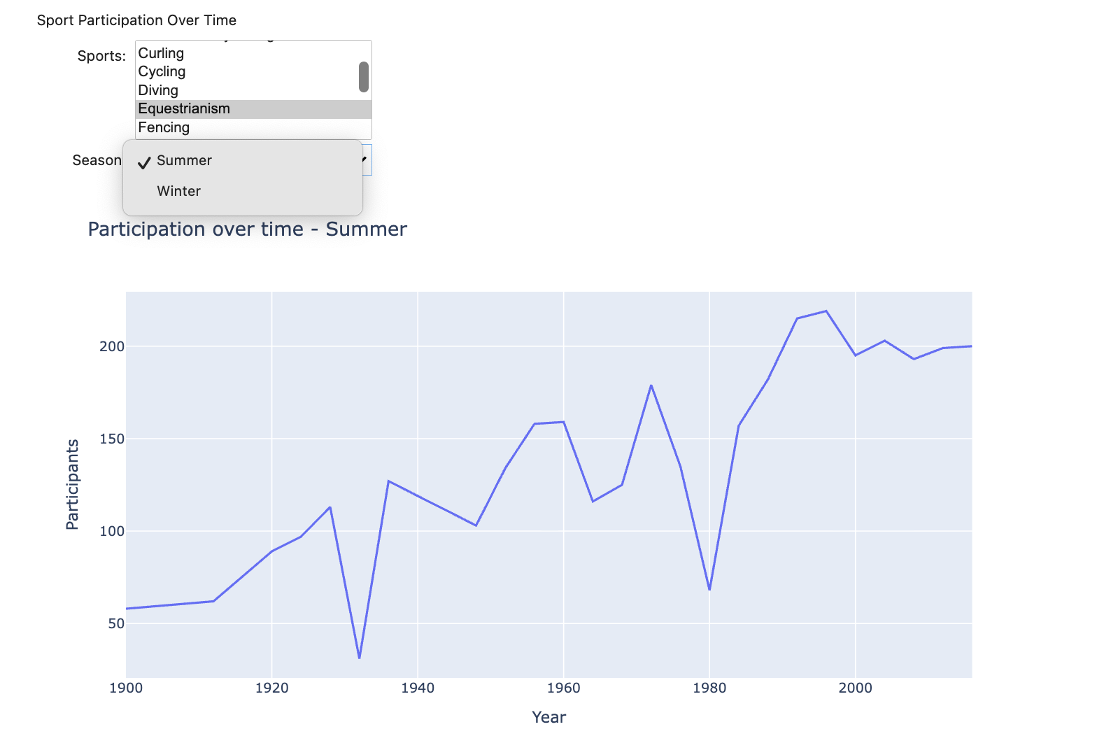
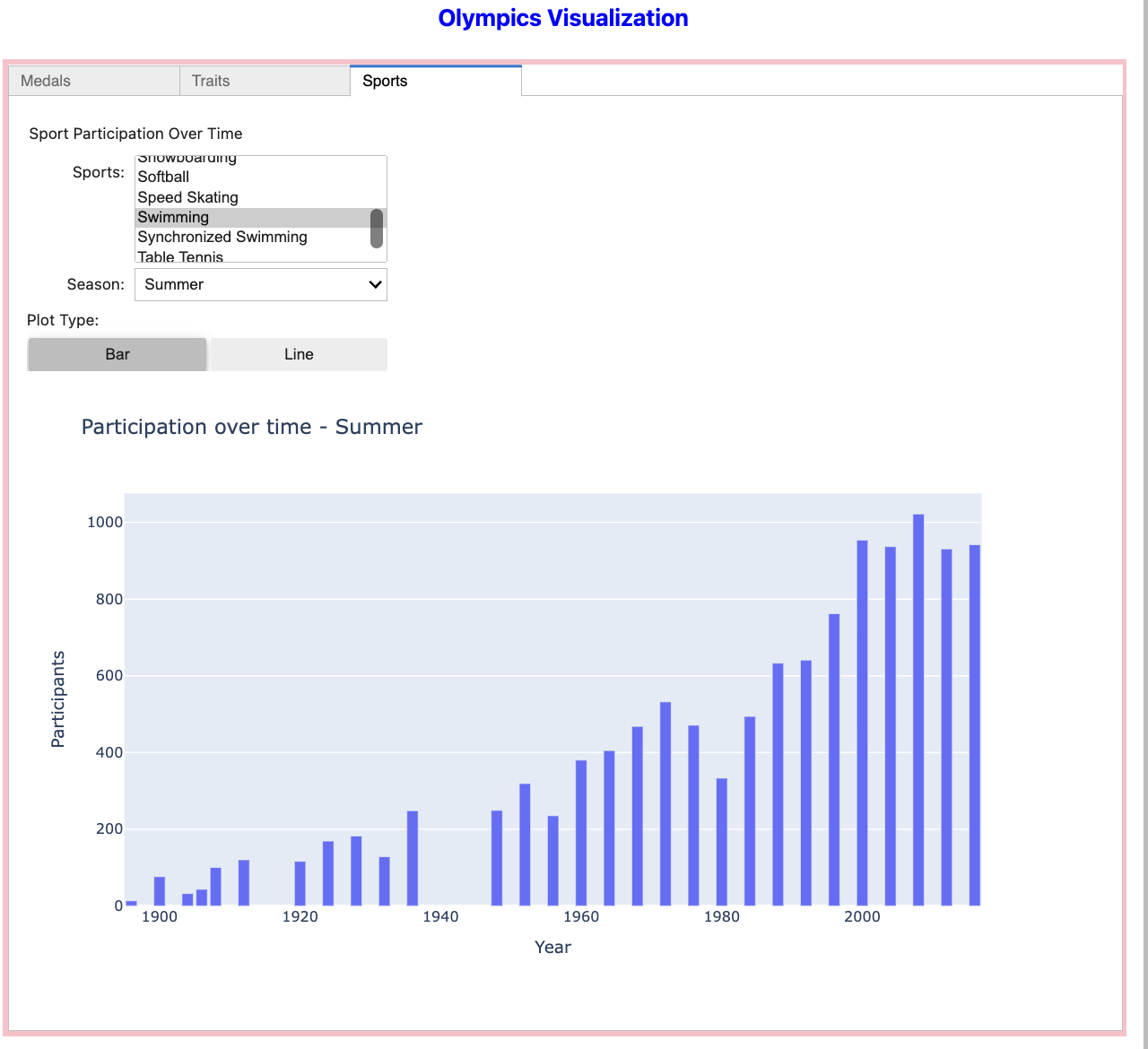
The types of sports and the number of participating athletes and popularity of each sports are another insights we can gain from the Olympics dataset. We can also see how some sports participation grows or declines, and how the pattern varies based on the season (summer and winter).
In this question, we will allow users to:
1. Select a sport of their choice,
2. Select between Summer and Winter Olympics,
3. See how athlete participation changes over time.
# Get unique sports from the dataset and sort them alphabetically
sports = sorted(df['Sport'].unique())
# Widget to choose sports
sports_select = widgets.SelectMultiple(options=sports,
                                       description='Sports:')
# Create dropdwon widget to select Olympic season
# Available options are summer and winter, and set default to summer. Also add the description
season_dropdown = widgets.Dropdown(
    options='''YOUR CODE HERE''',
    value='''YOUR CODE HERE''',
    description='''YOUR CODE HERE''')

# Create output widget to show the plot/messages
sport_output = '''YOUR CODE HERE'''
Similar to previous questions, now we write the function to create/update plots. Your task here is to write sports_plot() that:
-
Clears previous outputs,
-
Get sport and the season selected by the user,
-
Filter the dataset to include only the selected sports and the season,
-
Checks for empty data,
-
Group data by the Olympic year, count the number of unique athletes per year, and sort by year for the line plot,
-
Creates a plot showing the change in participation over time. x-axis represents the year and y-axis represents the number of athletes. Add title to the plot.
Below is an example output of what you can expect to see.
-
3a. Complete code for creating widgets.
-
3b. Code for sports_plot() function. Make sure to document all code.
-
3c. Write a few sentences on any observations or insights you gain from the data and/or plots and the trend you see.
Question 4 (2 points)
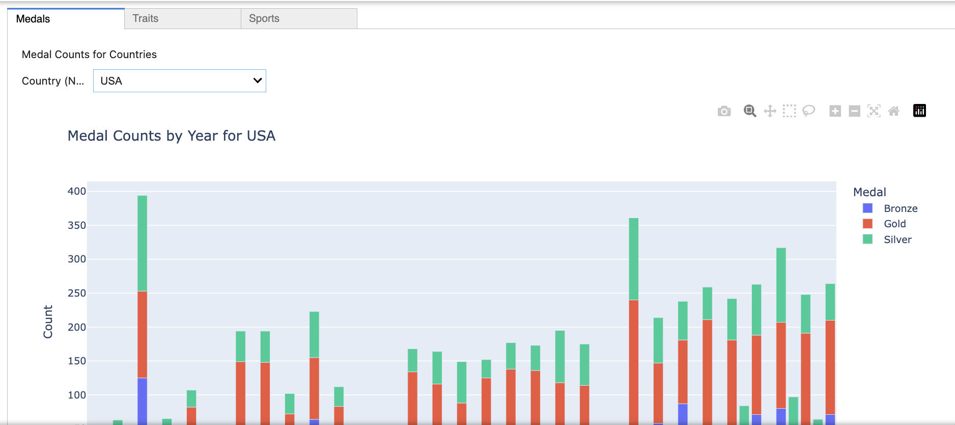
Now, we will combine all the interactive visualization so far created into one tab by using ipywidgets.Tab.
tab = widgets.Tab()This line creates the new Tab widget. Tab() can contain multiple child widgets and will display them separately in different tabs.
tab.children = [medals_panel, traits_panel, sports_panel]The children property defines what appears in each tab. Here, we assigned list of widgets (medals_panel, traits_panel, sports_panel), and each becomes the tab content in the same order listed. medals_panel, traits_panel, sports_panel are VBox widgets stacking multiple subwidgets vertically into one panel.
tab.set_title(0, 'Medals')
tab.set_title(1, 'Traits')
tab.set_title(2, 'Sports')
display(tab)
tab.set_title(index, 'Title') is used to label each child widget. Note that index is the position in the children list.
Since we are using Tab, in this part we do not need the separate display() that was used in previous questions. Also, each child panel will render automatically when the tab is selected.
You can expect to see output like the one below:
-
4a. Code, comment, and output of the tab.
-
Please include two output screenshots per tabs, showing that it works and the contents can be switched/updated.
-
-
4b. Explain in your own words how
Tab()and VBox widgets work individually, and together, to create the tab.
Question 5 (2 points)
There are many more features and details we can add! Below are some examples, and we recommend you to do more research yourself to find more ideas and available options.
Layout
-
width, height: Specifying width and height to get wanted dimensions using px (pixels), % (percentage of container space) -
border: Adding borders-
layout.border_width,layout.border_style,layout.border_colorsets width, style (e.g., solid, dotted), and colors respectively, for all four sides.
-
For example:
layout=widgets.Layout(width='100%',
                      height='50%',
                      border='5px solid pink')
You can read a lot more about layouts in Layout of Jupyter widgets page: ipywidgets.readthedocs.io/en/latest/examples/Widget%20Layout.html
HTML
Using HTML (widgets.HTML) and inline CSS provides more options to add text, headers, and other formatting.
-
Headings range from <h1> (largest) to <h6> (smallest)
-
General syntax to apply inline styles using style attribute looks like
<tag style="property: value;">.
Common CSS properties that can be used includes:
-
margin(space outside element),margin-bottom(space below),margin-top(space above),padding(space inside) -
Text options include:
-
font-family: type of font -
font-size: size of text (px, em, %) -
font-weight: Thickness of text (e.g., normal, bold, bolder, etc. You can also use numeric values 100 to 900, where higher number are bolder) -
font-style(e.g., normal, italic) -
There are other options for presentation style, such as
text-align,text-decoration,letter/word-spacing, etc.
-
-
Other tags that can be used in value include:
-
<p> … </p> : paragraphs
-
<br> : line breaks
-
<ul> : Unordered list; <li> … <\li> : List items
-
Below is a simple example for reference (added above medals_panel in Q1)
header = widgets.HTML("""<div style="padding:10px;">
    <h2 style="margin-bottom:5px;"> Country Medal Counts</h2>
    <p style="color:gray; margin-top: 0px;">
        Select a country from the dropdown
    </p>
</div>""")

medals_panel = widgets.VBox([header, dropdown, output])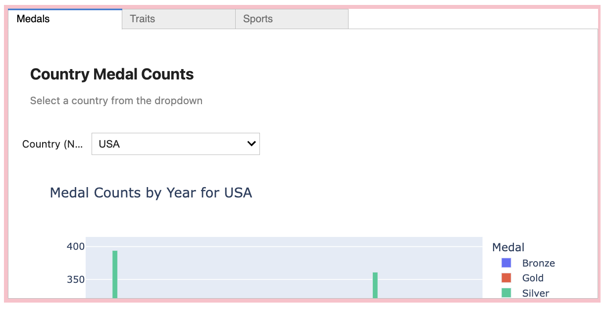
-
You can also add a single overall title like this example:
title = widgets.HTML(
                  "<h2 style='text-align:center; color: blue;'>Olympics Visualization</h2>")

# Display title above tab
display(widgets.VBox([title, tab]))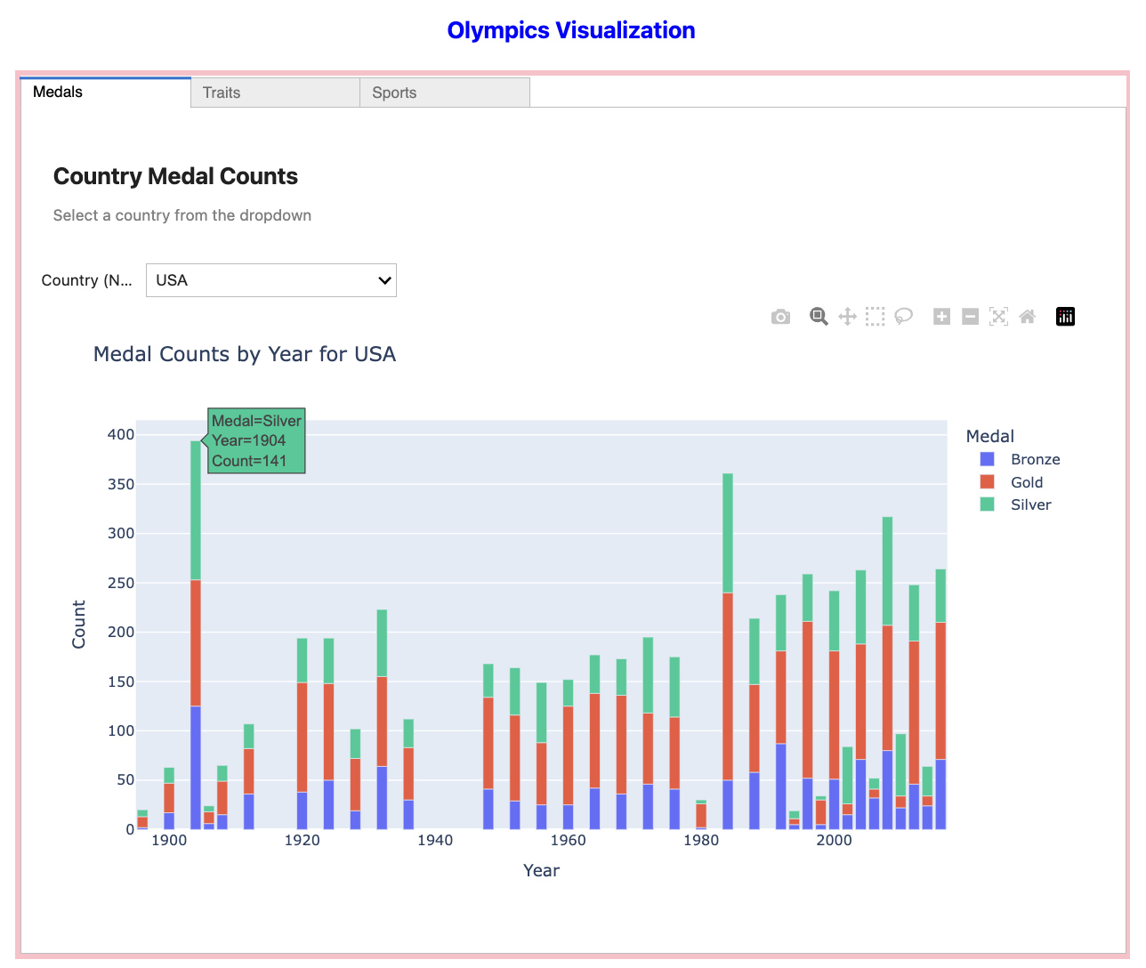
Another Widget feature
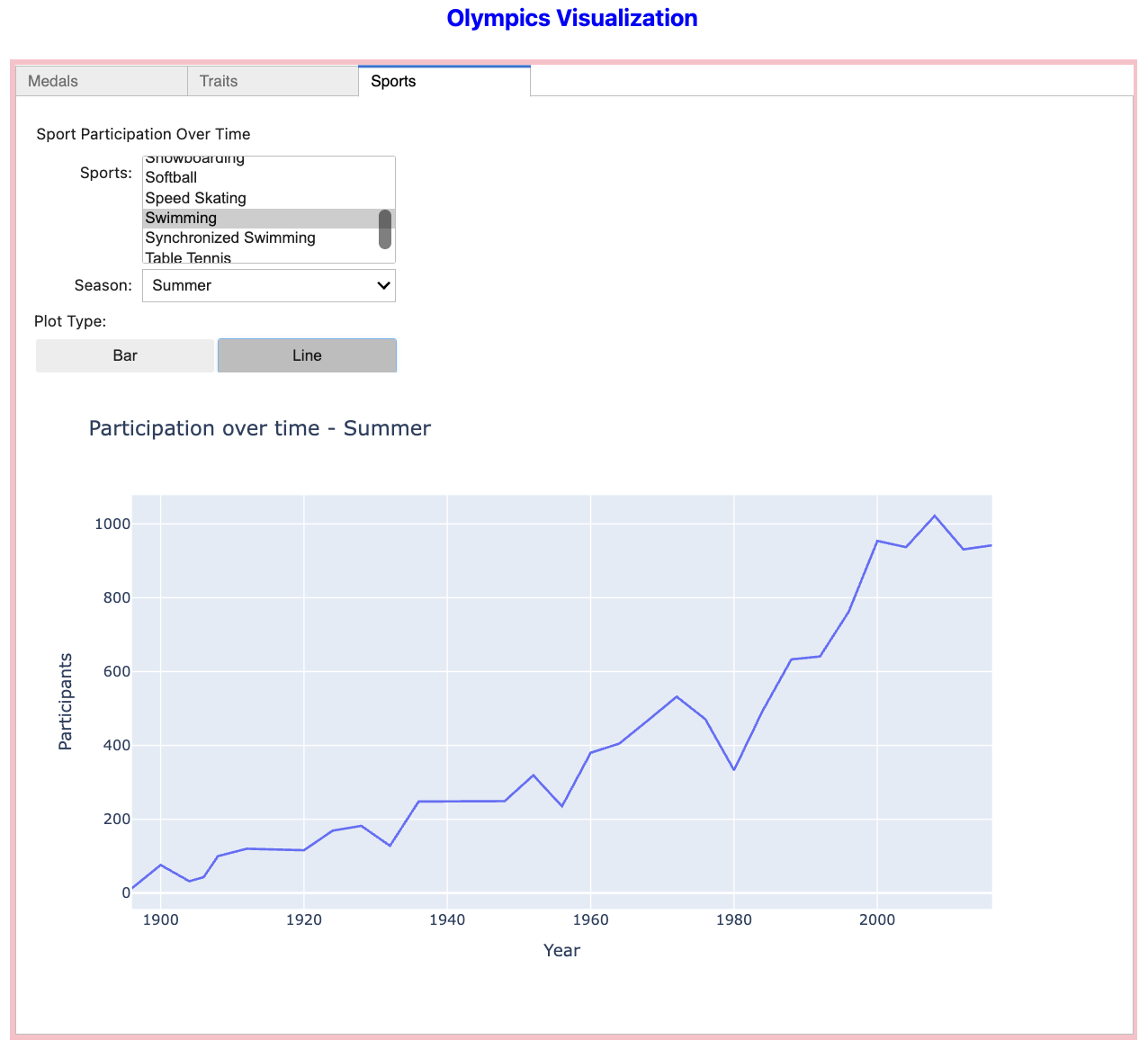
You would have seen some different types of widgets in the earlier question and provided reference documentation, such as various sliders, progress bars, and Boolean or selection widgets. In this part, we will see how ToggleBUttons can be added to switch back and forth between options, such as bar plot and line plot.
Below is an example using the sport participation example.
ToggleButtons lets users choose one option at a time. Here we specified the two options of 'Bar' and 'Line' which are two types of plots we can display. plot_type.value stores the selected value.
plot_type = widgets.ToggleButtons(options=['Bar', 'Line'], description='Plot Type:')And in our function, we can add:
-
Inside the function, the value of toggle is checked, and if
'Bar'is selected, we create plotly bar chart, and if'Line'is selected, we create plotly line chart.
 if plot_type.value == 'Bar':
            fig = px.bar(counts, x='Year', y='Participants',
                         title=f'Participation over time - {season}')
        else:
            fig = px.line(counts, x='Year', y='Participants',
                         title=f'Participation over time - {season}')

        fig.show()
Before displaying, we would also need to include:
plot_type.observe(sports_plot, names='value')

sports_panel = widgets.VBox([widgets.Label("Sport Participation Over Time"),
                             sports_select,
                             season_dropdown, plot_type,
sport_output])-
This ensures that when the toggle is changed by the user, the plotting function is called again so that chart automatically updates
-
Toggle is included in the VBox
-
5a. Code and output that includes at least two new additions to what we created in question 4. Feel free to use other customization not mentioned here.
-
5b. Make sure your code is commented, and write a few sentences explaining your work (how it works, what it does).
Submitting your Work
Once you have completed the questions, save your Jupyter notebook. You can then download the notebook and submit it to Gradescope.
-
firstname_lastname_project4.ipynb
|
It is necessary to document your work, with comments about each solution. All of your work needs to be your own work, with citations to any source that you used. Please make sure that your work is your own work, and that any outside sources (people, internet pages, generative AI, etc.) are cited properly in the project template. You must double check your Please take the time to double check your work. See submission page for instructions on how to double check this. You will not receive full credit if your |