TDM 30200: Project 6 - Audio Signal Processing Fundamentals
Project Objectives
In this project, you’ll explore some fundamentals of signal processing by working directly with audio signals. You’ll learn how to analyze, transform, and extract meaningful information from raw audio data using fundamental signal processing techniques.
Dataset
-
/anvil/projects/tdm/data/ravdess
-
RAVDESS (Ryerson Audio-Visual Database of Emotional Speech and Song): A validated database of emotional speech and song. Please refer to the ravdess page in the example book for more info.
|
If AI is used in any cases, such as for debugging, research, etc., we now require that you submit a link to the entire chat history. For example, if you used ChatGPT, there is an “Share” option in the conversation sidebar. Click on “Create Link” and please add the shareable link as a part of your citation. The project template in the Examples Book now has a “Link to AI Chat History” section; please have this included in all your projects. If you did not use any AI tools, you may write “None”. We allow using AI for learning purposes; however, all submitted materials (code, comments, and explanations) must all be your own work and in your own words. No content or ideas should be directly applied or copy pasted to your projects. Please refer to GenAI page in the example book. Failing to follow these guidelines is considered as academic dishonesty. |
Questions
Question 1 (2 points)
Understanding Audio Signals
Let’s start by understanding what an audio signal looks like in the time domain and how to work with it.
Problem
Let’s start by loading up the libraries we will use for this project and exploring some audio samples.
import os
import librosa
import matplotlib.pyplot as plt
import numpy as np
import pandas as pd
import seaborn as sns

from scipy import signal
from numpy.fft import rfft, rfftfreq

data_path = "/anvil/projects/tdm/data/ravdess"

# Emotion mapping - comes from the RAVDESS dataset & detailed in the link above
emotion_mapping = {
    '01': 'neutral',
    '02': 'calm',
    '03': 'happy',
    '04': 'sad',
    '05': 'angry',
    '06': 'fearful',
    '07': 'disgust',
    '08': 'surprised'
}
We have 8 available emotions, but we will primarily focus on using a subset of the emotions: happy, sad, angry, and neutral for this project. This function will load a sample audio file for each emotion we will use for testing purposes. This function uses the library librosa to load in the .wav files. It will return two parameters: the waveform, y, and the samplerate, sr.
def load_audio_sample(data_path, emotion_code):
    """Load a sample audio file for a given emotion"""
    for root, dirs, files in os.walk(data_path):
        for filename in files:
            if filename.endswith('.wav'):
                parts = filename.split('-')
                if parts[2] == emotion_code:
                    file_path = os.path.join(root, filename)
                    y, sr = librosa.load(file_path, sr=None)
                    return y, sr, filename
return None, None, None|
Slight modifications of the function above can be used to load in and separate all files by whatever classes you want. |
Now let’s load in the audio samples we want to analyze:
emotions_to_analyze = ['03', '04', '05', '01']  # happy, sad, angry, neutral
audio_samples = {}

for emotion_code in emotions_to_analyze:
    y, sr, filename = load_audio_sample(data_path, emotion_code)
    if y is not None:
        emotion_name = emotion_mapping[emotion_code]
        audio_samples[emotion_name] = {'signal': y, 'sample_rate': sr, 'filename': filename}
        print(f"Loaded {emotion_name}: {filename}")
        print(f"  Duration: {len(y)/sr:.2f} seconds")
        print(f"  Number of samples: {len(y)}")
        print(f"  Sample rate: {sr} Hz\n")
The number of samples we see for each file differs because each audio file is a slightly different length and each "sample" corresponds to a specific point in time.
But notice the sample rate - the average number of samples taken per second - is a uniform 48000 Hz across the audio files. Depending on the source of the audio, not all audio files may necessarily have the same sample rate. If you run into that you may want to consider resampling your audio files to a standard sample rate.
|
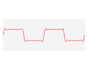
The second answer on Downsampling wav audio file post in stack overflow has a good explanation and graphics for down sampling (decimating): 
Figure 1. Downsampling wav audio file (Source of the diagram: stackoverflow.com/questions/30619740/downsampling-wav-audio-file accessed at 02/22/2026)
You can use |
Now that we have loaded in the audio samples, let’s visualize these signals in the time domain:
fig, axes = plt.subplots(2, 2, figsize=(15, 10))
axes = axes.ravel()

for i, (emotion, data) in enumerate(audio_samples.items()):
    y = data['signal']
    sr = data['sample_rate']

    librosa.display.waveshow(y, sr=sr, ax=axes[i], alpha=0.7)
    axes[i].set_title(f'{emotion.capitalize()} - Time Domain')
    axes[i].set_xlabel('Time (seconds)')
    axes[i].set_ylabel('Amplitude')
    axes[i].grid(True, alpha=0.3)

    # Adding some statistics to each graph
    rms = np.sqrt(np.mean(y**2))
    axes[i].text(0.02, 0.98, f'RMS: {rms:.3f}', transform=axes[i].transAxes,
                verticalalignment='top', bbox=dict(boxstyle='round', facecolor='wheat', alpha=0.8))

plt.tight_layout()
plt.show()
We also plotted the Root Mean Square (RMS) of each emotion. This is a measure of the "average" amplitude of the signal, which is useful for comparing the relative loudness and energy of the different emotions.
Notice there are some similarities in the waveform between certain emotions. Why could that be? What are some differences you see between the different waveforms in the time domain?
1.1 Sample waveform sample rate output.
1.2 Time domain plots.
1.3 Two-three sentences: What patterns do you notice in the waveforms? Which emotions seem most similar/different in the time domain and why?
Question 2 (2 points)
In the last question we examined the signals in the time domain, but some information is hidden if we only look at how the signal varies over time. We can also analyze them in the frequency domain to reveal the actual frequencies present in the signal and how strong they are.
Converting to the frequency domain lets you do a lot of cool things:
-
Can filter and perform noise reduction on the signal,
-
Can remove frequencies imperceptible to the human ear to aid in compression,
-
Simplifies math on the signal - convolutions in time domain are now simple multiplication (more information can be seen in here in the latter half of Chapter 9: Applications of the DFT in 'The Scientist and Engineer’s Guide to Digital Signal Processing' book of Steven W. Smith.
The last point is arguably one of the most important aspects, but how do we actually convert to the frequency domain?
We can perform a Fourier Transform on the signal to convert it to the frequency domain.
fft_vals = rfft(y)The Fast Fourier Transform (FFT) (via rfft) converts a time-domain signal (y) into its frequency-domain representation, decomposing it into sinusoidal components - a linear combination of sine and cosine waves that form the signal.
From the complex FFT output, the magnitude (amplitude) tells us how much of each frequency is present, and the frequency bins (via rfftfreq) tell us which frequencies they are.
We can calculate both the magnitude based on the FFT values and the frequency bins based on the length of the signal and the sample rate:
magnitude = np.abs(fft_vals)       # amplitude of each frequency bin
frequency = rfftfreq(len(y), 1/sr) # corresponding frequencies (Hz)|
Using |
Using these three quick lines, fill this in to graph the different emotions in the frequency domain.
fig, axes = plt.subplots(2, 2, figsize=(15, 10))
axes = axes.ravel()

for i, (emotion, data) in enumerate(audio_samples.items()):
    y = data['signal']
    sr = data['sample_rate']

    # -- Compute FFT -- #

    # -- ----------- -- #

    # Plot emotion in the frequency domain - frequency vs magnitude
    axes[i].plot(frequency, magnitude)
    axes[i].set_title(f'{emotion.capitalize()} - Frequency Domain')
    axes[i].set_xlabel('Frequency (Hz)')
    axes[i].set_ylabel('Magnitude')
    axes[i].set_xlim(0, 5000)  # Limit scope to typical speech frequencies
    axes[i].grid(True, alpha=0.3)

    # Find dominant frequency & plot it - the frequency with the highest magnitude
    dominant_freq_idx = np.argmax(magnitude)
    dominant_freq = frequency[dominant_freq_idx]
    axes[i].axvline(dominant_freq, color='red', linestyle='--', alpha=0.7)
    axes[i].text(0.79, 0.98, f'Dominant: {dominant_freq:.0f} Hz',
                transform=axes[i].transAxes, verticalalignment='top',
                bbox=dict(boxstyle='round', facecolor='lightcoral', alpha=0.8))

plt.tight_layout()
plt.show()
We also calculate the dominant frequency of each emotion. This can be a useful metric for differentiating emotions and even speakers since different speakers may have slightly different natural vocal ranges.
2.1 Frequency domain plots with dominant frequencies for each emotion.
2.2 Two-four sentences: Compare the dominant frequencies and overall spectral shapes. Which emotions have the most similar frequency distributions and why might that be? Make sure to note the magnitude scale of each emotions graph.
Question 3 (2 points)
The Power of Windowing and Spectrograms
So far, we have looked at signals in the time domain and frequency domain separately. But what if we want to see how the frequency content changes over time? This is where spectrograms come in.
Problem
A spectrogram is a 2D visualization that shows frequency content over time. It’s created by:
-
Windowing: Breaking the signal into small overlapping segments,
-
FFT (Fast Fourier Transform): Computing the frequency content of each segment,
-
Visualization: Plotting frequency vs time with color intensity representing magnitude.
3.A.
Windows are used in the FFT to calculate the transformation to the frequency domain. To create the windows, we define two parameters: window_size (how wide each window is) and hop_size (how many timesteps are skipped between windows). This can be used to create overlapping windows that help capture continuous features.
Let’s use the 'happy' emotion as an example:
happy_data = audio_samples['happy']

window_size = 1024 # Commonly used values
hop_size = 512

y = happy_data['signal']
sr = happy_data['sample_rate']
To create the windows, we divide our signal into overlapping segments. Each window contains window_size samples, and consecutive windows overlap by window_size - hop_size samples. This ensures we capture temporal changes while maintaining continuity.
Lets create the windows and see some basic information:
windows = []
window_times = []

# Creates the windows - length window_size, each iteration moves up by hop_size
for start in range(0, len(y) - window_size, hop_size):
    window = y[start:start + window_size]
    windows.append(window)
    window_times.append(start / sr) # will get the time in seconds

# Some basic summary information
print(f"Signal length: {len(y)} samples ({len(y)/sr:.2f} seconds)")
print(f"Window size: {window_size} samples ({window_size/sr:.3f} seconds)")
print(f"Hop size: {hop_size} samples ({hop_size/sr:.3f} seconds)")
print(f"Number of windows: {len(windows)}")
print(f"Window overlap: {((window_size - hop_size) / window_size) * 100:.1f}%")
Since our hop_size is half of our window_size, we have a 50% overlap, allowing us to see continuous features between windows. Modifying the window size and hop size will change the amount of overlap, the number of segments and the overall resolution of the spectrogram.
To actually see the windows, let’s plot out the signal and highlight a few windows:
fig, (ax1, ax2) = plt.subplots(2, 1, figsize=(15, 8))

# Original time signal
librosa.display.waveshow(y, sr=sr, ax=ax1, alpha=0.7)
ax1.set_title('Original Signal with Windows Highlighted - Happy Sample')
ax1.set_xlabel('Time (seconds)')
ax1.set_ylabel('Amplitude')

# Highlight a few windows
for i in [0, 100, 150]:  # Show windows 1, 51, and 101
    window_start = i * hop_size / sr
    window_end = window_start + window_size / sr
    ax1.axvspan(window_start, window_end, alpha=0.3, color='red')
    ax1.text(window_start + (window_end - window_start)/2,
             ax1.get_ylim()[1]*0.8, f'Window {i+1}', ha='center',
             bbox=dict(boxstyle='round', facecolor='red', alpha=0.7))

# Show the overlap between windows
librosa.display.waveshow(np.concatenate(windows[148:152]), sr=sr, ax=ax2, alpha=0.7)
ax2.set_title('Overlapping Windows (150 & 151)')
ax2.set_xlabel('Time (seconds)')
ax2.set_ylabel('Amplitude')

for i in [2, 3]:  # Highlight windows 150 and 151
    window_start = i * hop_size / sr
    window_end = window_start + window_size / sr
    ax2.axvspan(window_start, window_end, alpha=0.3, color='red')
    ax2.text(window_start + (window_end - window_start)/2,
             ax1.get_ylim()[1]*0.5, f'Window {i+148}', ha='center',
             bbox=dict(boxstyle='round', facecolor='red', alpha=0.7))

plt.tight_layout()
plt.show()
The first graph shows us the windows as they are defined within the original signal. Notice how each window captures a different part of the signal. In the second graph, we see the 50% overlap we talked about earlier which ensures we don’t miss important features that might occur at window boundaries.
3.B.
We have created the actual window segments so now we can apply a window 'operation' to a segment of the signal to look at how applying a window to the signal affects the frequency analysis. There are a bunch of different windows you can choose from but we will look at the Hann window. The Hann window is essentially like putting a smooth fade-in/fade-out on each segment, so the edges do not create artificial noise in our frequency analysis. We can apply the Hann window to one of our segments like so:
segment = windows[149]

hann_window = segment * np.hanning(len(segment)) # Apply the hann window to the segment

# FFT for both original and windowed segments
fft_original = np.abs(rfft(segment)) # gets magnitude of them
fft_hann = np.abs(rfft(hann_window))

frequency = rfftfreq(len(segment), 1/sr)|
We apply the window prior to calculating the FFT. |
Lets take a look at the original segment compared to the Hann window segment:
fig, (ax1, ax2) = plt.subplots(1, 2, figsize=(15, 5))

ax1.plot(frequency, fft_original)
ax1.set_title('Original Segment')
ax1.set_xlabel('Frequency (Hz)')
ax1.set_ylabel('Magnitude')
ax1.grid(True, alpha=0.3)

ax2.plot(frequency, fft_hann)
ax2.set_title('Hann Window Applied')
ax2.set_xlabel('Frequency (Hz)')
ax2.set_ylabel('Magnitude')
ax2.set_ylim(ax1.get_ylim())  # Match scales for fair comparison
ax2.grid(True, alpha=0.3)

plt.tight_layout()
plt.show()
Notice how the Hann window smooths out the frequency response and reduces artifacts from the sharp edges of the original segment.
We are seeing a lot of the data in this window around ~10k Hz indicating this information is likely not key to speech intelligibility. It could be due certain sharper language sounds (like fricatives/sibilants), noise, audio sampling or a host of other reasons.
|
Speech intelligibility is loosely broken down into the following frequency ranges:
Telephone systems use 300-3400 Hz because that’s the "sweet spot" - you lose some detail but keep most intelligibility. |
3. C.
We just tried out the Hann window, but like we said, there are different types of windows with different effects on the frequency response which you may want to use depending on the application.
However, instead of creating the windows, applying the window, and then calculating the FFT ourselves, we can let librosa handle this for us in one step using librosa.stft which defaults to applying the Hann window:
fft_vals = np.abs(librosa.stft(y))Note that you can pass in parameters to define the window size and hop size, but we will use the defaults which are 2048 samples and 512 samples respectively, so there might be a slight difference compared to what we did manually.
With our signal now in the frequency domain, we can use librosa to create spectrograms. We can do this by using librosa.amplitude_to_db to convert the magnitude values to decibels which is standard for visualizing spectrograms and then using librosa.display.specshow to plot the spectrogram:
fig, axes = plt.subplots(2, 2, figsize=(15, 10))
axes = axes.ravel()

for i, (emotion, data) in enumerate(audio_samples.items()):
    y = data['signal']
    sr = data['sample_rate']

    # Create spectrogram using librosa's stft function
    fft_vals = np.abs(librosa.stft(y))
    D = librosa.amplitude_to_db(fft_vals, ref=np.max)
    img = librosa.display.specshow(D, y_axis='linear', x_axis='time',
                                 sr=sr, ax=axes[i])
    axes[i].set_title(f'{emotion.title()} - Spectrogram')
    axes[i].set_xlabel('Time (seconds)')
    axes[i].set_ylabel('Frequency (Hz)')

plt.tight_layout()
plt.colorbar(img, ax=axes, format='%+2.0f dB')
plt.show()
The color bar on the right shows levels of decibels which correspond to the intensity of a frequency at a given point in time. This creates a nice way for us to analyze which frequencies are apparent at a given time.
3.1 Windowing demonstration plots.
3.2 Window comparison plots.
3.3 Spectrogram comparison plots.
3.4 One-two sentences: How does the Hann window improve the frequency analysis compared to no window?
3.5 Two-three sentences: What temporal patterns do you see in the spectrograms? Which emotions show the most dynamic frequency changes over time?
Question 4 (2 points)
Filtering and Signal Enhancement
Now that we understand how to analyze signals, let’s learn how to modify them using filters. Filtering is crucial for removing noise, enhancing specific frequencies, and preparing signals for analysis.
Problem
Filters can be categorized by their frequency response:
-
Low-pass: Passes low frequencies, blocks high frequencies,
-
High-pass: Passes high frequencies, blocks low frequencies,
-
Band-pass: Passes frequencies within a specific range.
Let’s start by just reloading the happy sample again:
happy_data = audio_samples['happy']

y = happy_data['signal']
sr = happy_data['sample_rate']
To create the different filter types we can use the Butterworth filter from the signal library.
There are a few key parameters that we are going to set in the Butterworth filter:
-
order: the order of the filter - 4 empirically seems to be a good balance between removing noise and not losing to much of the signal,
-
cutoff: the frequency cutoff - depends on the filter we are applying,
-
btype: the type of filter - low, high, or band.
The low pass filter blocks all frequencies above a certain threshold which we set to 3000 Hz to preserve the strongest speech energy. This typically captures vowels, but you will lose the higher frequency details like the softer consonants.
lowpass_cutoff = 3000
lowpass_b, lowpass_a = signal.butter(4, lowpass_cutoff / (sr / 2), btype='low')
The high-pass filter cuts off frequencies below a certain frequency which we set to 300 Hz here. Frequencies below 300 Hz are typically background noise from your room, your mic, or other lower rumbles.
highpass_cutoff = 300
highpass_b, highpass_a = signal.butter(4, highpass_cutoff / (sr / 2), btype='high')
The band-pass filter cuts off frequencies outside of a certain range. For this example we are going to only keep between 300 and 5000 Hz to focus within the speech intelligibility range.
bandpass_low = 300
bandpass_high = 5000
bandpass_b, bandpass_a = signal.butter(4, [bandpass_low / (sr / 2), bandpass_high / (sr / 2)], btype='band')
Now we can apply these filters to our signal using signal.filtfilt():
y_lowpass = signal.filtfilt(lowpass_b, lowpass_a, y)
y_highpass = signal.filtfilt(highpass_b, highpass_a, y)
y_bandpass = signal.filtfilt(bandpass_b, bandpass_a, y)|
|
Now we can graph these 3 filters and compare the signal against the original:
fig, axes = plt.subplots(2, 2, figsize=(15, 10))
axes = axes.ravel()

filters = [
    (y, 'Original Signal'),
    (y_lowpass, f'Low-pass Filtered (< {lowpass_cutoff} Hz)'),
    (y_highpass, f'High-pass Filtered (> {highpass_cutoff} Hz)'),
    (y_bandpass, f'Band-pass Filtered ({bandpass_low}-{bandpass_high} Hz)')
]

for i, (y_filtered, title) in enumerate(filters):
    librosa.display.waveshow(y_filtered, sr=sr, ax=axes[i], alpha=0.7)
    axes[i].set_title(title)
    axes[i].set_xlabel('Time (seconds)')
    axes[i].set_ylabel('Amplitude')
    axes[i].grid(True, alpha=0.3)

plt.tight_layout()
plt.show()
What do you notice between the different filters compared to the original? Notice the shape of the signal as well as the amplitudes of each filter - some are different. Why do you think that is?
Now let’s perform the FFT on the filtered signals and compare the spectrogram content before and after filtering:
fft_original = np.abs(librosa.stft(y))
fft_lowpass = np.abs(librosa.stft(y_lowpass))
fft_highpass = np.abs(librosa.stft(y_highpass))
fft_bandpass = np.abs(librosa.stft(y_bandpass))

frequency = librosa.fft_frequencies(sr=sr)
Here we opted to use the built in librosa function to get the frequency bins and FFT values.
Now lets plot the spectrograms:
fig, axes = plt.subplots(2, 2, figsize=(15, 10))
axes = axes.ravel()

signals = [
    ('Original', fft_original),
    ('Low-pass', fft_lowpass),
    ('High-pass', fft_highpass),
    ('Band-pass', fft_bandpass)
]

for i, (name, fft_vals) in enumerate(signals):
    D = librosa.amplitude_to_db(fft_vals, ref=np.max)
    img = librosa.display.specshow(D, y_axis='linear', x_axis='time',
                                 sr=sr, ax=axes[i])
    axes[i].set_title(f'Happy - {name}')
    axes[i].set_xlabel('Time (seconds)')
    axes[i].set_ylabel('Frequency (Hz)')

plt.tight_layout()
plt.colorbar(img, ax=axes, format='%+2.0f dB')
plt.show()
Similarly, what do you notice between the different filters compared to the original spectrogram? Notice the shape of the spectrogram as well as the intensity of the frequencies.
4.1 Filtered signal plots (time domain).
4.2 Spectrogram comparison plots.
4.3 Two-three sentences: Compare how each filter affects the signal. Which frequencies are most affected by each filter type?
4.4 One-two sentences: Which filter would be most effective at removing background noise? Why?
4.5 One-two sentences: Which filter preserves the most speech intelligibility? Why?
Question 5 (2 points)
Feature Extraction and Analysis
Now that we understand some fundamentals, let’s extract meaningful features from our audio signals. These features will be crucial for any following analysis or machine learning tasks.
Problem
We will extract several types of features that capture different aspects of the audio signal:
-
Statistical features: Basic properties like mean, standard deviation, RMS,
-
Spectral features: Energy distribution across frequencies,
-
MFCCs: Mel-frequency cepstral coefficients, powerful features for audio analysis.
Let’s start with statistical features:
happy_data = audio_samples['happy']

y = happy_data['signal']
sr = happy_data['sample_rate']

features = {}

features['mean'] = np.mean(y)
features['std'] = np.std(y)
features['rms'] = np.sqrt(np.mean(y**2))
features['zero_crossing_rate'] = np.median(librosa.feature.zero_crossing_rate(y))
We talked about it earlier but RMS helps to measure the loudness and overall energy of a signal. Zero Crossing Rate (ZCR) is defined as the number of times the signal changes sign (crosses zero) per frame. So a higher ZCR means more high-frequency/noisy/fricative content whereas a lower ZCR means more voiced/tonal content. This would typically be used as an auxiliary feature versus a main feature.
The librosa implementation of ZCR returns the ZCR per frame so we can either plot it over time to compare the dynamics between the emotions or we can also aggregate it to get a single value for each emotion like we did here.
Next let’s move on to extracting some spectral features using librosa:
# Spectral centroid - indicates the "center of mass" of the spectrum
centroid = librosa.feature.spectral_centroid(y=y, sr=sr)
features['spectral_centroid'] = np.mean(centroid)

# Spectral rolloff - frequency below which 85% of energy is contained
rolloff = librosa.feature.spectral_rolloff(y=y, sr=sr, roll_percent=0.85)
features['spectral_rolloff'] = np.mean(rolloff)
Spectral centroid is the “center of mass” of the spectrum which is the weighted average frequency, where weights are the magnitudes. So a higher centroid means a "brighter"/more high-frequency energy whereas a lower centroid means a "darker"/more low-frequency energy. It could be useful to give us information about emotions and differentiating voiced vs noisy segments of audio.
Spectral rolloff is the frequency below which some percent of the energy is contained (we used 85% here). So a higher rolloff means more high-frequency energy whereas a lower rolloff means more low-frequency energy. It can give a quick summary of how fast the energy decays with frequency and can be paired with the centroid to give a more robust spectral shape description.
Next, we are going to extract one of the more powerful features for audio classification:
mfccs = librosa.feature.mfcc(y=y, sr=sr, n_mfcc=13) # n_mfcc=13 is the standard
features['mfcc_1'] = np.mean(mfccs[0])
features['mfcc_2'] = np.mean(mfccs[1])
features['mfcc_3'] = np.mean(mfccs[2])
features['mfcc_4'] = np.mean(mfccs[3])
Mel-frequency cepstral coefficients (MFCCs) are a very common and powerful primary feature used in audio applications. These capture the spectral characteristics in a very compact representation. The blog post in Towards Data Science has a some good explanations and good graphics to help explain more about MFCCs. We highly recommend taking a look at it.
Now let’s extract these features for each emotion. Fill in the for loop to populate the features for each emotion sample.
all_features = {}
for emotion, data in audio_samples.items():
    y = data['signal']
    sr = data['sample_rate']

    features = {}

    ...

    all_features[emotion] = features
Now that we have our features for each emotion we should do some brief analysis. There are a lot of different ways to visualize and compare the features before using them, but for a quick preview, we can create a small formatted table to compare raw values:
# Dynamically grab the features - happy is arbitrarily picked
feature_names = list(all_features['happy'].keys())

print("Feature Comparison Across Emotions:")
print("=" * 80)
print(f"{'Feature':<20} {'Happy':<12} {'Sad':<12} {'Angry':<12} {'Neutral':<12}")
print("-" * 80)

for feature in feature_names:
    values = [all_features[emotion][feature] for emotion in ['happy', 'sad', 'angry', 'neutral']]
    print(f"{feature:<20} {values[0]:<12.4f} {values[1]:<12.4f} {values[2]:<12.4f} {values[3]:<12.4f}")

print("-" * 80)
Based on this table, do any of the features immediately jump out at you as not useful to include? There should be at least one which can be explained by what we talked about earlier with symmetry.
5.1 Feature comparison table.
5.2 One-two sentences: Which emotion has the highest RMS value? What does this tell us about the emotional expression?
5.3 One-two sentences: Which emotion has the highest spectral centroid? What does this indicate about the speech characteristics?
5.4 One-two sentences: How does the zero crossing rate differ between emotions? What does this measure and why might it vary?
Submitting your Work
Once you have completed the questions, save your Jupyter notebook. You can then download the notebook and submit it to Gradescope.
-
firstname_lastname_project6.ipynb
|
It is necessary to document your work, with comments about each solution. All of your work needs to be your own work, with citations to any source that you used. Please make sure that your work is your own work, and that any outside sources (people, internet pages, generative AI, etc.) are cited properly in the project template. You must double check your Please take the time to double check your work. See submission page for instructions on how to double check this. You will not receive full credit if your |