TDM 40100: Project 5 - Linear Regression Project
Project Objectives
In this project, you will build a linear regression model to predict the popularity of a song using features such as duration, loudness, and many more features. You’ll clean and prepare a Spotify dataset, and explore patterns in songs. Along the way, you’ll practice dealing with the model’s assumptions, dealing with multicollinearity, handling outliers, and feature selection. You’ll build the model and interpret it’s results.
|
Use 4 cores for this project. |
Why Linear Regression?
Linear regression is a simple but powerful method for predicting a quantitative (continuous) target variable.
Even though newer models exist, linear regression remains popular because:
-
Results can be interpreted directly (coefficients show how predictors affect the target).
-
You can use a single predictor variable or multiple predictors.
-
Math behind the model is more transparent compared to black-box models.
-
You can model the relationship between a numeric response and one (or more) predictors.
We will use the Spotify Dataset (1986–2023) to demonstrate since our target variable (popularity), what we are trying to predict, is continuous (0-100).
We will use the Spotify Dataset (1986–2023) for this project. Our target variable, popularity, is what we aim to predict, and it is continuous, ranging from 0 to 100
Dataset
-
/anvil/projects/tdm/data/spotify/linear_regression_popularity.csv
Learn more about the source: Spotify Dataset 1986–2023. Feature names and their descriptions are below for your reference:
| Feature | Description |
|---|---|
track_id |
Unique identifier for the track |
track_name |
Name of the track |
popularity |
Popularity score (0–100) based on Spotify plays |
available_markets |
Markets/countries where the track is available |
disc_number |
Disc number (for albums with multiple discs) |
duration_ms |
Track duration in milliseconds |
explicit |
Whether the track contains explicit content (True/False) |
track_number |
Position of the track within the album |
href |
Spotify API endpoint URL for the track |
album_id |
Unique identifier for the album |
album_name |
Name of the album |
album_release_date |
Release date of the album |
album_type |
Album type (album, single, compilation) |
album_total_tracks |
Total number of tracks in the album |
artists_names |
Names of the artists on the track |
artists_ids |
Unique identifiers of the artists |
principal_artist_id |
ID of the principal/primary artist |
principal_artist_name |
Name of the principal/primary artist |
artist_genres |
Genres associated with the principal artist |
principal_artist_followers |
Number of Spotify followers of the principal artist |
acousticness |
Confidence measure of whether the track is acoustic (0–1) |
analysis_url |
Spotify API URL for detailed track analysis |
danceability |
How suitable a track is for dancing (0–1) |
energy |
Intensity and activity measure of the track (0–1) |
instrumentalness |
Predicts whether a track contains vocals (0–1) |
key |
Estimated key of the track (integer, e.g., 0=C, 1=C#/Db) |
liveness |
Presence of an audience in the recording (0–1) |
loudness |
Overall loudness of the track in decibels (dB) |
mode |
Modality of the track (1=major, 0=minor) |
speechiness |
Presence of spoken words (0–1) |
tempo |
Estimated tempo in beats per minute (BPM) |
time_signature |
Estimated overall time signature |
valence |
Musical positivity/happiness of the track (0–1) |
year |
Year the track was released |
duration_min |
Track duration in minutes |
Simple Linear Regression
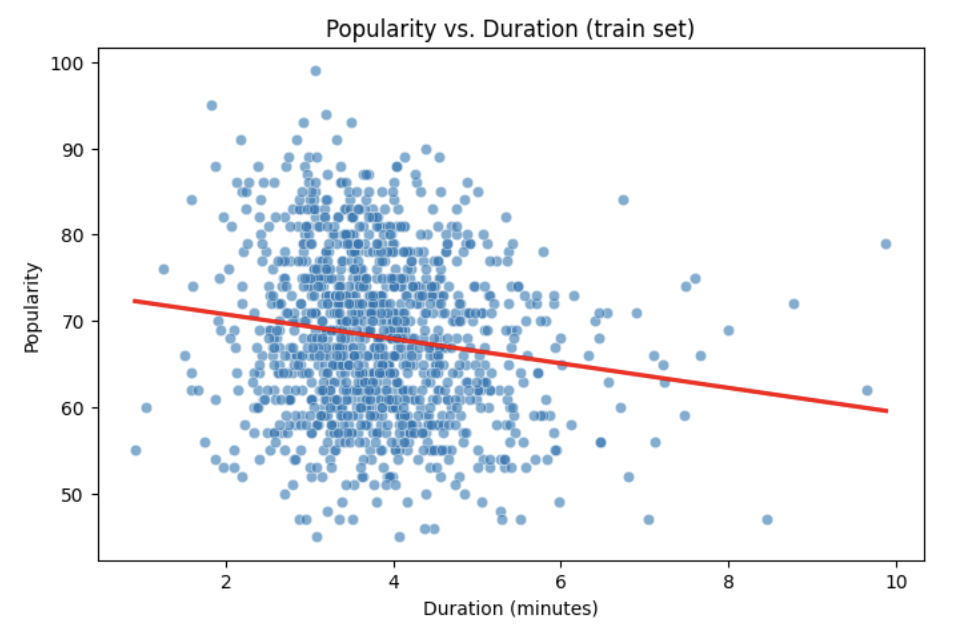
Let’s start with a simple example by predicting popularity from a single feature (e.g., duration of the song in minutes).
import matplotlib.pyplot as plt
import seaborn as sns

# Convert duration to minutes for training data

duration_min_train = X_train["duration_ms"] / 60000

# See how the relation is between duration and popularity with a scatter plot:

plt.figure(figsize=(8,5))
sns.scatterplot(x=duration_min_train, y=y_train, alpha=0.6)
sns.regplot(x=duration_min_train, y=y_train, scatter=False, color="red", ci=None)

plt.xlabel("Duration (minutes)")
plt.ylabel("Popularity")
plt.title("Popularity vs. Duration (train set)")
plt.show()
Predictor (X): Duration (minutes)
Response (Y): popularity
Broadly speaking, we would like to model the relationship between X and Y using the form:
Y = f(X) + $\epsilon$
-
If we fit the data with a horizontal line (e.g.,
f(x) = c), the model would not capture the relationship well. This is an example of underfitting. -
If we fit the data with a very wiggly curve that passes through nearly every point, the model becomes too complex. This is an example of overfitting.
So, our goal is to find a line that captures the main trend without falling into either extreme (underfitting or overfitting). The regression line should summarize the relationship between popularity (Y) and duration (X) well.
How Do We Define a Good Line?
We would like to use a linear function of X, writing our model with $\beta_1$ as the slope:
This shows:
-
$\beta_0$ = intercept,
-
$\beta_1$ = slope (how much $Y$ changes for a one-unit change in $X$),
-
$\epsilon_i$ = error term.
In simple linear regression, we model $Y$ as a linear relationship with $X_i$.
A good line is defined as one that produces small errors or residuals, meaning the predicted values are close to the observed values. In other words, the best line is the one where as many points as possible lie close to the regression line.
We find the line that minimizes the sum of all squared distances from the points to the line. That is:
In practice, software like Python’s statsmodels solves this using calculus and linear algebra. For example, the code below would estimate the coefficient for you with ordinary least squares (OLS) and then you can view the results using model.summary().
import statsmodels.api as sm
X = df[["duration_min"]]
y = df["popularity"]
X = sm.add_constant(X)
model = sm.OLS(y, X).fit()
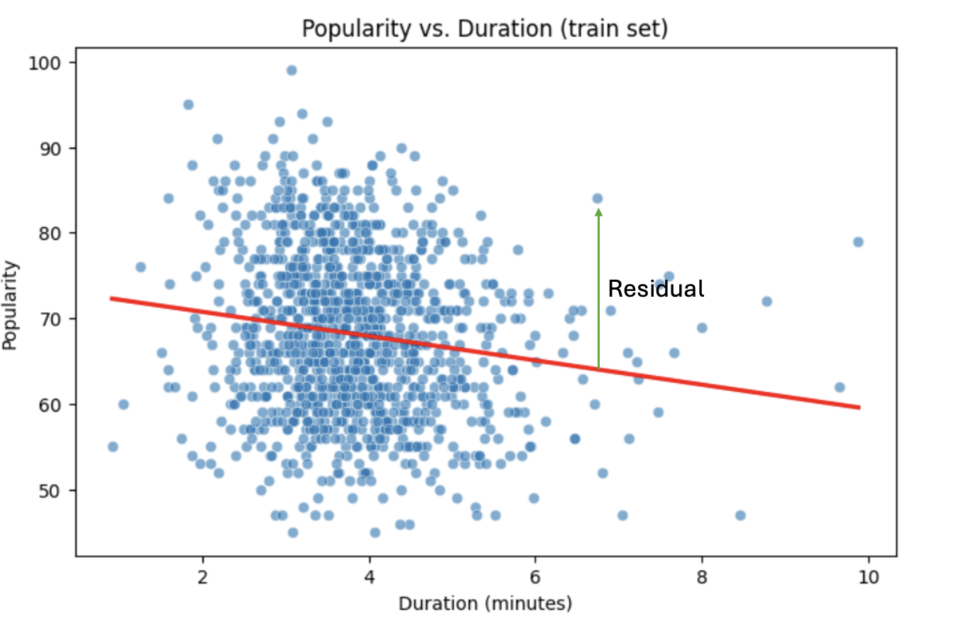
print(model.summary())Residuals
Residuals are the errors between observed and predicted values:
Residual = Observed Popularity – Predicted Popularity ($y - \hat(y)$)
Interpretation of Coefficient (Simple Linear Regression)
The slope $\beta_1$:
-
Tells us how much our target, popularity, changes (on average) for each additional minute of track duration.
-
If $\beta_1 < 0$, longer songs tend to be less popular.
-
If $\beta_1 > 0$, longer songs tend to be more popular.
Assumptions
When building a linear regression model, it is important to check it’s assumptions. We will go deeper into what the assumptions are in question 5. If the assumptions are satisfied, we can trust the results of inference. If they are not, the results lose validity, for example, hypothesis tests may lead to misleading accept/reject decisions. In other words: if you’re giving a linear regression model information that doesn’t meet it’s assumptions, it will give you invalid information back.
Parts of these explanations have been adapted from Applied Statistics with R (Dalpiaz, book.stat420.org).
Other Important Terms
-
Slope tells us the direction/magnitude of the relationship (duration vs. popularity).
-
Residuals show the difference between actual popularity and predicted popularity.
-
R² tells us how much of the variation in popularity is explained by predictors.
-
p-value for the slope tests whether the relationship is statistically significant or could be due to chance.
-
We can expand the model by adding more features (
loudness,danceability,energy,valence, etc.) for better predictions → this is called Multiple Linear Regression which we will explain in question 2.
Questions
Question 1 Reading and Preparing the Data (2 points)
1a. Read in the data and print the first five rows of the dataset. Save the dataframe as spotify_popularity_data.
import pandas as pd

spotify_popularity_data = pd.read_csv("/anvil/projects/tdm/data/spotify/linear_regression_popularity.csv")
1b. Use the code provided to drop the columns listed from spotify_popularity_data. After dropping them, print the columns still in the data.
Note: For more information on the drop function in pandas you can go here here.
drop_cols = [
    "Unnamed: 0", "Unnamed: 0.1", "track_id", "track_name", "available_markets", "href",
    "album_id", "album_name", "album_release_date", "album_type",
    "artists_names", "artists_ids", "principal_artist_id",
    "principal_artist_name", "artist_genres", "analysis_url", "duration_min"]

spotify_popularity_data = spotify_popularity_data.drop(columns=drop_cols)

# For YOU to do: List columns still in spotify_popularity_data after removing drop_cols
1c. Use the code provided to set up your prediction target and features. Then, print the shape of X and y using .shape().
Note: We are using the “popularity” column as y, and use all the other columns as X.
# Target and features
y = spotify_popularity_data["popularity"].copy()
X = spotify_popularity_data.drop(columns=["popularity"]).copy()

# Print shape of X and y
print(_____) # For YOU to do
print(____) #For YOU to do
Question 2 Splitting the Data and Understanding the Data (2 points)
Multiple Linear Regression
Most of the time, a single feature is not enough to explain the behavior of the target variable or to predict it. Multiple Linear Regression (MLR) uses several predictors in the model.
Interpretation:
-
Each coefficient $\beta_i$ is the expected change in $Y$ for a 1-unit change in $X_i$, holding all the other predictors constant.
Why use it?
-
More predictors can help captures more of what explains popularity (e.g., duration might not be enough for accurate predictions, but combined with more variables it can help).
Splitting the Data
Models are not trained on entire datasets. Instead, we partition the data into multiple subsets to serve distinct roles in the model development process. The most common partitioning scheme involves subsets:
-
Training data is what the model actually learns from. It’s used to find patterns and relationships between the features and the target.
-
Test data is completely held out until the very end. It gives us a final check to see how well the model is likely to perform on brand-new data it has never seen before.
Understanding the Subsets
In supervised learning, our dataset is split into predictors (X) and a target variable (y). We can further divide these into training, and test subsets to properly evaluate model performance and prevent overfitting.
|
In practice, it’s recommended to use cross-validation, which provides a more reliable estimate of a model’s performance by repeatedly splitting the data into training and validation sets and averaging the results. This helps reduce the variability that can come from a single random split. However, for this project, we will only perform a single random train/test split using a fixed random seed. |
2a. Use the code provided to create an 80/20 train/test split (use random_state=42). Then, print the shapes of X_train, X_test, y_train, and y_test using .shape().
from sklearn.model_selection import train_test_split

X_train, X_test, y_train, y_test = train_test_split(X, y, test_size=0.2, random_state=42)

# For YOU to do: print X_train shape

# For YOU to do: print X_test shape

# For YOU to do: print y_train shape

# For YOU to do: print y_test shape
2b. Generate a histogram of y_train (popularity) using the code provided. Be sure to include clear axis labels and a title for the plot.
Note: See documentation on using .histplot in seaborn library here.
import matplotlib.pyplot as plt
import seaborn as sns

plt.figure(figsize=(8,5))
sns.histplot(y, bins=30, kde=True, color="skyblue")
plt.xlabel("_____") # For YOU to fill
plt.ylabel("______") # For YOU to fill
plt.title("_____") # For YOU to fill
plt.show()
2c. Examine the plot above and determine whether the distribution appears roughly symmetric. In 2–3 sentences, note your observations of it’s skewness and distribution (mean, min, max).
2d. Using the provided code, generate a scatterplot of popularity versus duration (in minutes) and include a fitted regression line. In 2–3 sentences, describe (1) the relationship you observe between the two variables, and (2) how the regression line is constructed to represent the overall trend in the data using residuals. Make sure to include labels for the plot.
import matplotlib.pyplot as plt
import seaborn as sns

# Convert duration to minutes for training data
duration_min_train = X_train["duration_ms"] / 60000

plt.figure(figsize=(8,5))
sns.scatterplot(x=duration_min_train, y=y_train, alpha=0.6)
sns.regplot(x=duration_min_train, y=y_train, scatter=False, color="red", ci=None)

plt.xlabel("______") # For YOU to fill in
plt.ylabel("______")  # For YOU to fill in
plt.title("_______") # For YOU to fill in
plt.show()
Question 3 Checking for Multicollinearity and Influential Points (2 points)
$R^2$ (R-squared)
-
$R^2$ measures how well our regression model explains the variation in $Y$.
-
It is the proportion of variability in $Y$ that can be explained by the predictors $X_1, X_2, \dots, X_p$.
-
The value is always between $0$ and $1$:
-
$R^2 = 0$ → the model explains none of the variation in $Y$.
-
$R^2 = 1$ → the model perfectly explains all the variation in $Y$.
-
$R^2$ can also be expressed using sums of squares from the fitted model versus the mean-only model:
-
$SS(\text{fit}) =$ sum of squared errors from the regression model,
-
$SS(\text{mean}) =$ sum of squared errors from the model that only uses the mean of $Y$ (no predictors).
Checking Multicollinearity with VIF
Before fitting our model, we use Variance Inflation Factor (VIF) to check for multicollinearity. Multicollinearity occurs when predictors are highly correlated with each other, which can inflate standard errors, make coefficient estimates unstable, and reduce the reliability of our interpretations.
VIF(Xᵢ) = 1 / (1 – ${R_i}^2$),
where ${R_i}^2$ is the $R^2$ from a regression of $X_i$ onto all of other predictors. You can see that having ${R_i}^2$ close to one shows signs of high correlation (collinearity) and so the VIF will be large.
A VIF above 10 suggests the variable is highly collinear and may need to be removed (this is a common threshold).
Influential Observations and Cook’s Distance
Some outliers only change the regression line a small amount, while others have a large effect. Observations that fall into the second category are called influential. A common measure of influence is Cook’s Distance, which is defined as:
A Cook’s Distance is often considered large if:
An observation with a large Cook’s Distance is called influential.
How we use it:
-
4/nis a simple rule of thumb for flagging unusually influential points with Cook’s Distance. -
n= number of rows in your training data. -
As
ngets larger,4/ngets smaller, the bar for “unusually influential” gets stricter.
3a. Using the provided code, keep only the numeric columns and compute the Variance Inflation Factor (VIF) values. Be sure to specify the threshold 10 in the function.
Note: The function is provided and operates iteratively by removing the variable with the highest VIF at each step until all remaining variables have VIF values less than or equal to the chosen threshold (commonly set at 10). Your task is to run the function and fill in the appropriate threshold.
import pandas as pd
import numpy as np
from statsmodels.stats.outliers_influence import variance_inflation_factor

# Convert booleans to ints
bool_cols = X_train.select_dtypes(include=["bool"]).columns
if len(bool_cols):
    X_train[bool_cols] = X_train[bool_cols].astype(int)


def calculate_vif_iterative(X, thresh=__): # For YOU to fill in
    X_ = X.astype(float).copy()
    while True:
        vif_df = pd.DataFrame({
            "variable": X_.columns,
            "VIF": [variance_inflation_factor(X_.values, i) for i in range(X_.shape[1])]
        }).sort_values("VIF", ascending=False).reset_index(drop=True)

        max_vif = vif_df["VIF"].iloc[0]
        worst = vif_df["variable"].iloc[0]

        if (max_vif <= thresh) or (X_.shape[1] <= 1):
            return X_, vif_df.sort_values("VIF")

        print(f"Dropping '{worst}' with VIF={max_vif:.2f}")
        X_ = X_.drop(columns=[worst])
3b. Using the provided code, keep only the columns with VIF ≤ 10 and update the X_train dataset. Then, print the kept columns along with their VIF using vif_summary.
Note: Your task is to print the VIF summary table.
# Run iterative VIF filtering
result_vif = calculate_vif_iterative(X_train, thresh=10.0)

# Split into the filtered dataset and the VIF summary
X_train = result_vif[0]
vif_summary = result_vif[1]

# For YOU to do: print VIF summary
3c. Use the provided code to calculate Cook’s Distance and identify potential outliers. Use the .drop(index=__) function on both X_train and y_train to remove cooks_outliers.
Note: This code identifies influential outliers in the training data using Cook’s Distance. It begins by aligning and cleaning X_train and y_train, then fits a regression model. Cook’s Distance is computed for each observation, and any values exceeding the threshold 4/n are flagged as influential points. Your task is to ensure these flagged observations are removed from both the X_train and y_train dataframes.
import numpy as np
import pandas as pd
import statsmodels.api as sm

# Align and clean training data
X_train_cook = X_train.loc[X_train.index.intersection(y_train.index)]
y_train_cook = y_train.loc[X_train_cook.index]

# Keep only rows without missing/infinite values
mask = np.isfinite(X_train_cook).all(1) & np.isfinite(y_train_cook.to_numpy())
X_train_cook, y_train_cook = X_train_cook.loc[mask], y_train_cook.loc[mask]

# Fit model on the cleaned data
ols_model_cook = sm.OLS(y_train_cook, sm.add_constant(X_train_cook, has_constant="add")).fit()

# Cook's Distance values for each observation
cooks_distance = ols_model_cook.get_influence().cooks_distance[0]
cooks_threshold = 4 / len(X_train_cook)

# Identify outlier indices
cooks_outliers = X_train_cook.index[cooks_distance > cooks_threshold]

print(f"Flagged {len(cooks_outliers)} outliers (Cook's D > 4/n).")


# STUDENT TODO
X_train = X_train.drop(index=________) # For YOU to fill in
y_train = y_train.drop(index=________) # For YOU to fill in
3d. In 2–3 sentences, explain why it is important to (1) remove features with high multicollinearity and (2) remove outliers identified by Cook’s Distance before building a linear regression model.
Question 4 Feature Selection and Model Summary (2 points)
Feature Selection with AIC and Forward Selection
Another important topic when building a model is feature selection. To reduce the number of features, we can use forward selection guided by Akaike Information Criterion (AIC):
$AIC = 2k – 2log(L)$,
where
-
$k$ is the number of parameters in the model,
-
$L$ is the likelihood of the model.
The model with the lowest AIC fits the data by striking a balance between fit and the number of parameters (features) used. If we pick the model with the smallest AIC, we are choosing the model with a low k (fewer features) while still ensuring it has a high likelihood log(L).
-
Forward selection begins with no predictors and adds them one at a time, at each step choosing the variable that leads to the greatest reduction in AIC.
-
Backward elimination begins with all predictors and removes them one at a time, dropping the variable whose removal leads to the greatest reduction in AIC.
-
Stepwise selection is a hybrid approach: it adds variables like forward selection but also considers removing variables at each step (backward pruning) if doing so reduces AIC further.
Feature selection is a very popular and important topic in machine learning. We recommend exploring additional resources to deepen your understanding. One excellent resource is An Introduction to Statistical Learning with Applications in Python (Springer textbook), which is available for free here. The section on Linear Model Selection and Regularization provides a detailed discussion of this topic.
|
AIC is one of several possible criteria for feature selection. While we are using AIC in this project, you could also use:
Each criterion has trade-offs. AIC is popular because it balances model fit and complexity, making it a solid choice when comparing linear regression models. For consistency, we’ll use AIC throughout this project. |
4a. Use the code provided below to perform feature selection using stepwise selection with the AIC criterion. Then write 1–2 sentences explaining how stepwise selection with AIC works and why feature selection is useful in model building.
Note: The function has been provided. Your task is to run it successfully and then write 1-2 sentences about feature selection.
import statsmodels.api as sm

def stepwise_aic(X_train, y_train, max_vars=None, verbose=True):
    X = X_train.select_dtypes(include=[np.number]).astype(float).copy()
    y = pd.Series(y_train).astype(float)
    mask = np.isfinite(X).all(1) & np.isfinite(y)
    X, y = X.loc[mask], y.loc[mask]

    remaining, selected = set(X.columns), []
    current_aic = np.inf

    while remaining and (max_vars is None or len(selected) < max_vars):
        aics = [(sm.OLS(y, sm.add_constant(X[selected + [c]], has_constant='add')).fit().aic, c)
                for c in remaining]
        best_aic, best_var = min(aics, key=lambda t: t[0])

        if best_aic + 1e-6 < current_aic:
            selected.append(best_var); remaining.remove(best_var); current_aic = best_aic
            if verbose: print(f"+ {best_var} (AIC {best_aic:.2f})")
            # backward
            improved = True
            while improved and len(selected) > 1:
                backs = [(sm.OLS(y, sm.add_constant(X[[v for v in selected if v != d]], has_constant='add')).fit().aic, d)
                         for d in selected]
                back_aic, drop_var = min(backs, key=lambda t: t[0])
                if back_aic + 1e-6 < current_aic:
                    selected.remove(drop_var); remaining.add(drop_var); current_aic = back_aic
                    if verbose: print(f"- {drop_var} (AIC {back_aic:.2f})")
                else:
                    improved = False
        else:
            break

    model = sm.OLS(y, sm.add_constant(X[selected], has_constant='add')).fit()
    return selected, model
4b. Use the provided code to run the stepwise_aic function on your training data. Then print the selected_cols and interpret the results of the feature selection method in 1-2 sentences.
results_feature_selection = stepwise_aic(X_train, y_train, max_vars=None, verbose=True)

selected_cols = results_feature_selection[0]   # list of features
model = results_feature_selection[1]           # fitted model

print(_______) # For YOU to do
4c. Print the model summary and write 2-3 sentences interpreting the results about the variables in the model and their relationship to our target variable popularity.
Hint: for printing the model summary, use the .summary() function to see the summary of the model.
Question 5 Checking Assumptions of Linear Regression Model (2 points)
Linear Regression Assumptions
Often we talk about the assumptions of this model, which are remembered by LINE.
-
Linear. The relationship between $Y$ and the predictors is linear.
-
Independent. The errors $\epsilon_i$ are independent.
-
Normal. The errors $\epsilon_i$ are normally distributed (the “error” around the line follows a normal distribution).
-
Equal Variance. At each value of $x$, the variance of $Y$ is the same, $\sigma^2$.
|
If you are a data science or statistics major, a solid understanding of these assumptions is frequently discussed in coursework and often asked about during interviews for data science roles. We encourage you to not only memorize these assumptions but also develop a clear understanding of their meaning and implications. |
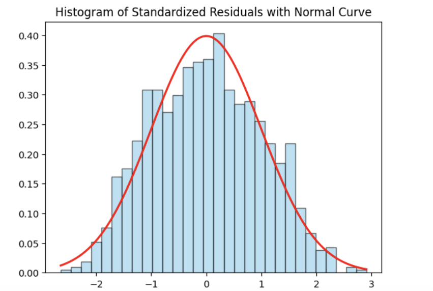
Normality Assumption - Histogram
We have several ways to assess the normality assumption. A simple check is a histogram of the residuals, if it looks roughly bell-shaped and symmetric, that supports treating the errors as approximately normal.
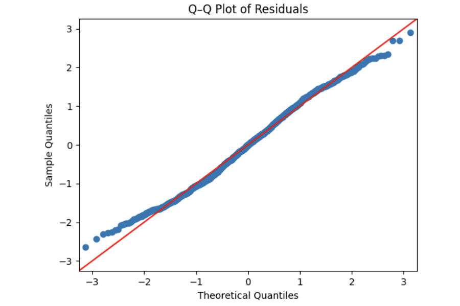
Normality Assumption - Q-Q plot
Another visual method for assessing the normality of errors, which is more powerful than a histogram, is a normal quantile-quantile plot, or Q-Q plot for short.
Essentially, if the points in a Q–Q plot don’t lie close to the straight line, that suggests the data are not normal. In essence, the plot puts the ordered sample values (sample quantiles) on the y-axis against the quantiles you’d expect under a normal distribution (theoretical quantiles) on the x-axis. Implementation details vary by software, but the idea is the same.
Independence Assumption - Durbin–Watson Independence Test
-
The question is “Are the residuals independent?”
-
If one residual is high and the next is also high, there’s positive autocorrelation. If they tend to alternate up/down, there’s negative autocorrelation. If there’s no pattern in residuals, they’re independent.
Rule of thumb:
-
~2 → residuals are approximately independent
-
< 2 → positive autocorrelation (closer to 0 is stronger)
-
> 2 → negative autocorrelation (closer to 4 is stronger)
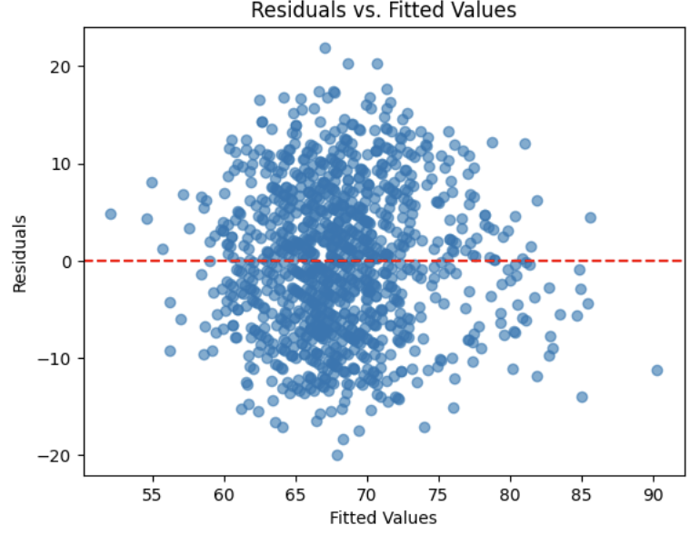
Equal Variance Assumption - Residuals versus Fitted Values Plot
A Fitted vs. Residuals plot is one of the most useful diagnostics for checking the linearity and equal variance (homoscedasticity) assumptions.
What to look for:
-
Zero-centered residuals.
-
At any fitted value, the average residual should be about 0. This supports the linearity assumption. We can add a horizontal reference line at y = 0 to make this clear.
-
Even spread (constant variance).
-
Across all fitted values, the spread of residuals should be roughly the same.
5a. Use the provided code to test for normality assumption. Make sure to label the plot and write 2-3 sentences on whether or not you think the model passes the normality assumption.
import matplotlib.pyplot as plt
import statsmodels.api as sm
import scipy.stats as stats
import numpy as np

# Residuals
resid = model.resid
z = (resid - np.mean(resid)) / np.std(resid, ddof=1)

# Histogram with normal curve
plt.hist(z, bins=30, density=True, alpha=0.6, color="skyblue", edgecolor="black")
x = np.linspace(z.min(), z.max(), 100)
plt.plot(x, stats.norm.pdf(x, 0, 1), "r", linewidth=2)
plt.title("________") # For YOU to fill in
plt.show()
5b. Use the provided code to test for normality using the q-q plot. Make sure to label your plot and interpret the results in 2-3 sentences.
# Q–Q Plot
sm.qqplot(z, line="45", fit=True)
plt.title("Q–Q Plot of Residuals")
plt.show()
5c. Run the code below to test for independence assumption in regression using the Durbin Watson test. Write 2-3 sentences interpreting the results and why testing for independence is important when building a linear regression model.
# Durbin–Watson independence test
from statsmodels.stats.stattools import durbin_watson

dw_stat = durbin_watson(resid)
print("[Independence: Durbin–Watson]")
print(f"Statistic={dw_stat:.4f}")
print("H0: Residuals are independent (no autocorrelation).")

if 1.5 < dw_stat < 2.5:
    print("-> Pass (approx. independent)")
else:
    print("-> FAIL: possible autocorrelation")
print()
5d. Run the code provided below to plot a residuals vs fitted values plot. Make sure to label your plot and interpret the results in 2-3 sentences.
import matplotlib.pyplot as plt

plt.scatter(model.fittedvalues, resid, alpha=0.6)
plt.axhline(0, color="red", linestyle="--")
plt.title("______")
plt.xlabel("______")
plt.ylabel("______")
plt.show()
Question 6 Calculating R-squared and Predicting Popularity (2 points)
6a. Use the provided code below to get the $R^2$ on the test set. Write 2-3 sentences interpreting the results of the $R^2$ on the test set.
from sklearn.metrics import r2_score
import statsmodels.api as sm

# Making sure test data has the same selected columns
X_test = X_test[selected_cols].copy()
mask = np.isfinite(X_test).all(1)
X_test = X_test.loc[mask]
y_test = y_test.loc[X_test.index]

# Predict with statsmodels OLS
y_pred = model.predict(sm.add_constant(X_test, has_constant='add'))

# R² on the test set
r2 = r2_score(y_test, y_pred)
print(f"Test R²: {r2:.3f}")
6b. Run the code provided to generate a table displaying each variable along with its coefficient, direction of effect (positive or negative), p-value, and significance. Then, write 2–3 sentences interpreting the results. Highlight any findings that stand out or seem surprising.
Note: The code has been provided, your task is to interpret the table’s results.
import pandas as pd

alpha = 0.05  # significance threshold

# Collect pieces from the statsmodels OLS result
coef = model.params.rename("coef")
pval = model.pvalues.rename("p_value")
ci = model.conf_int()

# Assemble table
coef_tbl = (
    pd.concat([coef, pval, ci], axis=1)
      .drop(index="const", errors="ignore")             # drop intercept row
      .assign(
          effect=lambda d: d["coef"].apply(lambda x: "Positive" if x > 0 else "Negative"),
          significant=lambda d: d["p_value"] < alpha
      )
      [["coef", "effect", "p_value", "significant"]]
      .sort_values("p_value")                            # most significant first
)

# rounding
coef_tbl_rounded = coef_tbl.round({"coef": 4, "p_value": 4})
print(coef_tbl_rounded)
6c. Using the code below, predict the popularity of a new song with the following features using the trained model:
Principal artist followers: 5,000,000
Duration: 210,000 ms (~3.5 minutes)
Loudness: -6.0
Album total tracks: 10
Acousticness: 0.20
Explicit: 0 (not explicit)
Mode: 1 (major key)
Valence: 0.40
Track number: 3
Key: 5 (F major)
Speechiness: 0.05
import pandas as pd
import statsmodels.api as sm

new_song = pd.DataFrame([{

    "principal_artist_followers": ______, # For YOU to fill in

    "duration_ms": _______,  # For YOU to fill in

    "loudness": _______, # For YOU to fill in

    "album_total_tracks": _____, # For YOU to fill in

    "acousticness": ________, # For YOU to fill in

    "explicit": ________, # For YOU to fill in

    "mode": ________, # For YOU to fill in

    "valence": ________, # For YOU to fill in

    "track_number": ________, # For YOU to fill in

    "key": ________, # For YOU to fill in

    "speechiness": # For YOU to fill in

}])

# Ensure the model sees the same columns it was trained on
new_song = new_song.reindex(columns=selected_cols)

new_song = new_song.fillna(X_train[selected_cols].median(numeric_only=True))

pred_pop = model.predict(sm.add_constant(new_song, has_constant="add"))[0]

print(f"Predicted popularity: {pred_pop:.1f}")
References
Some explanations in this project have been adapted from other sources in statistics and machine learning, as listed below.
-
James, Gareth; Witten, Daniela; Hastie, Trevor; Tibshirani, Robert; Taylor, Jonathan. An Introduction to Statistical Learning: with Applications in Python. Springer Texts in Statistics, 2023.
-
Dalpiaz, David. Applied Statistics with R. Available at: book.stat420.org/
Submitting your Work
Once you have completed the questions, save your Jupyter notebook. You can then download the notebook and submit it to Gradescope.
-
firstname_lastname_project5.ipynb
|
You must double check your You will not receive full credit if your |