Survival Analysis
Project Objectives
This project introduces Survival Analysis and Cox proportional hazards regression, guiding you through building and interpreting models to understand patient risk over time for a dataset related to the study of lung cancer patients.
Introduction
In many studies, we are interested in whether an event occurs, such as whether a patient survives surgery. In those cases, a binary modeling approach like logistic regression may seem like it can be used. However, when the timing of the event matters, survival analysis is more adequate. For example, a patient who dies during a medical procedure and a patient who dies two months later both experience death, yet a simple yes or no model would give them the same label. Ignoring how long it took for the event to occur removes valuable information and limits our ability to see important patterns.
This is where survival analysis becomes useful.
Instead of modeling only whether an event occurs, survival analysis models the time until the event occurs. This time is called the survival time or event time. The survival time is measured from a clearly defined starting point until the event happens.
Common examples of events include
-
Death of a patient,
-
Progression of a disease,
-
Failure of a machine part,
-
Cancellation of a customer subscription,
-
Time until pregnancy.
In all of these situations, the main response variable is the time from a defined beginning until an event happens.
True Survival Time and True Censoring Time
In survival analysis, we imagine that each individual has two underlying time values:
-
True survival time $T$: the time when the event actually occurs
-
True censoring time $C$: the time when observation of that individual stops
We do not usually observe both of these. Instead, we only see whichever occurs first.
The observed time for each individual is
$Y = \min(T, C)$
So
-
If the event occurs before observation stops, then $Y = T$.
-
If observation stops before the event occurs, then $Y = C$.
We will use this same notation when we describe censored data in more detail.
Our Example Data Set
Consider our dataset which is a study of lung cancer patients. Please see the Appendix for data dictionary.
In this data set
-
Survival time is the number of days from enrollment into the study until the outcome occurs.
-
The outcome is either Death, when the event is observed, or Censoring, when the event is not observed during the period of observation.
For each patient
-
Time begins at enrollment into the study.
-
Time ends at death, if the patient dies during the study, or at the last recorded contact, if the patient is still alive or no longer in contact with the study team. Those patients are treated as censored observations, which we describe next.
The data set does not record calendar dates for diagnosis or death. Instead, it records elapsed time in days between study start and the outcome. Each recorded survival time therefore represents how many days a patient lived after diagnosis or enrollment.

Questions
Question 1 Exploring and Cleaning the Data (2 points)
1a. Load the survival_data dataset using the file path provided and display the first 5 rows along with the size of the data.
# Load data
import pandas as pd
survival_data = pd.read_csv('/anvil/projects/tdm/data/survival/SurvivalData.csv')
1b. Recode the status variable so that death is labeled as 1 and censored cases are labeled as 0. (In the raw dataset, status = 2 corresponds to death and status = 1 corresponds to censored observations.)
survival_data.loc[survival_data.status==_, '____']=_ # For YOU to fill
survival_data.loc[survival_data.status==_, '____']=_ # For YOU to fill
1c. Apply linear interpolation to fill missing values in the meal.cal and wt.loss columns, then use forward fill and backward fill to handle any remaining NaNs in these two columns. Fill the missing values in the inst column using the column’s mode.
Hint: Use .ffill() and bfill() for forward and backward fill.
survival_data[['meal.cal', 'wt.loss']] = (
    survival_data[['meal.cal', 'wt.loss']].interpolate(method='___')) # For you to fill in

# Fill any remaining NaNs using forward and backward fill
survival_data[['meal.cal', 'wt.loss']] = _____ # For YOU to fill in

# Fill in inst using mode
survival_data['inst'] =  # For YOU to fill in
1d. For the remaining variables with missing data (ph.ecog, ph.karno, and pat.karno), fill the NaN values using the median of each respective column. Finally, display the updated missing-value counts for all columns to confirm that no missing values remain in the dataset.
# Fill any missing values using median
survival_data[['ph.ecog','ph.karno','pat.karno']] = _________ # For YOU to fill in

# For YOU to do: confirm no missing values remainQuestion 2 - Understanding Time, Censoring, and Survival (2 points)
Censored Observations
As we mentioned, although this setup may appear similar to a regression problem, an important complication exists: many patients survive past the end of the study, so their exact event times are unknown.
Those patients are considered censored.
For censored individuals:
-
The true event (death) has not been observed.
-
They may experience the event days, months, or years later.
-
We only know that their true event time occurs after their last follow-up time.
Censored data is still informative because each censored observation tells us the patient survived at least up to their recorded follow-up time.
Using the notation above, we still observe
$Y = \min(T, C)$
but now we also record a status indicator to tell us whether the event was actually seen.
$\delta$ = \begin{cases} 1 & \text{if } T \le C \quad \text{(event observed)} \\ 0 & \text{if } T > C \quad \text{(censored)} \end{cases}
So for each individual we have the pair $(Y, \delta)$.
-
If $\delta = 1$, then the event occurred at time $Y$.
-
If $\delta = 0$, then the observation is censored and the true event time is greater than $Y$.
Even though censored observations do not give us the exact event time, they still provide important information. Each censored patient tells us that the event did not occur before their last observed time.
Types of Censoring
There are several ways in which censoring can occur. The most common types are right censoring, left censoring, and interval censoring.
Right Censoring
Right censoring occurs when we know that the event time is at least as large as the observed time. In notation
$T \ge Y$
Examples
-
The study ends while the patient is still alive.
-
The patient leaves the study or is lost to contact before the event occurs.
In both cases, we do not know the exact value of $T$, but we do know that $T$ is larger than the final observed time.
Left Censoring
Left censoring occurs when the event happens before the time that observation begins, but the exact event time is unknown.
In this case
$T \le Y$
Example
Suppose we survey a group of pregnant women at one visit late in pregnancy. Some of them have already given birth by the time of the survey. For those women, we only know that the birth occurred some time before the survey date, which means their pregnancy duration is less than the time since conception that corresponds to the survey.
Interval Censoring
Interval censoring occurs when we only know that the event happened between two observation times.
In this setting we know that
$T \in (L, U)$
where $L$ and $U$ are the last time the event was known not to have happened and the first time it was known to have happened.
Example
-
Patients are checked once per week.
-
At one visit, the event has not occurred.
-
At the next visit, the event has occurred.
We do not know the exact day of the event, only that it occurred at some time between two visits.
Censored Data in Our Example Dataset
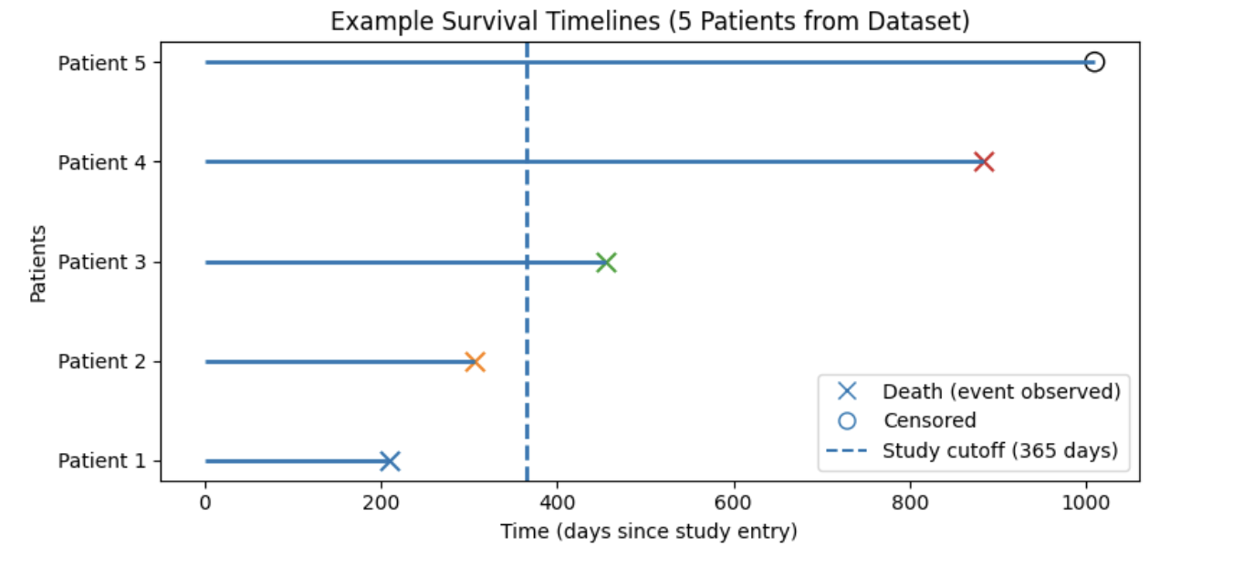
Figure interpretation:
In the figure above, each horizontal line represents one patient’s follow-up time starting at study entry (time = 0). An X marks when a death occurs (event observed), and an open circle marks a censored observation (patient still alive at last follow-up). The dashed vertical line shows a chosen reference (landmark) time at 365 days, which we use as a snapshot of follow-up rather than the true end of the study.
Notice that some patients die before this reference time (e.g., Patients 1 and 2), while others die after it (e.g., Patient 3 and 4). Patients who remain alive beyond the reference time (e.g., Patient 5) have survival times that extend past 365 days. From the perspective of a snapshot taken at day 365, patients who die after this point and patients who remain alive after this point are indistinguishable at that moment, because neither outcome has occurred yet. This demonstrates why survival analysis must explicitly account for censoring and time-to-event information rather than relying on simple yes/no outcome models.
Assumption About Censoring
In order for standard survival analysis methods to give valid results, we usually assume that
-
The censoring process is independent of the event time, after we account for the observed covariates in the model.
Informally, this means that whether or when a subject is censored should not depend on their unobserved survival time in a way that is not already explained by the variables in the model. When this assumption is reasonable, censored observations still contribute correct information about the survival experience of the population.
2a. Using the status event indicator variable, calculate how many observations are events (status = 1) and how many are right-censored (status = 0). Print the counts and create a bar plot showing the proportion of censored versus observed events.
# Print how many observations are deaths (status = 1) and how many are censored (status = 0).

# Plot the proportions
import matplotlib.pyplot as plt
survival_data['status'].value_counts().plot(kind='bar')
plt.xticks([1,0], ['Censored (0)', 'Death (1)'])
plt.ylabel('______')
plt.title('______')
plt.show()
2b. Use the code below to create a scatter plot that displays each patient’s follow-up time on the x-axis and the patient index (after sorting by time) on the y-axis. Then, write 1–2 sentences interpreting the results.
Note: Follow-up time is the length of time each patient is observed in the study, from study entry until either death occurs (event) or the patient is censored (e.g., study ends or they are lost to follow-up). In this dataset, follow-up time is stored in the time column and is measured in days.
import matplotlib.pyplot as plt

# Sort by follow-up time for better visualization
df_sorted = survival_data.sort_values(by='time')

# Color mapping: red = death (event), blue = censored
colors = df_sorted['status'].map({1.0: 'red', 0.0: 'blue'})

plt.figure(figsize=(10, 6))
plt.scatter(
    df_sorted['time'],
    range(len(df_sorted)),
    c=colors,
    alpha=0.7
)

plt.title("______") # For YOU to fill in
plt.xlabel("_______") # For YOU to fill in
plt.ylabel("________") # For YOU to fill in

# Custom legend
plt.legend(handles=[
    plt.Line2D([], [], marker='o', color='red', linestyle='None',
               label='Death (event observed)'),
    plt.Line2D([], [], marker='o', color='blue', linestyle='None',
               label='Censored (event not observed during study)')
])

plt.grid(alpha=0.3)
plt.show()
2c. Use the code below to generate a survival timeline plot for the first 10 patients in survival_data, including a dashed vertical reference line at 365 days to represent a snapshot of follow-up. Write 1–2 sentences interpreting the plot and stating how many patients experienced an observed death at our point of reference versus how many were a censored outcome.
import matplotlib.pyplot as plt

# Select the first 10 patients from the dataset
plot_df = survival_data.head(10).reset_index(drop=True)

# Create plot
plt.figure(figsize=(10, 5))
plt.axvline(x=365, linestyle='--', label='Study cutoff (365 days)')

death_labeled = False
censor_labeled = False

# Plot each patient's survival timeline
for i, row in plot_df.iterrows():
    plt.hlines(y=i+1, xmin=0, xmax=row['time'])

    if row['status'] == 1:
        plt.scatter(
            row['time'], i+1,
            marker='x', s=100,
            label='Death (event observed)' if not death_labeled else None
        )
        death_labeled = True
    else:
        plt.scatter(
            row['time'], i+1,
            facecolors='none', edgecolors='black', s=100,
            label='Censored' if not censor_labeled else None
        )
        censor_labeled = True

plt.yticks(range(1, 11), [f'Patient {i}' for i in range(1, 11)])
plt.xlabel('_________')
plt.ylabel('_________')
plt.title('_________')
plt.legend()
plt.show()Question 3 - Kaplan Meier (2 points)
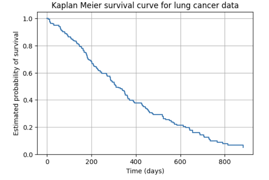
The survival function can be estimated using the Kaplan Meier estimator:
$\hat{S}(t) = \prod_{t_i \le t} \left(1 - \frac{d_i}{n_i}\right)$.
In this form
-
$t_i$ represents each observed event time,
-
$d_i$ is the number of deaths that occur at time $t_i$,
-
$n_i$ is the number of individuals at risk immediately before time $t_i$.
At each event time, survival is updated by multiplying the previous survival probability by a new fraction that accounts for how many deaths occurred out of the group still being observed.
Data Used for Illustration
We demonstrate this process using our lung cancer dataset. Each row of the data includes
-
time: the number of days observed,
-
event:
-
1 indicates death occurred,
-
0 indicates the observation is censored.
-
Example rows from the dataset are shown below.
   time  event
0   306      1
1   455      1
2  1010      0
3   210      1
4   883      1
Identify Event Times
Kaplan Meier updates the survival probability only at time points where deaths occur. These are called event times.
From our dataset, the first two event times are:
[5, 11]This means
-
At least one patient died at day 5.
-
At least one patient died at day 11.
We now calculate survival probabilities at each of these two event times.
Step 1 Calculate Survival at Time 5
At the first event time:
-
$t_1 = 5$
-
Number at risk just before day 5 $n_1 = 228$
-
Number of deaths on day 5 $d_1 = 1$
Apply the Kaplan–Meier step formula:
$S(5) = 1 \times \left(1 - \frac{1}{228}\right)$
This gives
S(5) = 0.995614
Interpretation
After day 5, approximately 99.56 percent of patients are estimated to survive beyond that time.
Step 2 Calculate Survival at Time 11
Move to the second event time.
-
$t_2 = 11$
-
Number at risk just before day 11 $n_2 = 227$
-
Number of deaths on day 11 $d_2 = 3$
The survival probability is updated by multiplying the previous estimate by a new fraction:
$S(11) = S(5) \times \left(1 - \frac{3}{227}\right)$
This gives
$S(11) = 0.982456$
Interpretation
After day 11, approximately 98.25 percent of patients are estimated to survive beyond this time.
Summary Table
The survival probabilities calculated for our first two event times are summarized below.
| Time (days) | Deaths \(d_i\) | At risk \(n_i\) | Survival probability |
|---|---|---|---|
5 |
1 |
228 |
0.995614 |
11 |
3 |
227 |
0.982456 |
Repeating this procedure at all event times builds the full Kaplan Meier survival curve.
3a. Use the code below to identify the first two event times in the dataset and explain what an "event time" means in the context of Kaplan Meier estimation. Then, in 1–2 sentences, explain what the survival function $S(t)$ represents in plain language.
# Identify event times
event_times = (
    survival_data
    .loc[survival_data["status"] == 1, "time"]
    .sort_values()
    .unique()
)

# For YOU to do: Identify the first two event times
3b. Use the code below to calculate the first survival probability $S(5)$. Then write 1 sentence explaining what $S(5)$ means for patients in this study.
# First event time
t1 = event_times[0]

# Count patients at risk and deaths
n1 = (survival_data["time"] >= t1).sum()
d1 = ((survival_data["time"] == t1) & (survival_data["status"] == 1)).sum()

# Kaplan Meier Equation
S1 = ______ # For YOU to fill in

print("Time =", t1)
print("At risk n1 =", n1)
print("Deaths d1 =", d1)
print("S(t1) =", S1)
3c. Using the value of $S(5)$ from Question 3b, calculate the updated survival probability $S(11)$. Then write 1 sentence explaining what $S(11)$ means for patients in this study.
# Second event time
t2 = event_times[1]

# Count patients at risk and deaths
n2 = (survival_data["time"] >= t2).sum()
d2 = ((survival_data["time"] == t2) & (survival_data["status"] == 1)).sum()

# Update survival probability
S2 = ______ # For YOU to fill in

print("Time =", t2)
print("At risk n2 =", n2)
print("Deaths d2 =", d2)
print("S(t2) =", S2)Question 4 - Survival Curves and Log Rank Test (2 points)
Comparing Survival Curves: The Log-Rank Test
Once survival curves are estimated using the Kaplan–Meier method, we often want to compare survival between two or more groups (for example, male vs female patients). While visual inspection of Kaplan–Meier curves can suggest differences between groups, overlap or small separations can be difficult to interpret by eye alone. To formally evaluate whether any observed differences are statistically meaningful, we use the log-rank test.
The log-rank test compares:
-
The observed number of deaths in each group at every event time,
-
To the number of deaths expected if both groups truly had the same underlying survival experience.
These comparisons are summed across all event times to produce a test statistic and corresponding p-value.
Interpretation
-
A small p-value (typically < 0.05) provides evidence that the survival curves differ between groups, suggesting different hazard rates.
-
A large p-value indicates that any visible differences in the curves are likely due to random variation rather than a true difference in survival.
The log-rank test therefore provides a formal statistical complement to Kaplan–Meier plots, moving beyond visual comparison to hypothesis testing.
4a. Using the code below, fit and plot the overall Kaplan Meier survival curve using all patients. Then write 1–2 sentences explaining what the curve communicates about survival probabilities over time.
from lifelines import KaplanMeierFitter
import matplotlib.pyplot as plt

kmf = KaplanMeierFitter()

kmf.fit(
    durations=survival_data["time"],
    event_observed=(survival_data["status"] == 1)
)

kmf.plot(ci_show=True)
plt.xlabel("_______") # For YOU to fill in
plt.ylabel("_______") # For YOU to fill in
plt.title("______") # For YOU to fill in
plt.grid(alpha=0.3)
plt.show()
4b. Create Kaplan Meier survival curves stratified by sex (sex = 1 for male, sex = 2 for female). Then write 1–2 sentences comparing survival between male and female groups and noting any visible separation between the curves.
from lifelines import KaplanMeierFitter
import matplotlib.pyplot as plt

kmf = KaplanMeierFitter()

plt.figure(figsize=(6, 4))

for sex_value, label in [(1, "Male"), (2, "Female")]:
    group = survival_data[survival_data["sex"] == sex_value]

    if group.empty:
        continue

    kmf.fit(
        durations=group["time"],
        event_observed=(group["status"] == 1),
        label=label
    )
    kmf.plot(ci_show=False)

plt.xlabel("______")  # For YOU to fill in
plt.ylabel("______")  # For YOU to fill in
plt.title("______")  # For YOU to fill in
plt.grid(alpha=0.3)
plt.legend()
plt.show()
4c. Using the code below, perform a log rank test to compare survival between male patients (sex = 1) and female patients (sex = 2). Then, in 1–2 sentences, state whether the p-value from the log rank test provides evidence that the log hazards differ between male and female groups.
from lifelines.statistics import logrank_test

# Separate data by sex
male = survival_data[survival_data["sex"] == 1]
female = survival_data[survival_data["sex"] == 2]

# Run log rank test
results = logrank_test(
    male["time"],
    female["time"],
    event_observed_A=(male["status"] == 1),
    event_observed_B=(female["status"] == 1)
)

# Print results
results.print_summary()Question 5 - The Cox Proportional Hazards Model (2 points)
The Cox Proportional Hazards Model
The Cox Proportional Hazards model describes how patient characteristics (covariates) affect the risk of death over time using the dataset survival_data.
The hazard function is:
$h(t) = h_0(t)\exp(\beta_1 X_1 + \beta_2 X_2 + \cdots + \beta_p X_p)$,
where:
-
$h(t)$ is the instantaneous risk of death at time $t$,
-
$h_0(t)$ is the baseline hazard (when all covariates equal 0),
-
$X_1,\ldots,X_p$ are covariates from
survival_data, includingage,sex,ph.ecog,ph.karno,pat.karno,meal.cal, andwt.loss, -
$\beta_1,\ldots,\beta_p$ are the estimated model coefficients.
Each covariate receives one coefficient.
Example model using our dataset
Suppose our Cox model includes age, sex, and ph.ecog.
The fitted model is written as:
$h(t) = h_0(t)\exp(\beta_1(\text{age}) + \beta_2(\text{sex}) + \beta_3(\text{ph.ecog}))$
Each coefficient represents the log hazard ratio of that variable while holding all others constant.
Log hazard coefficients
Example coefficient output:
| Covariate | Log hazard coefficient ($\beta$) | Interpretation |
|---|---|---|
Age |
0.02 |
Higher age increases hazard |
Sex (female vs male) |
-0.60 |
Lower hazard for females than males |
ph.ecog |
0.90 |
Worse ECOG score increases hazard |
From coefficients to hazard ratios
Coefficients are converted to hazard ratios using:
$HR = e^{\beta}$.
Why do we take the exponent of the log hazard coefficient?
Because the model uses an exponential function:
-
Coefficients are estimated on the log scale.
-
A one-unit increase in a predictor changes the log of the hazard, not the hazard directly.
-
Log values are a little more difficult to interpret in a real-world context.
-
This transformation produces a hazard ratio (HR), which represents the relative change in risk associated with a one-unit increase in a predictor.
-
Exponentiating the coefficients allows us to express model results in intuitive terms—such as percent increases or decreases in risk—making them easier to understand and communicate.
Hazard ratios
| Covariate | Hazard ratio (HR) | Interpretation |
|---|---|---|
Age |
1.02 |
Each additional year of age is associated with a ~2% increase in hazard. |
Sex (female) |
0.55 |
Females have a ~45% lower hazard compared to males. |
ph.ecog |
2.46 |
Each one-unit increase in ECOG score is associated with a ~146% increase in hazard (more than double the risk). |
How to interpret hazard ratios
-
$HR = 1$ → no difference in hazard
-
$HR > 1$ → increased hazard
-
$HR < 1$ → decreased hazard
Applying the model to real patients
Using rows from survival_data:
-
Patient 0: age = 74, sex = 1 (male), ph.ecog = 1
-
Patient 2: age = 56, sex = 1 (male), ph.ecog = 0
Because Patient 0 is older and has worse ECOG performance, the Cox model predicts:
Patient 0 has a higher hazard of death than Patient 2.
Sample Cox output
| Covariate | Coefficient ($\beta$) | Std Error | p-value | HR (95% CI) |
|---|---|---|---|---|
Age |
0.020 |
0.008 |
0.010 |
1.02 (1.01 – 1.03) |
Sex |
-0.60 |
0.25 |
0.014 |
0.55 (0.34 – 0.88) |
ph.ecog |
0.90 |
0.28 |
0.002 |
2.46 (1.42 – 4.28) |
Statistical significance
-
p-value < 0.05 → statistically significant
-
Confidence intervals:
-
CI includes 1 → not significant
-
CI above 1 → increased hazard
-
CI below 1 → decreased hazard
-
Example:
$HR(\text{ph.ecog}) = 2.46$, CI $(1.42,4.28)$
Because the CI does not include 1 and the p-value is < 0.05, ECOG performance status is a significant predictor of mortality.
Key takeaways
-
Cox coefficients are log hazard ratios.
-
Convert coefficients with $HR = e^{\beta}$.
-
Interpretation:
-
$HR > 1$ → higher hazard
-
$HR < 1$ → lower hazard
-
$HR = 1$ → no effect
-
5a. Use the following covariates (age, sex, ph.ecog, ph.karno, pat.karno, meal.cal and wt.loss) to fit a Cox regression model and display the coefficient summary table.
See documentation on CoxPHFitter.
from lifelines import CoxPHFitter

# Prepare modeling dataset
cox_data = survival_data[['time', 'status', 'age', 'sex',
                           'ph.ecog', 'ph.karno',
                           'pat.karno', 'meal.cal', 'wt.loss']]

# Fit Cox model
cph = CoxPHFitter()
cph.fit(cox_data, duration_col='time', event_col='status')
5b. Create a table that summarizes the hazard ratios, p-values, percent change in hazard, and statistical significance for each predictor in the Cox model by completing and running the code below.
import pandas as pd
import numpy as np

# Extract coefficients and p-values
hr_table = cph.summary[['coef', 'p']].reset_index()
hr_table.columns = ['Predictor', 'Log_Hazard_Ratio (coef)', 'p_value']

# Compute hazard ratio from the log hazard coefficient
hr_table['Hazard_Ratio (HR)'] = np.___(hr_table['Log_Hazard_Ratio (coef)']) # For YOU to fill in


# Using the table above, fill in the Effect column:
# * If the hazard ratio is greater than 1, fill in whether it increases or decreases hazard.
 #* If the hazard ratio is less than 1, fill in whether it increases or decreases hazard.

hr_table['Effect'] = np.where(
    hr_table['Hazard_Ratio (HR)'] >= ____, # For YOU to fill in
    '________', # For YOU to fill in
    '_______' # For YOU to fill in
)

# Round values for display
hr_table[['Log_Hazard_Ratio (coef)',
          'Hazard_Ratio (HR)',
          'p_value']] = (
    hr_table[['Log_Hazard_Ratio (coef)',
              'Hazard_Ratio (HR)',
              'p_value']]
    .round(3)
)

hr_table
5c. Using the generated table in 5b, write 1–2 sentences explaining which variables significantly increase or decrease patient hazard and what these results suggest about survival risk in the lung cancer dataset.
Question 6 - Cox Proportional Hazards Model Assumptions (2 points)
The Cox proportional hazards model relies on several important assumptions. These assumptions help ensure that the hazard ratios estimated by the model are meaningful and valid.
Assumption 1 – Proportional Hazards
The proportional hazards assumption states that the hazard ratios for predictors are constant over time.
This means the effect of a predictor on risk is assumed to be stable across the entire follow-up period. The proportional hazards assumption can be tested statistically using tests such as the Schoenfeld residual test, which produces a p-value for each predictor.
-
A large p-value (typically > 0.05) suggests that the assumption holds — there is no evidence that the effect of the predictor changes over time.
-
A small p-value (typically < 0.05) suggests that the assumption may be violated — the predictor’s effect may vary across time, meaning the reported hazard ratio may not be valid.
Assumption 2 – Linearity of Continuous Predictors
The Cox model assumes that continuous predictors have a linear relationship with the log hazard.
This means:
-
A one-unit increase in a continuous variable corresponds to a constant proportional change in hazard.
-
The effect of a predictor increases or decreases smoothly rather than abruptly changing at different values.
If a variable has a highly non-linear effect on risk, transformations or modeling adjustments may be needed.
Assumption 3 – Independent (Non-Informative) Censoring
We assume that censoring is independent of survival, after accounting for observed covariates.
This means:
-
Whether a patient is censored should not depend on their unobserved death time.
-
Censored patients are assumed to have the same survival prospects as non-censored patients with similar covariate values.
For a detailed discussion of the Cox model assumptions and how to assess them, see standard survival analysis references such as Klein & Moeschberger, Survival Analysis: Techniques for Censored and Truncated Data; students are encouraged to consult this text for deeper explanation and examples.
6a. One key assumption of the Cox model is that the effect of each predictor on patient risk remains constant over time. To evaluate this for the variable age, use the Schoenfeld residual test below and examine the resulting p-value. After viewing the output, write 1 sentence stating whether the proportional hazards assumption seems reasonable for age.
from lifelines.statistics import proportional_hazard_test

# Test proportional hazards for age
results = proportional_hazard_test(cph, cox_data, time_transform='rank')
print(results.summary.loc[['age']])
6b. Using the scatter plot below for the continuous predictor age, briefly explain whether assuming a linear relationship between age and the log hazard appears reasonable. Support your answer with 1–2 sentences describing any visible patterns in the plot.
This plot provides an informal check for patterns, but does not directly test linearity in the Cox model.
import matplotlib.pyplot as plt

# Example using age
plt.scatter(survival_data["age"], survival_data["time"], alpha=0.5)
plt.xlabel("____") # For YOU to fill in
plt.ylabel("____") # For YOU to fill in
plt.title("_____") # For YOU to fill in
plt.grid(alpha=0.3)
plt.show()
6c. In 2-3 sentences, describe what a violation of Cox proportional hazards model assumptions would imply for interpreting the hazard ratio.
Appendix: Data Dictionary for SurvivalData.csv
| Column Name | Data Type | Variable Type | Description |
|---|---|---|---|
|
Integer |
Categorical (ID) |
Index column from original file (identifier only; not used for analysis) |
|
Integer |
Categorical |
Institution or hospital center identifier |
|
Integer |
Continuous |
Survival time in days until death or censoring |
|
Integer |
Categorical (Binary) |
Event indicator: 1 = censored (event not observed), 2 = death (event observed) |
|
Integer |
Continuous |
Patient age in years at study entry |
|
Integer |
Categorical (Binary) |
Patient sex: 1 = male, 2 = female |
|
Float |
Categorical (Ordinal) |
ECOG performance status score (0 = fully active; higher values indicate worse condition) |
|
Float |
Continuous |
Karnofsky performance status as assessed by physician (0–100 scale; higher values = better condition) |
|
Float |
Continuous |
Karnofsky performance status as assessed by patient (0–100 scale) |
|
Float |
Continuous |
Daily caloric intake from meals (in calories) |
|
Float |
Continuous |
Weight loss over the previous six months (in pounds) |
References
Klein, J. P., & Moeschberger, M. L. (2003). Survival Analysis: Techniques for Censored and Truncated Data. Springer.
James, G., Witten, D., Hastie, T., Tibshirani, R. (2023). Statistical Learning with Python. Springer — Survival Analysis section.