Introduction to Time Series - Part 2 (NOAA Monthly Climate Data)
Project Objectives
In this project, you’ll explore and model monthly climate trends in Indianapolis using an Augmented Regressive model and SARIMAX, a type of ARIMA model that can handle seasonal patterns.
Dataset
-
/anvil/projects/tdm/data/noaa_timeseries2/monthly_avg_df_NOAA.csv
|
This guide was originally created as a seminar project, so you may notice it follows a question-and-answer format. Even so, it should still serve as a helpful resource to guide you through the process of building your own model. Use 4 cores if you want to replicate this project in Anvil. |
Introduction

“Roads? Where we’re going, we don’t need roads.”
Back to the Future
Time series forecasting is not just number crunching, it is the closest thing we have to a crystal ball. By recognizing patterns across time, we can uncover hidden structures in the data, anticipate what’s coming, and even influence decisions before events unfold. It’s not magic, it’s just cool math behind the scenes.
Climate is not random, it follows patterns, some obvious and others subtle. When we zoom out from daily weather reports and look at broader climate trends, we start to see the underlying patterns of our weather. In this project, we will work with nearly two decades of monthly-aggregated climate data from Indianapolis (2006–2024), sourced from the National Oceanic and Atmospheric Administration (NOAA).
This time, the focus shifts from day-to-day fluctuations to monthly averages, a scale better suited for modeling long-term behavior and seasonal trends. The dataset includes:
-
Monthly_AverageDryBulbTemperature_Farenheit: Our main target variable—how warm or cold it was on average each month.
-
Monthly_Precipitation: Total rainfall and snowmelt.
-
Monthly_AverageRelativeHumidity: Average monthly moisture in the air.
-
Monthly_AverageWindSpeed: Wind patterns that may influence temperature or storm formation.
-
Monthly_Snowfall: A key seasonal indicator in the Midwest.
The power of time series forecasting lies in its ability to take these past patterns and use them to make educated predictions about the future. In this project, you’ll start off with building an AR (autoregressive) model and then you’ll learn how to build a type of ARIMA (autoregressive integrated moving average) model. Specifically, a SARIMAX (seasonal autoregressive integrated moving average with exogenous regressors) model that incorporates not just past temperature values, but also external predictors like humidity and precipitation.
You will clean and transform the data, test for stationarity, evaluate model performance, and ultimately forecast future climate trends for Indianapolis. The goal? To understand not only what the temperature was, but what might be next. We are going to try to predict the future!
Getting to Know the Data
Before building any time series model, it is essential to understand the structure, completeness, and behavior of the data you are working with. In this section, you will load the NOAA monthly climate dataset, explore its basic properties, and visualize temperature trends over time.
Loading and Inspecting the Dataset
Begin by loading the monthly NOAA climate dataset and previewing its contents. This will help you understand the variables available and how the data is organized. Save the DataFrame as monthly_df and display the first five rows.
import pandas as pd

monthly_df = pd.read_csv("/anvil/projects/tdm/data/noaa_timeseries2/monthly_avg_df_NOAA.csv")
monthly_df.head()| Monthly_Precipitation | Monthly_AverageRelativeHumidity | Monthly_AverageWindSpeed | Monthly_Snowfall | Monthly_AverageDryBulbTemperature_Farenheit | DATE |
|---|---|---|---|---|---|
2.706452 |
77.870968 |
5.532258 |
2.225806 |
39.780645 |
2006-01-31 |
1.717857 |
68.892857 |
4.875000 |
3.571429 |
32.347143 |
2006-02-28 |
5.567742 |
70.838710 |
4.951613 |
4.516129 |
41.725806 |
2006-03-31 |
3.073333 |
61.366667 |
4.806667 |
0.000000 |
57.146000 |
2006-04-30 |
3.558065 |
68.387097 |
3.903226 |
0.000000 |
61.310968 |
2006-05-31 |
Next, examine the overall size of the dataset and confirm whether any values are missing. This step ensures the data is suitable for time series modeling without requiring additional cleaning.
print(monthly_df.shape)
print(monthly_df.isnull().sum())
(228, 6) Monthly_Precipitation 0 Monthly_AverageRelativeHumidity 0 Monthly_AverageWindSpeed 0 Monthly_Snowfall 0 Monthly_AverageDryBulbTemperature_Farenheit 0 DATE 0 dtype: int64
Visualizing Monthly Temperature Trends
To better understand the temporal behavior of the data, create a time series line plot of monthly average temperature. This visualization will allow you to observe long-term trends, recurring seasonal patterns, and potential anomalies.
import matplotlib.pyplot as plt

monthly_df['DATE'] = pd.to_datetime(monthly_df['DATE'])

plt.plot(
    monthly_df['DATE'],
    monthly_df['Monthly_AverageDryBulbTemperature_Farenheit']
)
plt.title("Monthly Average Temperature in Indianapolis")
plt.xlabel("Date")
plt.ylabel("Temperature (F)")
plt.grid()
plt.show()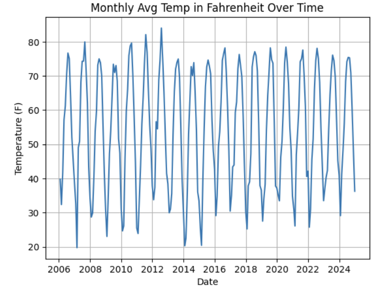
After viewing the plot, let’s cocus on identifying trends and seasonality, such as repeating yearly patterns or long-term changes in temperature. For example, noting strong annual seasonality with recurring peaks and troughs.
Understanding Lag Through Autoregressive Models
Time series models are different than other models. From forecasting stock prices to anticipating weather patterns, people attempt it constantly. But when we narrow our focus to short-term forecasting, predicting the near future based on recent historical data—the task becomes more manageable.
Take, for example, your plot of average monthly temperature. One thing you will notice right away is that observations from month to month are not independent. Instead, they are correlated with one another. This is known as autocorrelation, when values close together in time tend to be similar.
This feature distinguishes time series data from other datasets you have likely seen, where each row can typically be treated as an independent observation. In time series, the order of the data matters. Patterns, cycles, and trends can all emerge over time—and understanding those structures is the key to effective forecasting.
Why Autoregressive (AR) Models?
Autoregressive (AR) models are a natural starting point for time series forecasting. At their core, they use past values to predict the future. An AR model assumes that recent values carry useful information about what comes next.
These models are simple, interpretable, and often surprisingly effective, especially when patterns persist over time. In this project, we will start with AR models to help introduce foundational ideas like lags, autocorrelation, and stationarity—concepts that carry through to more advanced models.
Lag in Time Series
In time series analysis, we assume that the past influences the future. This makes time-based data different from other datasets—observations are not independent, and patterns often persist over time.
A lag is simply a previous value of the same variable:
-
Lag 1 → the value one time step ago
-
Lag 2 → the value two time steps ago
-
Lag n → the value n time steps ago
By including lagged values in a model, we give it memory. This lets the model "remember" past behavior and use that memory to explain current outcomes.
The AR(1) Model: A First Look at Autoregression
One of the simplest models that uses lags is the autoregressive model of order 1, or AR(1). It assumes the current value depends on the previous value, plus some random noise.
Yₜ = ϕ × Yₜ₋₁ + εₜ
where:
-
Yₜ is the current value
-
Yₜ₋₁ is the value one step before
-
ϕ is the autoregressive coefficient
-
εₜ is random noise
This equation may look intimidating at first, but conceptually it states that today’s value is largely a continuation of yesterday’s value, with some variability added in. In the context of this dataset, it suggests that this month’s temperature is related to last month’s temperature, plus some noise.
Let’s look at how autocorrelation appears in the monthly temperature data.
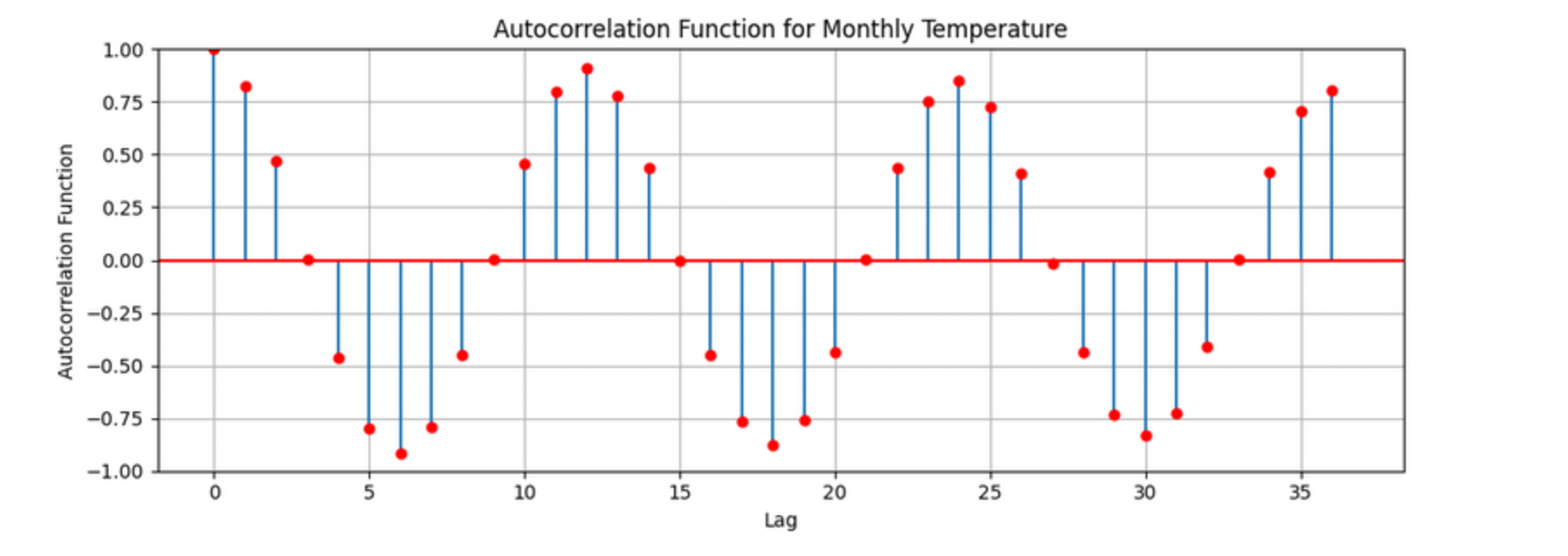
The figure above shows the autocorrelation for Monthly_AverageDryBulbTemperature_Farenheit, where each lag corresponds to one month. Strong positive correlations appear at lags of 12, 24, and 36 months, indicating a clear yearly seasonal pattern in monthly temperatures. The autocorrelation at lag 1 is also high, suggesting that consecutive months are strongly related.
Understanding the concept of lag is foundational before moving on to more complex models like SARIMAX. To see this idea in action, you will begin by fitting an AR-style comparison using consecutive months.
Working with Lagged Monthly Data
Begin by ensuring the dataset is properly ordered in time. Convert the DATE column to a datetime object and sort the DataFrame in ascending chronological order.
monthly_df['DATE'] = pd.to_datetime(monthly_df['DATE'])
monthly_df = monthly_df.sort_values('DATE').reset_index(drop=True)
monthly_df.head()| Monthly_Precipitation | Monthly_AverageRelativeHumidity | Monthly_AverageWindSpeed | Monthly_Snowfall | Monthly_AverageDryBulbTemperature_Farenheit | DATE |
|---|---|---|---|---|---|
2.706452 |
77.870968 |
5.532258 |
2.225806 |
39.780645 |
2006-01-31 |
1.717857 |
68.892857 |
4.875000 |
3.571429 |
32.347143 |
2006-02-28 |
5.567742 |
70.838710 |
4.951613 |
4.516129 |
41.725806 |
2006-03-31 |
3.073333 |
61.366667 |
4.806667 |
0.000000 |
57.146000 |
2006-04-30 |
3.558065 |
68.387097 |
3.903226 |
0.000000 |
61.310968 |
2006-05-31 |
Next, construct a new DataFrame that explicitly compares each month’s average temperature to the previous month’s temperature. This will allow you to examine how strongly consecutive observations are related.
monthly_comparisons = []

for i in range(1, len(monthly_df)):
    date = monthly_df.loc[i, 'DATE']
    current_temp = monthly_df.loc[i, 'Monthly_AverageDryBulbTemperature_Farenheit']
    previous_temp = monthly_df.loc[i - 1, 'Monthly_AverageDryBulbTemperature_Farenheit']

    row = {
        'Date': date,
        'Current': current_temp,
        'Previous': previous_temp
    }
    monthly_comparisons.append(row)

comparison_df = pd.DataFrame(monthly_comparisons)
comparison_df.head()
Visualizing Lag Relationships
To visualize the relationship between consecutive months, create a scatterplot with the previous month’s temperature on the x-axis and the current month’s temperature on the y-axis.
import matplotlib.pyplot as plt

plt.figure(figsize=(8, 6))
plt.scatter(comparison_df['Previous'], comparison_df['Current'], alpha=0.6)
plt.title('Current vs Previous Month Temperature')
plt.xlabel('Previous Month Temperature (°F)')
plt.ylabel('Current Month Temperature (°F)')
plt.grid(True)
plt.tight_layout()
plt.show()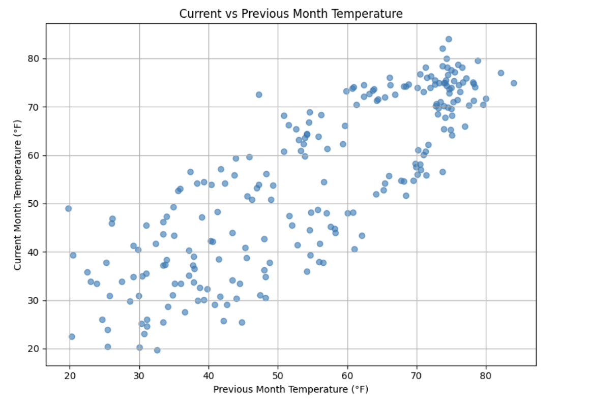
Use this plot to interpret how strongly the current month’s temperature depends on the previous month. Consider whether the relationship appears linear, tightly clustered, or highly variable, and how this supports the use of autoregressive models.
ARIMA and Stationarity
Why Are We Using ARIMA Now?
By now, you have seen that temperature data is not random. Some months are correlated with each other. Some months are warmer than others, and these shifts often repeat each year. But how can we predict the future based on what we have seen?
One of the most widely used tools for time series forecasting is the ARIMA model. ARIMA stands for:
-
AR – AutoRegressive: Uses past values to predict the future
-
I – Integrated: Removes trends by differencing the data
-
MA – Moving Average: Uses past errors to improve predictions
So why are we using ARIMA here?
-
We’re working with monthly climate data, which often shows both trend and seasonal behavior
-
The data is recorded at regular time intervals, which ARIMA is well-suited for
-
ARIMA provides an interpretable framework that allows us to understand what is driving predictions
Before jumping into a full ARIMA model, the earlier questions focused on autocorrelation. This was intentional. Autocorrelation lays the foundation for how time series models “remember” the past. It helped build intuition around lagged values and showed how previous observations influence current ones.
ARIMA models are flexible and interpretable, and they work best when future values depend linearly on past values. However, ARIMA makes one critical assumption that must be checked before modeling: stationarity.
Why Stationarity Matters
In time series modeling, stationarity means the statistical properties of the data—such as its mean, variance, and autocorrelation—remain consistent over time. This consistency allows ARIMA models to reliably detect patterns.
If a series has a strong trend or changing variance, ARIMA may struggle to learn anything meaningful. The model can mistake trends for patterns, leading to misleading forecasts. That is why stationarity must be assessed before fitting an ARIMA model. If the data is not stationary, transformations such as differencing can be applied to address the issue.
How Do We Know If a Series Is Stationary?
To test for stationarity, we use the Augmented Dickey-Fuller (ADF) test. This test evaluates the presence of a unit root in the series by comparing two hypotheses:
-
Null hypothesis (H₀): The series is non-stationary
-
Alternative hypothesis (H₁): The series is stationary
The test produces a p-value. If the p-value is below a chosen significance level (commonly 0.05), we reject the null hypothesis and conclude that the series appears stationary.
The ADF test can be thought of as a screening step. If the test indicates non-stationarity, that signals the need for transformation before modeling.
How Do We Make a Series Stationary?
One of the most common methods for achieving stationarity is differencing. Differencing subtracts each value from the previous value in the series. This shifts the focus from absolute levels to changes over time.
Conceptually:
-
The original series represents the actual temperature each month
-
The differenced series represents how much the temperature changes from one month to the next
By removing long-term trends, differencing stabilizes the series and allows ARIMA to focus on repeatable patterns. This step is essential for producing meaningful and interpretable forecasts.
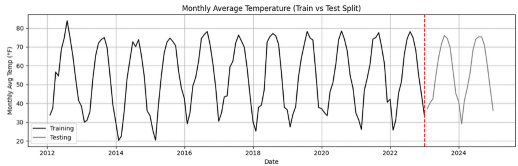
Train–Test Splitting in Time Series
When building forecasting models, the order of observations must always be respected. Unlike traditional machine learning problems, time series data cannot be randomly shuffled before splitting.
Instead, data must be split chronologically:
-
Training set: Earlier observations used to learn historical patterns
-
Testing set: Later observations used to evaluate future forecasting performance
For example, if monthly temperature data spans January 2012 through December 2024, a realistic split would be:
-
Training set: January 2012 to December 2022
-
Testing set: January 2023 to December 2024
This approach simulates real-world forecasting, where models are trained on past data and evaluated on unseen future values. It also prevents data leakage, which occurs when information from the future is inadvertently used during training.
Time-aware train/test splitting is fundamental to reliable time series forecasting and applies to all models, including ARIMA and LSTM.
Preparing the Data for ARIMA
Begin by splitting the dataset into training and testing sets using the specified date ranges. The stationarity tests and model fitting will be performed using the training data only.
import pandas as pd

monthly_df['DATE'] = pd.to_datetime(monthly_df['DATE'])

train = monthly_df[
    (monthly_df['DATE'] >= '2012-01-01') &
    (monthly_df['DATE'] <= '2022-12-31')
].copy()

test = monthly_df[
    (monthly_df['DATE'] >= '2023-01-01') &
    (monthly_df['DATE'] <= '2024-12-31')
].copy()

train.head()
test.head()
Testing for Stationarity with the ADF Test
With the training data prepared, run the Augmented Dickey-Fuller test on the Monthly_AverageDryBulbTemperature_Farenheit series. The test returns both a test statistic and a p-value, which can be used to assess stationarity.
from statsmodels.tsa.stattools import adfuller

result = adfuller(train['Monthly_AverageDryBulbTemperature_Farenheit'])

print("ADF Statistic:", result[0])
print("p-value:", result[1])
ADF Statistic: -2.006080928580352 p-value: 0.2839132054964615
Use the p-value to interpret whether the series appears stationary or non-stationary and how this impacts readiness for ARIMA modeling.
Applying First-Order Differencing
To address non-stationarity, apply first-order differencing to the training series and visualize the result. This transformation highlights month-to-month changes rather than absolute temperature levels.
train['Temp_diff'] = train['Monthly_AverageDryBulbTemperature_Farenheit'].diff()

import matplotlib.pyplot as plt

plt.plot(train['DATE'], train['Temp_diff'])
plt.title("First-Order Differenced Series (Training Data)")
plt.xlabel("Date")
plt.ylabel("Change in Temperature (°F)")
plt.grid()
plt.show()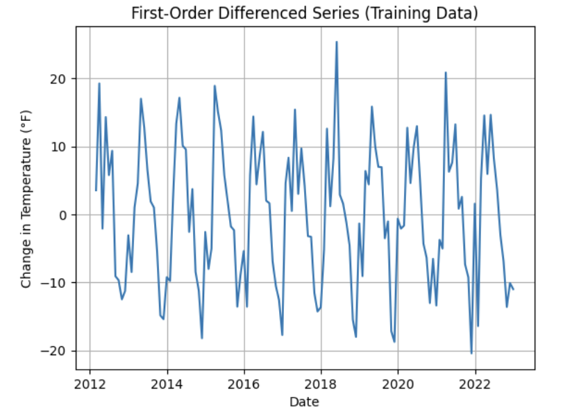
Re-testing Stationarity After Differencing
After differencing, run the ADF test again on the transformed series. Compare the new test results to the original ADF output to assess whether stationarity has been achieved.
temp_diff_clean = train['Temp_diff'].dropna()

result_diff = adfuller(temp_diff_clean)

print("ADF Statistic (differenced):", result_diff[0])
print("p-value (differenced):", result_diff[1])
ADF Statistic (differenced): -9.345081128600434 p-value (differenced): 8.589567709641302e-16
Use this comparison to reflect on how differencing changes the statistical properties of the series and why this step is essential before fitting an ARIMA model.
Fit a Baseline ARIMA Model and Evaluate Performance
You have done the groundwork: explored the data, visualized trends, and confirmed stationarity through differencing. Now it is time to fit a baseline ARIMA model using only the temperature data—without seasonality or external predictors.
This baseline model will serve as a point of comparison. Later, when you introduce seasonality and additional variables using SARIMAX, you will be able to evaluate whether those added components meaningfully improve performance.
Why Start with a Baseline ARIMA Model?
Fitting a basic ARIMA model first provides a simple benchmark. It answers an important question: How well can we forecast temperature using only its past values?
If a more complex model does not improve upon this baseline, then the added complexity may not be justified.
What Is ARIMA?
ARIMA is a classic and widely used model for time series forecasting. It stands for:
-
AutoRegressive (AR): The model uses the relationship between a variable and its own past values. Example: If last month was hot, this month might also be hot (though not always).
-
Integrated (I): Differencing is used to remove trends and make the series stationary, which is a key assumption of ARIMA. Example: If temperatures gradually increase over time, differencing shifts focus to month-to-month changes.
-
Moving Average (MA): The model incorporates past forecast errors to improve predictions. Example: If last month’s prediction was too low, the model may adjust future predictions upward.
Although ARIMA does not directly model seasonality or external variables, it remains a powerful and interpretable approach when working with a single time series.
Additional documentation for the ARIMA implementation in Python can be found here: www.statsmodels.org/stable/generated/statsmodels.tsa.arima.model.ARIMA.html
Defining the Target Variable
Before fitting the model, clearly define what you are trying to predict. In this project, the target variable is the monthly average dry bulb temperature.
# Define the target variable
target_col = 'Monthly_AverageDryBulbTemperature_Farenheit'
Preparing the Training Data
Reset the index of the training DataFrame and extract the target variable as a separate series. This prepares the data in the format expected by the ARIMA model.
train = train.reset_index(drop=True)
y_train = train[target_col]
Fitting a Baseline ARIMA(1,1,1) Model
Fit an ARIMA model with order (1, 1, 1), then visualize how well the fitted values align with the observed temperature series.
from statsmodels.tsa.arima.model import ARIMA
import matplotlib.pyplot as plt

# Fit the ARIMA model
arima_model = ARIMA(y_train, order=(1, 1, 1))
arima_fit = arima_model.fit()

# Extract fitted values
fitted_values = arima_fit.fittedvalues

# Align actual values and dates
y_aligned = y_train.loc[fitted_values.index]
date_aligned = train['DATE'].loc[fitted_values.index]

# Plot actual vs fitted values
plt.figure(figsize=(12, 5))
plt.plot(date_aligned, y_aligned, label='Actual', color='blue')
plt.plot(date_aligned, fitted_values, label='Fitted', color='orange', linestyle='--')

plt.title("ARIMA(1,1,1): Actual vs Fitted Monthly Temperature")
plt.xlabel("Date")
plt.ylabel("Temperature (°F)")
plt.legend()
plt.grid(True)
plt.tight_layout()
plt.xticks(rotation=45)
plt.show()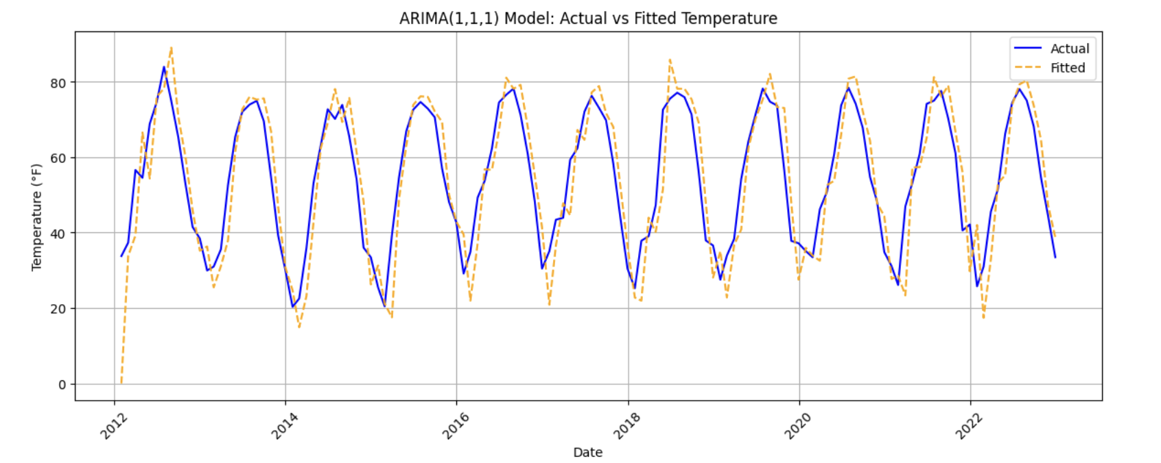
Use this plot to assess how well the ARIMA model captures the overall behavior of the training data, including trends and short-term fluctuations.
Evaluating Model Performance with MAE
To quantify model performance, compute the Mean Absolute Error (MAE). MAE measures the average magnitude of prediction errors in the same units as the target variable, making it easy to interpret.
from sklearn.metrics import mean_absolute_error

actual = y_train
predicted = fitted_values

mae = mean_absolute_error(actual, predicted)
print(f"Mean Absolute Error: {mae:.2f}°F — on average, the model's predictions are off by about this many degrees.")
Mean Absolute Error: 7.13°F — on average, the model's predictions are off by about this many degrees.
Use this value as a baseline benchmark. In later sections, you will compare this error to models that incorporate seasonality and additional predictors.
Reflecting on Model Limitations
Although ARIMA provides a useful starting point, it has limitations in the context of climate data. Reflect on one limitation of using a plain ARIMA model for this problem—for example, its inability to directly capture strong seasonal patterns or account for other weather-related variables such as precipitation or wind.
Build and Fit the SARIMAX Model and Evaluate Performance
Before fitting a SARIMAX model, it is important to understand why we are using it and how it extends what we have already learned from ARIMA.
SARIMAX stands for Seasonal AutoRegressive Integrated Moving Average with eXogenous regressors. It builds directly on ARIMA by adding two key capabilities: seasonality and external predictors.
What Is SARIMAX?
Let’s break the model down:
-
AutoRegressive (AR): Uses past values of the series to predict future values. By now, you have seen how temperature depends on recent history.
-
Integrated (I): Applies differencing to remove trends and make the series stationary.
-
Moving Average (MA): Uses past forecast errors to refine predictions.
-
Seasonal: Adds AR, I, and MA components that repeat at a fixed seasonal interval (such as yearly cycles in monthly data).
-
Exogenous variables (X): Allows the model to incorporate additional predictors—such as precipitation, humidity, wind speed, and snowfall—that may help explain temperature variation.
In simpler terms, SARIMAX is ARIMA with upgrades. It is designed to handle repeating seasonal patterns and external influences, making it a strong choice for modeling climate data.
Why not rely on ARIMA alone? ARIMA models temperature using only its own past behavior. SARIMAX allows us to include other weather-related variables that may help explain temperature changes more accurately.
In this section, you will define the target variable, select relevant exogenous variables, configure the SARIMAX model, and evaluate how well it performs.
What Are We Asking SARIMAX to Do?
The SARIMAX model in this project is designed to:
-
Learn how temperature evolves over time
-
Capture repeating seasonal patterns (for example, colder winters and warmer summers)
-
Use other climate variables that help explain temperature fluctuations
Model Configuration
We will begin with the following configuration:
order = (1, 1, 1)
seasonal_order = (1, 1, 1, 12)
Non-Seasonal Component: order = (1, 1, 1)
-
1(AR): Uses the previous observation -
1(I): Applies first-order differencing -
1(MA): Uses the previous forecast error
Seasonal Component: seasonal_order = (1, 1, 1, 12)
-
1(Seasonal AR): Looks at the same month in the previous year -
1(Seasonal I): Applies seasonal differencing -
1(Seasonal MA): Uses past seasonal forecast errors -
12: Indicates a yearly seasonal cycle in monthly data
This configuration allows the model to capture short-term dynamics, long-term trends, and yearly seasonality—while also accounting for outside weather conditions.
Loading Required Libraries
Begin by importing the libraries needed for modeling, evaluation, and visualization. A warning filter is included to keep the output readable.
import warnings
import numpy as np
import pandas as pd
import matplotlib.pyplot as plt

from statsmodels.tsa.statespace.sarimax import SARIMAX
from sklearn.metrics import mean_absolute_error

warnings.filterwarnings("ignore")
Fitting the SARIMAX Model
Define the exogenous variables that may influence temperature, then fit the SARIMAX model using the specified configuration.
exog_cols = [
    'Monthly_Precipitation',
    'Monthly_AverageRelativeHumidity',
    'Monthly_AverageWindSpeed',
    'Monthly_Snowfall'
]

X_train = train[exog_cols]

model = SARIMAX(
    y_train,
    exog=X_train,
    order=(1, 1, 1),
    seasonal_order=(1, 1, 1, 12)
)

model_fit = model.fit(disp=False)
Including a seasonal order of (1, 1, 1, 12) allows the model to explicitly learn repeating yearly temperature patterns, which are common in monthly climate data.
Evaluating Model Fit on the Training Data
Once the model is fitted, compare the fitted values to the actual training data to assess how well the model captures overall trends and seasonality.
fitted_values = model_fit.fittedvalues

plt.figure(figsize=(14, 6))
plt.plot(train['DATE'], y_train, label='Actual (Train)', color='blue')
plt.plot(train['DATE'], fitted_values, label='Fitted (Train)', color='orange', linestyle='--')

plt.title('Training Set: Actual vs Fitted (SARIMAX)')
plt.xlabel('Date')
plt.ylabel('Temperature (°F)')
plt.xticks(rotation=45)
plt.legend()
plt.grid(True)
plt.tight_layout()
plt.show()
This visualization provides a qualitative check on whether the model is capturing both the overall structure and the repeating seasonal patterns in the data.
Evaluating Performance on the Test Set
To assess how well the SARIMAX model generalizes to unseen data, generate forecasts for the test period and compute the Mean Absolute Error (MAE).
y_test = test[target_col]

forecast = model_fit.forecast(
    steps=len(test),
    exog=test[exog_cols]
)

mae_test = mean_absolute_error(y_test, forecast)

print(
    f"Mean Absolute Error (Test Set): {mae_test:.2f}°F — "
    f"on average, predictions are about {mae_test:.2f}°F away from actual values."
)
Mean Absolute Error (Test Set): 3.08°F — this means the model's predicted temperatures are, on average, about 3.08°F away from the actual values.
Evaluating performance on new data is essential for understanding whether the model has learned meaningful patterns or is simply fitting noise in the training set.
Forecast Into the Future
You have evaluated your SARIMAX model on the test set (January 2023–December 2024). The final step is to push the model beyond the observed data and use it to forecast future temperatures.
This is where time series modeling becomes especially powerful. By learning patterns from historical data—including trends, seasonality, and relationships with other variables—the model can generate informed predictions about what may happen next.
In this section, you will use your fitted SARIMAX model to forecast 12 additional months into the future (January–December 2025) and visualize how those predictions compare to historical trends.
Forecasting Beyond the Observed Data
To generate forecasts for future dates, the SARIMAX model still requires values for the exogenous variables. Since true future values are unknown, a common and reasonable placeholder strategy is to reuse recent observed values. Here, the final 12 months of exogenous data from the test set will serve as a stand-in for 2025.
Creating the Future Forecast
Begin by constructing a DataFrame that contains future dates and forecasted temperatures.
# Use the last 12 rows of exogenous variables as a placeholder for 2025
future_exog = test[exog_cols].tail(12).copy()

# Forecast 12 months into the future
future_forecast = model_fit.forecast(
    steps=12,
    exog=future_exog
)

# Create a date range for the forecast period
future_dates = pd.date_range(start='2025-01-01', periods=12, freq='MS')

# Combine dates and forecasts into a DataFrame
future_df = pd.DataFrame({
    'DATE': future_dates,
    'Forecasted_Temp': future_forecast
})

future_df.head()
DATE Forecasted_Temp 132 2025-01-01 29.074106 133 2025-02-01 33.112588 134 2025-03-01 44.510898 135 2025-04-01 52.317802 136 2025-05-01 63.753183
This DataFrame represents the model’s best estimate of monthly average temperatures for 2025, based on patterns learned from historical data.
Visualizing Historical Data, Test Forecasts, and Future Predictions
To better understand how the forecast behaves, create a final plot that overlays:
-
Actual temperatures from the full dataset
-
Model forecasts for the test period (2023–2024)
-
Future forecasts for 2025
plt.figure(figsize=(14, 6))

# Plot actual data
plt.plot(
    monthly_df['DATE'],
    monthly_df[target_col],
    label='Actual Temperature',
    color='blue'
)

# Plot test set forecast
plt.plot(
    test['DATE'],
    forecast,
    label='Forecast (2023–2024)',
    color='orange',
    linestyle='--'
)

# Plot future forecast
plt.plot(
    future_df['DATE'],
    future_df['Forecasted_Temp'],
    label='Future Forecast (2025)',
    color='green',
    linestyle='--'
)

plt.title("Actual Temperatures, Test Forecasts, and Future Predictions")
plt.xlabel("Date")
plt.ylabel("Temperature (°F)")
plt.xticks(rotation=45)
plt.legend()
plt.grid(True)
plt.tight_layout()
plt.show()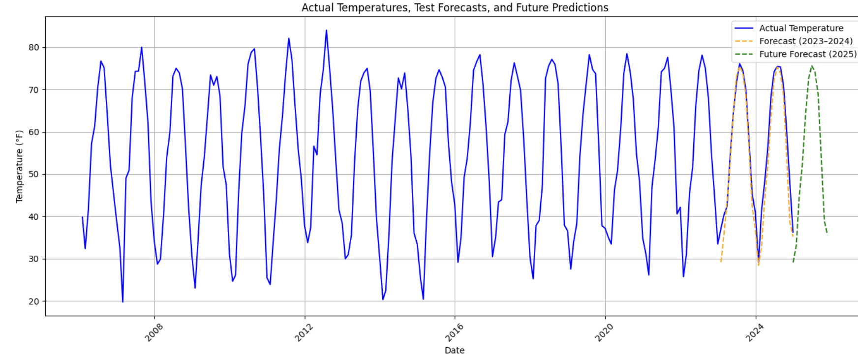
This visualization provides a holistic view of the model’s behavior across time—past, present, and projected future.