Aggregation with the NOAA Dataset
This example is from TDM 102 Project 8 Spring 2024.
These example(s) depend on the database:
-
/anvil/projects/tdm/data/whin/weather.parquet
Learn more about the dataset here.
1. Data Wrangling with Pandas
Read the file into a DataFrame called myDF.
(1a) Convert the observation_time column to into a datetime type.
#part a
import pandas as pd
import datetime
myDF = pd.read_parquet("/anvil/projects/tdm/data/whin/weather.parquet")
myDF['observation_time'] = pd.to_datetime(myDF['observation_time'])
(1b) Create 3 new columns for the year, month and day, based on the column observation_time.
# part b)
myDF['year'] = myDF['observation_time'].dt.year
myDF['month'] = myDF['observation_time'].dt.month
myDF['day'] = myDF['observation_time'].dt.day
(1c) For a given station_id, calculate the average month-and-year-pair temperatures (from the column temperature) for that station_id. Try this for a few different station_id values.
# part c
myDF['year'].unique()
avg_monthly_temp = myDF.groupby(['year','month'])['temperature'].mean()
print(avg_monthly_temp.head())
(1d) Now write a function called get_avg_temp that takes one station_id as input and returns the average month-and-year-pair temperatures (associated with that specific station_id). Make sure that the results of your function match with your work from question 1c.
def get_avg_temp(file, station_id):
    df = pd.read_parquet(file)
    df['observation_time'] = pd.to_datetime(df['observation_time'])
    df = df[df['station_id'] == station_id]
    #convert to datetime datatype and add year/month/day cols
    df['year'] = df['observation_time'].dt.year
    df['month'] = df['observation_time'].dt.month
    df['day'] = df['observation_time'].dt.day

    # calculate avg temp per month
    avg_monthly_temp = df.groupby(['year','month'])['temperature'].mean()

    return avg_monthly_temp
2. Data Visualization & Analysis
For this function, be sure to import matplotlib.pyplot.
We will use the function from question 1d to make some line plots.
(2a) For a given station_id, create a line plot, with one line for each year. Try this for a few different station_id values.
import matplotlib.pyplot as plt
# Try it for station_id = 1
avg_temp_by_month = get_avg_temp("/anvil/projects/tdm/data/whin/weather.parquet", 1)
avg_temp_by_month = avg_temp_by_month.to_frame().reset_index()

plt.figure(figsize=(10, 6))
for year in avg_temp_by_month['year'].unique():
    df_year = avg_temp_by_month[avg_temp_by_month['year'] == year]
    plt.plot(df_year['month'], df_year['temperature'], label=str(year), marker='o')

plt.title('Average Monthly Temperature for Station 1 Over the Years')
plt.xlabel('Month')
plt.ylabel('Average Temperature')
plt.legend(title='Year', loc='upper left')
plt.xticks(range(1, 13))
plt.grid(True)

plt.show()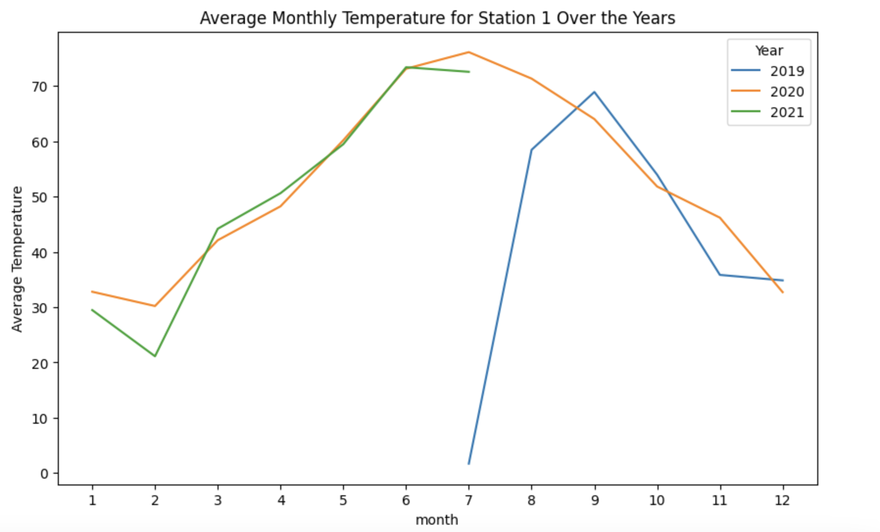
(2b) Now that you are sure your analysis from 2a works well, wrap your work from question 2a into a function that takes a station_id as input, and creates a line plot, with one line for each year (for the average month-and-year-pair temperatures from that station_id).
# part c
def get_avg_temp(file, station_id):
    df = pd.read_parquet(file)
    df['observation_time'] = pd.to_datetime(df['observation_time'])
    df = df[df['station_id'] == station_id]
    #convert to datetime datatype and add year/month/day cols
    df['year'] = df['observation_time'].dt.year
    df['month'] = df['observation_time'].dt.month
    df['day'] = df['observation_time'].dt.day

    # calculate avg temp per month
    avg_temp_by_month = df.groupby(['year','month'])['temperature'].mean()
    avg_temp_by_month = avg_temp_by_month.to_frame().reset_index()

    plt.figure(figsize=(10, 6))
    for year in avg_temp_by_month['year'].unique():
        df_year = avg_temp_by_month[avg_temp_by_month['year'] == year]
        plt.plot(df_year['month'], df_year['temperature'], label=str(year))
        plt.title('Average Monthly Temperature for Station 1 Over the Years')
        plt.xlabel('month')
        plt.ylabel('Average Temperature')
        plt.legend(title='Year', loc='best')
        plt.xticks(range(1, 13))
    plt.show()
avg_temp_by_month = get_avg_temp("/anvil/projects/tdm/data/whin/weather.parquet",1)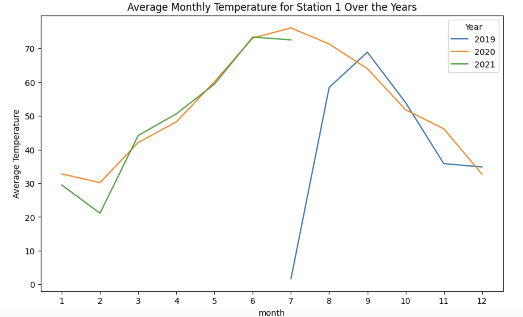
3. More Data Visualization & Analysis
(3a) Revisit the function from question 1d, to find the maximum temperature (instead of the average temperature) in each month-and-year-pair, for a given station. As before, you should test this for several examples before you build the function, and then make sure your function matches your examples.
# part a
df = pd.read_parquet("/anvil/projects/tdm/data/whin/weather.parquet")
df['observation_time'] = pd.to_datetime(df['observation_time'])
df = df[df['station_id'] == 1]
df['year'] = df['observation_time'].dt.year
df['month'] = df['observation_time'].dt.month
df['day'] = df['observation_time'].dt.day
df['year'].unique()
max_monthly_temp = df.groupby(['year','month'])['temperature'].max()
print(max_monthly_temp.head())
(3b) Revisit the function from question 2b, to make a function that takes one station_id as input and it creates a bar plot (instead of a line plot), depicting the maximum temperature in each month-and-year-pair (instead of the average temperature).
# part b
def get_max_temp(file, station_id):
    df = pd.read_parquet(file)
    df['observation_time'] = pd.to_datetime(df['observation_time'])
    df = df[df['station_id'] == station_id]
    #convert to datetime datatype and add year/month/day cols
    df['year'] = df['observation_time'].dt.year
    df['month'] = df['observation_time'].dt.month
    df['day'] = df['observation_time'].dt.day

    # calculate max temp per month
    avg_temp_by_month = df.groupby(['year','month'])['temperature'].max()
    avg_temp_by_month = avg_temp_by_month.to_frame().reset_index()

    plt.figure(figsize=(10, 6))
    for year in avg_temp_by_month['year'].unique():
        df_year = avg_temp_by_month[avg_temp_by_month['year'] == year]
        plt.plot(df_year['month'], df_year['temperature'], label=str(year))
        plt.title('Average Monthly Temperature for Station 1 Over the Years')
        plt.xlabel('month')
        plt.ylabel('Average Temperature')
        plt.legend(title='Year', loc='best')
        plt.xticks(range(1, 13))
    plt.show()

    return max_monthly_temp
max_temp_by_month = get_max_temp("/anvil/projects/tdm/data/whin/weather.parquet",1)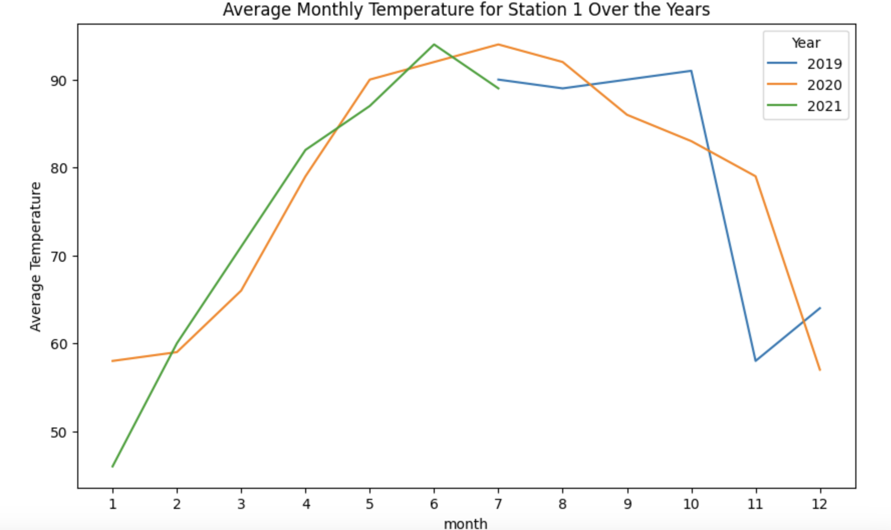
4. Data Visualization – Wind Speed Analysis
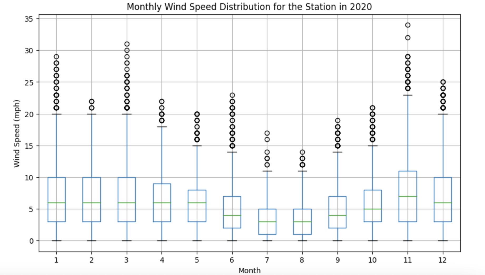
(4a) For a given station_id, create a box plot that shows the month-by-month wind speeds in 2020 for that specified station_id. Try this for a few different station_id values.
import pandas as pd
import matplotlib.pyplot as plt

file = "/anvil/projects/tdm/data/whin/weather.parquet"
# Part (a)
def plot_wind_2020(dataset, station_id):
df = pd.read_parquet(dataset)
station_df = df[df['station_id'] == station_id].copy()
station_df['observation_time'] = pd.to_datetime(station_df['observation_time'])
station_df['year'] = station_df['observation_time'].dt.year
station_df['month'] = station_df['observation_time'].dt.month
station_new_df = station_df[station_df['year'] == 2020]
station_new_df.boxplot(column='wind_speed_mph', by='month', figsize=(10, 6))
plt.title('Monthly Wind Speed Distribution for the Station in 2020')
plt.suptitle('')
plt.xlabel('Month')
plt.ylabel('Wind Speed (mph)')
plt.show()
return station_new_df(4b) Write a function that takes a year (not necessarily 2020) and a station_id as inputs, and the function creates a box plot about the month-by-month wind speeds in that specific year (not necessarily 2020), at the specified station_id.
# Part (b)
def plot_wind_dist(dataset, station_id, year):
    df = pd.read_parquet(dataset)
    station_df = df[df['station_id'] == station_id].copy()

    station_df['observation_time'] = pd.to_datetime(station_df['observation_time'])
    station_df['year'] = station_df['observation_time'].dt.year
    station_df['month'] = station_df['observation_time'].dt.month

    station_new_df = station_df[station_df['year'] == year]

    station_new_df.boxplot(column='wind_speed_mph', by='month', figsize=(10, 6))
    plt.title('Monthly Wind Speed Distribution for the Station in {}'.format(year))
    plt.suptitle('')
    plt.xlabel('Month')
    plt.ylabel('Wind Speed (mph)')
    plt.show()
    return station_new_df

wind_df = plot_wind_2020(file, 1)
wind_df = plot_wind_dist(file, 1, 2019)