Linear Regression with Spotify Data
Project Objectives
In this project, you will build a linear regression model to predict the popularity of a song using features such as duration, loudness, and many more features. You’ll clean and prepare a Spotify dataset, and explore patterns in songs. Along the way, you’ll practice dealing with the model’s assumptions, dealing with multicollinearity, handling outliers, and feature selection. You’ll build the model and interpret it’s results.
|
Use 4 cores for this project. |
Why Linear Regression?
Linear regression is a simple but powerful method for predicting a quantitative (continuous) target variable.
Even though newer models exist, linear regression remains popular because:
-
Results can be interpreted directly (coefficients show how predictors affect the target).
-
You can use a single predictor variable or multiple predictors.
-
Math behind the model is more transparent compared to black-box models.
-
You can model the relationship between a numeric response and one (or more) predictors.
We will use the Spotify Dataset (1986–2023) for this project. Our target variable, popularity, is what we aim to predict, and it is continuous, ranging from 0 to 100.
Dataset
-
/anvil/projects/tdm/data/spotify/linear_regression_popularity.csv
Learn more about the source: Spotify Dataset 1986–2023. Feature names and their descriptions are below for your reference:
| Feature | Description |
|---|---|
track_id |
Unique identifier for the track |
track_name |
Name of the track |
popularity |
Popularity score (0–100) based on Spotify plays |
available_markets |
Markets/countries where the track is available |
disc_number |
Disc number (for albums with multiple discs) |
duration_ms |
Track duration in milliseconds |
explicit |
Whether the track contains explicit content (True/False) |
track_number |
Position of the track within the album |
href |
Spotify API endpoint URL for the track |
album_id |
Unique identifier for the album |
album_name |
Name of the album |
album_release_date |
Release date of the album |
album_type |
Album type (album, single, compilation) |
album_total_tracks |
Total number of tracks in the album |
artists_names |
Names of the artists on the track |
artists_ids |
Unique identifiers of the artists |
principal_artist_id |
ID of the principal/primary artist |
principal_artist_name |
Name of the principal/primary artist |
artist_genres |
Genres associated with the principal artist |
principal_artist_followers |
Number of Spotify followers of the principal artist |
acousticness |
Confidence measure of whether the track is acoustic (0–1) |
analysis_url |
Spotify API URL for detailed track analysis |
danceability |
How suitable a track is for dancing (0–1) |
energy |
Intensity and activity measure of the track (0–1) |
instrumentalness |
Predicts whether a track contains vocals (0–1) |
key |
Estimated key of the track (integer, e.g., 0=C, 1=C#/Db) |
liveness |
Presence of an audience in the recording (0–1) |
loudness |
Overall loudness of the track in decibels (dB) |
mode |
Modality of the track (1=major, 0=minor) |
speechiness |
Presence of spoken words (0–1) |
tempo |
Estimated tempo in beats per minute (BPM) |
time_signature |
Estimated overall time signature |
valence |
Musical positivity/happiness of the track (0–1) |
year |
Year the track was released |
duration_min |
Track duration in minutes |
Simple Linear Regression
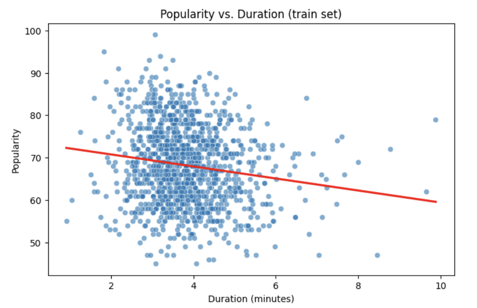
Let’s start with a simple example by predicting popularity from a single feature (e.g., duration of the song in minutes).
import matplotlib.pyplot as plt
import seaborn as sns

# Convert duration to minutes for training data

duration_min_train = X_train["duration_ms"] / 60000

# See how the relation is between duration and popularity with a scatter plot:

plt.figure(figsize=(8,5))
sns.scatterplot(x=duration_min_train, y=y_train, alpha=0.6)
sns.regplot(x=duration_min_train, y=y_train, scatter=False, color="red", ci=None)

plt.xlabel("Duration (minutes)")
plt.ylabel("Popularity")
plt.title("Popularity vs. Duration (train set)")
plt.show()
Predictor (X): Duration (minutes)
Response (Y): popularity
Broadly speaking, we would like to model the relationship between X and Y using the form:
Y = f(X) + $\epsilon$
-
If we fit the data with a horizontal line (e.g.,
f(x) = c), the model would not capture the relationship well. This is an example of underfitting. -
If we fit the data with a very wiggly curve that passes through nearly every point, the model becomes too complex. This is an example of overfitting.
So, our goal is to find a line that captures the main trend without falling into either extreme (underfitting or overfitting). The regression line should summarize the relationship between popularity (Y) and duration (X) well.
How Do We Define a Good Line?
We would like to use a linear function of X, writing our model with $\beta_1$ as the slope:
This shows:
-
$\beta_0$ = intercept,
-
$\beta_1$ = slope (how much $Y$ changes for a one-unit change in $X$),
-
$\epsilon_i$ = error term.
In simple linear regression, we model $Y$ as a linear relationship with $X_i$.
A good line is defined as one that produces small errors or residuals, meaning the predicted values are close to the observed values. In other words, the best line is the one where as many points as possible lie close to the regression line.
We find the line that minimizes the sum of all squared distances from the points to the line. That is:
In practice, software like Python’s statsmodels solves this using calculus and linear algebra. For example, the code below would estimate the coefficient for you with ordinary least squares (OLS) and then you can view the results using model.summary().
import statsmodels.api as sm
X = df[["duration_min"]]
y = df["popularity"]
X = sm.add_constant(X)
model = sm.OLS(y, X).fit()
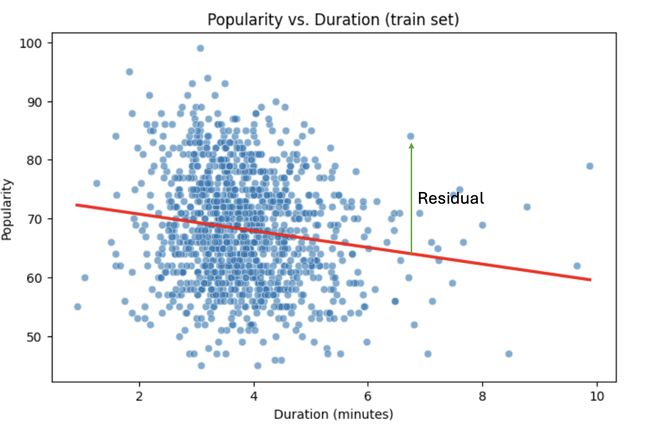
print(model.summary())Residuals
Residuals are the errors between observed and predicted values:
Residual = Observed Popularity – Predicted Popularity ($y - \hat(y)$)
Interpretation of Coefficient (Simple Linear Regression)
The slope $\beta_1$:
-
Tells us how much our target, popularity, changes (on average) for each additional minute of track duration.
-
If $\beta_1 < 0$, longer songs tend to be less popular.
-
If $\beta_1 > 0$, longer songs tend to be more popular.
Assumptions
When building a linear regression model, it is important to check it’s assumptions. We will go deeper into what the assumptions are in question 5. If the assumptions are satisfied, we can trust the results of inference. If they are not, the results lose validity, for example, hypothesis tests may lead to misleading accept/reject decisions. In other words: if you’re giving a linear regression model information that doesn’t meet it’s assumptions, it will give you invalid information back.
Parts of these explanations have been adapted from Applied Statistics with R (Dalpiaz, book.stat420.org).
Other Important Terms
-
Slope tells us the direction/magnitude of the relationship (duration vs. popularity).
-
Residuals show the difference between actual popularity and predicted popularity.
-
R² tells us how much of the variation in popularity is explained by predictors.
-
p-value for the slope tests whether the relationship is statistically significant or could be due to chance.
-
We can expand the model by adding more features (
loudness,danceability,energy,valence, etc.) for better predictions → this is called Multiple Linear Regression which we will explain in question 2.
Reading and Preparing the Data
In this section, we will load the Spotify popularity dataset and prepare it for modeling. This includes reading the data into Python, removing unnecessary columns, and separating the prediction target from the feature variables.
Step 1: Read the Data
We begin by reading the dataset into Python using pandas. After loading the data, we print the first five rows to get an initial sense of the structure and variables included in the dataset. We will store the dataset in a DataFrame called spotify_popularity_data.
import pandas as pd

spotify_popularity_data = pd.read_csv("/anvil/projects/tdm/data/spotify/linear_regression_popularity.csv")

spotify_popularity_data.head()
Step 2: Remove Unnecessary Columns
The original dataset contains many columns that are not needed for our analysis, such as identifiers, text-based fields, and metadata related to albums and artists. To simplify the dataset and focus on numeric features relevant for modeling, we drop these columns.
For more information on the drop function, you can refer to the pandas documentation:
pandas.pydata.org/docs/reference/api/pandas.DataFrame.drop.html
drop_cols = [
    "Unnamed: 0", "Unnamed: 0.1", "track_id", "track_name", "available_markets", "href",
    "album_id", "album_name", "album_release_date", "album_type",
    "artists_names", "artists_ids", "principal_artist_id",
    "principal_artist_name", "artist_genres", "analysis_url", "duration_min"
]

# Drop unnecessary columns
spotify_popularity_data = spotify_popularity_data.drop(columns=drop_cols)

for col in spotify_popularity_data:
    print(col)
After dropping these columns, the dataset now includes the following variables:
popularity
disc_number
duration_ms
explicit
track_number
album_total_tracks
principal_artist_followers
acousticness
danceability
energy
instrumentalness
key
liveness
loudness
mode
speechiness
tempo
time_signature
valence
year
Step 3: Define the Target and Features
Next, we separate the dataset into a prediction target and a set of feature variables.
In this project, we are interested in predicting song popularity. Therefore, we use the popularity column as our target variable y, and all remaining columns as the feature matrix X.
# Target and features
y = spotify_popularity_data["popularity"].copy()
X = spotify_popularity_data.drop(columns=["popularity"]).copy()

# Quick check
print(X.shape)
print(y.shape)
This confirms that we have 1,500 observations and 19 feature variables, with one corresponding popularity value for each observation.
(1500, 19)
(1500,)
Splitting the Data and Understanding the Data
Multiple Linear Regression
Most of the time, a single feature is not enough to explain the behavior of the target variable or to predict it. Multiple Linear Regression (MLR) uses several predictors in the model.
Interpretation:
-
Each coefficient $\beta_i$ is the expected change in $Y$ for a 1-unit change in $X_i$, holding all the other predictors constant.
Why use it?
-
More predictors can help captures more of what explains popularity (e.g., duration might not be enough for accurate predictions, but combined with more variables it can help).
Splitting the Data
Models are not trained on entire datasets. Instead, we partition the data into multiple subsets to serve distinct roles in the model development process. The most common partitioning scheme involves subsets:
-
Training data is what the model actually learns from. It’s used to find patterns and relationships between the features and the target.
-
Test data is completely held out until the very end. It gives us a final check to see how well the model is likely to perform on brand-new data it has never seen before.
Understanding the Subsets
In supervised learning, our dataset is split into predictors (X) and a target variable (y). We can further divide these into training, and test subsets to properly evaluate model performance and prevent overfitting.
|
In practice, it’s recommended to use cross-validation, which provides a more reliable estimate of a model’s performance by repeatedly splitting the data into training and validation sets and averaging the results. This helps reduce the variability that can come from a single random split. However, for this project, we will only perform a single random train/test split using a fixed random seed. |
Now that the data has been cleaned and structured, we move on to splitting the dataset into training and testing sets and exploring the distribution of the response variable. These steps are essential for building and evaluating predictive models.
Step 1: Create a Train/Test Split
To evaluate model performance fairly, we split the dataset into training and testing subsets. We use an 80/20 split, where 80% of the data is used for training and 20% is reserved for testing. A fixed random_state is set to ensure reproducibility.
from sklearn.model_selection import train_test_split

X_train, X_test, y_train, y_test = train_test_split(
    X, y, test_size=0.2, random_state=42
)

print("X_train shape:", X_train.shape)
print("X_test  shape:", X_test.shape)
print("y_train shape:", y_train.shape)
print("y_test  shape:", y_test.shape)
This confirms that the training set contains 1,200 observations and the test set contains 300 observations.
X_train shape: (1200, 19)
X_test  shape: (300, 19)
y_train shape: (1200,)
y_test  shape: (300,)
Step 2: Examine the Distribution of Popularity
Before fitting any models, it is helpful to understand the distribution of the target variable. We begin by visualizing the popularity values in the training set using a histogram.
import matplotlib.pyplot as plt
import seaborn as sns

plt.figure(figsize=(8,5))
sns.histplot(y_train, bins=30, kde=True)
plt.xlabel("Popularity")
plt.ylabel("Count")
plt.title("Distribution of Track Popularity (Training Set)")
plt.show()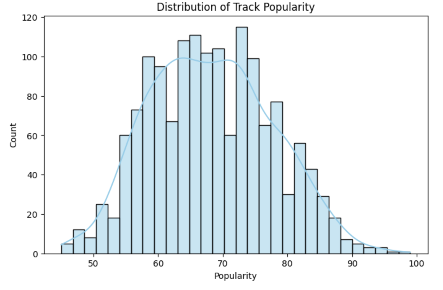
After examining the histogram, we observe that the popularity distribution appears roughly symmetric and approximately normal. There is a slight right tail near the upper bound (around 100), but no strong outliers. Most popularity values fall between roughly 45 and 100, with the mean near the upper-middle of this range.
Step 3: Explore the Relationship Between Popularity and Duration
Next, we explore the relationship between song duration and popularity. Since duration is measured in milliseconds, we first convert it to minutes for easier interpretation. We then create a scatterplot using the training data and overlay a fitted linear regression line.
# Convert duration to minutes for training data
duration_min_train = X_train["duration_ms"] / 60000

plt.figure(figsize=(8,5))
sns.scatterplot(x=duration_min_train, y=y_train, alpha=0.6)
sns.regplot(x=duration_min_train, y=y_train, scatter=False, ci=None)

plt.xlabel("Duration (minutes)")
plt.ylabel("Popularity")
plt.title("Popularity vs. Duration (Training Set)")
plt.show()From the scatterplot, we observe a weak relationship between track duration and popularity, with popularity varying widely across different song lengths. The regression line represents the best-fitting linear trend by minimizing the sum of squared residuals, providing a simple summary of the overall direction of the relationship despite substantial variability in the data.
Checking for Multicollinearity and Influential Points
$R^2$ (R-squared)
-
$R^2$ measures how well our regression model explains the variation in $Y$.
-
It is the proportion of variability in $Y$ that can be explained by the predictors $X_1, X_2, \dots, X_p$.
-
The value is always between $0$ and $1$:
-
$R^2 = 0$ → the model explains none of the variation in $Y$.
-
$R^2 = 1$ → the model perfectly explains all the variation in $Y$.
-
$R^2$ can also be expressed using sums of squares from the fitted model versus the mean-only model:
-
$SS(\text{fit}) =$ sum of squared errors from the regression model,
-
$SS(\text{mean}) =$ sum of squared errors from the model that only uses the mean of $Y$ (no predictors).
Checking Multicollinearity with VIF
Before fitting our model, we use Variance Inflation Factor (VIF) to check for multicollinearity. Multicollinearity occurs when predictors are highly correlated with each other, which can inflate standard errors, make coefficient estimates unstable, and reduce the reliability of our interpretations.
VIF(Xᵢ) = 1 / (1 – ${R_i}^2$),
where ${R_i}^2$ is the $R^2$ from a regression of $X_i$ onto all of other predictors. You can see that having ${R_i}^2$ close to one shows signs of high correlation (collinearity) and so the VIF will be large.
A VIF above 10 suggests the variable is highly collinear and may need to be removed (this is a common threshold).
Influential Observations and Cook’s Distance
Some outliers only change the regression line a small amount, while others have a large effect. Observations that fall into the second category are called influential. A common measure of influence is Cook’s Distance, which is defined as:
A Cook’s Distance is often considered large if:
An observation with a large Cook’s Distance is called influential.
How we use it:
-
4/nis a simple rule of thumb for flagging unusually influential points with Cook’s Distance. -
n= number of rows in your training data. -
As
ngets larger,4/ngets smaller, the bar for “unusually influential” gets stricter.
Before fitting a linear regression model, it is important to ensure that the feature set does not suffer from severe multicollinearity and that influential outliers are appropriately handled. In this section, we use Variance Inflation Factor (VIF) to diagnose multicollinearity and Cook’s Distance to identify influential observations in the training data.
Step 1: Evaluate Multicollinearity Using VIF
We begin by assessing multicollinearity among the predictor variables using the Variance Inflation Factor (VIF). VIF measures how strongly each feature is linearly related to the other features in the model. Large VIF values indicate high multicollinearity, which can inflate standard errors and destabilize coefficient estimates.
Before computing VIF, we ensure that all variables are numeric by converting boolean columns to integers. We then use a provided iterative function that repeatedly removes the variable with the highest VIF until all remaining variables have VIF values below a specified threshold. In this project, we use a commonly accepted threshold of 10.
import pandas as pd
import numpy as np
from statsmodels.stats.outliers_influence import variance_inflation_factor

# Convert booleans to ints
bool_cols = X_train.select_dtypes(include=["bool"]).columns
if len(bool_cols):
    X_train[bool_cols] = X_train[bool_cols].astype(int)


def calculate_vif_iterative(X, thresh=10.0):
    X_ = X.astype(float).copy()
    while True:
        vif_df = pd.DataFrame({
            "variable": X_.columns,
            "VIF": [
                variance_inflation_factor(X_.values, i)
                for i in range(X_.shape[1])
            ]
        }).sort_values("VIF", ascending=False).reset_index(drop=True)

        max_vif = vif_df["VIF"].iloc[0]
        worst = vif_df["variable"].iloc[0]

        if (max_vif <= thresh) or (X_.shape[1] <= 1):
            return X_, vif_df.sort_values("VIF")

        print(f"Dropping '{worst}' with VIF={max_vif:.2f}")
        X_ = X_.drop(columns=[worst])
Step 2: Filter Features Based on VIF
Next, we run the iterative VIF function using a threshold of 10. The function returns two objects: a filtered version of X_train containing only variables with acceptable VIF values, and a summary table listing the remaining variables and their corresponding VIFs.
# Run iterative VIF filtering
result_vif = calculate_vif_iterative(X_train, thresh=10.0)

# Split into the filtered dataset and the VIF summary
X_train = result_vif[0]
vif_summary = result_vif[1]
During this process, several highly collinear variables are removed:
Dropping 'year' with VIF=320.29
Dropping 'time_signature' with VIF=92.09
Dropping 'disc_number' with VIF=46.33
Dropping 'energy' with VIF=19.81
Dropping 'danceability' with VIF=19.10
Dropping 'tempo' with VIF=12.17
The remaining variables and their VIF values are shown below:
| Variable | VIF |
|---|---|
instrumentalness |
1.243990 |
principal_artist_followers |
1.420775 |
explicit |
1.696639 |
acousticness |
2.259710 |
speechiness |
2.419409 |
liveness |
2.551417 |
track_number |
2.854535 |
mode |
2.959880 |
key |
3.133896 |
valence |
5.012910 |
album_total_tracks |
5.030855 |
loudness |
6.561215 |
duration_ms |
9.724675 |
All remaining features now have VIF values at or below the threshold, indicating acceptable levels of multicollinearity.
Step 3: Identify Influential Observations Using Cook’s Distance
After addressing multicollinearity, we examine the training data for influential observations using Cook’s Distance. Cook’s Distance measures how much each observation influences the fitted regression coefficients. Observations with unusually large Cook’s Distance values can disproportionately affect the model’s results.
We fit a linear regression model on the cleaned training data and compute Cook’s Distance for each observation. Any observation with Cook’s Distance greater than $4/n$, where $n$ is the number of observations, is flagged as potentially influential.
import statsmodels.api as sm

# Align and clean training data
X_train_cook = X_train.loc[X_train.index.intersection(y_train.index)]
y_train_cook = y_train.loc[X_train_cook.index]

# Keep only rows without missing or infinite values
mask = np.isfinite(X_train_cook).all(1) & np.isfinite(y_train_cook.to_numpy())
X_train_cook, y_train_cook = X_train_cook.loc[mask], y_train_cook.loc[mask]

# Fit model on the cleaned data
ols_model_cook = sm.OLS(
    y_train_cook,
    sm.add_constant(X_train_cook, has_constant="add")
).fit()

# Cook's Distance values
cooks_distance = ols_model_cook.get_influence().cooks_distance[0]
cooks_threshold = 4 / len(X_train_cook)

# Identify influential observations
cooks_outliers = X_train_cook.index[cooks_distance > cooks_threshold]

print(f"Flagged {len(cooks_outliers)} outliers (Cook's D > 4/n).")

# Remove influential observations
X_train = X_train.drop(index=cooks_outliers)
y_train = y_train.drop(index=cooks_outliers)
Flagged 61 outliers (Cook's D > 4/n).Removing features with high multicollinearity is important because strongly correlated predictors can inflate standard errors and make it difficult to interpret which variables are truly associated with the response. Similarly, outliers identified by Cook’s Distance can exert an outsized influence on regression coefficients and distort the model’s fit. By addressing both multicollinearity and influential observations, we build a linear regression model that is more stable, reliable, and interpretable.
Feature Selection and Model Summary
Feature Selection with AIC and Forward Selection
Another important topic when building a model is feature selection. To reduce the number of features, we can use forward selection guided by Akaike Information Criterion (AIC):
$AIC = 2k – 2log(L)$,
where
-
$k$ is the number of parameters in the model,
-
$L$ is the likelihood of the model.
The model with the lowest AIC fits the data by striking a balance between fit and the number of parameters (features) used. If we pick the model with the smallest AIC, we are choosing the model with a low k (fewer features) while still ensuring it has a high likelihood log(L).
-
Forward selection begins with no predictors and adds them one at a time, at each step choosing the variable that leads to the greatest reduction in AIC.
-
Backward elimination begins with all predictors and removes them one at a time, dropping the variable whose removal leads to the greatest reduction in AIC.
-
Stepwise selection is a hybrid approach: it adds variables like forward selection but also considers removing variables at each step (backward pruning) if doing so reduces AIC further.
Feature selection is a very popular and important topic in machine learning. We recommend exploring additional resources to deepen your understanding. One excellent resource is An Introduction to Statistical Learning with Applications in Python (Springer textbook), which is available for free here. The section on Linear Model Selection and Regularization provides a detailed discussion of this topic.
|
AIC is one of several possible criteria for feature selection. While we are using AIC in this project, you could also use:
Each criterion has trade-offs. AIC is popular because it balances model fit and complexity, making it a solid choice when comparing linear regression models. For consistency, we’ll use AIC throughout this project. |
Feature Selection and Model Interpretation
With a cleaned feature set and influential observations removed, we are now ready to build a linear regression model. Before fitting a final model, we perform feature selection to identify a subset of predictors that best explain variation in song popularity while balancing model complexity and goodness of fit.
Step 1: Perform Feature Selection Using Stepwise AIC
To select an appropriate set of predictors, we use stepwise selection with the Akaike Information Criterion (AIC). AIC rewards models that fit the data well but penalizes unnecessary complexity, helping to prevent overfitting.
The provided function implements a hybrid stepwise approach. At each iteration, it considers adding variables (forward selection) while also checking whether any previously added variables should be removed (backward pruning) if doing so further reduces AIC.
import statsmodels.api as sm

def stepwise_aic(X_train, y_train, max_vars=None, verbose=True):
    X = X_train.select_dtypes(include=[np.number]).astype(float).copy()
    y = pd.Series(y_train).astype(float)
    mask = np.isfinite(X).all(1) & np.isfinite(y)
    X, y = X.loc[mask], y.loc[mask]

    remaining, selected = set(X.columns), []
    current_aic = np.inf

    while remaining and (max_vars is None or len(selected) < max_vars):
        aics = [(sm.OLS(y, sm.add_constant(X[selected + [c]], has_constant='add')).fit().aic, c)
                for c in remaining]
        best_aic, best_var = min(aics, key=lambda t: t[0])

        if best_aic + 1e-6 < current_aic:
            selected.append(best_var)
            remaining.remove(best_var)
            current_aic = best_aic
            if verbose:
                print(f"+ {best_var} (AIC {best_aic:.2f})")

            # Backward step
            improved = True
            while improved and len(selected) > 1:
                backs = [(sm.OLS(y, sm.add_constant(X[[v for v in selected if v != d]], has_constant='add')).fit().aic, d)
                         for d in selected]
                back_aic, drop_var = min(backs, key=lambda t: t[0])
                if back_aic + 1e-6 < current_aic:
                    selected.remove(drop_var)
                    remaining.add(drop_var)
                    current_aic = back_aic
                    if verbose:
                        print(f"- {drop_var} (AIC {back_aic:.2f})")
                else:
                    improved = False
        else:
            break

    model = sm.OLS(y, sm.add_constant(X[selected], has_constant='add')).fit()
    return selected, model
Stepwise selection is useful because it helps identify a parsimonious model that balances interpretability and predictive performance. By reducing redundancy and excluding weak predictors, feature selection often leads to more stable coefficient estimates and better generalization.
Step 2: Run Stepwise Selection on the Training Data
Next, we apply the stepwise AIC function to the training data. The function returns both the selected feature names and a fitted OLS model using those features.
results_feature_selection = stepwise_aic(X_train, y_train, max_vars=None, verbose=True)

selected_cols = results_feature_selection[0]   # list of selected features
model = results_feature_selection[1]           # fitted OLS model

print(selected_cols)
During the selection process, features are added sequentially as long as they improve the AIC:
+ principal_artist_followers (AIC 8054.83)
+ duration_ms (AIC 8001.12)
+ loudness (AIC 7961.86)
+ album_total_tracks (AIC 7932.94)
+ acousticness (AIC 7909.56)
+ explicit (AIC 7887.99)
+ mode (AIC 7873.37)
+ valence (AIC 7861.57)
+ track_number (AIC 7858.87)
+ key (AIC 7857.61)
+ speechiness (AIC 7857.16)
The final selected model includes variables related to artist popularity, audio characteristics, and track structure. This suggests that both musical features and artist-level signals contribute to explaining song popularity.
Step 3: Interpret the Final Regression Model
We now examine the summary of the fitted regression model to interpret coefficient estimates, statistical significance, and overall model performance.
print(model.summary())The model explains approximately 29% of the variability in song popularity ($R^2 = 0.289$), which is reasonable given the complexity of popularity as an outcome. Several predictors, such as principal_artist_followers, loudness, acousticness, and explicit, have statistically significant positive relationships with popularity. Other variables, including album_total_tracks, mode, and track_number, show significant negative associations.
Not all variables are statistically significant at conventional levels; for example, key and speechiness have larger p-values, suggesting weaker evidence of association with popularity. Overall, the results indicate that while the model captures meaningful trends, there remains substantial unexplained variability, leaving room for improvement through additional features or alternative modeling approaches.
Checking Assumptions of Linear Regression Model
Linear Regression Assumptions
Often we talk about the assumptions of this model, which are remembered by LINE.
-
Linear. The relationship between $Y$ and the predictors is linear.
-
Independent. The errors $\epsilon_i$ are independent.
-
Normal. The errors $\epsilon_i$ are normally distributed (the “error” around the line follows a normal distribution).
-
Equal Variance. At each value of $x$, the variance of $Y$ is the same, $\sigma^2$.
|
If you are a data science or statistics major, a solid understanding of these assumptions is frequently discussed in coursework and often asked about during interviews for data science roles. We encourage you to not only memorize these assumptions but also develop a clear understanding of their meaning and implications. |
Normality Assumption - Histogram
We have several ways to assess the normality assumption. A simple check is a histogram of the residuals, if it looks roughly bell-shaped and symmetric, that supports treating the errors as approximately normal.
Normality Assumption - Q-Q plot
Another visual method for assessing the normality of errors, which is more powerful than a histogram, is a normal quantile-quantile plot, or Q-Q plot for short.
Essentially, if the points in a Q–Q plot don’t lie close to the straight line, that suggests the data are not normal. In essence, the plot puts the ordered sample values (sample quantiles) on the y-axis against the quantiles you’d expect under a normal distribution (theoretical quantiles) on the x-axis. Implementation details vary by software, but the idea is the same.
Independence Assumption - Durbin–Watson Independence Test
-
The question is “Are the residuals independent?”
-
If one residual is high and the next is also high, there’s positive autocorrelation. If they tend to alternate up/down, there’s negative autocorrelation. If there’s no pattern in residuals, they’re independent.
Rule of thumb:
-
~2 → residuals are approximately independent
-
< 2 → positive autocorrelation (closer to 0 is stronger)
-
> 2 → negative autocorrelation (closer to 4 is stronger)
Equal Variance Assumption - Residuals versus Fitted Values Plot
A Fitted vs. Residuals plot is one of the most useful diagnostics for checking the linearity and equal variance (homoscedasticity) assumptions.
What to look for:
-
Zero-centered residuals.
-
At any fitted value, the average residual should be about 0. This supports the linearity assumption. We can add a horizontal reference line at y = 0 to make this clear.
-
Even spread (constant variance).
-
Across all fitted values, the spread of residuals should be roughly the same.
After fitting the linear regression model, it is important to evaluate whether the key assumptions of linear regression are reasonably satisfied. In this section, we examine the normality, independence, and homoscedasticity assumptions by analyzing the model residuals.
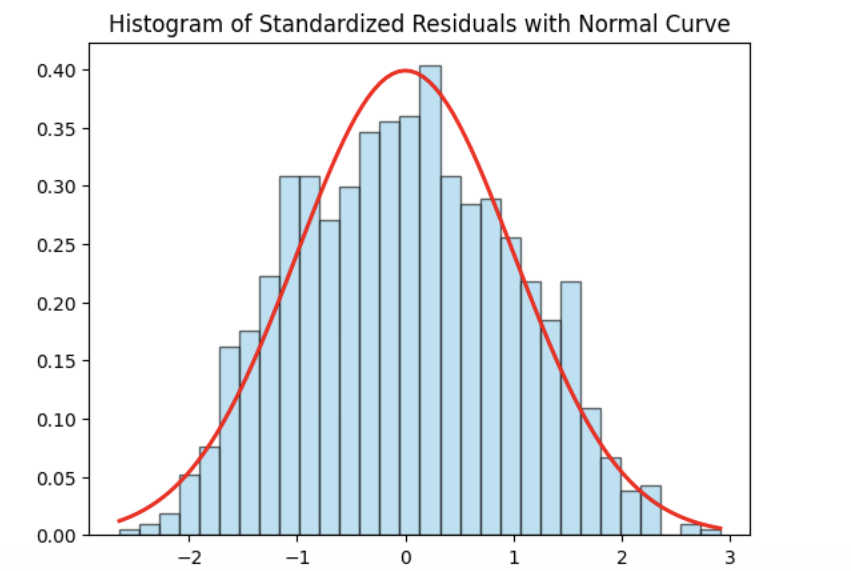
Step 1: Check Normality Using a Histogram of Residuals
We begin by examining the normality of the residuals using a histogram of standardized residuals overlaid with a standard normal density curve. Standardizing the residuals allows us to directly compare their distribution to a normal distribution with mean 0 and variance 1.
import matplotlib.pyplot as plt
import statsmodels.api as sm
import scipy.stats as stats
import numpy as np

# Residuals
resid = model.resid
z = (resid - np.mean(resid)) / np.std(resid, ddof=1)

# Histogram with normal curve
plt.hist(z, bins=30, density=True, alpha=0.6, edgecolor="black")
x = np.linspace(z.min(), z.max(), 100)
plt.plot(x, stats.norm.pdf(x, 0, 1), "r", linewidth=2)
plt.title("Histogram of Standardized Residuals with Normal Curve")
plt.xlabel("Standardized Residuals")
plt.ylabel("Density")
plt.show()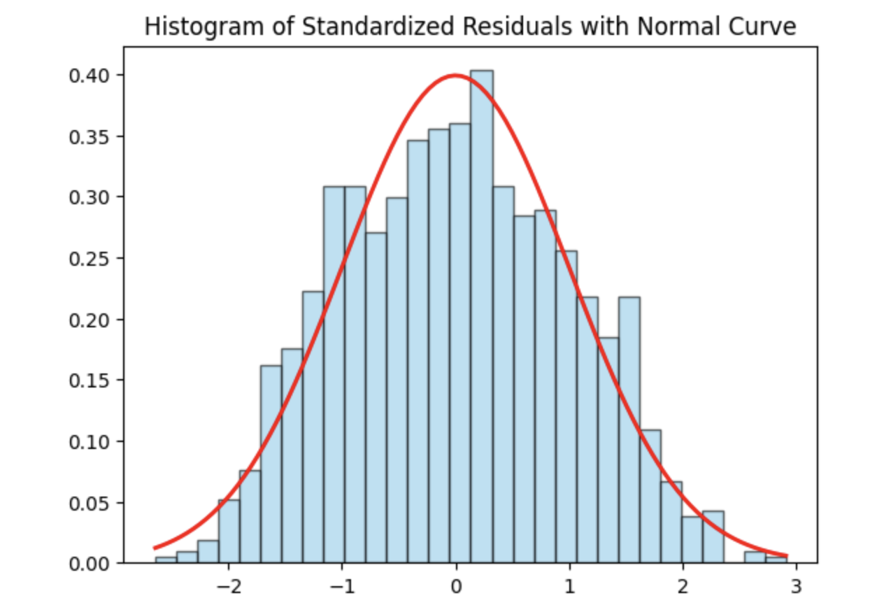
The histogram appears approximately symmetric and closely follows the overlaid normal curve, suggesting that the residuals are reasonably normally distributed. While minor deviations may exist in the tails, there is no strong evidence of severe non-normality. Overall, the model appears to satisfy the normality assumption.
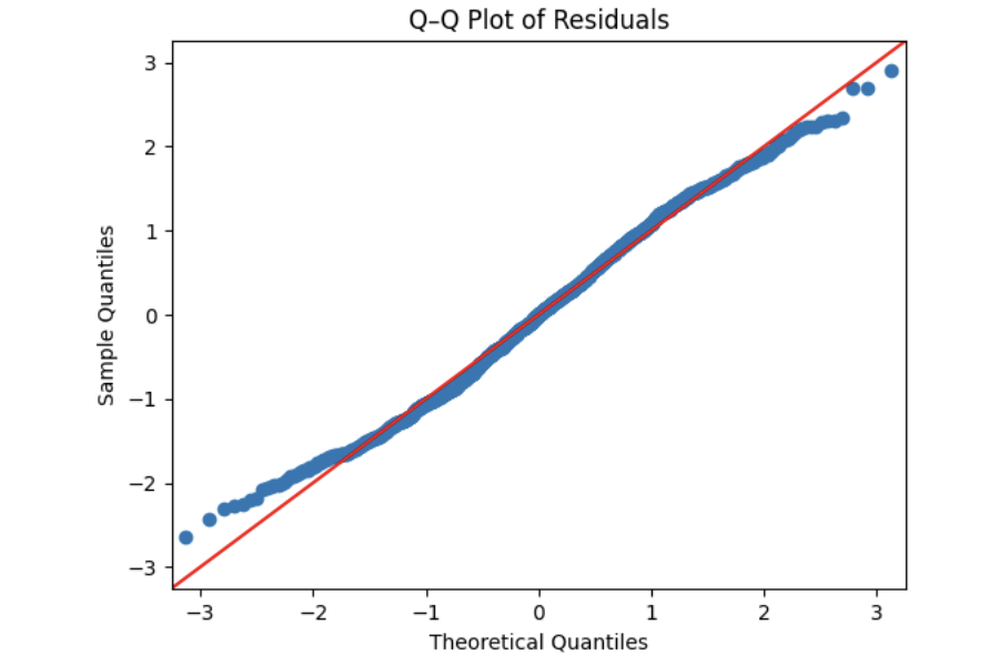
Step 2: Check Normality Using a Q–Q Plot
Next, we assess residual normality using a quantile–quantile (Q–Q) plot. In a Q–Q plot, normally distributed residuals should fall approximately along the 45-degree reference line.
# Q–Q Plot
sm.qqplot(z, line="45", fit=True)
plt.title("Q–Q Plot of Residuals")
plt.show()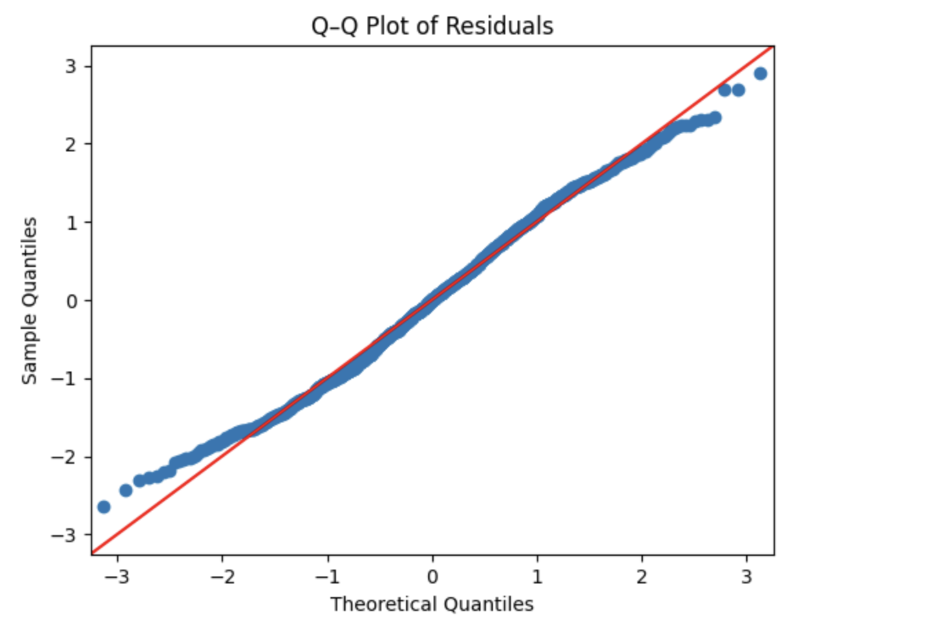
The residuals closely follow the reference line, with only slight deviations at the extremes. This visual evidence further supports the conclusion that the normality assumption is reasonably met for this model.
Step 3: Test Independence Using the Durbin–Watson Statistic
We now test the independence assumption using the Durbin–Watson statistic, which detects autocorrelation in the residuals. Values close to 2 indicate little to no autocorrelation, while values far from 2 suggest potential dependence among residuals.
from statsmodels.stats.stattools import durbin_watson

dw_stat = durbin_watson(resid)
print("[Independence: Durbin–Watson]")
print(f"Statistic={dw_stat:.4f}")
print("H0: Residuals are independent (no autocorrelation).")

if 1.5 < dw_stat < 2.5:
    print("-> Pass (approx. independent)")
else:
    print("-> FAIL: possible autocorrelation")
print()
[Independence: Durbin–Watson]
Statistic=1.9603
H0: Residuals are independent (no autocorrelation).
-> Pass (approx. independent)The Durbin–Watson statistic is very close to 2, indicating that the residuals are approximately independent. Independence is important because correlated residuals can lead to biased standard errors and invalid inference. Based on this test, the model satisfies the independence assumption.
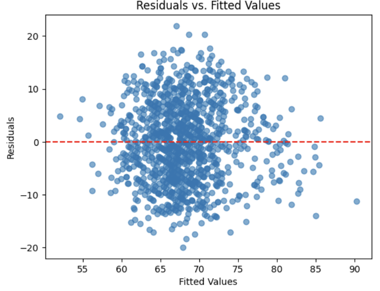
Step 4: Check Linearity and Homoscedasticity Using Residuals vs. Fitted Values
Finally, we examine a residuals versus fitted values plot to assess the assumptions of linearity and constant variance (homoscedasticity). Ideally, residuals should be randomly scattered around zero with no clear patterns or changes in spread.
plt.scatter(model.fittedvalues, resid, alpha=0.6)
plt.axhline(0, color="red", linestyle="--")
plt.title("Residuals vs. Fitted Values")
plt.xlabel("Fitted Values")
plt.ylabel("Residuals")
plt.show()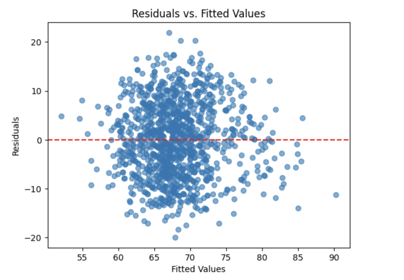
The residuals appear to be evenly scattered around the horizontal reference line with no obvious patterns or funnel shapes. This suggests that the assumptions of linearity and homoscedasticity are reasonably satisfied, supporting the overall validity of the fitted linear regression model.
Model Evaluation and Predicting Song Popularity
In the final stage of the analysis, we evaluate the model’s performance on unseen data and use the fitted regression model to interpret feature effects and make predictions for a new song. These steps help assess how well the model generalizes and how it can be used in practice.
Step 1: Evaluate Model Performance on the Test Set
To assess how well the model generalizes to new data, we compute the coefficient of determination ($R^2$) on the test set. This measures the proportion of variability in song popularity that is explained by the model when applied to unseen observations.
from sklearn.metrics import r2_score
import statsmodels.api as sm

# Ensure test data uses the selected features
X_test = X_test[selected_cols].copy()
mask = np.isfinite(X_test).all(1)
X_test = X_test.loc[mask]
y_test = y_test.loc[X_test.index]

# Predict using the trained OLS model
y_pred = model.predict(sm.add_constant(X_test, has_constant='add'))

# R² on the test set
r2 = r2_score(y_test, y_pred)
print(f"Test R²: {r2:.3f}")
Test R²: 0.250The test set $R^2$ of approximately 0.25 indicates that the model explains about 25% of the variability in song popularity on unseen data. While there is room for improvement, the test $R^2$ is reasonably close to the training $R^2$, suggesting that the model does not suffer from severe overfitting and generalizes moderately well.
Step 2: Interpret Feature Effects and Statistical Significance
Next, we examine a summary table that displays each selected variable’s coefficient, direction of effect, p-value, and statistical significance. This allows us to interpret which features are most strongly associated with popularity and whether their effects are statistically meaningful.
import pandas as pd

alpha = 0.05  # significance threshold

# Extract model components
coef = model.params.rename("coef")
pval = model.pvalues.rename("p_value")
ci = model.conf_int()

# Build summary table
coef_tbl = (
    pd.concat([coef, pval, ci], axis=1)
      .drop(index="const", errors="ignore")
      .assign(
          effect=lambda d: d["coef"].apply(lambda x: "Positive" if x > 0 else "Negative"),
          significant=lambda d: d["p_value"] < alpha
      )
      [["coef", "effect", "p_value", "significant"]]
      .sort_values("p_value")
)

coef_tbl_rounded = coef_tbl.round({"coef": 4, "p_value": 4})
print(coef_tbl_rounded)
coef effect p_value significant
principal_artist_followers 0.0000 Positive 0.0000 True
loudness 0.6164 Positive 0.0000 True
duration_ms -0.0000 Negative 0.0000 True
acousticness 5.4814 Positive 0.0000 True
album_total_tracks -0.1788 Negative 0.0000 True
explicit 2.7251 Positive 0.0000 True
mode -1.9647 Negative 0.0001 True
valence -3.5808 Negative 0.0002 True
track_number -0.1283 Negative 0.0300 True
key 0.1134 Positive 0.0777 False
speechiness -4.6218 Negative 0.1195 FalseSeveral variables, such as principal_artist_followers, loudness, acousticness, and explicit, show strong and statistically significant positive relationships with popularity. Other features, including album_total_tracks, valence, and track_number, are associated with lower popularity. Not all variables are statistically significant; for example, key and speechiness have p-values above 0.05, suggesting weaker evidence of association.
Step 3: Predict Popularity for a New Song
Finally, we use the trained regression model to predict the popularity of a new song based on its known characteristics. This demonstrates how the model can be applied to real-world scenarios.
The new song has the following features:
-
Principal artist followers: 5,000,000
-
Duration: 210,000 ms (approximately 3.5 minutes)
-
Loudness: −6.0
-
Album total tracks: 10
-
Acousticness: 0.20
-
Explicit: 0 (not explicit)
-
Mode: 1 (major key)
-
Valence: 0.40
-
Track number: 3
-
Key: 5 (F major)
-
Speechiness: 0.05
import pandas as pd
import statsmodels.api as sm

new_song = pd.DataFrame([{
    "principal_artist_followers": 5_000_000,
    "duration_ms": 210_000,
    "loudness": -6.0,
    "album_total_tracks": 10,
    "acousticness": 0.20,
    "explicit": 0,
    "mode": 1,
    "valence": 0.40,
    "track_number": 3,
    "key": 5,
    "speechiness": 0.05
}])

# Align columns with the trained model
new_song = new_song.reindex(columns=selected_cols)
new_song = new_song.fillna(X_train[selected_cols].median(numeric_only=True))

pred_pop = model.predict(sm.add_constant(new_song, has_constant="add"))[0]
print(f"Predicted popularity: {pred_pop:.1f}")
Predicted popularity: 68.9Based on the fitted model, the predicted popularity score for this new song is approximately 69. This value reflects the combined influence of artist popularity, audio features, and track characteristics captured by the regression model.
References
Some explanations in this project have been adapted from other sources in statistics and machine learning, as listed below.
-
James, Gareth; Witten, Daniela; Hastie, Trevor; Tibshirani, Robert; Taylor, Jonathan. An Introduction to Statistical Learning: with Applications in Python. Springer Texts in Statistics, 2023.
-
Dalpiaz, David. Applied Statistics with R. Available at: book.stat420.org/
Questions
If you have any questions about this guide or how to implement this model in your own work and project at the Data Mine, please submit a ticket by emailing [email protected]. Purdue students can submit a ticket here as well.