XGBoost Guide
Project Objectives
In this guide, you will build an XGBoost model to accurately predict fertility rates and discover which features in the data are most important for predicting fertility rates around the globe. This guide is designed to walk you through the modeling process, from preparing the data to training, evaluating, and interpreting an XGBoost model. The guide was originally created as a seminar project, so you may notice it follows a question-and-answer format. Even so, it should still serve as a helpful resource to guide you through the process of building your own model.
Dataset
-
/anvil/projects/tdm/data/worldbank/worldbank_data.csv
|
Use 4 cores to replicate this guide in Anvil. |
The Data We Will Model
We will use World Bank data containing fertility_rate (births per woman) along with dozens of socioeconomic and health indicators, including adolescent fertility, infant and child mortality, sector value added, literacy, labor participation, and energy use.
The data was pulled using an API from the World Bank Group. You can learn more about the dataset here: datacatalog.worldbank.org/search/dataset/0037712
A table summarizing the columns and definitions can be found at the end of this guide.
Why XGBoost for Fertility Rates?
Two properties guide our modeling choice:
-
XGBoost is one of the most powerful and widely used machine learning algorithms.
-
It builds models sequentially, learning from the residuals of previous trees.
-
It includes built-in feature selection by evaluating the gain from each feature at every split.
-
It performs well when datasets contain many correlated features.
-
It applies regularization (L1 and L2) to reduce overfitting.
-
It provides feature importance measures such as gain, coverage, and frequency.
Because of these properties, XGBoost is especially effective when working with:
-
High-dimensional datasets,
-
Correlated variables,
-
Uneven or missing values,
-
No clear assumptions about linearity or variable interactions.
In this dataset, we use XGBoost due to the large number of predictors, its strong performance, and its ability to identify which features are most important for predicting fertility rates across countries.
|
Students may find it helpful to watch the visual explanation of gradient boosted trees below before or alongside this project, especially if XGBoost is new to them. |
Step 1: Handling Missing Values Before Modeling
Real-world datasets—especially those combining multiple countries and indicators—often include missing values. Before building a predictive model like XGBoost, we must address these gaps.
Since most columns in this dataset are numeric and measured over time within each country (for example, fertility rate, literacy, and employment), we use linear interpolation to estimate missing values. This method assumes smooth changes between known values and is more informative than simply dropping rows or filling with a single statistic like the mean.
Because each country has its own trajectory, we interpolate within each country group rather than across countries. After interpolation, we apply forward-fill and backward-fill to handle any remaining gaps. These steps preserve as much data as possible, which is especially important when building models that rely on many features.
Load the dataset
import pandas as pd
worldbank_data = pd.read_csv("/anvil/projects/tdm/data/worldbank/worldbank_data.csv")

worldbank_data.head()| Index | country | year | fertility_rate | gdp_per_capita | female_literacy | male_literacy | female_secondary_edu | male_secondary_edu | contraceptive_use | maternal_mortality | … | female_employ_industry | government_health_exp | region_map_Europe & Central Asia | region_map_Latin America & Caribbean | region_map_Middle East | region_map_North Africa | region_map_North America | region_map_Other / Unassigned | region_map_South Asia |
|---|---|---|---|---|---|---|---|---|---|---|---|---|---|---|---|---|---|---|---|---|
region_map_Sub-Saharan Africa |
0 |
Afghanistan |
1960 |
7.282 |
82.481277 |
NaN |
NaN |
NaN |
NaN |
NaN |
NaN |
… |
NaN |
NaN |
0.0 |
0.0 |
0.0 |
0.0 |
0.0 |
0.0 |
1.0 |
0.0 |
1 |
Afghanistan |
1961 |
7.284 |
87.853861 |
NaN |
NaN |
NaN |
NaN |
42.0 |
NaN |
… |
NaN |
NaN |
0.0 |
0.0 |
0.0 |
0.0 |
0.0 |
0.0 |
1.0 |
0.0 |
2 |
Afghanistan |
1962 |
7.292 |
92.199958 |
NaN |
NaN |
NaN |
NaN |
NaN |
NaN |
… |
NaN |
NaN |
0.0 |
0.0 |
0.0 |
0.0 |
0.0 |
0.0 |
1.0 |
0.0 |
3 |
Afghanistan |
1963 |
7.302 |
94.142374 |
NaN |
NaN |
NaN |
NaN |
22.1 |
NaN |
… |
NaN |
NaN |
0.0 |
0.0 |
0.0 |
0.0 |
0.0 |
0.0 |
1.0 |
0.0 |
4 |
Afghanistan |
1964 |
7.304 |
102.459764 |
NaN |
NaN |
NaN |
NaN |
NaN |
NaN |
… |
NaN |
NaN |
0.0 |
0.0 |
Interpolate missing numeric values by country
# Sort by country and year (still useful for organization)
worldbank_data = worldbank_data.sort_values(by=["country", "year"])

# Define numeric columns (excluding 'year')
numeric_cols = worldbank_data.select_dtypes(include="number").columns.difference(["year"])

# Interpolate only values that are still missing
for col in numeric_cols:
    mask = worldbank_data[col].isna()
    interpolated = (
        worldbank_data
        .groupby("country")[col]
        .transform(lambda group: group.interpolate(method="linear", limit_direction="both").ffill().bfill())
    )
    worldbank_data.loc[mask, col] = interpolated[mask]
Confirm that missing values have been resolved
print(worldbank_data[numeric_cols].isna().sum())| Column Name | Missing Values |
|---|---|
access_to_basic_sanitation |
0 |
access_to_electricity |
0 |
adolescent_fertility |
0 |
agriculture_value_added |
0 |
avg_years_schooling |
0 |
births_attended_by_skill |
0 |
births_registered |
0 |
child_mortality_female |
0 |
clean_fuel_access |
0 |
contraceptive_use |
0 |
electricity_consumption |
0 |
energy_use_per_capita |
0 |
female_employ_agriculture |
0 |
female_employ_industry |
0 |
female_employ_services |
0 |
female_labor_participation |
0 |
female_literacy |
0 |
female_parliament_seats |
0 |
female_property_rights |
0 |
female_secondary_edu |
0 |
female_self_employed |
0 |
fertility_rate |
0 |
gdp_per_capita |
0 |
gini_index |
0 |
government_health_exp |
0 |
health_exp_gdp |
0 |
industry_value_added |
0 |
infant_mortality |
0 |
internet_usage |
0 |
life_expectancy |
0 |
male_labor_participation |
0 |
male_literacy |
0 |
male_secondary_edu |
0 |
maternal_mortality |
0 |
mean_years_schooling_female |
0 |
mobile_subscriptions |
0 |
physicians_per_1000 |
0 |
population_growth |
0 |
poverty_headcount_ratio |
0 |
primary_completion_rate_female |
0 |
region_map_Europe & Central Asia |
0 |
region_map_Latin America & Caribbean |
0 |
region_map_Middle East |
0 |
region_map_North Africa |
0 |
region_map_North America |
0 |
region_map_Other / Unassigned |
0 |
region_map_South Asia |
0 |
region_map_Sub-Saharan Africa |
0 |
road_density |
0 |
school_enrollment_primary_female |
0 |
school_enrollment_primary_male |
0 |
unemployment_female |
0 |
unemployment_male |
0 |
urban_population_pct |
0 |
youth_literacy_female |
0 |
youth_literacy_male |
0 |
Step 2: Exploring Correlation Before Modeling
Before building a predictive model, it is important to understand the relationship between our target variable, fertility_rate, and the features in the dataset.
Correlation helps us see which variables tend to move together with fertility rates. A positive correlation means that two variables increase together. For example, a strong positive correlation between adolescent fertility and total fertility suggests that higher adolescent fertility is associated with higher overall fertility.
A negative correlation means that two variables move in opposite directions. For instance, a strong negative correlation between female literacy and fertility rate suggests that as literacy increases, fertility rates tend to decline.
While correlation does not imply causation, it provides useful context for understanding the data and helps motivate feature selection and interpretation later in the modeling process.
Identify the target variable and it’s mean
worldbank_data["fertility_rate"].mean()3.8148926759901287
Compute correlations with fertility rate
numeric_data = worldbank_data.drop(columns=["country"])

# Correlation matrix on numeric data
correlations = numeric_data.corr()

# Sort correlations with fertility_rate
fert_corr = correlations["fertility_rate"].sort_values(ascending=False)

# Top 5 most positively correlated features (excluding fertility_rate itself)
top5_positive = fert_corr[1:6]
print("Top 5 positively correlated features:")
print(top5_positive)

# Top 5 most negatively correlated features
top5_negative = fert_corr.tail(5)
print("\nTop 5 negatively correlated features:")
print(top5_negative)| Feature | Correlation with fertility_rate |
|---|---|
adolescent_fertility |
0.820256 |
infant_mortality |
0.784289 |
child_mortality_female |
0.761008 |
agriculture_value_added |
0.670910 |
maternal_mortality |
0.629717 |
Top 5 Negatively Correlated Features
| Feature | Correlation with fertility_rate |
|---|---|
primary_completion_rate_female |
-0.690855 |
avg_years_schooling |
-0.735221 |
male_secondary_edu |
-0.735754 |
female_secondary_edu |
-0.778032 |
life_expectancy |
-0.862601 |
The tables above shows the five features most strongly correlated with fertility_rate. Positive correlations indicate features that tend to increase as fertility rate increases, while negative correlations indicate features that tend to decrease as fertility rate increases.
Step 3: Exploring Fertility Rates Across Countries
So far, we have explored how fertility relates to other features numerically. Next, we shift to a geographic perspective, using the most recent data available for each country to examine how fertility rates vary across the world.
To do this, we create a dataset with one row per country, using the most recent year of data available. This allows us to compare countries directly and identify regional trends.
We then visualize these differences using a choropleth map, where each country is shaded based on its fertility rate. Choropleth maps are useful because they make geographic patterns visually apparent in ways that tables often cannot.
You can learn more about choropleth mapping with GeoPandas here: geopandas.org/en/stable/docs/user_guide/mapping.html
Create a country-level fertility dataset
latest_data = worldbank_data.loc[worldbank_data.groupby("country")["year"].idxmax()]
fertility_by_country = latest_data[["country", "year", "fertility_rate"]]
fertility_by_country.head()| Index | Country | Year | Fertility Rate |
|---|---|---|---|
64 |
Afghanistan |
2024 |
4.840000 |
129 |
Africa Eastern and Southern |
2024 |
4.223771 |
194 |
Africa Western and Central |
2024 |
4.497707 |
259 |
Albania |
2024 |
1.348000 |
324 |
Algeria |
2024 |
2.766000 |
Create a choropleth map of fertility rates
import geopandas as gpd, matplotlib.pyplot as plt, pandas as pd

# Load, merge, and plot
(gpd.read_file("https://raw.githubusercontent.com/nvkelso/natural-earth-vector/master/geojson/ne_110m_admin_0_countries.geojson")
 .assign(ADMIN_norm=lambda d: d["ADMIN"].str.lower())
 .merge(fertility_by_country[fertility_by_country["year"] == 2024]
        .assign(fertility_rate=lambda d: pd.to_numeric(d["fertility_rate"], errors="coerce"),
                name_norm=lambda d: d["country"].str.lower().replace({
                    "united states": "united states of america",
                    "north macedonia": "republic of north macedonia",
                    "kyrgyz republic": "kyrgyzstan"}))
        .rename(columns={"country": "name"})
        .query("~name.str.contains('income|world|OECD|IDA|IBRD|region|fragile', case=False)"),
        left_on="ADMIN_norm", right_on="name_norm", how="left")
 [lambda d: ~d["ADMIN"].isin(["Antarctica", "Falkland Islands", "French Southern and Antarctic Lands"])]
 .plot(column="fertility_rate", cmap="YlOrRd", legend=True, figsize=(15, 8), missing_kwds={"color": "lightgrey"}))

plt.title("Fertility Rate by Country (2024)")
plt.axis("off")
plt.show()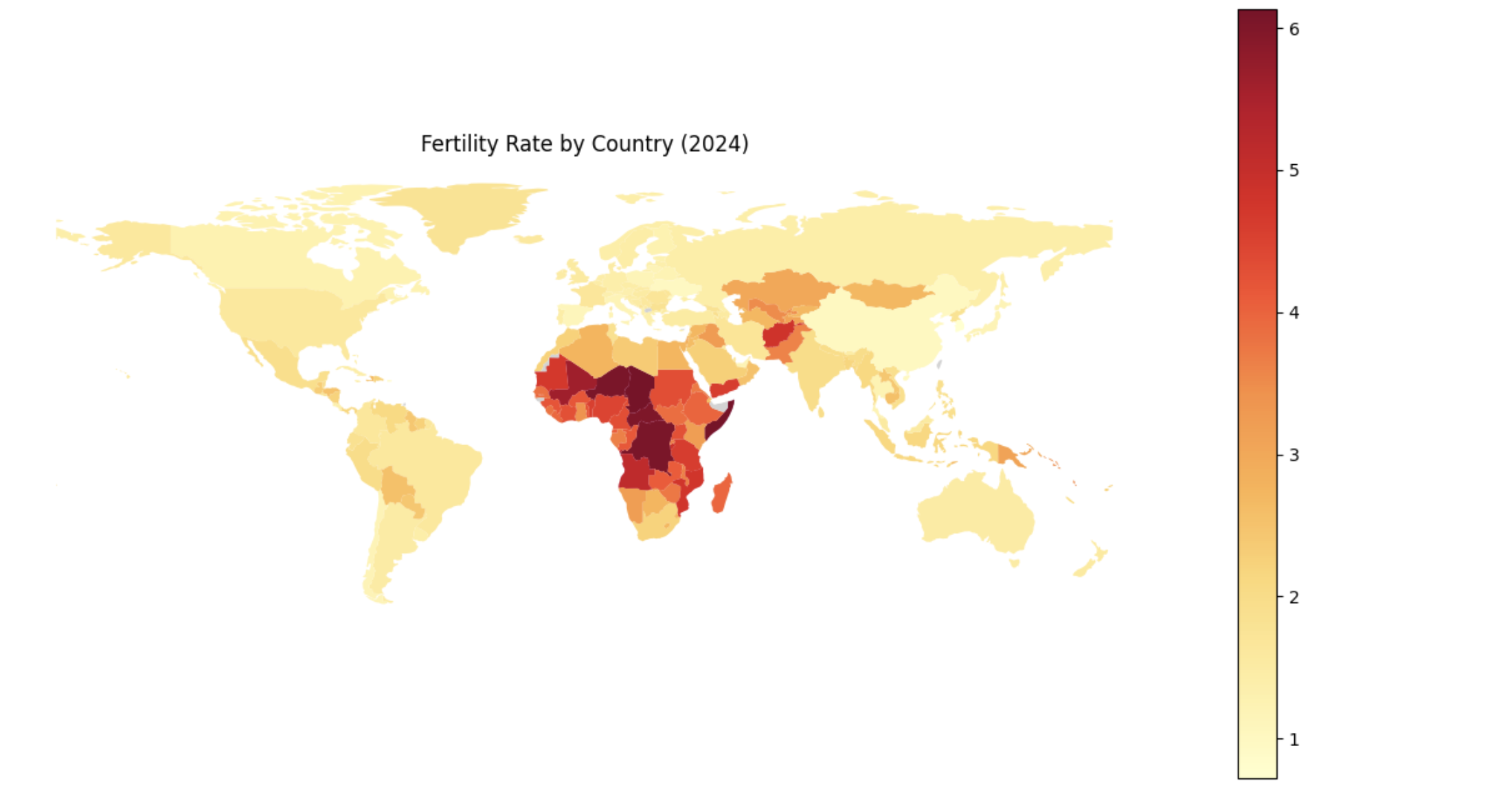
Step 4: Understanding Boosting and Building an XGBoost Model
Before fitting our final models, it is important to understand how boosting works and how XGBoost improves upon traditional decision tree models.
Foundations of Boosting
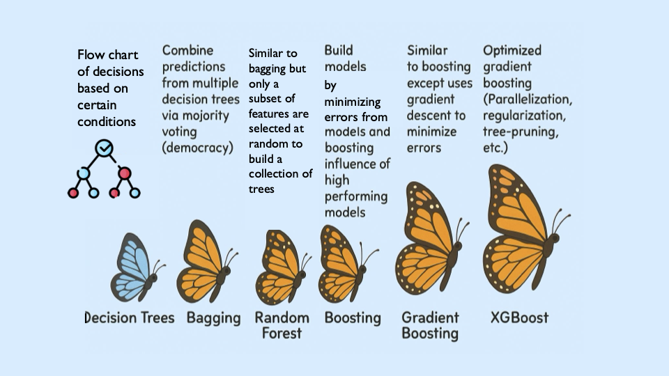
XGBoost is built off the boosting modeling approach for decision trees. Boosting is an ensemble technique that builds models sequentially, with each new model correcting errors from the previous one. This contrasts with Random Forest, where trees are grown independently.
| Random Forest | Boosting (XGBoost) |
|---|---|
Parallel tree growth |
Sequential tree growth |
Bootstrap sampling |
Modifies data via residual fitting |
With Random Forest, we use bagging, where random bootstrap samples are drawn from the data, a tree is built on each sample, and predictions are averaged. Each tree is grown independently.
Boosting works differently. Trees are grown one at a time, and each new tree is trained using information from the errors made by previous trees. Boosting does not involve bootstrap sampling.
XGBoost: Optimized Gradient Boosting
XGBoost (Extreme Gradient Boosting) improves traditional boosting in three key ways:
-
Second-order optimization: XGBoost uses both gradients (first-order derivatives) and hessians (second-order derivatives) of the loss function. Gradients indicate the direction of steepest ascent, while hessians describe the curvature of the loss function and help determine optimal step sizes.
-
Regularization: XGBoost includes L1 and L2 regularization, which penalize overly complex trees and help prevent overfitting.
-
Computational efficiency: XGBoost is optimized for speed and can take advantage of parallel processing.
These ideas align with the statistical treatment of boosting described in James et al. (2023), An Introduction to Statistical Learning (ISLR), available at www.statlearning.com.
Evaluation Metrics
$RMSE = \sqrt{\frac{1}{n} \sum_{i=1}^{n} (y_i - \hat{y}_i)^2}$
$R^2 = 1 - \frac{ \sum_{i=1}^{n} (y_i - \hat{y}_i)^2 }{ \sum_{i=1}^{n} (y_i - \bar{y})^2 }$
Loss Function (Regression)
For regression problems, XGBoost minimizes the squared error loss:
$\mathcal{L}(y_i, \hat{y}_i) = (y_i - \hat{y}_i)^2$
Key Takeaways
-
XGBoost sequentially corrects errors from previous trees, similar to learning from past mistakes.
-
It provides feature importance measures that help identify influential predictors.
-
Its optimizations make it both fast and accurate.
|
Here is a visual explanation of how gradient boosted trees work: www.youtube.com/watch?v=TyvYZ26alZs |
Build a baseline XGBoost model using top correlated features
from sklearn.model_selection import train_test_split

# Compute correlations with fertility_rate
correlations = worldbank_data.corr(numeric_only=True)["fertility_rate"]

# Select the top 5 positively correlated features
top5_features = correlations.drop("fertility_rate").sort_values(ascending=False).head(5).index.tolist()

X_small = worldbank_data[top5_features]
y = worldbank_data["fertility_rate"]

X_train, X_test, y_train, y_test = train_test_split(
    X_small, y, test_size=0.2, random_state=42)
Train and evaluate the model
from xgboost import XGBRegressor
from sklearn.metrics import mean_squared_error, r2_score

small_model = XGBRegressor(random_state=42)
small_model.fit(X_train, y_train)

y_pred = small_model.predict(X_test)
rmse = mean_squared_error(y_test, y_pred) ** 0.5
r2 = r2_score(y_test, y_pred)

print(f"Test RMSE (Top 5 Features): {rmse:.3f}")
print(f"Test R² (Top 5 Features): {r2:.3f}")
Test RMSE (Top 5 Features): 0.541
Test R² (Top 5 Features): 0.923
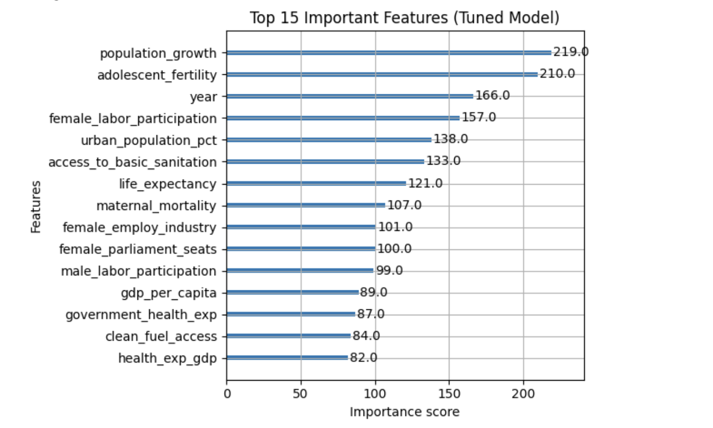
Step 5: Hyperparameter Tuning and Full-Feature XGBoost Model
XGBoost contains several important hyperparameters whose values are not learned directly from the data. These hyperparameters control tree structure, learning behavior, and regularization strength, and are typically chosen using cross-validation.
We now train a model using all numeric features, allowing XGBoost’s regularization and feature selection to determine which predictors are most important.
Key XGBoost Hyperparameters
XGBoost contains several important hyperparameters whose values are not learned directly from the data. These hyperparameters control tree structure, learning behavior, and regularization strength, and are typically chosen using cross-validation.
The table below summarizes the most important hyperparameters you will encounter in this project and explains what they do. Find more information on the hyperparameters here:
| Hyperparameter | Typical Values | What It Controls (Plain Language) |
|---|---|---|
|
3–8 |
How deep each tree is allowed to grow. Smaller values create simpler trees and help prevent overfitting, while larger values allow the model to capture more complex patterns. |
|
0.01–0.3 |
How much each tree contributes to the final prediction. Smaller values make learning more gradual and stable, often improving generalization but requiring more trees. |
|
50–300 |
The number of trees in the model. More trees allow the model to learn more patterns, but too many can increase training time and risk overfitting. |
|
1–10 |
Controls how many data points must be in a leaf before a split is allowed. Higher values make the model more conservative and reduce overfitting. |
|
0–5 |
Minimum improvement required to make a split. Larger values make the model more cautious about adding complexity. |
|
0.5–1.0 |
Fraction of the data randomly sampled for each tree. Using less than 100% adds randomness and helps reduce overfitting. |
|
0.5–1.0 |
Fraction of features randomly sampled for each tree. This helps when many features are correlated. |
|
0–1 |
L1 regularization penalty. Encourages the model to ignore less important features by pushing some weights toward zero. |
|
1–10 |
L2 regularization penalty. Penalizes large weights and helps stabilize the model. |
|
You do not need to tune every hyperparameter at once. In practice, data scientists often start with |
Prepare the full feature set
from sklearn.model_selection import train_test_split

X_full = worldbank_data.drop(columns=["fertility_rate", "country"])
y = worldbank_data["fertility_rate"]

X_train_full, X_test_full, y_train_full, y_test_full = train_test_split(
    X_full, y, test_size=0.2, random_state=42)
Train a tuned XGBoost model
from xgboost import XGBRegressor

tuned_model = XGBRegressor(
    random_state=42,
    max_depth=5,
    learning_rate=0.1,
    n_estimators=100
)

tuned_model.fit(X_train_full, y_train_full)
Evaluate tuned model performance
from sklearn.metrics import mean_squared_error, r2_score

y_pred = tuned_model.predict(X_test_full)
rmse = mean_squared_error(y_test_full, y_pred)**0.5
r2 = r2_score(y_test_full, y_pred)

print("Test Model Performance:")
print(f"Test RMSE: {rmse:.4f}")
print(f"Test R²: {r2:.4f}")
Test Model Performance:
Test RMSE: 0.2834
Test R²: 0.9789
Step 6: Interpreting Trends and Model Limitations
Fertility trends over time
import matplotlib.pyplot as plt

countries_to_plot = ["United States of America", "Turkey"]

plt.figure(figsize=(10, 6))
for country in countries_to_plot:
    data = worldbank_data[worldbank_data["country"] == country]
    plt.plot(data["year"], data["fertility_rate"], label=country)

plt.title("Fertility Rate Over Time")
plt.xlabel("Year")
plt.ylabel("Fertility Rate")
plt.legend()
plt.grid(True)
plt.tight_layout()
plt.show()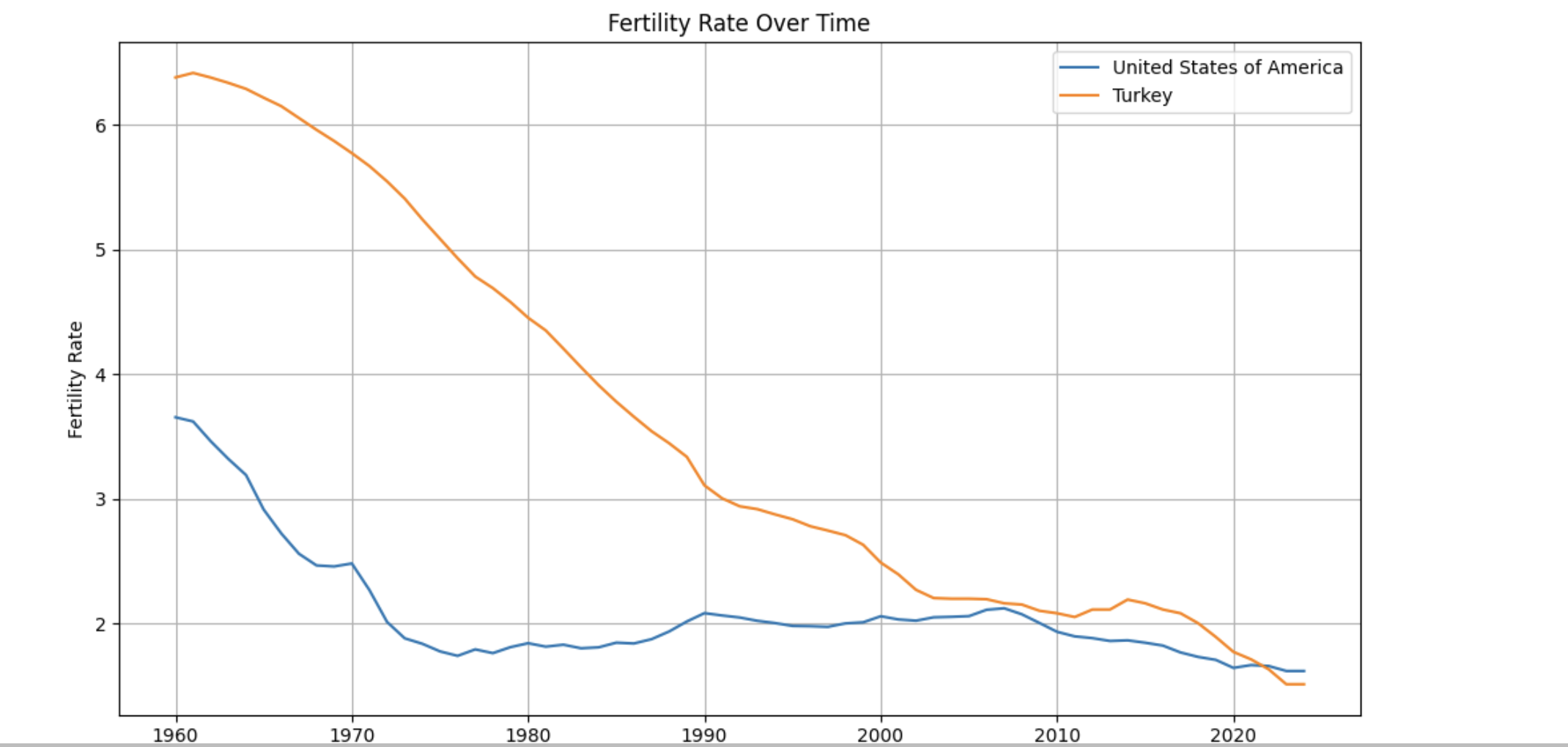
Additional Learning Resources
The following resources provide visual and theoretical explanations of XGBoost that may help reinforce the concepts introduced in this guide.
Visual Explanation of XGBoost
This video provides an intuitive, step-by-step visualization of how gradient boosted trees work and how XGBoost improves predictions over successive iterations.