Seaborn
Seaborn is a Python library built on top of Matplotlib. It’s great for exploring data because it works well with pandas DataFrames and includes built-in themes and statistical plotting options like scatterplots, boxplots, and heatmaps!
In this document, we will:
-
Create different types of visualizations, including bar plots, scatterplots, boxplots histograms, and heatmaps.
-
Modify axis labels, titles, and other graph elements to improve readability.
-
Explore dataset preparation techniques, including handling missing values and filtering data.
-
Analyze trends and patterns in the data by applying various Seaborn visualization techniques.
Understanding the Data Prior to Plotting
Just as we did when learning plotly, we will use the following dataset(s) to understand seaborn:
/anvil/projects/tdm/data/zillow/Metro_time_series.csv
Let’s review the dataset’s columns to identify which ones might be suitable for creating a plot. We will use the .columns function again.
import plotly.express as px
import pandas as pd

myDF = pd.read_csv("/anvil/projects/tdm/data/zillow/Metro_time_series.csv")
myDF.columns
Index(['Date', 'RegionName', 'AgeOfInventory', 'DaysOnZillow_AllHomes',
'InventorySeasonallyAdjusted_AllHomes', 'InventoryRaw_AllHomes',
'InventorySeasonallyAdjusted_BottomTier',
'InventorySeasonallyAdjusted_MiddleTier',
'InventorySeasonallyAdjusted_TopTier',
'MedianListingPricePerSqft_1Bedroom',
'MedianListingPricePerSqft_2Bedroom',
'MedianListingPricePerSqft_3Bedroom',
'MedianListingPricePerSqft_4Bedroom',
'MedianListingPricePerSqft_5BedroomOrMore',
'MedianListingPricePerSqft_AllHomes',
'MedianListingPricePerSqft_CondoCoop',
'MedianListingPricePerSqft_DuplexTriplex',
'MedianListingPricePerSqft_SingleFamilyResidence',
'MedianListingPrice_1Bedroom', 'MedianListingPrice_2Bedroom',
'MedianListingPrice_3Bedroom', 'MedianListingPrice_4Bedroom',
'MedianListingPrice_5BedroomOrMore', 'MedianListingPrice_AllHomes',
'MedianListingPrice_CondoCoop', 'MedianListingPrice_DuplexTriplex',
'MedianListingPrice_SingleFamilyResidence',
'MedianPctOfPriceReduction_AllHomes',
'MedianPctOfPriceReduction_CondoCoop',
'MedianPctOfPriceReduction_SingleFamilyResidence',
'MedianPriceCutDollar_AllHomes', 'MedianPriceCutDollar_CondoCoop',
'MedianPriceCutDollar_SingleFamilyResidence',
'MedianRentalPricePerSqft_1Bedroom',
'MedianRentalPricePerSqft_2Bedroom',
'MedianRentalPricePerSqft_3Bedroom',
'MedianRentalPricePerSqft_4Bedroom',
'MedianRentalPricePerSqft_5BedroomOrMore',
'MedianRentalPricePerSqft_AllHomes',
'MedianRentalPricePerSqft_CondoCoop',
'MedianRentalPricePerSqft_DuplexTriplex',
'MedianRentalPricePerSqft_MultiFamilyResidence5PlusUnits',
'MedianRentalPricePerSqft_SingleFamilyResidence',
'MedianRentalPricePerSqft_Studio', 'MedianRentalPrice_1Bedroom',
'MedianRentalPrice_2Bedroom', 'MedianRentalPrice_3Bedroom',
'MedianRentalPrice_4Bedroom', 'MedianRentalPrice_5BedroomOrMore',
'MedianRentalPrice_AllHomes', 'MedianRentalPrice_CondoCoop',
'MedianRentalPrice_DuplexTriplex',
'MedianRentalPrice_MultiFamilyResidence5PlusUnits',
'MedianRentalPrice_SingleFamilyResidence', 'MedianRentalPrice_Studio',
'ZHVIPerSqft_AllHomes', 'PctOfHomesDecreasingInValues_AllHomes',
'PctOfHomesIncreasingInValues_AllHomes',
'PctOfHomesSellingForGain_AllHomes',
'PctOfHomesSellingForLoss_AllHomes',
'PctOfListingsWithPriceReductionsSeasAdj_AllHomes',
'PctOfListingsWithPriceReductionsSeasAdj_BottomTier',
'PctOfListingsWithPriceReductionsSeasAdj_CondoCoop',
'PctOfListingsWithPriceReductionsSeasAdj_MiddleTier',
'PctOfListingsWithPriceReductionsSeasAdj_SingleFamilyResidence',
'PctOfListingsWithPriceReductionsSeasAdj_TopTier',
'PctOfListingsWithPriceReductions_AllHomes',
'PctOfListingsWithPriceReductions_BottomTier',
'PctOfListingsWithPriceReductions_CondoCoop',
'PctOfListingsWithPriceReductions_MiddleTier',
'PctOfListingsWithPriceReductions_SingleFamilyResidence',
'PctOfListingsWithPriceReductions_TopTier', 'PriceToRentRatio_AllHomes',
'Sale_Counts_Msa', 'Sale_Counts_Seas_Adj_Msa', 'Sale_Prices_Msa',
'InventoryTierShare_BottomTier_AllHomes',
'InventoryTierShare_MiddleTier_AllHomes',
'InventoryTierShare_TopTier_AllHomes', 'ZHVI_1bedroom', 'ZHVI_2bedroom',
'ZHVI_3bedroom', 'ZHVI_4bedroom', 'ZHVI_5BedroomOrMore',
'ZHVI_AllHomes', 'ZHVI_BottomTier', 'ZHVI_CondoCoop', 'ZHVI_MiddleTier',
'ZHVI_SingleFamilyResidence', 'ZHVI_TopTier', 'ZRI_AllHomes',
'ZRI_AllHomesPlusMultifamily', 'ZriPerSqft_AllHomes',
'Zri_MultiFamilyResidenceRental', 'Zri_SingleFamilyResidenceRental'],
dtype='object')
As we can see, there are many columns in the dataset! It’s essential to understand the available columns before creating any visualizations.
You can use the .head() function and the .tail() function to get a further preview of the data.
Barplots Using Seaborn
Let’s plot a barplot of MedianListingPrice_1Bedroom and the first 10 regions that are not null using Seaborn to show how the code syntax is a little bit different than plotly and matplotlib. There are some missing values in our dataset, so we will again, filter for when they are not null as we did when using plotly.
import pandas as pd
myDF = pd.read_csv("/anvil/projects/tdm/data/zillow/Metro_time_series.csv")
import seaborn as sns
import matplotlib.pyplot as plt
# Filter the dataset
filteredDF = myDF[myDF['MedianListingPrice_1Bedroom'].notnull()][['RegionName', 'MedianListingPrice_1Bedroom']].head(10)
plt.figure(figsize=(10, 6))
sns.barplot(data=filteredDF, x='RegionName', y='MedianListingPrice_1Bedroom')
plt.title('Median Listing Price for 1-Bedroom Homes by Region (First 10)')
plt.xlabel('Region')
plt.ylabel('Median Listing Price ($)')
plt.xticks(rotation=45)
plt.tight_layout()
plt.show()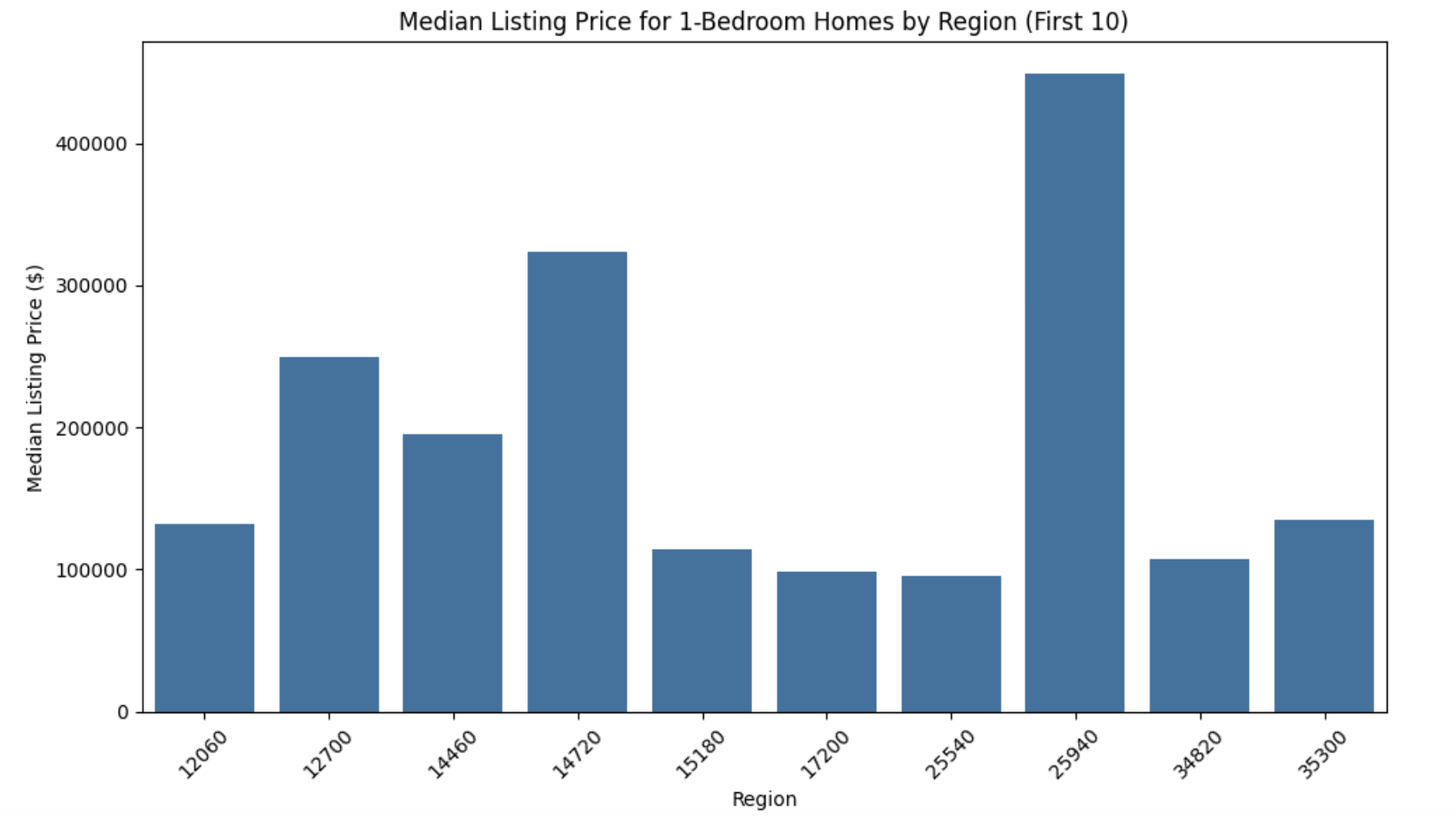
Notice how we had to import seaborn and matplotlib since they are two libraries that complement each other. Seaborn’s barplot function was used to create the bar chart with aggregation and it’s default aesthetics.
Seaborn leverages matplotlib for its back-end plotting engine.
We import matplotlib’s pyplot to customize the plot further, such as adding titles, labels, or adjusting layouts.
For example:
-
plt.title,plt.xlabel, andplt.ylabeladd titles and axis labels. -
plt.xticksrotates the x-axis labels for better readability.
Boxplots Using Seaborn
Now let’s use Seaborn to plot a box-plot.
A box plot (also known as a box-and-whisker plot) is a way of displaying the distribution of data based on the statistics:
-
Minimum
-
First quartile (Q1)
-
Median (Q2)
-
Third quartile (Q3)
-
Maximum
Remember, a box plot requires numerical data to display the distribution and summarize its key statistical properties. Let’s use the column DaysOnZillow_AllHomes and create a new column called Year to create a box-plot in seaborn. Note, we will need to clean up the Date column to be able to create the Year column.
import pandas as pd
import seaborn as sns
import matplotlib.pyplot as plt

# Clean up year
myDF['Year'] = pd.to_datetime(myDF['Date']).dt.year

filtered_days_zillow = myDF[myDF['DaysOnZillow_AllHomes'].notnull()][['Year', 'DaysOnZillow_AllHomes']]

plt.figure(figsize=(12, 6))
sns.boxplot(data=filtered_days_zillow, x='Year', y='DaysOnZillow_AllHomes')
plt.title('Box Plot of Days on Zillow by Year')
plt.xlabel('Year')
plt.ylabel('Days on Zillow (All Homes)')
plt.xticks(rotation=45)
plt.tight_layout()
plt.show()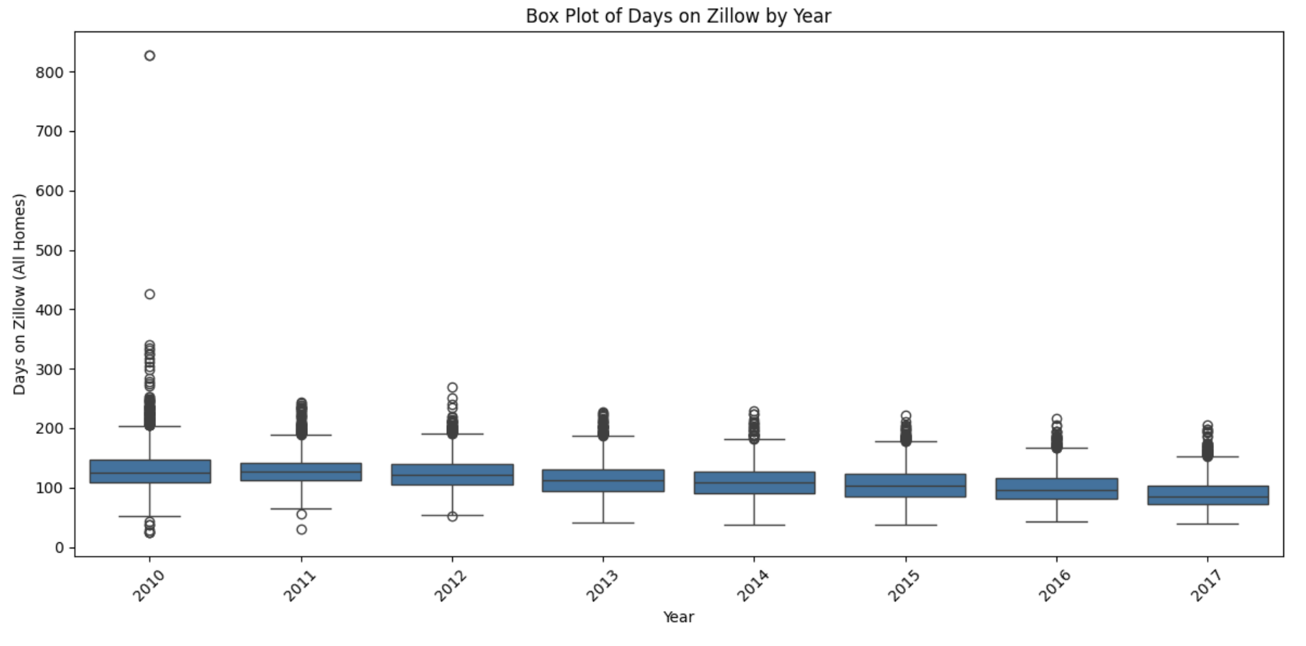
Histograms with Seaborn
This example demonstrates how to create histograms using the Seaborn. The code snippet plots a histogram to analyze the distribution of the number of days properties remain listed on Zillow.
import pandas as pd
import seaborn as sns
import matplotlib.pyplot as plt

myDF = pd.read_csv("/anvil/projects/tdm/data/zillow/Metro_time_series.csv")
filtered_data = myDF[myDF['DaysOnZillow_AllHomes'].notnull()]

plt.figure(figsize=(10, 6))
sns.histplot(data=filtered_data, x='DaysOnZillow_AllHomes', bins=100, kde=False)
plt.title('Histogram of Days on Zillow')
plt.xlabel('Days on Zillow')
plt.ylabel('Frequency')
plt.tight_layout()
plt.show()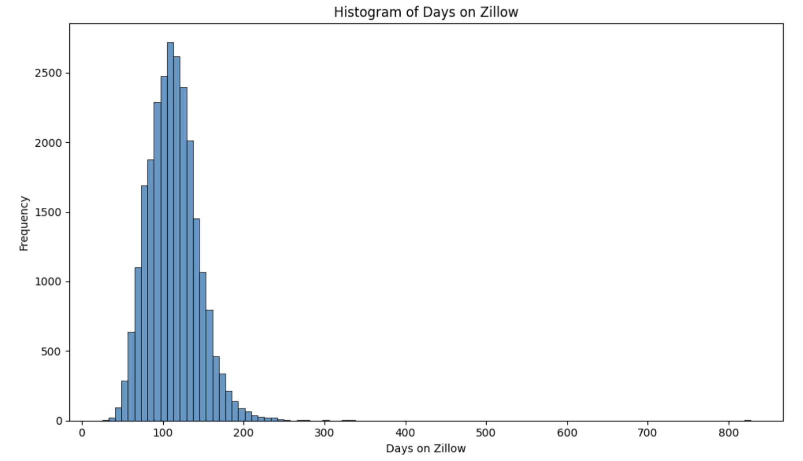
Similar to the plotly example, the histogram helps us understand the distribution of the number of days the houses are on zillow. It seems that some houses genuinely stay on Zillow for much longer. It may be due to location, pricing, or other factors.
Scatterplots with Seaborn
Let’s plot a scatterplot of MedianListingPrice_1Bedroom vs DaysOnZillow_AllHomes using Seaborn.
import pandas as pd
import seaborn as sns
import matplotlib.pyplot as plt

myDF = pd.read_csv("/anvil/projects/tdm/data/zillow/Metro_time_series.csv")
filteredDF_scatter = myDF.dropna(subset=['DaysOnZillow_AllHomes', 'MedianListingPrice_1Bedroom'])

plt.figure(figsize=(10, 6))
sns.scatterplot(
    data=filteredDF_scatter,
    x='DaysOnZillow_AllHomes',
    y='MedianListingPrice_1Bedroom'
)

plt.title('Days on Zillow vs Median Listing Price for 1-Bedroom Homes')
plt.xlabel('Days on Zillow (All Homes)')
plt.ylabel('Median Listing Price (1-Bedroom)')
plt.tight_layout()
plt.show()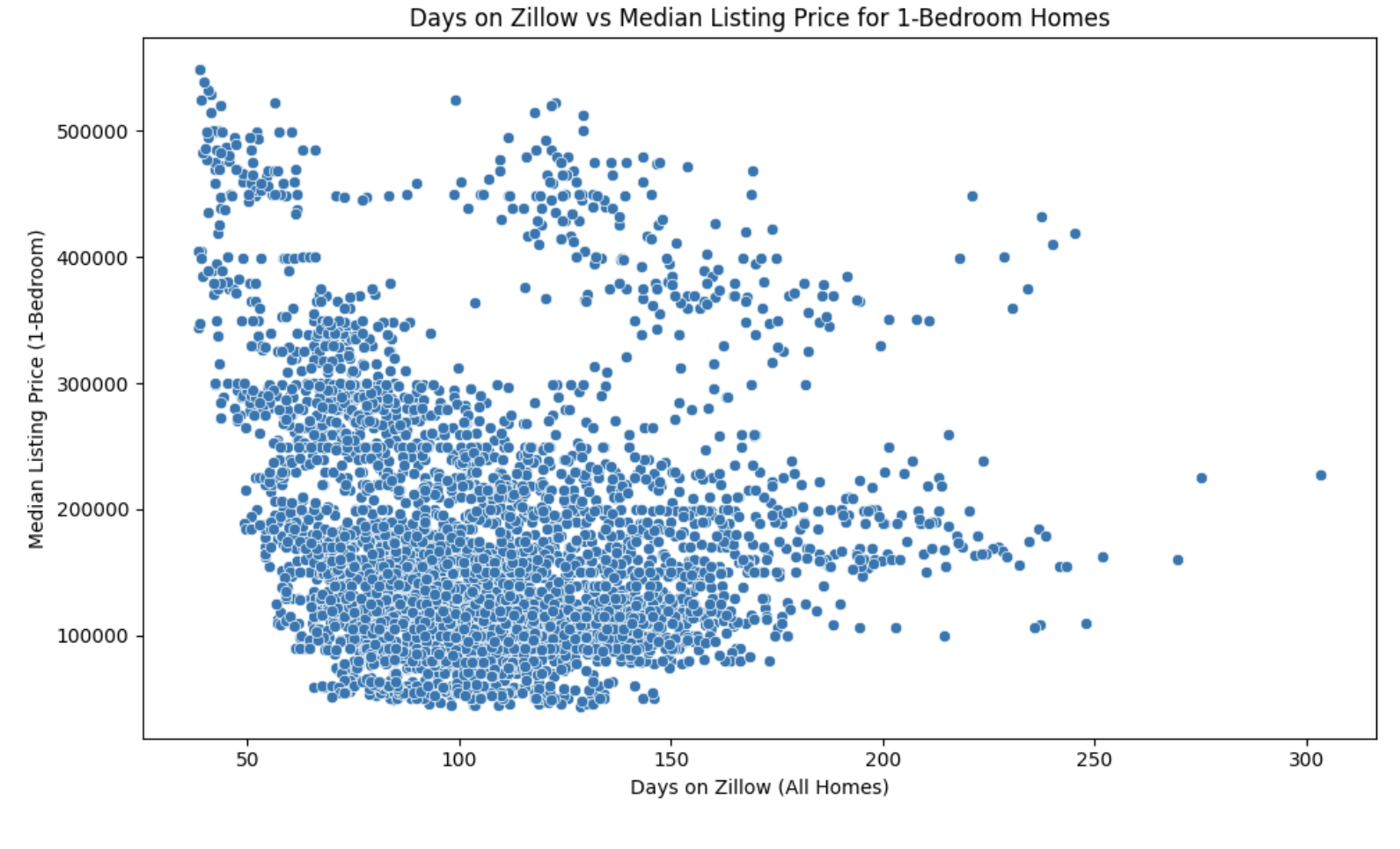
Similar to the plotly example, we can see that there appears to be a general downward trend between the number of days a home is listed on Zillow DaysOnZillow_AllHomes and the median listing price for 1-bedroom homes MedianListingPrice_1Bedroom. This suggests that higher-priced 1-bedroom homes tend to spend fewer days on Zillow. Also, we can see that a significant concentration of points is clustered around lower listing prices (below $400K) and shorter listing durations (less than 150 days).
Heatmap with Seaborn
A heatmap is a chart that shows data as colors, making it easy to see patterns, trends, or relationships in a table. Each cell in the heatmap represents a value, and the color shows how big or small the value is.
-
In a correlation heatmap, you can quickly see how two variables are related.
-
Darker colors might mean stronger relationships, while lighter ones mean weaker.
Correlation measures the statistical relationship between two variables, such as:
-
Positive correlation: As one variable increases, so does the other.
-
Negative correlation: As one variable increases, the other decreases.
The example below is a heatmap we create using the seaborn library. The graph focuses on numeric variables because a correlation matrix requires numerical data to calculate the relationships between variables. Below, we will filter for columns that seem relevant for understanding real estate trends.
import pandas as pd
import seaborn as sns
import matplotlib.pyplot as plt

myDF = pd.read_csv("/anvil/projects/tdm/data/zillow/Metro_time_series.csv")

relevant_columns = [
    'AgeOfInventory',
    'DaysOnZillow_AllHomes',
    'InventoryRaw_AllHomes',
    'ZHVI_AllHomes',
    'ZHVI_BottomTier',
    'ZHVI_TopTier',
    'ZRI_AllHomes',
    'ZriPerSqft_AllHomes'
]

filtered_relevant_data = myDF[relevant_columns].dropna()
correlation_matrix = filtered_relevant_data.corr()

plt.figure(figsize=(10, 8))
sns.heatmap(correlation_matrix, annot=True, cmap='coolwarm', fmt='.2f', linewidths=0.5)
plt.title('Correlation Heatmap (Relevant Columns)')
plt.show()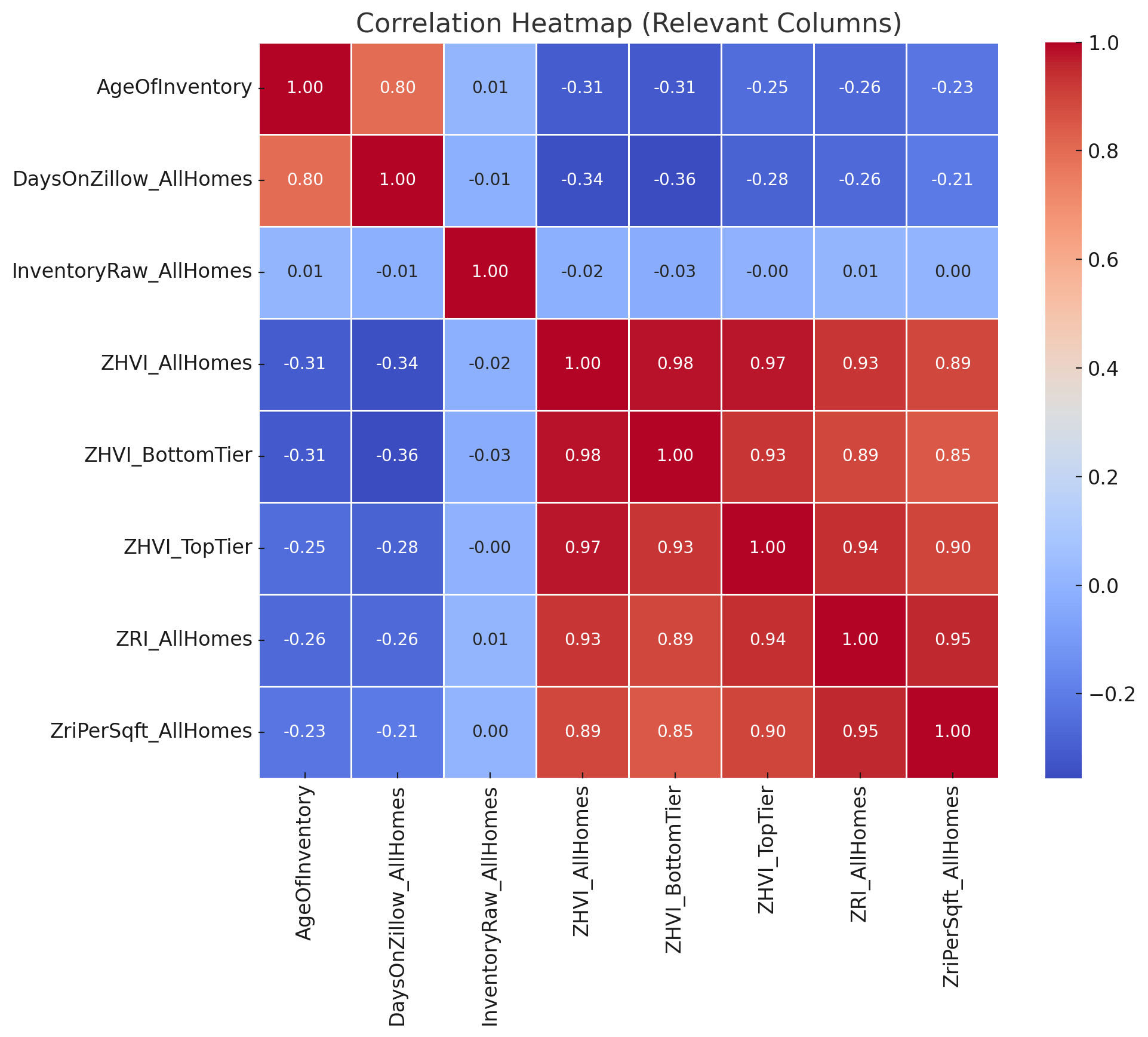
If we look at the heatmap, we can gain a better understanding of some of the real estate metrics in the data. It seems that time-related metrics AgeOfInventory, DaysOnZillow have weaker, generally negative correlations with price-related metrics (ZHVI metrics), hinting that homes staying on the market longer might reflect less competitive pricing or lower demand.
Overall, this document provided an introduction to Seaborn, a Python library built on top of Matplotlib, showing use for statistical visualizations like scatterplots, boxplots, and heatmaps.