Dynamic Time Warping Project
Project Objectives
In this project, you will explore Dynamic Time Warping (DTW), a method for measuring similarity between time series. DTW focuses on the shape of each time series, allowing sequences with similar behavior to be compared. This makes DTW well suited for clustering large collections of time series, helping uncover shared temporal patterns that can help build later forecasting time series models.
Introduction to Dynamic Time Warping
Time series data appears in many settings, including weather measurements, user behavior over time, sales trends, medical signals, and financial indicators. Dynamic Time Warping (DTW) offers a different way to think about similarity in time series. Instead of asking whether two sequences match at the same time index, DTW asks whether they follow a similar pattern or shape.
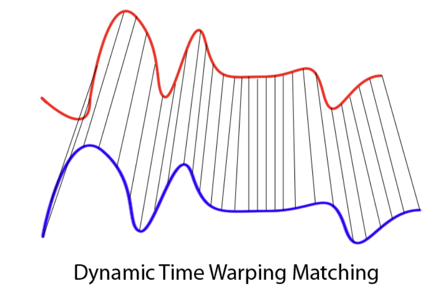
DTW was originally developed in the 1970s in the context of speech recognition. Researchers were interested in comparing spoken words that were clearly the same but spoken faster or slower by different speakers. When sound signals like these are compared point by point, they often appear dissimilar because peaks and pauses do not align in time. However, when attention is given to the overall structure of the signal, the similarity becomes much more apparent. DTW was designed to capture this idea by allowing flexibility in how time is aligned.
At a high level, Dynamic Time Warping is an algorithm that aligns two time series by allowing the time axis to stretch or compress where necessary. Rather than enforcing a one-to-one comparison between observations, DTW finds an alignment that minimizes the total distance between the two sequences after accounting for differences in timing. As a result, a single observation in one series may align with multiple observations in the other if doing so improves the overall match.
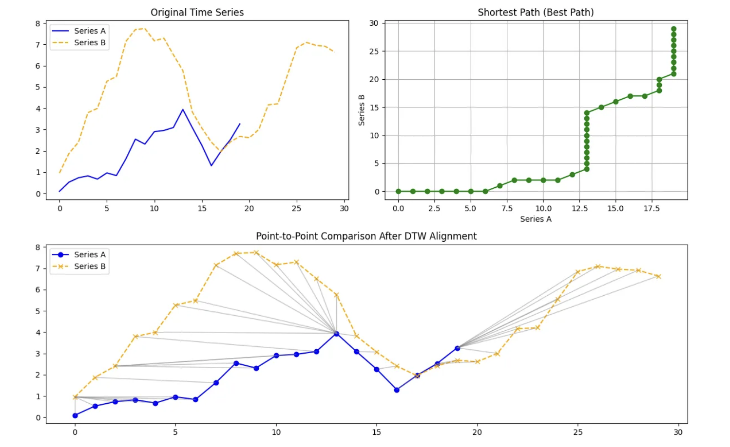
Internally, DTW compares every point in one time series with every point in another and organizes these comparisons into a grid. It then searches for a path through this grid that respects the ordering of time and produces the smallest cumulative distance. The alignment path itself is just as important as the final distance value. It reveals where one series had to be stretched, where it was compressed, and where both series progressed at a similar pace.
DTW distance can be defined as:
$DTW(A,B) = \min\sqrt{\sum_{i,j} d(a_i,b_j)^2}$.
Because of this flexibility, DTW is especially useful in settings where timing differences are meaningful rather than problematic. It has been applied in speech and audio analysis, healthcare signals such as heart rate data, financial and economic time series, marketing and user behavior patterns, and environmental and climate data. In each of these cases, the goal is to find similarity in structure.
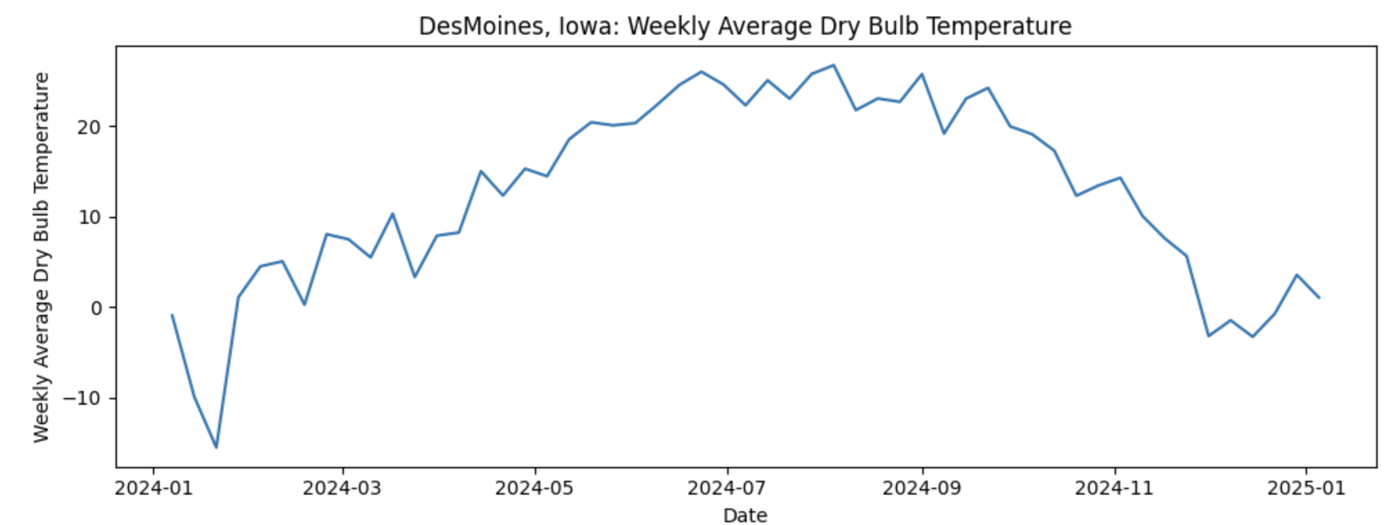
As for the data used for this project, we will use daily weather data from NOAA covering January 2024 through December 2024. The dataset contains one full year of temperature observations for the capital city of each U.S. state, giving us 50 separate temperature time series, with one per capital. Let’s look at one time series of Weekly Average Temperature in Desmoines, Iowa:
If our goal is to predict next week’s average temperature, it would seem that the most straightforward approach would be to build 50 separate time series models, one for each capital. While feasible, this can become difficult to maintain. Instead, we ask a more strategic question: what if some capitals follow similar temperature patterns over time and we could group them? This is where Dynamic Time Warping (DTW) comes in. DTW allows us to measure similarity between time series based on their overall shape rather than exact timing. By grouping capitals with similar temperature dynamics, we can cluster time series together and use those clusters to inform model building reducing complexity.
Columns in the dataset:
-
Station: NOAA weather station identifier -
Date: Timestamp of the observation -
DailyAverageDryBulbTemperature: Daily average air temperature (°C) -
State: U.S. state name -
Capital: Capital city of the state
Each row represents a temperature observation at a given time for a specific capital city. Some timestamps may contain missing temperature values, which we will address during data cleaning and aggregation before applying DTW and time series modeling.
In this project, DTW will be used as a tool for understanding and comparing time series patterns rather than as a standalone distance metric. The focus will be on how DTW aligns sequences, what those alignments reveal about the data, and how this information can support clustering and downstream modeling decisions.
Questions
Question 1 - Understanding Our Data (2 points)
1a. You are given multiple CSV files containing daily weather observations, where each file corresponds to 50 unique U.S. state capital weather data for 2024. Fill in the code below to read all files from the provided directory, extract the state and capital names from each filename, and append the data into a single DataFrame. Retain only the STATION, DATE, and DailyAverageDryBulbTemperature, then add state and capital columns.
import pandas as pd
import glob
import os

data_path = os.path.expanduser("/anvil/projects/tdm/data/noaa_dtw/*.csv")

files = glob.glob(data_path)

print(f"Number of files found: {len(files)}")

dfs = []

for file in files:
    filename = os.path.basename(file).replace(".csv", "")
    state, capital = filename.split("_")

    df = pd.read_csv(
        file,
        usecols=["____", "_____", "_____"], # For YOU to fill in
        engine="python",
        on_bad_lines="skip"
    )

    df["State"] = # For YOU to fill in
    df["Capital"] =  # For YOU to fill in

    dfs.append(df)

combined_df = pd.concat(dfs, ignore_index=True)
combined_df.head()
1b. Complete the code below to convert the DATE column to a datetime object and ensure that DailyAverageDryBulbTemperature is numeric. Then, sort the dataset by State, Capital, and DATE. Display the first few rows of the cleaned DataFrame to verify that the transformations were applied correctly and in 2–3 sentences, explain why these steps are necessary when preparing data for time series analysis.
combined_df["DATE"] = pd.to_datetime(combined_df["DATE"])
combined_df["______"] = pd.to_numeric(combined_df["________"],errors="coerce") # For YOU to fill in

combined_df = (
    combined_df
    .sort_values(["____", "_____", "_____"])  # For YOU to fill in
    .reset_index(drop=True))
1c. As part of this preparation, you will notice that we will need to remove rows that are missing the DailyAverageDryBulbTemperature measurements. Carefully observe the pattern of missingness in the data before removing these rows. Report the number of missing values remaining in each column and in 1–2 sentences, explain why rows with no DailyAverageDryBulbTemperature weather information should be excluded prior to time series modeling.
cols_to_check = [
    col for col in combined_df.columns
    if col not in ["______", "______", "_____", "______"]]  # For YOU to Fill in

combined_df = combined_df.dropna(
    subset=_______, # For YOU to Fill in
    how="all")

combined_df.isna().sum()
1d. Convert the cleaned daily temperature data into weekly data by computing the mean weekly temperature for each (State, Capital) pair, using weeks that end on Sunday. Check for missing weekly values and use forward-fill and backward-fill within each group to address them. Confirm that the final weekly temperature series contains no missing values.
combined_df = (
    combined_df
    .set_index("DATE")
    .groupby(["State", "Capital"])["DailyAverageDryBulbTemperature"]
    .resample("W-SUN")
    .mean()
    .reset_index(name="WeeklyAvgTemp")
    .sort_values(["State", "Capital", "DATE"])
    .reset_index(drop=True)
)

combined_df["WeeklyAvgTemp"] = (
    combined_df
    .groupby(["____", "______"])["WeeklyAvgTemp"] # For YOU to fill in
    .ffill()
    .bfill()
)Question 2 - Preparing Our Data For Time Series (2 points)
In this section, we focus on getting to know our data at a deeper level. We explore how temperature patterns vary across locations and how multiple time series are represented within a single dataset. By visually examining weekly temperature trends for different capital cities, we begin to build intuition around seasonality, variability, and timing differences across series.
Randomly sampling states allows us to explore a manageable subset of the data without relying on arbitrary or biased choices. Using a fixed random seed ensures that this exploration is reproducible, which is important as the analysis builds and evolves.
Plotting each capital’s weekly temperature as its own time series reinforces the idea that each location represents a complete sequence rather than a collection of independent observations. This step encourages thinking in terms of overall patterns and structure before introducing formal similarity measures.
Taken together, this exploratory work helps us understand what similarity might look like in the data. These observations motivate the use of methods that compare entire sequences based on their overall structure rather than exact alignment in time. This foundation is essential for clustering approaches that rely on sequence level similarity, such as Dynamic Time Warping.
2a. Rather than selecting states manually, use the function below to randomly select a fixed number of unique states from the dataset. The function should allow the number of states and the random seed to be specified so that the selection is reproducible. Use this function to select five random states.
import numpy as np

def sample_states(df, n_states=5, seed=42):
    np.random.seed(seed)

    states = (
        df["State"]
        .drop_duplicates()
        .sample(n_states)
        .tolist()
    )

    return states

random_states = sample_states(_____, n_states=__, seed=__) # For YOU to fill in
random_states
2b. Using the selected states, weekly average dry bulb temperature time series are plotted for each corresponding capital city. These plots allow you to visually compare seasonal patterns and temperature variability across locations. Briefly describe any similarities or differences you observe in the trends.
import matplotlib.pyplot as plt

plot_df = combined_df[combined_df["State"].isin(______)] # For YOU to fill in

for (state, capital), group in plot_df.groupby(["State", "Capital"]):

    plt.figure(figsize=(10, 4))

    plt.plot(
        group["DATE"],
        group["WeeklyAvgTemp"])

    plt.xlabel("_____")  # For YOU to fill in
    plt.ylabel("______")  # For YOU to fill in
    plt.title(f"{capital}, {state}: Weekly Average Dry Bulb Temperature")

    plt.tight_layout()
    plt.show()
2c. Each (State, Capital) pair represents a distinct weekly temperature time series in the dataset. The total number of unique series is computed by identifying these pairs. Report the total number and explain in 1-2 sentences why this count is important for later time-series analysis.
n_series = (
    combined_df[[_____, _____]] # For YOU to fill in
    .drop_duplicates()
.shape[0])Question 3 - Using DTW to Cluster Our Time Series Weather Data of State Capitals (2 points)
In this section, we will review how time series data must be represented and prepared before it can be compared using Dynamic Time Warping. The focus is on reshaping, standardizing, and organizing the data so that each sequence can be treated as a single analytical object.
We will begin by restructuring the data from a long format to a wide format. By pivoting the dataset so that each State and Capital pair occupies one row with dates running across columns, each time series becomes explicit. This reinforces the idea that a time series is not a collection of rows but a single ordered sequence of values. This step is essential because DTW compares entire sequences rather than individual timestamps.
Next, we will convert the wide table into a numerical array and apply z score normalization to each time series independently. This introduces an important modeling concept: scale matters. Without normalization, DTW would primarily capture differences in absolute temperature levels rather than similarities in seasonal patterns. By centering and scaling each series, the comparison focuses on shape and timing instead of magnitude.
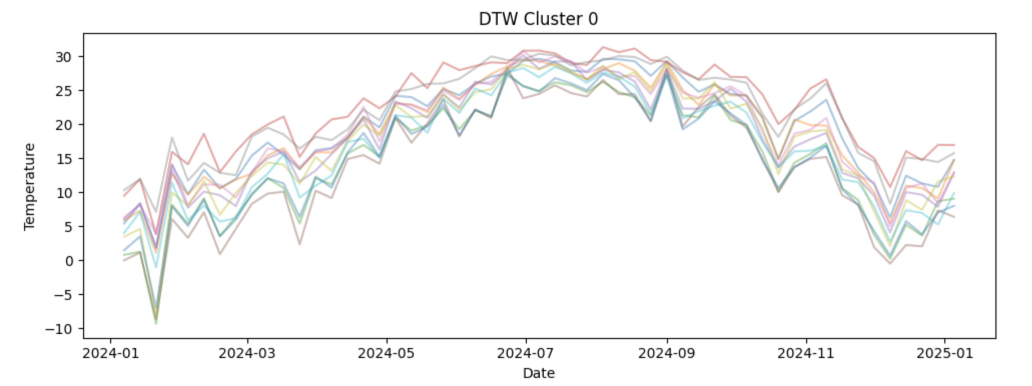
We will then apply DTW within a clustering framework using the TimeSeriesKMeans class from the tslearn package. In this step, k-means clustering is performed with dtw specified as the distance metric, which means similarity between time series is determined by Dynamic Time Warping rather than point-by-point differences. This allows the model to group capital cities based on the overall shape and seasonal structure of their temperature patterns, even when peaks and troughs occur at slightly different times across locations.
Finally, we will visualize the clustering results using the original temperature values. Plotting non normalized series by cluster keeps the seasonal patterns interpretable and helps us connect the cluster assignments back to real world temperature dynamics. This step reinforces the idea that normalization is a modeling tool, not a visualization tool.
Together, these steps will help us understand how DTW clustering works, why careful data preparation is critical, and how to interpret the resulting clusters in a meaningful way.
3a. To apply DTW, the weekly temperature data must be reshaped so that each (State, Capital) pair corresponds to a single row, with dates running across columns. This wide format allows each row to be treated as an individual time series. Fill in the code below to create a wide data frame containing weekly average temperatures indexed by state and capital.
wide_df = combined_df.pivot_table(
    index=["____", "_____"], # For YOU to fill in
    columns="DATE",
    values="WeeklyAvgTemp"
)
3b. DTW operates on numerical arrays rather than pandas data frames. Use the code below to convert the wide table into a NumPy array and apply z-score normalization so that each time series has mean zero and unit variance. This ensures that DTW compares temperature patterns instead of absolute temperature levels.
import numpy as np

X = wide_df.values

X = (X - X.mean(axis=1, keepdims=True)) / X.std(axis=1, keepdims=True)
3c. Cluster the normalized time series using Dynamic Time Warping (DTW) to group capital cities with similar seasonal temperature patterns. Using the code below, set the number of clusters to 4 and fit a k-means model with dtw as the distance metric and store the resulting cluster assignment for each state–capital pair in a new DataFrame. Then, write 1–2 sentences explaining how DTW is used to group capitals into clusters.
from tslearn.clustering import TimeSeriesKMeans

n_clusters = ____ # For YOU to fill in

dtw_km = TimeSeriesKMeans(
    n_clusters=n_clusters,
    metric="____",
    random_state=42
)

labels = dtw_km.fit_predict(X)

cluster_df = wide_df.reset_index()[["State", "Capital"]].copy()
cluster_df["Cluster"] = labels

cluster_df.head()
3d. To interpret the DTW clustering results, the weekly temperature time series for each capital are visualized by cluster. For each cluster, plot all member time series using the original (non-normalized) temperature values so the seasonal patterns remain interpretable. Examine how temperature dynamics differ across clusters. Write 2-3 sentences about your observations of each cluster. What patterns do you notice?
import matplotlib.pyplot as plt

dates = wide_df.columns        # calendar dates
wide_values = wide_df.values  # original (non-normalized) temperatures

for cluster in range(n_clusters):
    plt.figure(figsize=(10, 4))

    for i, label in enumerate(labels):
        if label == cluster:
            plt.plot(
                dates,
                wide_values[i],
                alpha=0.4
            )

    plt.title(f"DTW Cluster {cluster}")
    plt.xlabel("___") # For YOU to fill in
    plt.ylabel("_____")  # For YOU to fill in
    plt.tight_layout()
plt.show()Question 4 Comparing DTW Clusters to Regional Clusters (2 points)
Now we will focus on interpreting and contextualizing the DTW clustering results. After grouping capital cities based on seasonal temperature patterns, it is important to understand what those clusters represent geographically and how they relate to existing regional definitions.
We will begin by creating a clean table that links each State and Capital pair to its assigned DTW cluster. This step formalizes the clustering output and produces a structure that can be merged with other datasets. Organizing cluster assignments in a standalone table reinforces the idea that clusters are properties of entire time series, not individual observations.
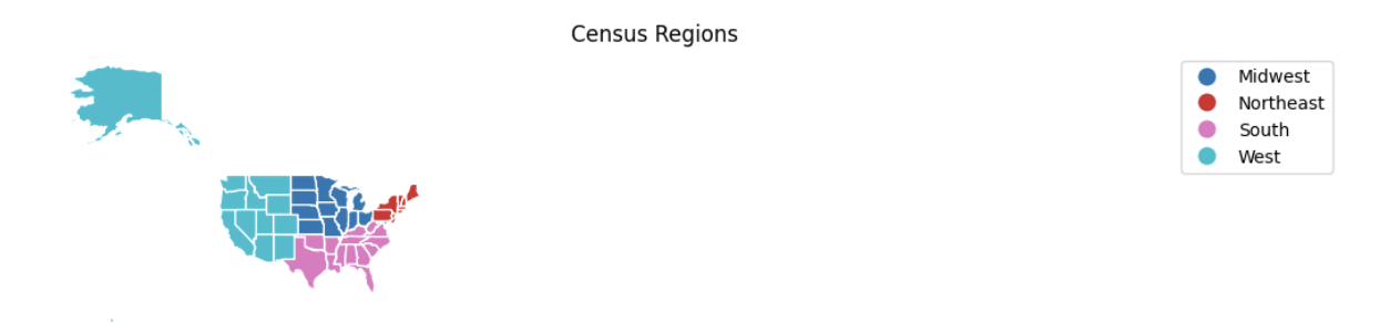
Next, we will address a common but critical data preparation issue: inconsistent naming conventions. To successfully merge cluster information with geographic boundary files, state names must match exactly across datasets. Applying a cleaning function allows us to standardize state names and avoid silent merge failures. This highlights the importance of careful string handling and data validation when working across multiple data sources. We will then introduce geographic context by assigning each state to a U.S. Census region. These regions provide a familiar baseline that reflects traditional geographic groupings. Comparing DTW-based clusters to Census regions helps us evaluate whether temperature driven patterns align with established regional boundaries or reveal different groupings driven by climate rather than geography.
Using GeoPandas and publicly available Census boundary data, we will visualize both DTW clusters and Census regions side by side on a map. Mapping the results allows us to assess spatial coherence, identify regional transitions, and detect mismatches between climate based clusters and political or geographic regions. This step emphasizes that clustering results should be interpreted visually and contextually, not just numerically.
Finally, we will merge the DTW cluster labels back onto the weekly temperature dataset. This integration step is essential for downstream analysis. By attaching cluster assignments to each observation, we enable cluster level modeling, forecasting, and evaluation in later questions. This reinforces the idea that clustering is not an endpoint, but a tool that informs subsequent time series analysis.
Together, these steps show how DTW clustering can support modeling and decision making.
4a. To visualize DTW clusters geographically, each state must be associated with a single cluster label. Create a DataFrame that contains one row per State and Capital along with its assigned DTW cluster. This table will later be merged with geographic boundary data.
cluster_df = wide_df.reset_index()[["____", "_____"]].copy() # For YOU to fill in
cluster_df["Cluster"] = labels

cluster_df.head()
4b. To successfully merge cluster data with geographic boundary files and develop a map, state names must follow a consistent naming convention. Some state names contain formatting differences or errors introduced during file ingestion. Use the code provided below to apply a cleaning function to standardize state names.
state_name_fix = {
    "NewYork": "New York",
    "NewJersey": "New Jersey",
    "NewMexico": "New Mexico",
    "NewHampshire": "New Hampshire",
    "NorthCarolina": "North Carolina",
    "NorthDakota": "North Dakota",
    "SouthCarolina": "South Carolina",
    "SouthDakota": "South Dakota",
    "WestVirginia": "West Virginia",
    "RhodeIsland": "Rhode Island",
    "Atlanta": "Georgia",
    "Tallahassee": "Florida",
    "OklahomaCity": "Oklahoma"
}

def clean_state(s):
    return s.replace(_____).str.strip().str.title() # For YOU to fill in

cluster_df["State"] = clean_state(cluster_df["State"])
combined_df["State"] = clean_state(combined_df["State"])
4c. To add geographic context, assign each state to its corresponding U.S. Census region. Use the code below to merge region information into a state-level summary table. Then write 1–2 sentences explaining why it may be informative to compare DTW-based temperature clusters with traditional Census region groupings.
import pandas as pd

region_df = pd.DataFrame({
    "State": [
        # Northeast
        "Connecticut","Maine","Massachusetts","New Hampshire","Rhode Island",
        "Vermont","New Jersey","New York","Pennsylvania",
        # Midwest
        "Illinois","Indiana","Michigan","Ohio","Wisconsin","Iowa","Kansas",
        "Minnesota","Missouri","Nebraska","North Dakota","South Dakota",
        # South
        "Delaware","Florida","Georgia","Maryland","North Carolina","South Carolina",
        "Virginia","West Virginia","Alabama","Kentucky","Mississippi","Tennessee",
        "Arkansas","Louisiana","Oklahoma","Texas",
        # West
        "Arizona","Colorado","Idaho","Montana","Nevada","New Mexico","Utah",
        "Wyoming","Alaska","California","Hawaii","Oregon","Washington"
    ],
    "Region": (
        ["Northeast"] * 9 +
        ["Midwest"] * 12 +
        ["South"] * 16 +
        ["West"] * 13
    )
})

state_to_region = dict(zip(region_df["State"], region_df["Region"]))

combined_df["Region"] = combined_df["State"].map(_____) # For YOU to fill in
4d. Using the code below and geographic boundary data for U.S. states, visualize the DTW cluster assignments and U.S. Census regions side by side on a map. These maps allow you to compare temperature-based clusters with established geographic regions. Briefly describe any alignments or mismatches you observe between the DTW clusters and Census regions in 2-3 sentences.
import geopandas as gpd
import matplotlib.pyplot as plt

state_summary = cluster_df[["State", "Cluster"]].merge(
    combined_df[["State", "Region"]].drop_duplicates(),
    on="State",
    how="left"
)

us_states = (
    gpd.read_file(
        "https://www2.census.gov/geo/tiger/GENZ2021/shp/cb_2021_us_state_20m.zip"
    )
    .query("STUSPS not in ['PR','VI','GU','MP','AS','DC']")
    .assign(State=lambda df: df["NAME"].str.strip().str.title())
)

map_df = us_states.merge(state_summary, on="State", how="left")

fig, axes = plt.subplots(1, 2, figsize=(22, 10))

map_df.plot(column="Cluster", categorical=True, cmap="Set2",
            legend=True, edgecolor="white", ax=axes[0])
axes[0].set_title("DTW Clusters")
axes[0].axis("off")

map_df.plot(column="Region", categorical=True, cmap="tab10",
            legend=True, edgecolor="white", ax=axes[1])
axes[1].set_title("Census Regions")
axes[1].axis("off")

plt.tight_layout()
plt.show()
4e. Each weekly temperature observation must be associated with its DTW cluster in order to build cluster-level models. Use the code below to merge the cluster assignments onto the weekly dataset using State and Capital identifiers. Verify that the resulting dataset contains both temperature and cluster information.
df_labeled = combined_df.merge(
    cluster_df[["State", "Capital", "Cluster"]],
    on=["____", "____"], # For YOU to fill in
how="inner")Question 5 Transition To Forecast Models (2 points)
In this section, we shift from discovering structure to building forecasts. Up to this point, Dynamic Time Warping helped us identify groups of capital cities that share similar temperature patterns over time. We now use that structure to guide forecasting, allowing us to model behavior at the cluster level rather than fitting a separate model for every capital.
Establishing a time-aware train–test split
We’ll split each capital’s time series into training and test sets. The data is first sorted by State, Capital, and Date to ensure the observations are in correct chronological order. We then reserve the final four weekly observations as a test set using positional indexing with iloc. This choice reflects a core principle of time series analysis: when forecasting the future, models should be trained only on past data. Holding out the most recent observations creates a realistic out-of-sample evaluation.
Constructing a cluster-level temperature pattern
With training data defined, we can focus on capturing the shared behavior within each DTW cluster. Each capital’s training series is standardized using a z-score transformation, removing differences in average temperature and variability across locations. These standardized series are then averaged within each cluster. The resulting cluster-level pattern represents a smooth "average shape" that emphasizes common seasonal dynamics while reducing city-specific noise.
Modeling with SARIMAX
Now let’s have the cluster-level patterns form the basis for forecasting for us. Rather than modeling individual capitals directly, we fit SARIMAX models to each cluster-level series using the statsmodels package. The non-seasonal order $(p, d, q)$ controls how the series evolves over time: $p$ determines how many past values influence current predictions, $d$ governs differencing to address long-term trends, and $q$ accounts for short-term dependence in forecast errors.
Selecting model parameters using validation performance
To determine appropriate values for $(p, d, q)$, we evaluate a small grid of candidate models using a short validation window and RMSE as the evaluation metric. This approach reinforces the idea that model selection should be guided by empirical performance rather than arbitrary choices. For each cluster, the parameter configuration that minimizes validation error is selected.
Accounting for yearly seasonality
Because weekly temperature data exhibits strong annual seasonality, we incorporate a fixed seasonal structure of $(0, 1, 0, 52)$. Seasonal differencing with $D = 1$ removes repeating yearly patterns, while $s = 52$ reflects the length of one seasonal cycle in weekly data. Keeping the seasonal autoregressive and moving average terms at zero maintains model simplicity while allowing the dominant seasonal signal to be captured effectively
Applying cluster models to individual capitals
Once cluster-level models are selected, we can apply them back to individual capitals. Forecasts are generated on the standardized scale and then transformed back to the original temperature units using each capital’s mean and standard deviation. This step connects the shared cluster-level structure to city-specific predictions.
Here is a table of the parameters in SARIMAX model:
| Parameter | Name | What it Controls |
|---|---|---|
$p$ |
Autoregressive order |
How many past values of the time series are used to predict the current value. Larger values allow the model to use longer memory but may increase complexity. |
$d$ |
Differencing order |
How many times the series is differenced to remove long term trends and make the series more stable over time. A value of 1 is common for trending data. |
$q$ |
Moving average order |
How many past forecast errors are used to correct current predictions. This helps capture short term noise and shocks in the data. |
$P$ |
Seasonal autoregressive order |
The autoregressive component applied at the seasonal scale. This models relationships between values separated by one full seasonal cycle. |
$D$ |
Seasonal differencing order |
How many times seasonal differencing is applied to remove repeating seasonal patterns. A value of 1 removes yearly seasonality when using weekly data. |
$Q$ |
Seasonal moving average order |
The moving average component applied at the seasonal scale, modeling seasonal error patterns. |
$s$ |
Seasonal period |
The number of observations in one seasonal cycle. For weekly temperature data, $s = 52$ represents one year. |
This step bridges the gap between standardized modeling and interpretable temperature values. Finally, we will evaluate and visualize forecast performance. RMSE provides a numerical summary of accuracy, while forecast plots allow us to assess whether the model captures seasonal timing, smoothness, and overall trend. Comparing these visual cues with RMSE values helps us understand both the strengths and limitations of cluster based forecasting.
Together, these steps show how DTW clustering, thoughtful model selection, and SARIMAX forecasting work together to produce scalable and interpretable time series predictions.
5a. To evaluate forecasting performance, split each capital’s time series into training and test sets. Use the last four weekly observations as the test set and all prior observations for training. Pay close attention to the use of iloc, which selects rows based on their position within each grouped time series rather than on date values. This ensures that the split is strictly time-ordered and reflects true out-of-sample forecasting.
import warnings

with warnings.catch_warnings():
    warnings.simplefilter("ignore", FutureWarning)

    df_labeled = (
        df_labeled
        .sort_values(["State", "Capital", "DATE"])
        .reset_index(drop=True))

    train_df = (
        df_labeled
        .groupby(["State", "Capital"], group_keys=False)
        .apply(lambda g: g.iloc[:-4])
        .reset_index(drop=True))

    test_df = (
        df_labeled
        .groupby(["State", "Capital"], group_keys=False)
        .apply(lambda g: g.iloc[-4:])
        .reset_index(drop=True))
5b. Rather than fitting a separate model for each capital, use the code below to estimate a standardized "average shape" for each DTW cluster. Weekly temperature series are standardized within each capital and then averaged across capitals in the same cluster. These cluster-level patterns form the basis for forecasting. In 1–2 sentences, describe how creating a standardized "average shape" at the cluster level helps capture common temperature dynamics across capitals. Why might this approach be preferable to modeling each capital independently?
import numpy as np

capital_scale = {}
cluster_shapes = {}

for cluster, grp in train_df.groupby("Cluster"):
    z_series = []

    for (state, capital), g in grp.groupby(["State", "Capital"]):
        y = g.set_index("DATE")["WeeklyAvgTemp"].asfreq("W-SUN").interpolate()

        mu, sigma = y.mean(), y.std(ddof=0)
        if sigma > 0:
            capital_scale[(state, capital)] = (mu, sigma)
            z_series.append((y - mu) / sigma)

    cluster_shapes[cluster] = pd.concat(z_series, axis=1).mean(axis=1)
5c. Rather than fitting a separate model for each capital, select a SARIMAX model for each DTW cluster using the cluster-level standardized temperature pattern. In the SARIMAX model below, use seasonal_order = $(0, 1, 0, 52)$. Fill in these values directly in the code. Then, in 1–2 sentences, explain what each part of this seasonal order is doing and why a 52-week seasonal period makes sense for weekly temperature data.
Read more about the SARIMAX model at the statmodels page.
from statsmodels.tsa.statespace.sarimax import SARIMAX
import itertools
import warnings
from statsmodels.tools.sm_exceptions import ConvergenceWarning

warnings.filterwarnings("ignore", category=UserWarning)
warnings.filterwarnings("ignore", category=ConvergenceWarning)
warnings.filterwarnings("ignore", category=RuntimeWarning)

def rmse(y, yhat):
    return np.sqrt(np.mean((y - yhat) ** 2))

# Grid over non-seasonal ARIMA parameters
param_grid = list(itertools.product([0, 1, 2], [0, 1], [0, 1, 2]))
best_cluster_params = {}

for cluster, z in cluster_shapes.items():
    z = z.asfreq("W-SUN").interpolate()
    z_train, z_val = z.iloc[:-4], z.iloc[-4:]

    best_score, best_cfg = np.inf, None

    for order in param_grid:
        try:
            res = SARIMAX(
                z_train,
                order=order,
                # Annual seasonality fixed using domain knowledge
                seasonal_order=(0, 1, 0, 52),
                enforce_stationarity=False,
                enforce_invertibility=False
            ).fit(disp=False)

            preds = res.get_forecast(4).predicted_mean
            score = rmse(z_val, preds)

            if score < best_score:
                best_score, best_cfg = score, order

        except Exception:
            continue

    best_cluster_params[cluster] = best_cfg
    print(f"Cluster {cluster}: RMSE={best_score:.3f}, order={best_cfg}")
5d. Using the selected cluster-level SARIMAX models, generate forecasts for each capital’s held-out test period using the code below. Predictions are transformed back to the original temperature scale and compared against observed values. Compute the RMSE for each capital and visualize forecasts for the best-performing locations. In 2-3 sentences, interpret the RMSE values and describe whether it indicates strong or weak model performance.
predictions = {}

for (state, capital), g in train_df.groupby(["State", "Capital"]):
    cluster = int(g["Cluster"].iloc[0])

    if (state, capital) not in capital_scale:
        continue

    mu, sigma = capital_scale[(state, capital)]
    z = cluster_shapes[cluster]

    model = SARIMAX(
        z,
        order=best_cluster_params[cluster],
        seasonal_order=(0, 1, 0, 52),
        enforce_stationarity=False,
        enforce_invertibility=False).fit(disp=False)

    y_test = (
        test_df
        .query("State == @state and Capital == @capital")
        .set_index("DATE")["WeeklyAvgTemp"]
        .asfreq("W-SUN")
        .interpolate())

    z_pred = model.get_forecast(len(y_test)).predicted_mean
    predictions[(state, capital)] = (y_test, z_pred * sigma + mu)

rmse_df = pd.DataFrame([
    {
        "State": s,
        "Capital": c,
        "Cluster": train_df.query(
            "State == @s and Capital == @c"
        )["Cluster"].iloc[0],
        "RMSE": rmse(y.values, yhat.values)
    }
    for (s, c), (y, yhat) in predictions.items()])

top3 = rmse_df.nsmallest(3, "RMSE")
5e. Use the code below to plot the test-set forecasts for selected capitals from different DTW clusters. Examine how well the predicted temperatures track the observed values across the seasonal cycle. In 1–2 sentences, explain what visual cues (such as timing of peaks and troughs, smoothness, or systematic bias) indicate good or poor model performance and how these observations relate to differences in RMSE across capitals.
import matplotlib.pyplot as plt

for _, row in top3.iterrows():

    state   = row["State"]
    capital = row["Capital"]
    cluster = int(row["Cluster"])
    score   = row["RMSE"]

    train_obs = (
        train_df
        .query("State == @state and Capital == @capital")
        .set_index("DATE")["WeeklyAvgTemp"]
        .asfreq("W-SUN")
        .interpolate())

    test_obs = (
        test_df
        .query("State == @state and Capital == @capital")
        .set_index("DATE")["WeeklyAvgTemp"]
        .asfreq("W-SUN")
        .interpolate())

    _, y_pred = predictions[(state, capital)]

    plt.figure(figsize=(11, 4))

    # Training observations
    plt.plot(train_obs, label="Train (Observed)", linewidth=2)

    # Explicit connection from train → test
    plt.plot(
        [train_obs.index[-1], test_obs.index[0]],
        [train_obs.iloc[-1], test_obs.iloc[0]],
        color="black",
        linewidth=2)

    # Test observations
    plt.plot(test_obs, label="Test (Observed)", color="black", linewidth=2)
    # Test predictions
    plt.plot(y_pred, "--", linewidth=2, label="Test (Predicted)")

    # Train/test split marker
    plt.axvline(
        test_obs.index.min(),
        color="gray",
        linestyle=":",
        label="Train/Test Split")
    plt.title(f"{capital}, {state} — Cluster {cluster}\nRMSE = {score:.2f}")
    plt.xlabel("Date")
    plt.ylabel("Weekly Avg Temperature")
    plt.legend()
    plt.tight_layout()
plt.show()Question 6 - Evaluating the Model on Each Cluster (2 points)
6a. Using the rmse_df created in Question 5, compute the average RMSE for each DTW cluster. This summary provides a high-level view of how well the cluster-level SARIMAX models perform across different temperature pattern groups.
# Students fill in
 cluster_rmse_summary = (
     rmse_df
     .groupby("_____")        # For YOU to fill in
     ["_____"]                # For YOU to fill in
     .mean()
     .reset_index()
 )

 cluster_rmse_summary
6b. Identify the Best and Worst Performing Clusters by sorting the clusters by their average RMSE to identify which clusters are easiest and hardest to forecast. Which DTW clusters exhibit the lowest and highest average RMSE?
Hint: Use sort_values
6c. In 2–3 sentences, reflect on whether modeling at the DTW cluster level appears to be a reasonable alternative to fitting separate models for each capital. Then based on the RMSE results, discuss one or two ways you might further improve forecasting accuracy.
References
Stent, M. (2024, April 9). Dynamic Time Warping: An introduction. Medium page about DTW.