Matplotlib with the Vehicles Database
This example is based on question 5 from TDM 102 Project 2 Spring 2024.
These example(s) depend on the database:
-
/anvil/projects/tdm/data/craigslist/vehicles.csv
This dataset consists of vehicle listings sourced from Craigslist.org. It includes comprehensive information provided by Craigslist on car sales, featuring details such as price, condition, manufacturer, latitude/longitude, and 18 additional categories.
Find more about the dataset here.
|
For the example below, you need to use 3 cores in your Jupyter Lab session. If you started your Jupyter Lab session with only 1 core, just close your Jupyter Lab session and start a new session that uses 3 cores. Otherwise, your kernel will crash when you load the data. We added a video about starting an anvil session with more cores |
Barplot with Vehicles Dataset
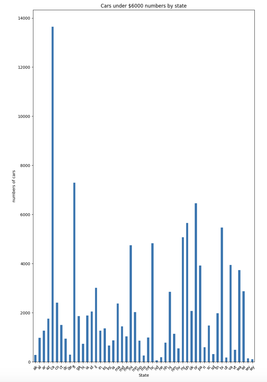
Plot a bar chart that illustrates the number of vehicles in each state, whose price is strictly lower than $6000. The bar chart should show the number of each of these vehicles in each state.
mydf = pd.read_csv("/anvil/projects/tdm/data/craigslist/vehicles.csv",index_col=0)import matplotlib.pyplot as plt
subDF = mydf[mydf['price']<6000]
cars_by_states = subDF.groupby('state').size()
cars_by_states.plot(kind = 'bar',figsize = (10,16))
plt.title("Cars under $6000 numbers by state")
plt.xlabel("State")
plt.ylabel("numbers of cars")
plt.xticks(rotation = 45)
plt.show()