Logistic Regression – Predicting Prescriptions Using Logistic Regression
Introduction
This guide introduces logistic regression through a real-world healthcare analytics example: predicting which prescribers are most likely to issue prescriptions for Ozempic (generic name Semaglutide). You’ll follow a full modeling workflow — from cleaning and preparing the data to interpreting the final model’s coefficients, evaluating predictive accuracy, and making new predictions.
By walking through this case step by step, you’ll learn how logistic regression can reveal the relationships between features like prescriber specialty, region, and cost patterns, and how these factors influence the likelihood of prescribing Semaglutide.
|
This guide was originally created as a seminar project, so you may notice it follows a question-and-answer format. Even so, it should still serve as a helpful resource to guide you through the process of building your own model. |
Project Objectives
This project focuses on using logistic regression to uncover the patterns behind Semaglutide prescriptions in U.S. Medicare data. You’ll explore which prescriber features most strongly predict whether a prescription involves Semaglutide.
Dataset Overview
We’ll use a subset of the Centers for Medicare & Medicaid Services (CMS) 2023 Medicare Part D Prescriber Public Use File. Each row represents a prescriber and a specific diabetes drug.
/anvil/projects/tdm/data/CMS/diabetes_prescriber_data.csv

This dataset contains real-world prescribing behavior. Using logistic regression, we’ll explore questions such as:
-
Which prescribers are most likely to prescribe Semaglutide?
-
Are there regional or specialty-based trends?
-
What financial or volume indicators influence prescription likelihood?
Key Variables
| Column | Description |
|---|---|
|
Prescriber’s state (two-letter code) |
|
Detailed specialty (e.g., Family Practice, Endocrinology) |
|
Brand name of the drug |
|
Generic name of the drug |
|
Total number of claims |
|
Approximate number of 30-day fills |
|
Total days of medication supplied |
|
Total drug cost across all claims |
|
Unique patients who received the drug |
|
Grouped specialty category (e.g., Primary Care) |
1. Data Cleaning and Feature Engineering
Class Distributions
Before we can analyze or model anything, we need to clean the data and add few new features (do some feature engineering). One of the first things you will do is create a binary target variable to indicate whether a record involves Semaglutide. This kind of variable only takes on two values: 1 if the drug is Semaglutide, and 0 if it is not. In Python, you can create a binary variable using a Boolean expression and then convert the result to integers using .astype(int).
For example:
df["Semaglutide_drug"] = (df["Gnrc_Name"] == "Semaglutide").astype(int)This creates a column where any row with Semaglutide is marked as 1, and all others are marked as 0. This will eventually serve as the outcome we try to predict.
Feature Engineering - Creating New Columns
Another important task we will perform is called feature engineering. Feature engineering is the process of transforming raw data into meaningful features that better represent the underlying problem to the predictive model. This includes creating, modifying, or grouping existing variables to enhance model performance or interpretability.
One simple but powerful example is creating a new column that provides more insight than the raw data alone. For instance, to understand how costly each prescription claim is, we can divide Tot_Drug_Cst (total drug cost) by Tot_Clms (total number of claims) to compute a new column called Cost_per_claim:
diabetes_prescriber_data["Cost_per_claim"] = diabetes_prescriber_data["Tot_Drug_Cst"] / diabetes_prescriber_data["Tot_Clms"]This gives us a per-claim cost that may be more meaningful for comparison across prescribers or regions.
Another useful technique is mapping existing values into broader categories. For example, individual state abbreviations in the Prscrbr_State_Abrvtn column can be mapped to broader U.S. Census regions. This can help us spot regional trends more easily than looking at each state individually:
state_region_map = {
    "CT": "Northeast", "CA": "West", "TX": "South", ...
}

diabetes_prescriber_data["Prscrbr_State_Region"] = diabetes_prescriber_data["Prscrbr_State_Abrvtn"].map(state_region_map)
By grouping states into regions, we reduce granularity while retaining useful geographic patterns, a valuable preprocessing step before modeling.
However, not all states in the dataset may appear in the dictionary. In those cases, .map() returns a missing value (NaN). To handle this, you can fill in those missing values with a default label like "Missing" using .fillna("Missing").
Value Counts
Finally, it is often useful to explore the distribution of values in a column. For example, how many rows fall into each region or how many are Semaglutide prescriptions. You can do this using .value_counts() for counts and .value_counts(normalize=True) for proportions.
These basic data preparation steps: binary indicators, feature engineering, mapping, and counting are critical in setting up a dataset for modeling. Now, you are ready for exploratory analysis.
Before building the model, we’ll create our target variable, add informative features, and prepare categorical groupings.
Let’s begin by loading the dataset and exploring its first few rows.
import pandas as pd
diabetes_prescriber_data = pd.read_csv("/anvil/projects/tdm/data/CMS/diabetes_prescriber_data.csv")
diabetes_prescriber_data.head()| Prscrbr_State_Abrvtn | Prscrbr_Type | Brnd_Name | Tot_Clms | Tot_30day_Fills | Tot_Day_Suply | Tot_Drug_Cst | Total_Patients | Gnrc_Name | Prscrbr_Type_Grouped |
|---|---|---|---|---|---|---|---|---|---|
KY |
Family Practice |
Ozempic |
18 |
19.7 |
568 |
18681.38 |
NaN |
Semaglutide |
Primary Care |
CA |
Endocrinology |
Ozempic |
113 |
230.7 |
6828 |
236624.18 |
25.0 |
Semaglutide |
Endocrinology |
MA |
Rheumatology |
Ozempic |
11 |
11.9 |
342 |
10413.53 |
NaN |
Semaglutide |
GI/Renal/Rheum |
TX |
Internal Medicine |
Ozempic |
107 |
130.3 |
3765 |
128932.39 |
20.0 |
Semaglutide |
Primary Care |
OH |
Certified Clinical Nurse Specialist |
Ozempic |
21 |
29.0 |
840 |
29104.96 |
NaN |
Semaglutide |
Advanced Practice |
We’ll now define our target variable: Semaglutide_drug, which equals 1 when the generic name is Semaglutide and 0 otherwise.
| Semaglutide_drug | count |
|---|---|
0 |
40065 |
1 |
8421 |
diabetes_prescriber_data["Semaglutide_drug"] = (diabetes_prescriber_data["Gnrc_Name"] == "Semaglutide").astype(int)
print(diabetes_prescriber_data["Semaglutide_drug"].value_counts())
Next, we’ll engineer new columns that reveal more about prescriber behavior. One useful metric is cost per claim:
diabetes_prescriber_data['Cost_per_claim'] = (
    diabetes_prescriber_data['Tot_Drug_Cst'] / diabetes_prescriber_data['Tot_Clms']
)
diabetes_prescriber_data[['Tot_Drug_Cst','Tot_Clms','Cost_per_claim']].head()| Tot_Drug_Cst | Tot_Clms | Cost_per_claim |
|---|---|---|
18681.38 |
18 |
1037.854444 |
236624.18 |
113 |
2094.019292 |
10413.53 |
11 |
946.684545 |
128932.39 |
107 |
1204.975607 |
29104.96 |
21 |
1385.950476 |
We can also group prescribers by U.S. region for easier interpretation.
state_region_map = {
    "CT": "Northeast","ME": "Northeast","MA": "Northeast","NH": "Northeast",
    "NJ": "Northeast","NY": "Northeast","PA": "Northeast","RI": "Northeast","VT": "Northeast",
    "IL": "Midwest","IN": "Midwest","IA": "Midwest","KS": "Midwest","MI": "Midwest","MN": "Midwest",
    "MO": "Midwest","NE": "Midwest","ND": "Midwest","OH": "Midwest","SD": "Midwest","WI": "Midwest",
    "AL": "South","AR": "South","DE": "South","DC": "South","FL": "South","GA": "South","KY": "South",
    "LA": "South","MD": "South","MS": "South","NC": "South","OK": "South","SC": "South","TN": "South",
    "TX": "South","VA": "South","WV": "South",
    "AK": "West","AZ": "West","CA": "West","CO": "West","HI": "West","ID": "West","MT": "West",
    "NV": "West","NM": "West","OR": "West","UT": "West","WA": "West","WY": "West",
    "PR": "Territory","VI": "Territory","GU": "Territory","MP": "Territory","AS": "Territory",
    "AA": "Military","AE": "Military","AP": "Military","ZZ": "Unknown"
}
diabetes_prescriber_data["Prscrbr_State_Region"] = (
    diabetes_prescriber_data["Prscrbr_State_Abrvtn"].map(state_region_map)
)
diabetes_prescriber_data["Prscrbr_State_Region"].value_counts(dropna=False)| Prscrbr_State_Region | count |
|---|---|
South |
17785 |
Midwest |
10571 |
West |
10170 |
Northeast |
9559 |
Territory |
391 |
Military |
7 |
Unknown |
3 |
At this stage, we’ve created a structured dataset suitable for exploratory data analysis.
2. Exploratory Data Analysis
Before we build any models, we need to take a step back and get to know our data. This is the purpose of exploratory data analysis, (EDA). You look for patterns, inconsistencies, and clues that might be helpful to understand how different variables relate to the outcome you’re trying to predict. In our case, that outcome is Semaglutide_drug, a column that tells us whether or not a prescription record involves the diabetes drug Semaglutide.
Each of the questions below helps uncover different aspects of the data structure and variability that may influence our model’s performance or interpretability.
Missing Values
We will start by checking for missing values in the numeric columns. This might seem minor, but it is actually really important. If a feature is missing data for just a few rows, we might be able to fill it in or move on. But if half the values are missing, it could be a sign that the variable is not reliable for modeling.
To calculate the percentage of missing values, we can use the .isna() method to find missing entries, then apply .mean() to calculate the proportion of missing values in each column. Multiplying this by 100 gives us the percentage. You can also use .sum() if you want the raw count.
Group Statistics: Mean and Standard Deviation
Next, we will split the data into two groups: one where Semaglutide was prescribed and one where it was not. Then we will calculate the mean (average) and standard deviation (a measure of spread) for key numeric features in each group. This gives us insight into whether, for example, Semaglutide is associated with higher costs or larger patient counts. These statistics can help us start forming hypotheses, like whether prescribers who use Semaglutide tend to prescribe more 30-day fills or serve more patients.
To do this, we can use .groupby("Semaglutide_drug") followed by .agg(["mean", "std"]) on the numeric columns. This will create a side-by-side comparison table showing the average and variability for each group.
Correlation Between Numeric Variables
We will also explore how the numeric features relate to one another using correlation. Correlation is a measure that ranges from -1 to 1 and tells us how strongly two variables move together. A value close to 1 means they move together in the same direction, while -1 indicates that one tends to decrease as the other increases. A value near 0 suggests no clear relationship.
Heatmap Visualization
To visualize these relationships, we will use a heatmap. A heatmap is a color-coded grid where darker or brighter colors represent stronger relationships. This allows us to quickly see which variables are closely linked and potentially redundant.
To create the heatmap, we first use .corr() on the numeric columns to compute all pairwise correlations. Then we pass that matrix into sns.heatmap(), a Seaborn function that creates the visualization. By setting annot=True, we can print the correlation values directly on the plot, which makes it easier to interpret.
Geographic Patterns
Lastly, we will examine regional prescribing patterns. We want to know: do certain prescribers in certain regions prescribe Semaglutide more often? A good way to check this is with a count plot, which shows how many records come from each region — and whether Semaglutide was prescribed.
Using sns.countplot(), we can plot the number of prescribers in each Prscrbr_State_Region and split the bars by Semaglutide_drug using the hue parameter. This lets us compare across regions in one chart and spot any geographic trends in prescription behavior.
|
Learn more about count plots and how to use |
To explore relationships between numeric variables (like cost and total fills), we can use .corr() to compute pairwise correlations and sns.heatmap() to visualize them as a color-coded matrix.
|
See how to create heatmaps from correlation matrices:
Seaborn |
Before modeling, we’ll explore patterns, missing values, and relationships between variables.
Check missing numeric data:
numeric_cols = ['Cost_per_claim','Tot_30day_Fills','Tot_Day_Suply','Total_Patients']
print(diabetes_prescriber_data[numeric_cols].isna().sum())
Next, compare group averages to spot differences between prescribers who do and don’t prescribe Semaglutide.
summary_stats = diabetes_prescriber_data.groupby("Semaglutide_drug")[numeric_cols].mean()
summary_stats| Semaglutide_drug | Cost_per_claim | Tot_30day_Fills | Tot_Day_Suply |
|---|---|---|---|
Total_Patients |
0 |
151.209056 |
105.228559 |
2694.060552 |
34.224819 |
1 |
1293.350409 |
Let’s visualize correlation between numeric variables using a heatmap.
import seaborn as sns
import matplotlib.pyplot as plt

corr_matrix = diabetes_prescriber_data[numeric_cols].corr()
plt.figure(figsize=(8,6))
sns.heatmap(corr_matrix, annot=True, cmap="coolwarm", center=0)
plt.title("Correlation Matrix of Numeric Features")
plt.tight_layout()
plt.show()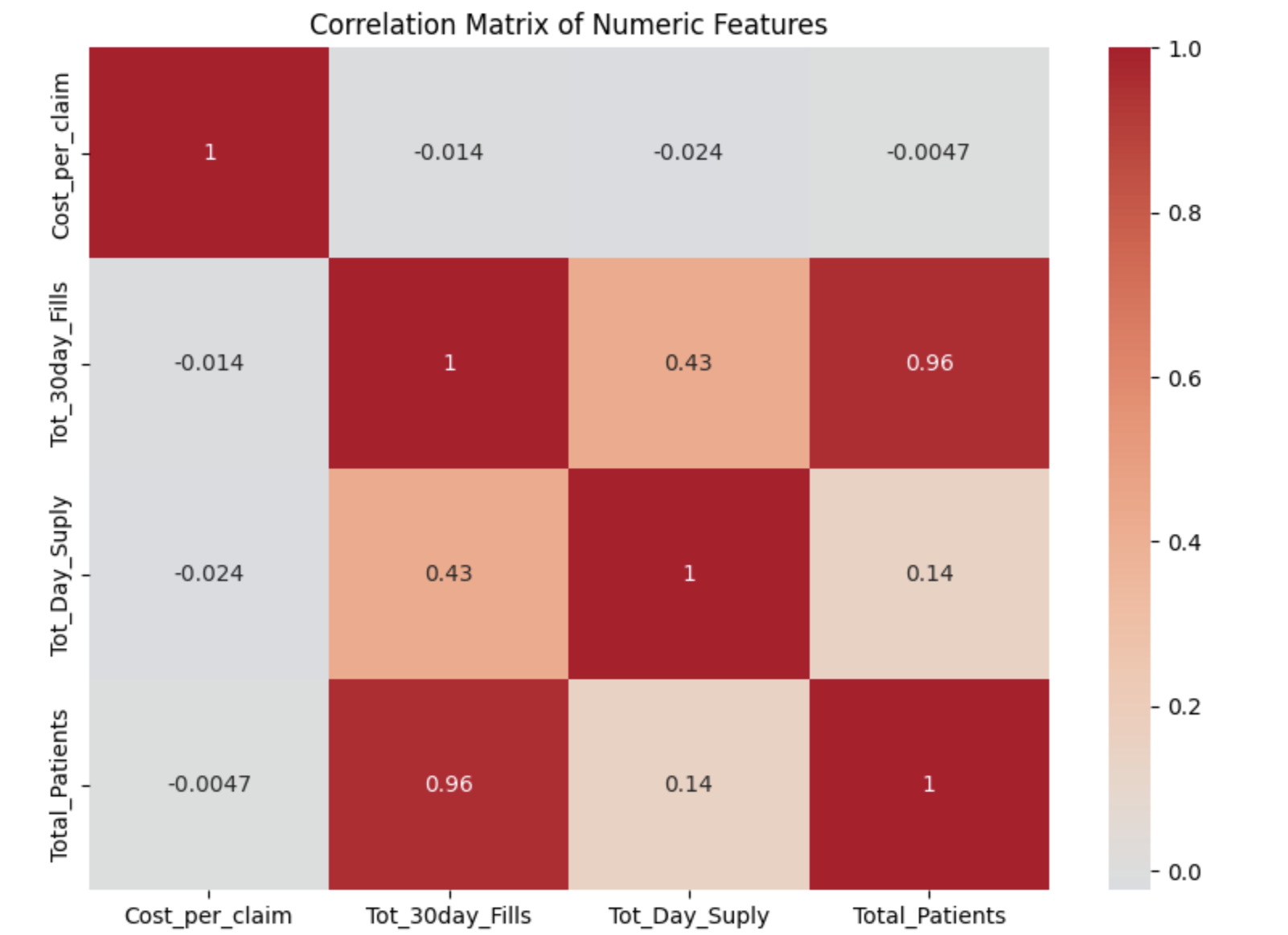
Finally, explore geographic patterns:
plt.figure(figsize=(10,5))
sns.countplot(data=diabetes_prescriber_data, x='Prscrbr_State_Region', hue='Semaglutide_drug')
plt.title('Semaglutide Prescriptions by Region')
plt.xticks(rotation=45)
plt.tight_layout()
plt.show()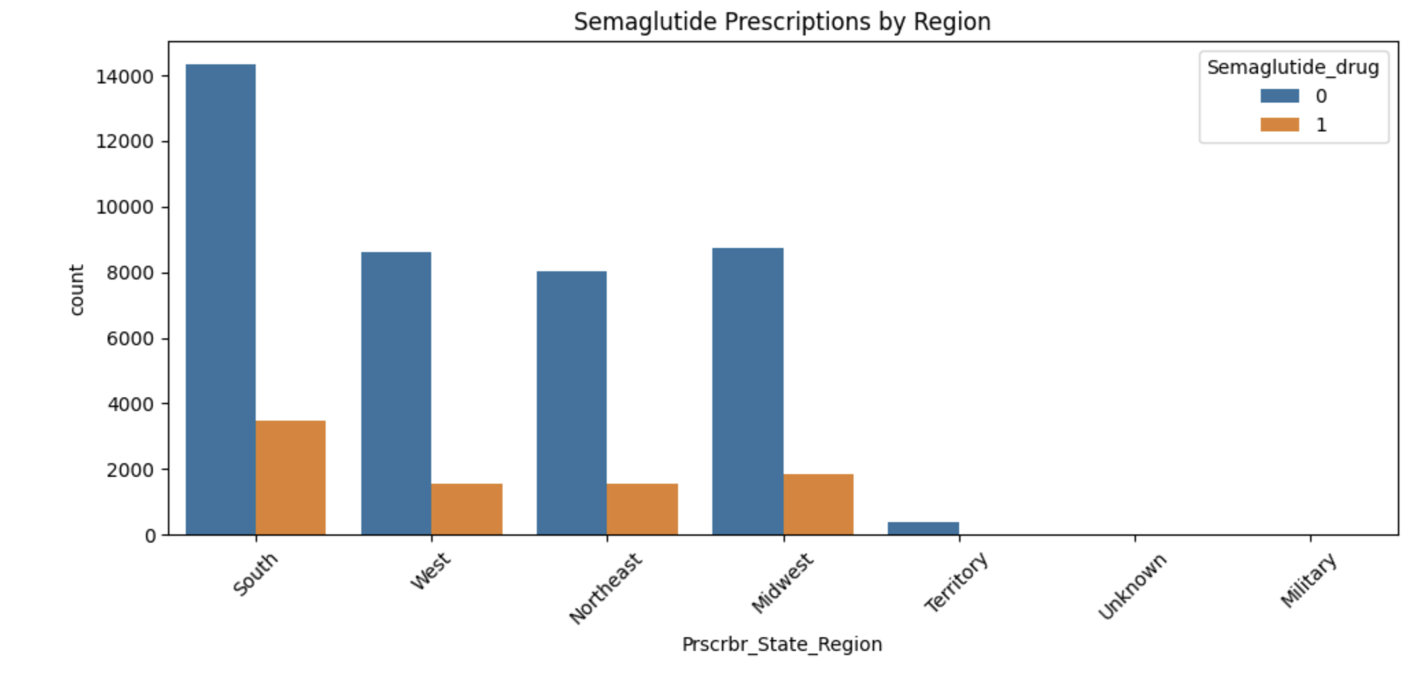
3. Splitting Data for Modeling
In predictive modeling, one of the first steps is to distinguish between predictors (also known as features or independent variables) and response (or target). The predictors are the pieces of information the model will use to make its decisions, while the response is the variable we wish to predict. In this context, we are interested in predicting whether a prescriber issued a prescription for Semaglutide which is a binary outcome that will form the basis of our classification model.
Splitting the Data
Models are not trained on entire datasets. Instead, we partition the data into multiple subsets to serve distinct roles in the model development process. The most common partitioning scheme involves three subsets:
-
Training data is what the model actually learns from. It’s used to find patterns and relationships between the features and the target.
-
Validation data helps us make decisions about the model such as choosing which features to keep or which settings (hyperparameters) work best. We use it to check how well it’s doing while we’re still building it.
-
Test data is completely held out until the very end. It gives us a final check to see how well the model is likely to perform on brand-new data it has never seen before.
Understanding the Subsets
In supervised learning, our dataset is split into predictors (X) and a target variable (y). We further divide these into training, validation, and test subsets to properly evaluate model performance and prevent overfitting.
Here is what each of these variables means:
| Subset | X (Predictors) | y (Target Labels) |
|---|---|---|
Training |
|
|
Validation |
|
|
Test |
|
|
These splits are crucial to simulate how the model will perform in real-world settings and ensure that we’re not simply memorizing the data.
|
In practice, it’s recommended to use cross-validation, which provides a more reliable estimate of a model’s performance by repeatedly splitting the data into training and validation sets and averaging the results. This helps reduce the variability that can come from a single random split. However, for this project, we will only perform a single random train/validation/test split using a fixed random seed. |
Stratified Sampling
One subtle but essential consideration is that we must maintain the distribution of the response variable, particularly in classification settings with imbalanced classes. To achieve this, we use stratified sampling, which ensures that the proportion of cases (e.g., Semaglutide = 1 vs. 0) remains consistent across the training, validation, and test sets. This avoids the model performing poorly simply because the subsets are not represented in the data.
Finally, it is good to inspect each of the resulting subsets. How many observations are in each split? Is the class balance preserved? These simple diagnostics are foundational checks that ensure the integrity of downstream modeling efforts which you will perform in the questions below.
To evaluate the model fairly, we’ll split data into train, validation, and test sets.
from sklearn.model_selection import train_test_split

model_features = ["Tot_30day_Fills","Tot_Day_Suply","Cost_per_claim","Total_Patients",
                  "Prscrbr_State_Region","Prscrbr_Type_Grouped"]

X = diabetes_prescriber_data[model_features]
y = diabetes_prescriber_data["Semaglutide_drug"]

X_train_val, X_test, y_train_val, y_test = train_test_split(
    X, y, test_size=0.20, stratify=y, random_state=42)

X_train, X_val, y_train, y_val = train_test_split(
    X_train_val, y_train_val, test_size=0.25, stratify=y_train_val, random_state=42)
Check that class proportions remain balanced across subsets:
for name, arr in [("Train", y_train), ("Validation", y_val), ("Test", y_test)]:
    print(f"\n{name} rows:", len(arr))
print(arr.value_counts(normalize=True))| Dataset | Rows | Class Proportion (Semaglutide_drug) |
|---|---|---|
Train |
29,091 |
0: 0.826304 |
1: 0.173696 |
Validation |
9,697 |
0: 0.826338 |
1: 0.173662 |
Test |
9,698 |
0: 0.826356 |
1: 0.173644 |
4. Data Preprocessing
Before we can fit our logistic regression model, we need to make sure our dataset is clean and formatted correctly. This stage, called preprocessing, ensures that our features are in a numerical format, have no missing values, are properly scaled, and are aligned across all datasets. Logistic regression, like many models, assumes that the data has been prepared in a certain way. If we skip these steps or do them incorrectly, our model may perform poorly or fail to train altogether.
These question will walk you through five key preprocessing steps, some of which have partially completed code to help guide you.
Handling Missing Values in Categorical Variables
Missing values can cause errors during modeling and interfere with scaling or encoding. For categorical columns like Prscrbr_State_Region and Prscrbr_Type_Grouped, we’ll fill in missing values with the string "Missing". This way, even rows with unknown data are retained and can be captured as their own category during encoding.
For numeric columns like Tot_30day_Fills, Tot_Day_Suply, Cost_per_claim, and Total_Patients, we’ll fill missing values using the median from the training set. This is preferred over the mean because the median is less sensitive to outliers. You’ll use .fillna() to perform this replacement.
For one-hot encoded (binary) columns, we’ll fill missing values with 0. These columns represent the presence or absence of a category, so 0 safely indicates that the feature was not activated for that row.
One-Hot Encoding Categorical Variables
Machine learning models can’t interpret text categories directly. We convert them into numeric form using one-hot encoding, which creates a separate binary column for each unique category. You may hear them as dummy variables, too. For example, the column Prscrbr_State_Region might be transformed into:
-
Prscrbr_State_Region_Midwest -
Prscrbr_State_Region_South -
Prscrbr_State_Region_Northeast -
etc.
We use pd.get_dummies() to apply one-hot encoding. The option drop_first=True tells pandas to omit the first category — this prevents duplicate, which is especially important in models like logistic regression.
Why We Encode Train, Validation, and Test Separately
We always apply one-hot encoding to X_train first. That’s because we want the model to learn from the structure of the training data, including which categories exist. We then apply the same process to X_val and X_test — but here’s the tricky part:
-
These datasets may contain a different set of categories (some categories might be missing, or new ones might appear).
-
If we encoded all three together, we would risk leaking information from validation or test sets into training — which we want to avoid to ensure fair model evaluation.
To resolve this, we:
-
Encode each dataset separately using
pd.get_dummies(). -
Then use
.reindex(columns=encoded_columns, fill_value=0)onX_valandX_testto ensure their columns match the training set exactly — any missing columns will be added with `0`s.
This guarantees that the model sees inputs with the same structure at all stages (training, validation, testing), even if the underlying data varies.
Standardizing Numeric Features
Features that are on very different numeric scales can cause issues for models like logistic regression. For example, Tot_Day_Suply might be in the hundreds while Cost_per_claim could be in the thousands. If we don’t scale them, the model might assign disproportionate importance to the larger features.
To address this, we use StandardScaler() from sklearn.preprocessing. This function subtracts the mean and divides by the standard deviation, resulting in a column with mean 0 and standard deviation 1. We fit the scaler on X_train[numeric_cols], and apply the transformation to X_train, X_val, and X_test.
Converting Boolean Columns
Some features may be stored as True/False. Most models, including logistic regression, expect numeric input. We use .astype(int) to convert all Boolean columns into 1/0 format, which the model can interpret as binary indicators.
Final Structure Check
After all these steps, it’s important to verify that X_train, X_val, and X_test all have the same number and order of columns. This ensures the model receives a consistent input structure during training and evaluation.
Now we’ll clean and standardize features for modeling.
-
Fill missing values for categorical and numeric columns.
-
Apply one-hot encoding to categorical columns.
-
Standardize numeric variables.
-
Ensure train/validation/test sets share identical column structures.
categorical_cols = ['Prscrbr_State_Region','Prscrbr_Type_Grouped']

for df in [X_train, X_val, X_test]:
    for col in categorical_cols:
        df[col] = df[col].fillna("Missing")

X_train = pd.get_dummies(data=X_train, columns=categorical_cols, drop_first=True)
X_test = pd.get_dummies(data=X_test, columns=categorical_cols, drop_first=True)
X_val  = pd.get_dummies(data=X_val,  columns=categorical_cols, drop_first=True)

encoded_columns = X_train.columns
X_test = X_test.reindex(columns=encoded_columns, fill_value=0)
X_val  = X_val.reindex(columns=encoded_columns, fill_value=0)
Standardize numeric variables:
from sklearn.preprocessing import StandardScaler

numeric_cols = ['Tot_30day_Fills','Tot_Day_Suply','Cost_per_claim','Total_Patients']
scaler = StandardScaler()

X_train[numeric_cols] = scaler.fit_transform(X_train[numeric_cols])
X_val[numeric_cols]   = scaler.transform(X_val[numeric_cols])
X_test[numeric_cols]  = scaler.transform(X_test[numeric_cols])
Finally, confirm column consistency:
print(X_train.shape, X_val.shape, X_test.shape)X_train shape: (29091, 26)
X_val shape: (9697, 26)
X_test shape: (9698, 26)
5. Model Building and Evaluation
Logistic Regression and the Sigmoid Function
In binary classification problems, our goal is to predict the probability of a binary outcome: such as success/failure or 1/0. Unlike linear regression, which can produce any real number, logistic regression bounds the output between 0 and 1 by applying the sigmoid function. This lets us model probabilities directly using the equation:
$p = 1 / (1 + e^{(-(\beta_0 + \beta_1 \times X)})$
where
-
$p$ is the predicted probability of success (e.g., winning)
-
$\beta_0$ is the intercept
-
$\beta_1$ is the coefficient for the input variable $X$
-
$e$ is Euler’s number (approximately 2.718)
The result is an S-shaped curve that flattens near 0 and 1, making it ideal for modeling probabilities.
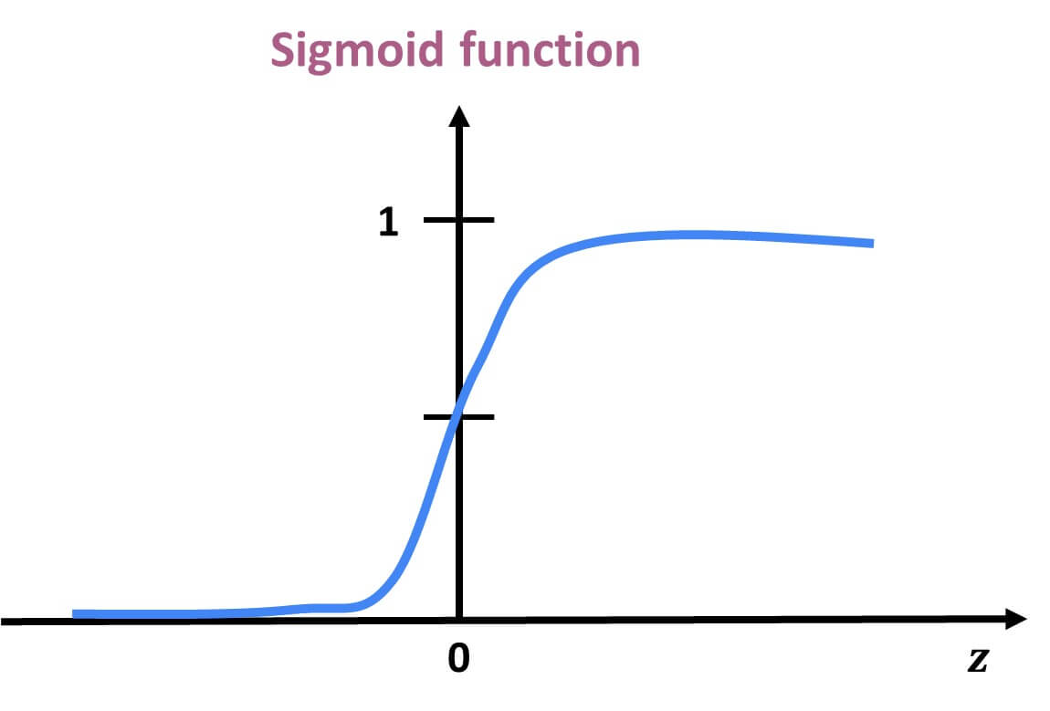
|
Why can’t this equation give probabilities outside of 0 to 1? No matter what value $X$ takes, the exponentiated term is always positive.
So the sigmoid function always produces values strictly between 0 and 1. |
Log Odds (Logit) Transformation
Modeling probability with a linear equation (like in linear regression) does not work because probabilities must stay between 0 and 1. To make logistic regression behave like linear regression, we apply a transformation to the probability using log-odds, or the logit function:
-
$\log\left(\dfrac{p}{1 - p}\right) = \beta_0 + \beta_1 X$ where
-
$\dfrac{p}{1 - p}$ is called the odds — the probability of success divided by the probability of failure.
-
$\log\left(\dfrac{p}{1 - p}\right)$ is the log-odds, which maps probabilities (between 0 and 1) to the entire real number line.
|
If odds = 4, that means the event is 4 times more likely to happen than not. In other words, the probability of success is 4× greater than the probability of failure. |
Three Equivalent Forms of the Logistic Model
| Form | Expression |
|---|---|
Log-odds (logit) |
$\log\left(\dfrac{p}{1 - p}\right) = \beta_0 + \beta_1 X$ |
Odds |
$\dfrac{p}{1 - p} = e^{\beta_0 + \beta_1 X}$ |
Probability (sigmoid) |
$p = \dfrac{1}{1 + e^{-(\beta_0 + \beta_1 X)}}$ |
Each form is mathematically equivalent, and which one you use depends on the context:
-
Use log-odds when modeling or interpreting coefficients.
-
Use odds when communicating risk ratios.
-
Use probability when making predictions.
Key Features of the Logistic Curve
-
It always produces outputs between 0 and 1, making it ideal for probability modeling.
-
The log-odds transformation allows us to model the predictors in a linear way, just like in linear regression.
How to Interpret Coefficients
In a logistic regression model, each coefficient (β) represents the change in the log-odds of the outcome for a one-unit increase in the predictor, holding all else constant.
| Interpretation Type | What It Means |
|---|---|
Raw Coefficient (β) |
A one-unit increase in X increases the log-odds of the outcome by β. |
Exponentiated Coefficient (e^β) |
A one-unit increase in X multiplies the odds of the outcome by e^β. This is called the odds ratio. |
Odds Ratio > 1 |
The predictor increases the likelihood of the outcome. |
Odds Ratio < 1 |
The predictor decreases the likelihood of the outcome. |
Odds Ratio = 1 |
The predictor has no effect on the odds of the outcome. |
|
To interpret a coefficient as an odds ratio, you must exponentiate it: Odds Ratio = e^β This is especially helpful when explaining or interpreting the results in plain language! For example, if β = 0.75, then e^β ≈ 2.12, meaning a one-unit increase in that predictor makes the outcome about 2.1× more likely — or increases the odds by 112%. |
Checking Multicollinearity with VIF
Before fitting our model, we use Variance Inflation Factor (VIF) to check for multicollinearity:
VIF(Xᵢ) = 1 / (1 – R²ᵢ)
where ${R_i}^2$ is the $R^2$ from a regression of $X_i$ onto all of other predictors. You can easily see that having ${R_i}^2$ close to one refer to collinearity and so the VIF will be large.
A VIF above 10 suggests the variable is highly collinear and may need to be removed.
Feature Selection with AIC and Forward Selection
To reduce the number of features, we use forward selection guided by Akaike Information Criterion (AIC):
AIC = 2·k – 2·log(L),
where
-
k is the number of parameters in the model
-
L is the likelihood of the model
The model with the lowest AIC fits the data by striking a balance between fit and the number of parameters (features) used. If we pick the model with the smallest AIC, we are choosing the model with a low k (fewer features) while still ensuring it has a high likelihood log(L).
Forward selection begins with no predictors and adds them one at a time, at each step choosing the variable that leads to the greatest reduction in AIC.
|
AIC is one of several possible criteria for feature selection. While we are using AIC in this project, you could also use:
Each criterion has trade-offs. AIC is popular because it balances model fit and complexity, making it a solid choice when comparing logistic regression models. For consistency, we’ll use AIC throughout this project. |
Interpreting Model Coefficients with Odds Ratios
Once the model is fit, we convert coefficients into odds ratios to interpret them:
Odds Ratio = exp(β)
| Odds Ratio Value | Interpretation |
|---|---|
Greater than 1 |
Increases odds of prescribing Semaglutide |
Less than 1 |
Decreases odds of prescribing Semaglutide |
Equal to 1 |
No effect on the odds |
Evaluating Model Performance
Confusion Matrix
A confusion matrix compares the model’s predicted classes with the actual outcomes. It is used to calculate accuracy, precision, recall, and more.
| Predicted: No (0) | Predicted: Yes (1) | |
|---|---|---|
Actual: No (0) |
True Negative (TN) |
False Positive (FP) |
Actual: Yes (1) |
False Negative (FN) |
True Positive (TP) |
|
From the confusion matrix, we can compute key metrics:
| Metric | Formula |
|---|---|
Accuracy |
(TP + TN) / Total |
Precision |
TP / (TP + FP) |
Recall (Sensitivity) |
TP / (TP + FN) |
Specificity |
TN / (TN + FP) |
ROC Curve and AUC
A Receiver Operating Characteristic (ROC) curve plots the tradeoff between:
-
True Positive Rate (Recall)
-
False Positive Rate (1 – Specificity)
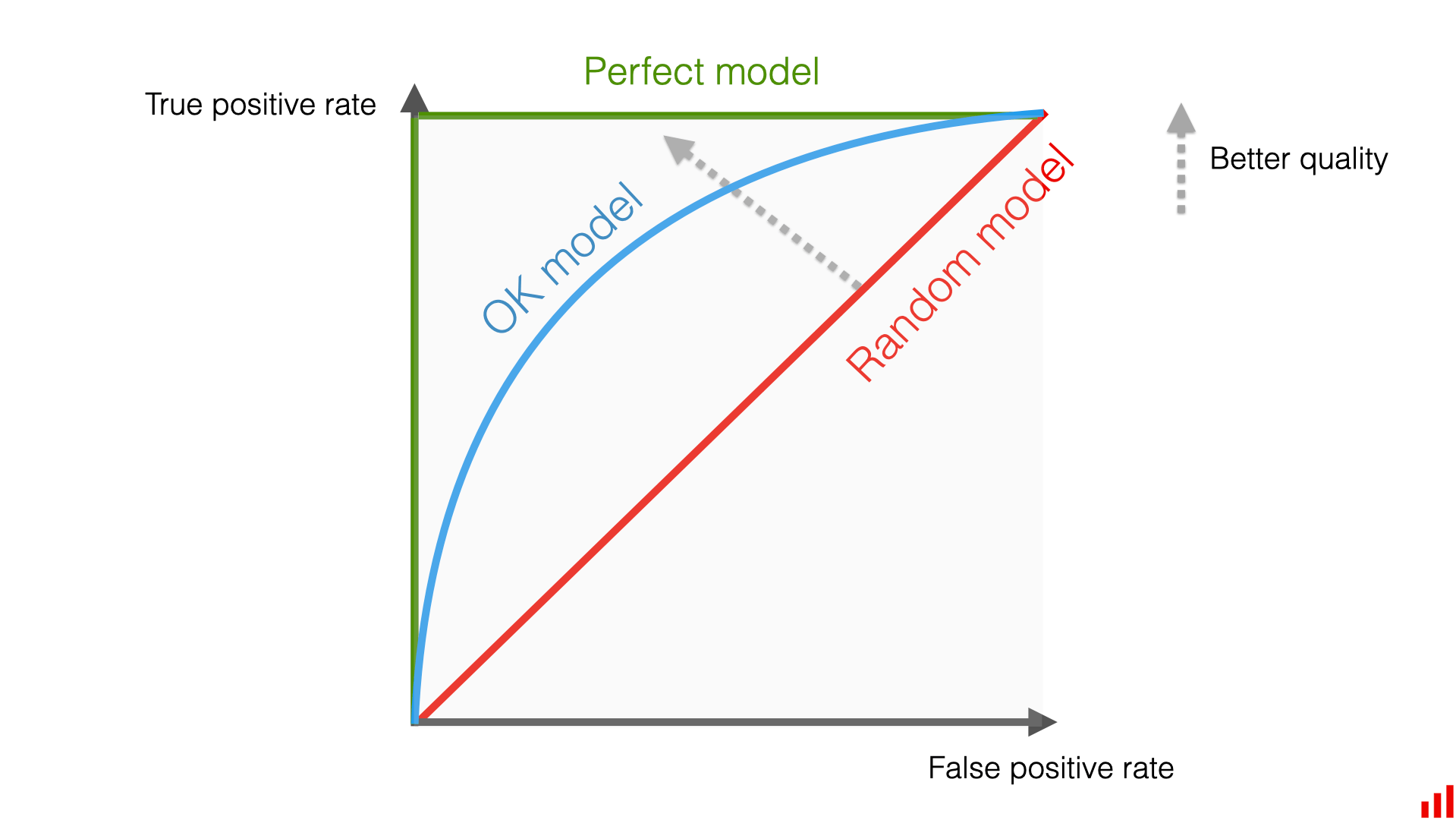
It shows how the model performs across all classification thresholds.
The Area Under the Curve (AUC) is a summary metric:
| AUC Score | Interpretation |
|---|---|
0.5 |
No better than random guessing |
0.7–0.8 |
Fair performance |
0.8–0.9 |
Strong performance |
1.0 |
Perfect classification |
|
AUC is threshold-independent — it evaluates how well the model ranks positive cases above negative ones, regardless of where we place the 0.5 decision boundary. |
You should compute and compare AUC scores for:
-
Training set
-
Validation set
-
Test set
This helps check for overfitting, which occurs when a model learns the noise or specific quirks of the training data rather than the underlying patterns. An overfitted model may perform very well on the training set but poorly on new, unseen data (test and validation dataset!). By evaluating performance on validation and test sets, we can ensure the model generalizes well to other data.
Ready to Model
Now that you’ve reviewed the key concepts, proceed with training your logistic regression model and interpreting the results using this knowledge!
We’ll now fit a logistic regression model, interpret coefficients, and assess performance.
Checking Multicollinearity
import numpy as np
from sklearn.linear_model import LinearRegression

def calculate_vif(X):
    vif_dict = {}
    for feature in X.columns:
        y = X[feature]
        X_pred = X.drop(columns=feature)
        r2 = LinearRegression().fit(X_pred, y).score(X_pred, y)
        vif_dict[feature] = np.inf if r2 == 1 else 1/(1 - r2)
    return pd.Series(vif_dict, name="VIF").sort_values(ascending=False)

vif_values = calculate_vif(X_train.select_dtypes(include=[np.number]))
vif_values| Feature | VIF |
|---|---|
Tot_30day_Fills |
948.471582 |
Total_Patients |
832.139064 |
Tot_Day_Suply |
51.847664 |
Prscrbr_State_Region_South |
1.704191 |
Prscrbr_State_Region_West |
1.553571 |
Prscrbr_State_Region_Northeast |
1.532947 |
Prscrbr_Type_Grouped_Primary Care |
1.452644 |
Prscrbr_Type_Grouped_Dental |
1.223323 |
Prscrbr_Type_Grouped_Missing |
1.213235 |
Prscrbr_Type_Grouped_Dermatology/Ophthalmology |
1.138811 |
Prscrbr_Type_Grouped_Surgery |
1.111818 |
Prscrbr_Type_Grouped_Neuro/Psych |
1.094020 |
Prscrbr_Type_Grouped_Cardiology |
1.091790 |
Prscrbr_Type_Grouped_GI/Renal/Rheum |
1.074066 |
Prscrbr_Type_Grouped_Other |
1.071768 |
Cost_per_claim |
1.058779 |
Prscrbr_Type_Grouped_Endocrinology |
1.058377 |
Prscrbr_Type_Grouped_Women’s Health |
1.050068 |
Prscrbr_Type_Grouped_Oncology/Hematology |
1.043538 |
Prscrbr_State_Region_Territory |
1.034220 |
Prscrbr_Type_Grouped_Pulmonary/Critical Care |
1.021193 |
Prscrbr_Type_Grouped_Rehabilitation |
1.019222 |
Prscrbr_Type_Grouped_Anesthesia/Pain |
1.014930 |
Prscrbr_Type_Grouped_Palliative Care |
1.002206 |
Prscrbr_State_Region_Military |
1.001128 |
Prscrbr_State_Region_Unknown |
1.000924 |
Remove highly collinear variables (VIF > 10), except Tot_Day_Suply which we’ll retain for interpretability.
features_after_vif = [col for col in X_train.columns if col in (
'Tot_Day_Suply','Cost_per_claim','Prscrbr_State_Region_South',
'Prscrbr_Type_Grouped_Primary Care','Prscrbr_Type_Grouped_Endocrinology')]
X_train = X_train[features_after_vif]
Forward Selection with AIC
import statsmodels.api as sm
import warnings
warnings.filterwarnings("ignore")

def forward_selection(X, y, aic_threshold=20):
    included = []
    current_score = np.inf
    while True:
        changed=False
        excluded = list(set(X.columns) - set(included))
        scores = []
        for new_col in excluded:
            try:
                model = sm.Logit(y, sm.add_constant(X[included + [new_col]])).fit(disp=0)
                scores.append((model.aic, new_col))
            except:
                continue
        if not scores: break
        scores.sort()
        best_new_score, best_candidate = scores[0]
        if current_score - best_new_score >= aic_threshold:
            included.append(best_candidate)
            current_score = best_new_score
            changed=True
        if not changed: break
    return included

selected_features = forward_selection(X_train, y_train)
selected_features
Selected features: ['Cost_per_claim', 'Prscrbr_Type_Grouped_Primary Care', 'Prscrbr_Type_Grouped_GI/Renal/Rheum', 'Tot_Day_Suply', 'Prscrbr_Type_Grouped_Endocrinology', 'Prscrbr_Type_Grouped_Neuro/Psych', 'Prscrbr_Type_Grouped_Missing', 'Prscrbr_Type_Grouped_Surgery', 'Prscrbr_Type_Grouped_Other', "Prscrbr_Type_Grouped_Women’s Health", 'Prscrbr_State_Region_South']
Fitting the Final Model
X_train_final = sm.add_constant(X_train[selected_features])
final_model = sm.Logit(y_train, X_train_final).fit()
print(final_model.summary())
print(f"AIC: {final_model.aic}")
Optimization terminated successfully.
Current function value: 0.262632
Iterations 10
Logit Regression Results
==============================================================================
Dep. Variable: Semaglutide_drug No. Observations: 29091
Model: Logit Df Residuals: 29079
Method: MLE Df Model: 11
Date: Tue, 30 Dec 2025 Pseudo R-squ.: 0.4312
Time: 16:35:04 Log-Likelihood: -7640.2
converged: True LL-Null: -13431.
Covariance Type: nonrobust LLR p-value: 0.000
=======================================================================================================
coef std err z P>|z| [0.025 0.975]
-------------------------------------------------------------------------------------------------------
const -2.3807 0.038 -63.081 0.000 -2.455 -2.307
Cost_per_claim 2.4191 0.036 66.890 0.000 2.348 2.490
Prscrbr_Type_Grouped_Primary Care 1.2536 0.045 28.164 0.000 1.166 1.341
Prscrbr_Type_Grouped_GI/Renal/Rheum -4.8014 0.357 -13.449 0.000 -5.501 -4.102
Tot_Day_Suply -0.7831 0.044 -17.731 0.000 -0.870 -0.697
Prscrbr_Type_Grouped_Endocrinology 1.8776 0.148 12.667 0.000 1.587 2.168
Prscrbr_Type_Grouped_Neuro/Psych -6.7406 0.959 -7.027 0.000 -8.621 -4.861
Prscrbr_Type_Grouped_Missing -1.4901 0.136 -10.951 0.000 -1.757 -1.223
Prscrbr_Type_Grouped_Surgery -2.5203 0.343 -7.348 0.000 -3.193 -1.848
Prscrbr_Type_Grouped_Other -1.6574 0.268 -6.196 0.000 -2.182 -1.133
Prscrbr_Type_Grouped_Women's Health -2.0414 0.451 -4.524 0.000 -2.926 -1.157
Prscrbr_State_Region_South 0.2295 0.043 5.301 0.000 0.145 0.314
=======================================================================================================
Final AIC: 15304.476049756959Interpreting Coefficients with Odds Ratios
odds_ratios = pd.DataFrame({
    "Odds Ratio": np.exp(final_model.params),
    "P-value": final_model.pvalues
})
odds_ratios["Direction"] = odds_ratios["Odds Ratio"].apply(
    lambda x: "Increases Odds" if x > 1 else ("Decreases Odds" if x < 1 else "No Effect"))
odds_ratios.round(3)| Feature | Odds Ratio | P-value | Direction |
|---|---|---|---|
Cost_per_claim |
11.236 |
0.0 |
Increases Odds |
Prscrbr_Type_Grouped_Endocrinology |
6.538 |
0.0 |
Increases Odds |
Prscrbr_Type_Grouped_Primary Care |
3.503 |
0.0 |
Increases Odds |
Prscrbr_State_Region_South |
1.258 |
0.0 |
Increases Odds |
Tot_Day_Suply |
0.457 |
0.0 |
Decreases Odds |
Prscrbr_Type_Grouped_Missing |
0.225 |
0.0 |
Decreases Odds |
Prscrbr_Type_Grouped_Other |
0.191 |
0.0 |
Decreases Odds |
Prscrbr_Type_Grouped_Women’s Health |
0.130 |
0.0 |
Decreases Odds |
const |
0.092 |
0.0 |
Decreases Odds |
Prscrbr_Type_Grouped_Surgery |
0.080 |
0.0 |
Decreases Odds |
Prscrbr_Type_Grouped_GI/Renal/Rheum |
0.008 |
0.0 |
Decreases Odds |
Prscrbr_Type_Grouped_Neuro/Psych |
0.001 |
0.0 |
Decreases Odds |
Confusion Matrices
from sklearn.metrics import confusion_matrix

def display_cm(y_true, y_pred, label):
    cm = confusion_matrix(y_true, y_pred)
    df = pd.DataFrame(cm, index=["Actual 0","Actual 1"], columns=["Pred 0","Pred 1"])
    print(f"\n{label} Confusion Matrix:\n", df)

X_val_final = sm.add_constant(X_val[selected_features])
X_test_final = sm.add_constant(X_test[selected_features])

train_pred = (final_model.predict(X_train_final) >= 0.5).astype(int)
val_pred   = (final_model.predict(X_val_final)   >= 0.5).astype(int)
test_pred  = (final_model.predict(X_test_final)  >= 0.5).astype(int)

display_cm(y_train, train_pred, "Train")
display_cm(y_val, val_pred, "Validation")
display_cm(y_test, test_pred, "Test")| Train Confusion Matrix | Predicted 0 | Predicted 1 |
|---|---|---|
Actual 0 |
23608 |
430 |
Actual 1 |
1260 |
3793 |
| Validation Confusion Matrix | Predicted 0 | Predicted 1 |
|---|---|---|
Actual 0 |
7875 |
138 |
Actual 1 |
421 |
1263 |
| Test Confusion Matrix | Predicted 0 | Predicted 1 |
|---|---|---|
Actual 0 |
7865 |
149 |
Actual 1 |
424 |
1260 |
ROC Curves and AUC
from sklearn.metrics import roc_curve, roc_auc_score
import matplotlib.pyplot as plt

def plot_roc(y_true, y_proba, label):
    fpr, tpr, _ = roc_curve(y_true, y_proba)
    auc = roc_auc_score(y_true, y_proba)
    plt.plot(fpr, tpr, label=f"{label} (AUC={auc:.2f})")

plt.figure(figsize=(8,6))
plot_roc(y_train, final_model.predict(X_train_final), "Train")
plot_roc(y_val, final_model.predict(X_val_final), "Validation")
plot_roc(y_test, final_model.predict(X_test_final), "Test")
plt.plot([0,1],[0,1],'k--')
plt.title("ROC Curves - Train, Validation, and Test")
plt.xlabel("False Positive Rate")
plt.ylabel("True Positive Rate")
plt.legend()
plt.grid(True)
plt.show()

print("Train AUC:", roc_auc_score(y_train, final_model.predict(X_train_final)))
print("Validation AUC:", roc_auc_score(y_val, final_model.predict(X_val_final)))
print("Test AUC:", roc_auc_score(y_test, final_model.predict(X_test_final)))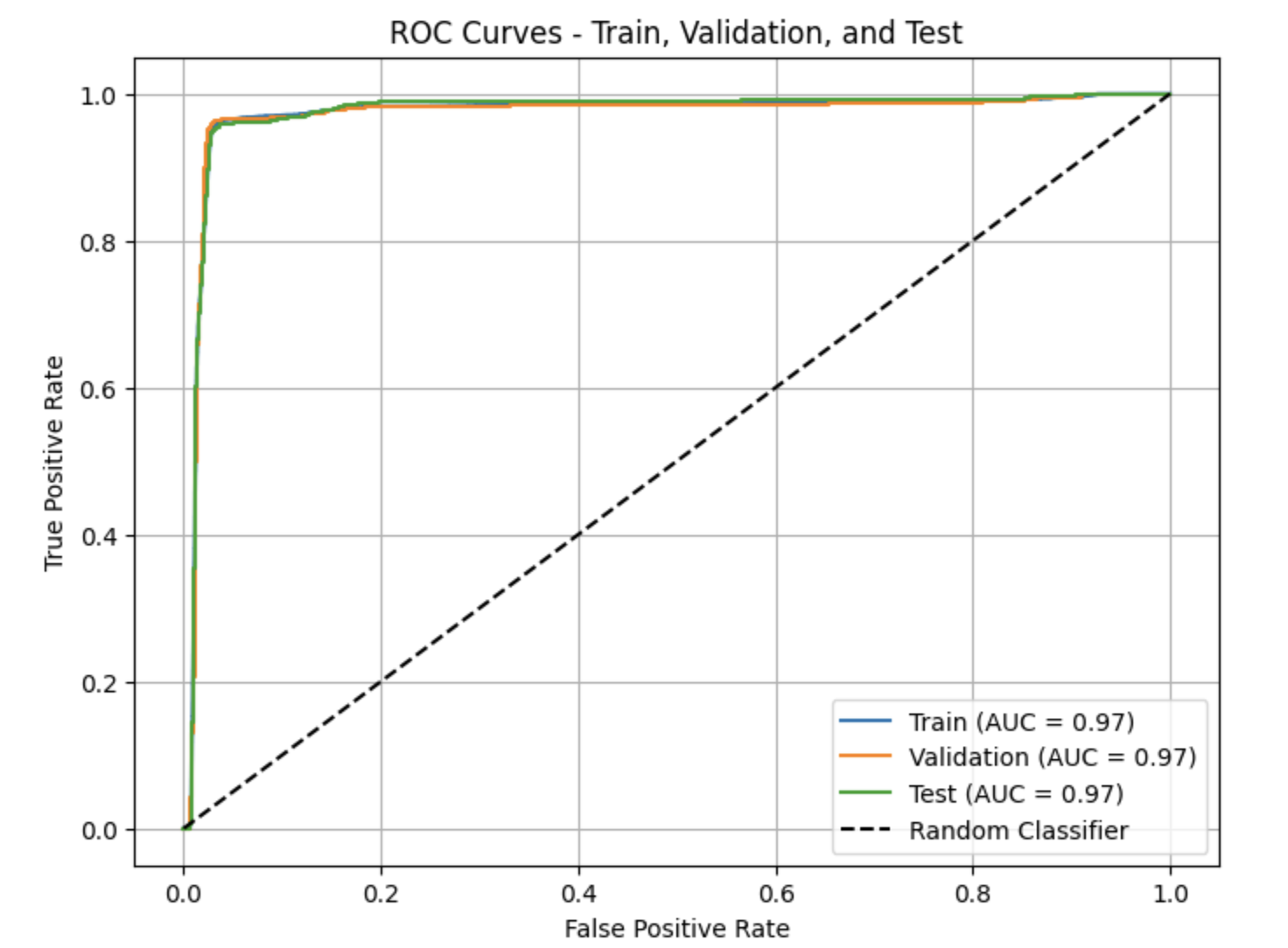
Calibration Plot
What Is a Calibration Plot?*
A calibration plot, is a tool used to evaluate how well a classification model’s predicted probabilities align with actual observed outcomes. Rather than measuring how well the model ranks observations, a calibration plot assesses whether the probabilities produced by the model are trustworthy.
To create a calibration plot, predicted probabilities are grouped into bins (for example, 0–0.1, 0.1–0.2, and so on). For each bin, the average predicted probability is plotted against the observed proportion of positive outcomes. The x-axis represents the mean predicted probability, while the y-axis represents the observed fraction of positives.
A perfectly calibrated model will produce points that lie close to the diagonal line $y = x$. Points below this line indicate that the model is overconfident, meaning it predicts probabilities that are too high. Points above the line indicate that the model is underconfident, meaning it predicts probabilities that are too low.
Calibration is especially important in probability-based decision settings, such as healthcare analytics, where predicted probabilities are often used to inform risk assessment and decision-making rather than simple yes/no classifications.
import numpy as np
import matplotlib.pyplot as plt
from sklearn.calibration import calibration_curve

# Predicted probabilities on the test set
test_probs = final_model.predict(X_test_final)

# Compute calibration curve
# n_bins controls how many probability bins are used
prob_true, prob_pred = calibration_curve(
    y_test,
    test_probs,
    n_bins=10,
    strategy="uniform"
)

# Plot calibration curve
plt.figure(figsize=(7, 7))
plt.plot(prob_pred, prob_true, marker="o", label="Model")
plt.plot([0, 1], [0, 1], linestyle="--", color="gray", label="Perfectly Calibrated")

plt.xlabel("Mean Predicted Probability")
plt.ylabel("Observed Proportion of Positives")
plt.title("Calibration Plot (Test Set)")
plt.legend()
plt.grid(True)
plt.tight_layout()
plt.show()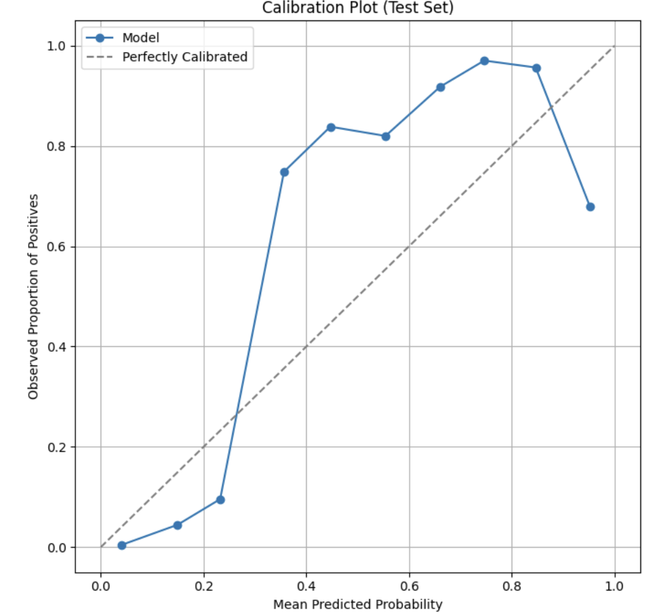
This calibration plot shows how well the model’s predicted probabilities match the actual outcomes. The dashed diagonal line represents perfect calibration, where predicted probabilities equal the observed proportion of prescribers. Points close to this line indicate reliable probability estimates, while points below the line indicate overconfidence and points above the line indicate underconfidence. For example, if a point lies on the diagonal line of a calibration plot, the model’s predicted probabilities closely match what actually occurs in the data. If a point falls below the diagonal, the model is overconfident: for instance, predicting an 80% chance when only about 60% of prescribers actually prescribe the drug. Conversely, if a point falls above the diagonal, the model is underconfident, such as predicting a 30% chance when about 50% of prescribers end up prescribing it. Overall, points above the line indicate underconfidence, while points below the line indicate overconfidence.
6. Making Predictions on New Prescribers
Now that you’ve trained your final model, let’s use it to predict how likely new prescribers are to prescribe Semaglutide.
The Sigmoid Function and Likelihood in Logistic Regression (Semaglutide Example)
Let’s say we have a prescriber with the following characteristics:
-
22 total 30-day fills
-
$450 per claim
-
Practices in the South
-
Internal Medicine specialist
Using the sigmoid function, the model calculates p = 0.83, meaning there’s an 83% chance this provider prescribes Semaglutide.
So:
-
If this provider did prescribe Semaglutide, their likelihood = 0.83
-
If this provider did not prescribe Semaglutide, their likelihood = 1 – 0.83 = 0.17
Maximum Likelihood Estimation (MLE)
To train the model, we use maximum likelihood estimation.
This means we:
-
Calculate the likelihood for each prescriber in the data (based on whether or not they prescribed Semaglutide).
-
Multiply all the individual likelihoods together to get a total likelihood.
-
Adjust the coefficients (β₀, β₁, etc.) to maximize that total likelihood.
Example:
If the model predicts:
-
Prescriber A: p = 0.75, and they did prescribe → likelihood = 0.75
-
Prescriber B: p = 0.20, and they did not prescribe → likelihood = 0.80
-
Prescriber C: p = 0.55, and they did prescribe → likelihood = 0.55
Then the total likelihood is:
Likelihood = 0.75 × 0.80 × 0.55
We want to find the coefficients that maximize this product across all rows in the dataset.
|
Logistic regression finds the coefficients that maximize the likelihood of the observed outcomes. That’s how we “fit” the model and it’s also how we estimate the best values for the βs in the sigmoid equation. |
At this point, our model is trained and evaluated. Let’s see how it performs on new, unseen prescribers.
We’ll sample 20 new records from the test set and compute their predicted probability of prescribing Semaglutide.
sample_prescribers = X_test.sample(n=20, random_state=42)
sample_final = sm.add_constant(sample_prescribers[selected_features])
sample_final = sample_final[final_model.params.index]
sample_preds = final_model.predict(sample_final)

scored_sample = sample_prescribers.copy()
scored_sample["Predicted_Probability"] = sample_preds

scored_sample.sort_values("Predicted_Probability", ascending=False).head(5)| Index | Tot_30day_Fills | Tot_Day_Suply | Cost_per_claim | Total_Patients | Prscrbr_State_Region_Military | Prscrbr_State_Region_Northeast | Prscrbr_State_Region_South | Prscrbr_State_Region_West | Prscrbr_Type_Grouped_Primary Care | Predicted_Probability |
|---|---|---|---|---|---|---|---|---|---|---|
26406 |
-0.060228 |
-0.181987 |
1.466532 |
-0.018389 |
0 |
0 |
0 |
1 |
1 |
0.928453 |
1897 |
-0.050658 |
-0.099769 |
1.611421 |
-0.018389 |
0 |
0 |
1 |
0 |
0 |
0.861192 |
1442 |
0.009717 |
0.097126 |
0.795578 |
-0.039022 |
0 |
0 |
1 |
0 |
1 |
0.721310 |
2520 |
-0.146181 |
-0.452130 |
0.708982 |
-0.018389 |
0 |
0 |
1 |
0 |
0 |
0.479521 |
37937 |
-0.074843 |
-0.199071 |
-0.315274 |
-0.044180 |
0 |
0 |
0 |
0 |
0 |
… |
You can now interpret the highest probabilities. Typically, top prescribers share similar characteristics — such as being in Southern or Western regions, having higher cost per claim, or belonging to Primary Care specialties.
This consistent pattern suggests that both geographic and specialty factors influence Semaglutide prescribing behavior.
Conclusion
You’ve completed a full logistic regression pipeline:
-
Data cleaning and feature engineering
-
Exploratory analysis and visualization
-
Data splitting and preprocessing
-
Multicollinearity diagnostics and feature selection
-
Model fitting, evaluation, and interpretation
-
Predictive scoring on unseen prescribers
This workflow represents a robust and interpretable approach to understanding binary outcomes — a method widely used in both healthcare and business analytics.
By mastering this process, you can now apply logistic regression confidently to new datasets where understanding the probability of an event is key.