TDM 40100: Project 13 - XGBoost
Project Objectives
In this project, you will build an XGBoost model to accurately predict fertility rates and discover which features in the data are most important for predicting fertility rates around the globe.
Dataset
-
/anvil/projects/tdm/data/worldbank/worldbank_data.csv
|
Use 4 cores for this project. |
|
If AI is used in any cases, such as for debugging, research, etc., we now require that you submit a link to the entire chat history. For example, if you used ChatGPT, there is an “Share” option in the conversation sidebar. Click on “Create Link” and please add the shareable link as a part of your citation. The project template in the Examples Book now has a “Link to AI Chat History” section; please have this included in all your projects. If you did not use any AI tools, you may write “None”. We allow using AI for learning purposes; however, all submitted materials (code, comments, and explanations) must all be your own work and in your own words. No content or ideas should be directly applied or copy pasted to your projects. Please refer to the-examples-book.com/projects/fall2025/syllabus#guidance-on-generative-ai. Failing to follow these guidelines is considered as academic dishonesty. |
The data we will model
We will use a World Bank data with fertility_rate (births per woman) and dozens of socioeconomic and health indicators (e.g., adolescent fertility, infant/child mortality, sector value added, literacy, labor participation, energy use). The data was pulled using an API from the World Bank Group. You can find out more about the dataset here.
Dataset Overview
The table below summarizes the columns and definitions.
| Column | Definition/Notes |
|---|---|
|
Name of the country or economy. |
|
Calendar year of observation. |
|
Access to basic sanitation; see source metadata for exact definition. |
|
Access to electricity; see source metadata for exact definition. |
|
Births to women ages 15–19 per 1,000 women ages 15–19. |
|
Value added from agriculture, forestry, and fishing (percent of GDP). |
|
Average years of schooling; see source metadata for exact definition. |
|
Births attended by skilled health staff (percent of total). |
|
Births officially registered with civil authorities (percent). |
|
Under-5 mortality for females (per 1,000 live births). |
|
Population with access to clean cooking fuels and technologies (percent). |
|
Use of contraception among women ages 15–49 (percent). |
|
Electricity consumption per capita (kWh). |
|
Energy use per capita (kg of oil equivalent). |
|
Female employment in agriculture (percent of female employment). |
|
Female employment in industry (percent of female employment). |
|
Female employment in services (percent of female employment). |
|
Female labor force participation (percent of female population age 15+). |
|
Female literacy rate (percent of women age 15 and older). |
|
Proportion of seats held by women in national parliaments (percent). |
|
Index or proxy for women’s property/asset rights (scale varies). |
|
Female secondary school completion or enrollment rate (percent). |
|
Self-employed women (percent of female employment). |
|
Total fertility rate (births per woman). |
|
Gross domestic product per capita (current USD). |
|
Gini index of income inequality (0 = equality, 100 = inequality). |
|
Government health expenditure (percent of general government spending). |
|
Total health expenditure as percent of GDP. |
|
Industry value added including construction (percent of GDP). |
|
Infant mortality rate (deaths under age 1 per 1,000 live births). |
|
Individuals using the Internet (percent of population). |
|
Life expectancy at birth (years). |
|
Male labor force participation (percent of male population age 15+). |
|
Male literacy rate (percent of men age 15 and older). |
|
Male secondary school completion or enrollment rate (percent). |
|
Maternal deaths per 100,000 live births. |
|
Average years of schooling among females. |
|
Mobile cellular subscriptions (per 100 people). |
|
Physicians per 1,000 people. |
|
Annual population growth rate (percent). |
|
Population living below international poverty line (percent). |
|
Female primary school completion rate (percent). |
|
Region indicator for Europe & Central Asia (binary). |
|
Region indicator for Latin America & Caribbean (binary). |
|
Region indicator for Middle East (binary). |
|
Region indicator for North Africa (binary). |
|
Region indicator for North America (binary). |
|
Region indicator for Other / Unassigned (binary). |
|
Region indicator for South Asia (binary). |
|
Region indicator for Sub-Saharan Africa (binary). |
|
Kilometers of road per 100 sq. km of land area. |
|
Primary school enrollment for females (percent of age group). |
|
Primary school enrollment for males (percent of age group). |
|
Female unemployment (percent of female labor force). |
|
Male unemployment (percent of male labor force). |
|
Urban population as a percentage of total population. |
|
Literacy rate of females aged 15–24 (percent). |
|
Literacy rate of males aged 15–24 (percent). |
Why XGBoost for Fertility Rates
Two properties guide our modeling choice:
-
XGBoost is one of the most powerful and widely used machine learning algorithms.
-
It builds models sequentially, learning from the residuals of previous trees.
-
It includes built-in feature selection: at each split, it evaluates gain from each feature and selects only those that improve the model.
-
It performs well even when the dataset has dozens or hundreds of features, thanks to strong regularization (L1, L2) that prevent overfitting.
-
It ranks features by importance (gain, coverage, frequency).
Because of these properties, XGBoost is especially effective in datasets with:
-
High dimensionality (large number of features or variables),
-
Correlated variables,
-
Uneven or missing values,
-
No clear assumptions about linearity or variable interactions.
In this dataset, we will use XGBoost because of the high number of variables we have, because of it’s known high performance, and because it has built in feature selection which will help us understand what features are the most importance when predicting fertility rates around the globe.
Questions
Question 1 (2 points)
Handling Missing Values Before Modeling
Real-world datasets especially large ones combining multiple countries and indicators often include missing values. Before we can build a predictive model like XGBoost, we need to deal with these gaps. Since most columns in this dataset are numeric and measured over time within each country (e.g., fertility rate, literacy, employment), we will use linear interpolation to estimate missing values. This method assumes a smooth change between known values and is more informed than simply dropping rows or filling with the mean.
Because each country has its own trends, we interpolate within each country group to avoid mixing data across different contexts. After interpolation, we can apply .ffill() and .bfill() and direction = both to fill in any remaining values. This ensures we preserve as much data as possible which is critical when building models that depend on many features. These steps will help us prepare a complete, clean dataset ready for machine learning.
1a. Load the dataset using the file path provided and display the first 5 rows.
import pandas as pd
worldbank_data = pd.read_csv("/anvil/projects/tdm/data/worldbank/worldbank_data.csv")

# TODO: Display first five rows
1b. Fill in the missing numeric values for each country by performing linear interpolation on the worldbank_data dataframe. Only interpolate values that are still missing.
Note: The code below has already sorted the data and selected the numeric columns (excluding "year"). Your task is to complete the interpolation method and direction. We will group the dataset by country and apply interpolation within each group, making sure to interpolate in both forward and backward directions. See documentation on interpolation here.
# Sort by country and year
worldbank_data = worldbank_data.sort_values(by=["country", "year"])

# Define numeric columns (excluding 'year')
numeric_cols = worldbank_data.select_dtypes(include="number").columns.difference(["year"])

# Interpolate only values still missing
for col in numeric_cols:
    mask = worldbank_data[col].isna()
    interpolated = (
        worldbank_data
        .groupby("country")[col]
        .transform(lambda group: group.interpolate(method=____, limit_direction=____).ffill().bfill()) # For YOU to fill in
    )
    worldbank_data.loc[mask, col] = interpolated[mask]
1c. Confirm that all numeric columns no longer have missing values after interpolation.
Hint: You can use DF[numeric_cols].isna().sum(). Make sure to replace DF with the dataframe’s name.
Question 2 (2 points)
Looking at Correlation Before Modeling
Before we build a predictive model, it’s important to understand the relationship between our target variable: fertility_rate and the features in the dataset.
Correlation allows us to see which features move alongside fertility rates. A positive correlation means the two variables move in the same direction for instance, a strong positive correlation between adolescent fertility and total fertility suggests that higher adolescent fertility move together with higher overall fertility. A negative correlation indicates that the variables move in opposite directions for example, if female literacy has a strong negative correlation with fertility, it suggests that as literacy rises, fertility rates tend to decline.
2a. Identify the target variable (what you are predicting) for this project and it’s mean.
2b. Compute the correlation matrix using all numeric features. Report the 5 features most positively and most negatively correlated with fertility rate.
Note: Use the code structure below as a starting point, make sure to still report the 5 features most positively and most negatively correlated with fertility rate. We will use use .corr() for the correlation matrix and .sort_values to sort the correlation matrix. You can see pandas documentation on computing pairwaise correlations here.
# Drop non-numeric column
numeric_data = worldbank_data.drop(columns=["country"])

# Compute correlation matrix
correlations = numeric_data.corr()

# Extract correlations with fertility_rate
fert_corr = correlations["fertility_rate"].sort_values(ascending=False)

# TODO: Report the 5 features most positively and most negatively correlated with fertility rate.
2c. Provide an interpretation for one strong positive and one strong negative correlation in 1-2 sentences.
Question 3 (2 points)
Exploring Fertility Rates Across Countries
So far, we’ve explored how fertility relates to other features numerically. Now we’ll shift to a geographic perspective, using the most recent data available for each country to see how fertility rates vary across the world.
This means converting our dataset so we can see just one row per country, using its most recent year of data. This will allow us to compare countries and identify geographic trends in fertility.
To visualize these differences, we’ll use a choropleth map, which shades each country based on its fertility rate. Darker colors typically indicate higher values, and lighter colors indicate lower ones. These maps help us visually detect global patterns that might be hard to spot in tables. You can learn more about Choropleth mapping with GeoPandas here.
Creating a Map for Geographic Data
We will use the GeoPandas library to load a shapefile of country boundaries and merge it with the fertility data. Here’s what happens in the code:
-
GeoPandas.read_file()loads a global shapefile (country outlines). -
Country names in both datasets are normalized to ensure they match despite naming differences (e.g., "United States" vs "United States of America").
-
The fertility data is filtered to only include the most recent year (2024).
-
The datasets are merged, and a map is generated
By the end of this question, you’ll be able to recognize regional fertility patterns, connect them to real world context, and gain experience using spatial data visualization a powerful tool in applied data science.
3a. Using the most recent year available for each country, create a DataFrame that includes only the country, year, and fertility rate columns and name it the DataFrame fertility_by_country.
Note: Use the code below. Fill in the correct variable names to complete it. If needed, check available column names using latest_data.columns.
latest_data = worldbank_data.loc[worldbank_data.groupby("country")["year"].idxmax()]

fertility_by_country = latest_data[["____", "____", "____"]] # For YOU to fill in with correct column names
3b. Run the code below to create a choropleth map of fertility rate by country using the fertility_by_country dataframe.
Note: The code below is complete. Your task is to run the code succesfully then interpret the map in the next question (3c).
import geopandas as gpd, matplotlib.pyplot as plt, pandas as pd

# Load, merge, and plot
import geopandas as gpd, matplotlib.pyplot as plt, pandas as pd

# Load, merge, and plot
(gpd.read_file("https://raw.githubusercontent.com/nvkelso/natural-earth-vector/master/geojson/ne_110m_admin_0_countries.geojson")
 .assign(ADMIN_norm=lambda d: d["ADMIN"].str.lower())
 .merge(fertility_by_country[fertility_by_country["year"] == 2024]
        .assign(fertility_rate=lambda d: pd.to_numeric(d["fertility_rate"], errors="coerce"),
                name_norm=lambda d: d["country"].str.lower().replace({
                    "united states": "united states of america",
                    "north macedonia": "republic of north macedonia",
                    "kyrgyz republic": "kyrgyzstan"}))
        .rename(columns={"country": "name"})
        .query("~name.str.contains('income|world|OECD|IDA|IBRD|region|fragile', case=False)"),
        left_on="ADMIN_norm", right_on="name_norm", how="left")
 [lambda d: ~d["ADMIN"].isin(["Antarctica", "Falkland Islands", "French Southern and Antarctic Lands"])]
 .plot(column="fertility_rate", cmap="YlOrRd", legend=True, figsize=(15, 8), missing_kwds={"color": "lightgrey"}))

plt.title("Fertility Rate by Country (2024)")
plt.axis("off")
plt.show()
3c. Write 1–2 sentences describing any geographic patterns you observe. Comment on which regions have the highest and lowest fertility rates.
Question 4 (2 points)
Understanding the Foundations of Boosting
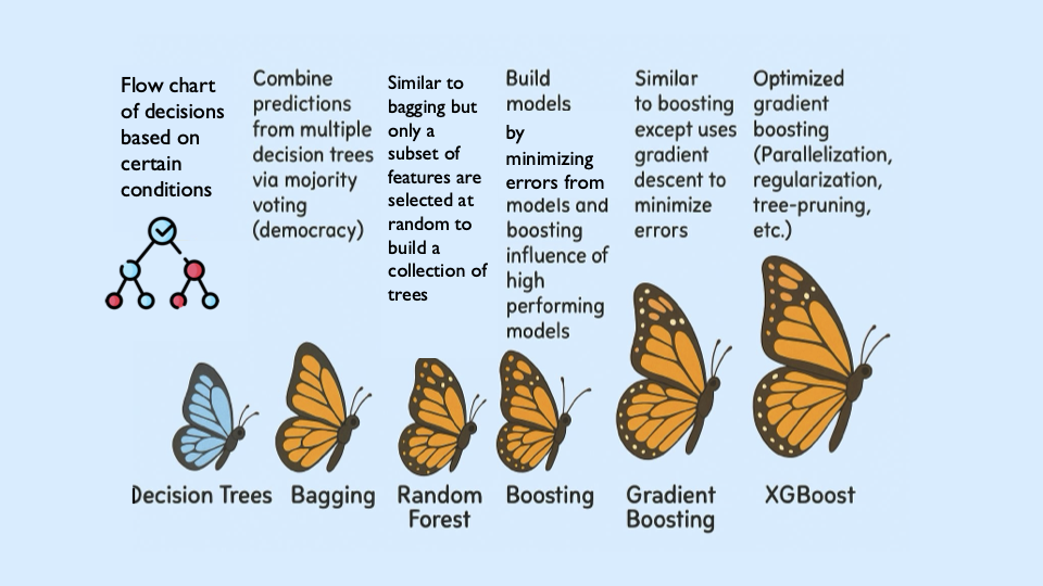
XGBoost is built off the boosting modeling approach for decision trees. Boosting is an ensemble technique that builds models sequentially, with each new model correcting errors from the previous one. This contrasts with Random Forest, where trees are grown independently.
| Random Forest | Boosting (XGBoost) |
|---|---|
Parallel tree growth |
Sequential tree growth |
Bootstrap sampling |
Modifies data via residual fitting |
So boosting is another approach for improving the predictions from decision trees. Remember with Random Forest, we use a concept called bagging, where we pulled random samples from the original data, used the bootstrap to develop a tree from each copy, and then combined all of the trees to make a single prediciton. Each tree was built on a bootstrap data set, independent of the other trees. Boosting is different in the fact that it grows trees sequentially, each tree is grown using information from previously grown trees. It does not involve bootstrap sampling like Random Forest does.
XGBoost: Optimized Gradient Boosting
XGBoost (Extreme Gradient Boosting) enhances traditional boosting with three things:
-
Second-order optimization: Uses both gradients (first order derivatives) and hessians (second order derivatives) for precise updates. Gradients indicate the direction of the steepest ascent of the loss function. When minimizing the loss, movement occurs in the opposite direction of the gradient. Hessians provide information about the curvature of the loss function, essentially indicating how rapidly the gradient changes. Using this second-order information helps XGBoost determine the optimal step size and direction for each update.
-
Regularization: Combines L1/L2 penalties to control overfitting
-
Computational efficiency: Parallel processing
These improvements align with the statistical principles of boosting described in James et al. (2023) in An Introduction to Statistical Learning (ISLP). The book is freely available here.
Evaluation Metrics
$RMSE = \sqrt{\frac{1}{n} \sum_{i=1}^{n} (y_i - \hat{y}_i)^2}$ $R^2 = 1 - \frac{ \sum_{i=1}^{n} (y_i - \hat{y}_i)^2 }{ \sum_{i=1}^{n} (y_i - \bar{y})^2 }$
Loss Function (Regression)
XGBoost minimizes the squared error for regression: $\mathcal{L}(y_i, \hat{y}_i) = (y_i - \hat{y}_i)^2$
Where:
-
$y_i$: true value
-
$\hat{y}_i$: predicted value
Key Takeaways
-
XGboost sequentially corrects errors (residuals) from prior trees. The same way you learn from your errors and past mistakes, so does XGBoost!
-
Provides feature importance scores (e.g.,
life_expectancymay be top predictor) -
"Extreme" optimizations for speed/accuracy
|
Here’s a great video that visually shows how gradient boosted trees (xgboost) work: watch here. |
4a. Identify the five features most positively correlated with fertility_rate. Use these to create your feature set, then split the data into training and test sets (80% training, 20% test) using random_state=42.
Note: The code below has already selected the top five features for you. All that remains is to split the data using train_test_split. You only need to specify the test size. The training size will be calculated automatically. Refer to the train_test_split documentation from sklearn.model_selection for guidance.
from sklearn.model_selection import train_test_split

# correlations with fertility_rate
correlations = worldbank_data.corr(numeric_only=True)["fertility_rate"]

# Select the top 5 positively correlated features (excluding fertility_rate itself)
top5_features = correlations.drop("fertility_rate").sort_values(ascending=False).head(5).index.tolist()

# Define X and y using those features
X_small = worldbank_data[top5_features]
y = worldbank_data["fertility_rate"]

# Split into 80% train/ 20% test sets
X_train, X_test, y_train, y_test = train_test_split(X_small, y, test_size=______, random_state=____) # For YOU to fill in
4b. Use XGBRegressor to create and fit an XGBoost model on the training dataset with the top five features. When creating the model, only set random_state=42. Then, fit the model using your training data (X_train, y_train) from the previous step.
from xgboost import XGBRegressor

# Only fill in the missing piece use the correct parameter

small_model = XGBRegressor(random_state=__) # For YOU to fill in

# Fit the model on training data
small_model.fit(______________, ______________) # For YOU to fill in
4c. Evaluate the XGBoost model on the test dataset using RMSE and $R^2$., and print the results.
Note: Most of the code has been provided for you. Your task is to complete the missing pieces to print both the RMSE and $R^2$.
from sklearn.metrics import mean_squared_error, r2_score

# Predict on the test set
y_pred = small_model.predict(X_test)

# Calculate RMSE and R^2
rmse = mean_squared_error(y_test, y_pred) ** 0.5
r2 = r2_score(y_test, y_pred)

# TODO: Print the RMSE and R^2 values
4d. In 2–3 sentences, explain what XGBRegressor package does. How does it differ from DecisionTreeRegressor package? Why might it perform better?
Question 5 (2 points)
Hyperparameter Tuning Considerations
XGBoost contains several important hyperparameters. They are called hyperparameters because their best values must be found through cross-validation.
XGBoost’s performance is sensitive to hyperparameter selection. These parameters can be grouped into three categories:
1. Tree Structure Controls
| Parameter | Default | Description |
|---|---|---|
|
6 |
Maximum tree depth. Lower values prevent overfitting. |
|
1 |
Minimum sum of instance weights needed in a leaf. Higher values regularize. |
|
0 |
Minimum loss reduction required to make a split (complexity penalty). |
2. Learning Process
| Parameter | Default | Description |
|---|---|---|
|
0.3 |
Shrinks feature weights to make boosting more conservative. |
|
1 |
Fraction of observations randomly selected for each tree. |
|
1 |
Fraction of features randomly selected per tree. |
|
100 |
Number of boosting rounds (trees in ensemble). |
3. Regularization
| Parameter | Default | Description |
|---|---|---|
|
1 |
L2 regularization term on weights. |
|
0 |
L1 regularization term on weights. |
|
1 |
Controls class imbalance (set to negative/positive ratio). |
|
Here are some more resources on XGBoost hyperparameter documentation: |
5a. Now use all numeric columns from the dataset as features, excluding "country" and "fertility_rate". Set "fertility_rate" as the target variable y. Then split the data into training and test sets using an 80/20 split and random_state=42.
Note: Now we are using all of the numeric features in our model instead of the five features most positively correlated with fertility_rate. Use the code below to fill in the appropriate column names and states in the code below. The train_test_split function only requires you to specify the test_size. The training set will automatically use the remaining portion of the data.
from sklearn.model_selection import train_test_split

# Define features and target
X_full = worldbank_data.drop(columns=["__________", "__________"]) # For YOU to fill in
y = worldbank_data["__________"] # For YOU to fill in

# Split into training and test sets
X_train_full, X_test_full, y_train_full, y_test_full = train_test_split(
    X_full, y, test_size=___, random_state=__) # For YOU to fill in
5b. Use an XGBRegressor with the following pre-tuned hyperparameter.
-
random_state: 42
-
max_depth: 5 -
learning_rate: 0.1 -
n_estimators: 100
from xgboost import XGBRegressor, plot_importance
from sklearn.metrics import mean_squared_error, r2_score
import matplotlib.pyplot as plt

# Initialize and train model with pretuned parameters
tuned_model = XGBRegressor(
    random_state=____, # For YOU to fill in
    max_depth=____, # For YOU to fill in
    learning_rate=____, # For YOU to fill in
    n_estimators=______ # For YOU to fill in
)
tuned_model.fit(X_train_full, y_train_full)
5c. Use the code below to report the test set RMSE and $R^2$ scores on the tuned_model.
y_pred = tuned_model.predict(X_test_full)
rmse = mean_squared_error(y_test_full, y_pred)**0.5
r2 = r2_score(y_test_full, y_pred)

# TODO: Print the RMSE and R^2 values
5d. Use xgboost.plot_importance to visualize the top 15 most important features in the model.
Note: Use the code below to develop your plot. Make sure to fill in the number of features and a title.
from xgboost import plot_importance
import matplotlib.pyplot as plt

plt.figure(figsize=(10, 6))
plot_importance(tuned_model, max_num_features=__) # For YOU to fill in
plt.title("________") # For YOU to fill in
plt.tight_layout()
plt.show()
5e. Write 1–2 sentences answering each of the following: (1) Explain how hyperparameter tuning improved the model compared to your earlier model from Question 4c. (2) Identify which features were most important for prediction, and briefly discuss whether you believe these features make sense and why.
Question 6 (2 points)
6a. Plot how fertility rate has changed over time for the United States of America and Turkey. Write 1-2 sentences on the patterns you notice.
Note: Use the code below for the plot. Make sure to fill in the title and interpret the plot.
import matplotlib.pyplot as plt

countries_to_plot = ["_________", "______"] # For YOU to fill in

plt.figure(figsize=(10, 6))
for country in countries_to_plot:
    data = worldbank_data[worldbank_data["country"] == country]
    plt.plot(data["year"], data["fertility_rate"], label=country)

plt.title("_____") # For YOU to fill in
plt.xlabel("_____") # For YOU to fill in
plt.ylabel("_______") # For YOU to fill in
plt.legend()
plt.grid(True)
plt.tight_layout()
plt.show()
6b. Write 1-2 sentences: what are two limitations of your XGBoost model compared to decision trees for real-world decision-making?
6c. Write 1-2 sentences explaining the similarities and differences between XGBoost and Random Forest.
Submitting your Work
Once you have completed the questions, save your Jupyter notebook. You can then download the notebook and submit it to Gradescope.
-
firstname_lastname_project13.ipynb
|
You must double check your You will not receive full credit if your |