GIS: Geographical Information Systems
Map Basics
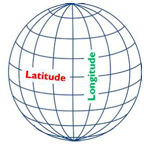
What are Maps and Geospatial Data?
Maps are everywhere around us: in our cars, on our phones, and driving public health initiatives. Geospatial skills and knowledge are increasingly sought after in industry, and will continue to prove vital to Data Science. You will learn how to create maps and analyze spatial data using Python and SQL, how spatial data are applied in a variety of domains, and have hands-on experiences with real data. Together, we will answer questions such as: (1) what are maps, (2) how can we create maps from data, (3) and how do we quantify and analyze maps. Applied geospatial projects in industry can include: autonomous vehicles, public health, supply chain, and more.
Geospatial data are the collective data and associated technology containing geographic or locational components. Some examples include coordinates, a street address, the name of city, satellite imagery, etc. Within geospatial data, you can think of vector data and raster data.
Vector data are graphical representations of the real world: points, lines, and polygons. Connecting points create lines, and connecting lines that create an enclosed area are polygons.
Raster data are presented in a grid of pixels. This typically refers to maps comprised of imagery.
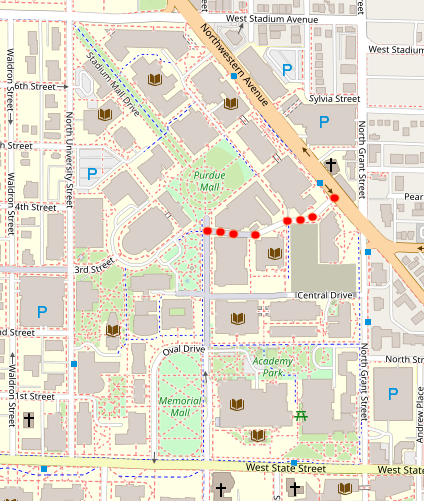
Continuing on the idea of a vector map, this is a very common way of thinking of maps: as a graph, with a series of nodes connected by edges. An example of this is a road network. Take the example below. This map represents a graphical representation of a portion of Purdue University’s campus.
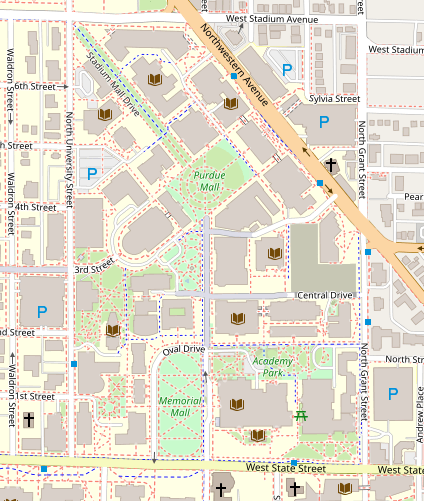
We can think of the roads around campus as edges, and can choose to place nodes anywhere on the map. As an example, we will draw path between the Physics Library and the Armory on campus. Note the nodes drawn at these buildings, and the edge connecting them. The edge follows the road network. Establishing a map as a graph allows us to use graph theory and vector map to manipulate and analyze spatial data.
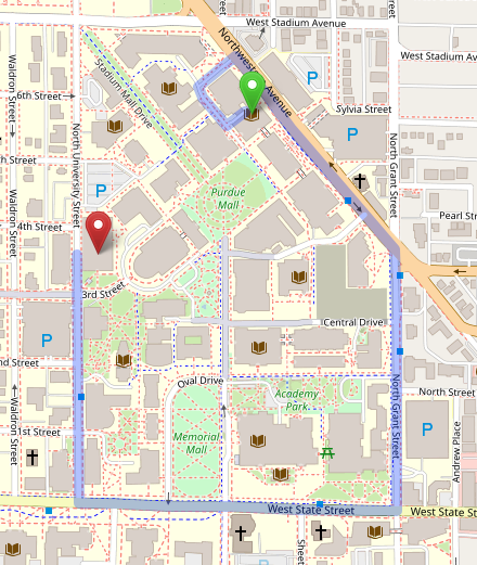
Node classification is not just limited to buildings. You can think of a node being placed at every intersection junction.
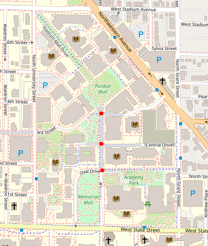
How can one account for curvature in the road? Not all roads are straight lines; however, edges connecting nodes are always straight.Beyond intersection junctions, we place nodes at every point at which the road curvature deviates. This ensures a straight line can be drawn between all nodes, and the road curvature is accurately reflected.
Geometry Data Types
While, mathematically, we can easily represent a road network as a graph, how can we codify these objects so they can be analyzed using computational methods. This is a very complex and deep subject, which will be explored in great depth throughout the chapter; however, this section is meant to serve as an outline of what is to come, and provide the reader with a high-level understanding of geometric objects.
There are two basic overarching geometric object types on which we will focus:
-
Two-dimensional:
(x, y)… i.e.,(latitude, longitude) -
Three-dimensional:
(x, y, z)… i.e.,(latitude, longitude, altitude)
Geometric Objects:
-
Type: Point
-
Definition: A given space (lon lat)
-
Shape:

-
Example(s):
-
POINT(-83.2456381 42.3061845)`
-
-
-
Type: Linestring
-
Definition: Connected series of points
-
Shape:

-
Example(s):
-
LINESTRING(POINT, POINT, POINT, …)`
-
-
-
Type: Polygon
-
Definition: Closed shape defined by a connected sequence of (lon lat) pairs
-
Shape:

-
Example(s):
-
POLYGONPOINT, POINT, …
-
-
-
Type: Multipoint
-
Definition: Ordered collection of points
-
Shape:

-
Example(s):
-
MULTIPOINT(POINT, POINT, POINT, …)
-
-
-
Type: Multilinestring
-
Definition: A collection of > 1 linestrings
-
Shape:

-
Example(s):
-
MULTILINESTRING(LS, LS, LS, …)
-
-
-
Type: Multipolygon
-
Definition: A collection of polygons that consists which construct from exterior ring and hole list tuples
-
Shape:

-
Example(s):
-
MULTIPOLYGON(POLYGON, POLYGON, POLYGON, …)
-
-
As we have seen, spatial data are typically represented as strings or numeric values. Well-known text (WKT) is a text markup language for representing vector geometry objects:
-
POINT(LONLAT) -
LINESTRING(POINT,POINT,…)
GeoJSON is a format for encoding a variety of geographic data structures:
{
    "type": "Feature",
    "geometry": {
    "type": "Point",
    "coordinates": [102.0, 0.5]
}
Coordinates and Coordinate Systems
A coordinate reference system (CRS) defines how your two-dimensional, projected map relates to real places on earth. These coordinate reference systems are stored in the EPSG Geodetic Parameter Dataset (EPSG, for short). The EPSG Geodetic Parameter Dataset is a public registry of all geodetic datums, coordinate reference systems, and all coordinate transformations between reference systems. Each object in the dataset is assigned a code between 1024-32767, along with a standard WKT representation.
As of 2021, there are over 6,000 coordinate systems registered through EPSG Registry. Since there is no perfect way to transpose a curved surface to a flat surface without some distortion, many different map projections exist that provide different properties. Thus, individual states and countries can have their own coordinate reference system, which may suit their very specific needs.
The standard CRS is WGS84 (EPSG:4326). This is the CRS used by the GPS satellite navigation system and for NATO military geodetic surveying. This is a latitude/longitude coordinate system based on the Earth’s center of mass.
A close relative to this CRS is the Web Mercator Projection (EPSG:3857). This is typically used for display by web-based maps, such as Google Maps or Apple Maps. The main distinction between this CRS and WGS84 is that the Web Mercator Projection can be represented in meters.
Geographies: Cartesian vs. Spherical
Maps and spatial data consist of geographies and geometries. It is important to understand the differences between the two terms. Geometry assumes your data live on a Cartesian plane (such as a map projection). Whereas Geography assumes that your data are made up of points on the earth’s surface.
This is an important distinction. While we can represent maps on a graph in vector space, we must remember these are projections of space on a spherical object—the earth.
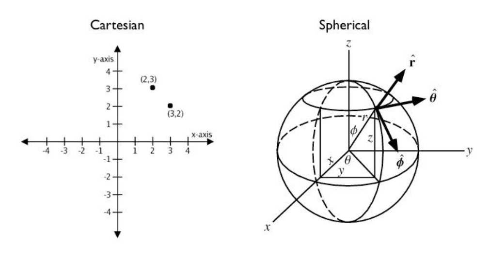
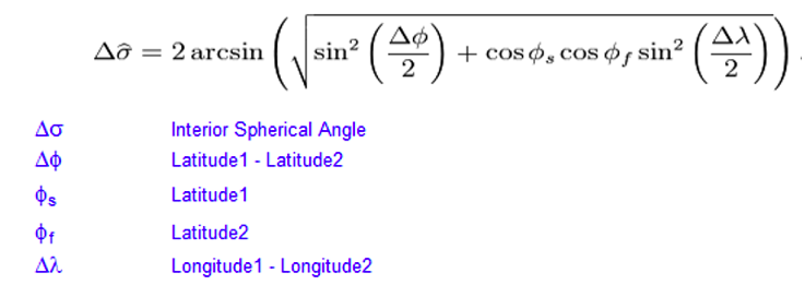
Cartesian Distances vs. Spherical Distances
Cartesian points are on a plane with 2 dimensions: x (latitude) and y (longitude). You can calculate the shortest path (in degrees, in our case), as you would any two points on a plane.
Since our earth is round, calculating distance between two points is more challenging than in vector space. The haversine formula is a very accurate way of computing distances between two points on the surface of a sphere using the latitude and longitude of the two points. The haversine formula is a re-formulation of the spherical law of cosines, but the formulation in terms of haversines is more useful for small angles and distances.
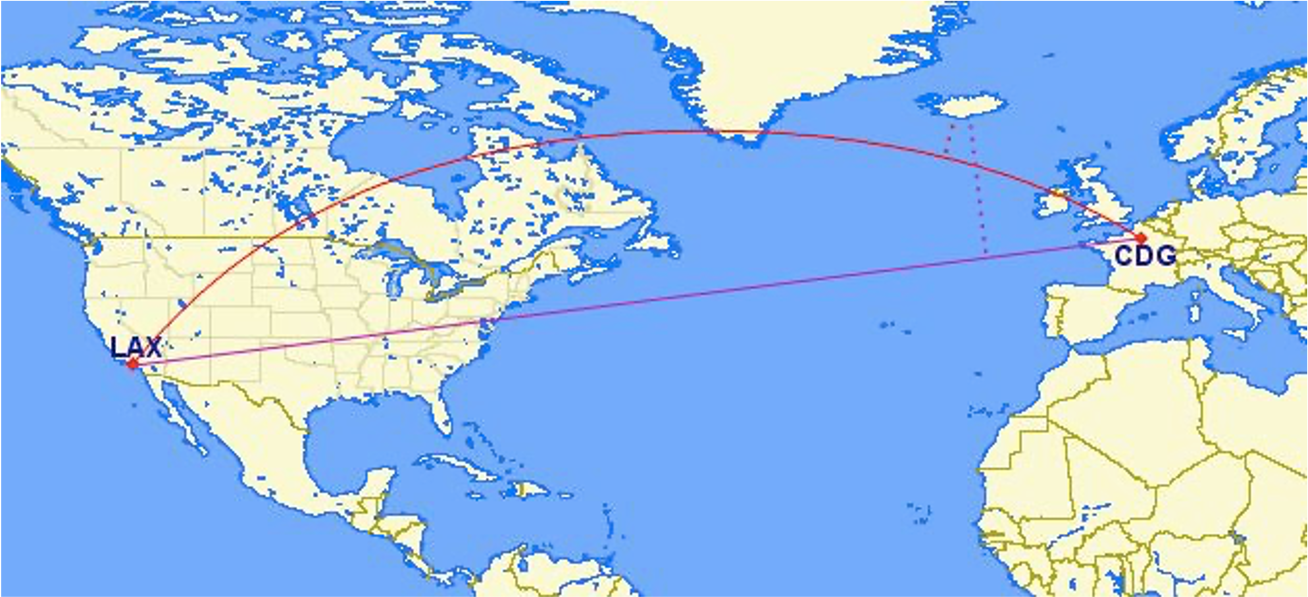
Let’s put this knowledge to use by calculating the distance between LAX and CDG.
You can treat geographic coordinates as approximate Cartesian coordinates and continue to do spatial calculations. However, measurements of distance, length and area will be nonsensical. Since spherical coordinates measure angular distance, the units are in “degrees.” Further, the approximate results from indexes and true/false tests like intersects and contains can become terribly wrong. The distance between points get larger as problem areas like the poles or the international dateline are approached.
Working with geographic coordinates on a Cartesian plane (the purple line) yields a very wrong answer indeed! Using great circle routes (the red lines) gives the right answer.
Calculating the distance using a cartesian distance (ST_GeometryFromText):
SELECT
	ST_Distance(
		ST_GeometryFromText('POINT(-118.4107 33.9415)', 4326),
		ST_GeometryFromText('POINT(2.5457 49.0096)', 4326)
	);
>> 121.891338 (degrees)
The units for spatial reference 4326 are degrees. So our answer is 121 degrees. But, what does that mean?
On a sphere, the size of one “degree square” is quite variable, becoming smaller as you move away from the equator. Think of the meridians (vertical lines) on the globe getting closer to each other as you go towards the poles. So, a distance of 121 degrees doesn’t mean anything. It is a nonsense number.
In order to calculate a meaningful distance, we must treat geographic coordinates not as approximate Cartesian coordinates but rather as true spherical coordinates. We must measure the distances between points as true paths over a sphere – a portion of a great circle.
Calculating the distance using a spherical distance (ST_GeographyFromText):
SELECT
	ST_Distance(
		ST_GeographyFromText('POINT(-118.4107 33.9415)'),
		ST_GeographyFromText('POINT(2.5457 49.0096)')
	);
>> 9102760.908043034 (meters)
All return values from geography calculations are in meters, so our answer is 9124km.
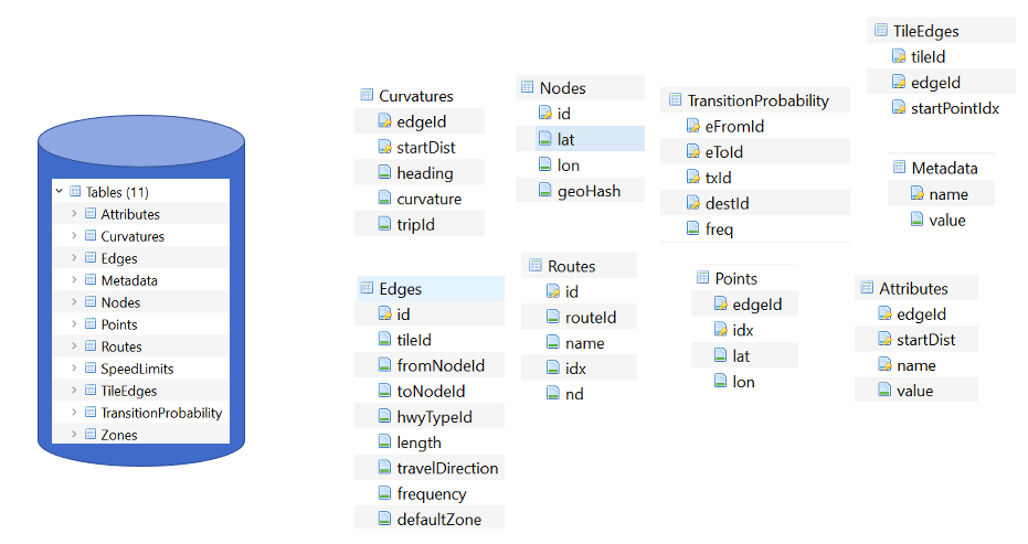
Storing Map Data and Map Attributes
We now know that we can capture the physical geometry of a road network as a graph. However, how can we store and utilize these data?
To effectively store spatial data and all attributes of the map, we will leverage a spatial database. A spatial database is a database with column data types specifically designed to store objects in space—these data types can be added to database tables. The information stored is usually geographic in nature, such as a point location or the boundary of a lake.
In essence, a spatial database is a relational database which supports querying geographic and non-geographic features via SQL to gain insights into, and manipulate, your data.
An Example of a Spatial Database
Let’s walk through a toy example of creating a spatial database.
-
Scenario:
-
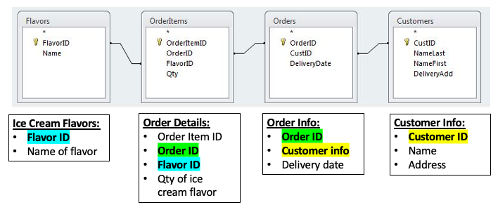
Ice cream entrepreneurs Jen and Barry have opened their business and now need a database to track orders.
-
-
What data do they collect?
-
When taking an order, they record the customer’s name, the details of the order such as the flavors and quantities of ice cream needed, the date the order is needed, and the delivery address.
-
-
What does the spatial database need to answer for Jen and Barry?
-
Which orders are due to be shipped within the next two days?
-
Which flavors must be produced in greater quantities?
-
What are some fields we should include in the database for Jen and Barry?
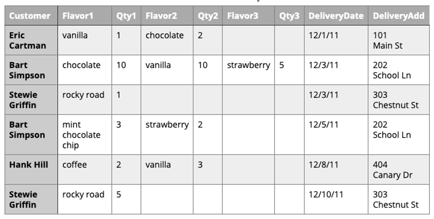
Our first attempt:
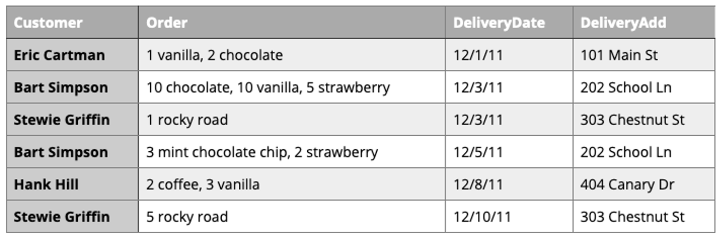
Is this table schema acceptable? No. The problem with this design becomes clear when you imagine trying to write a query that calculates the number of gallons of vanilla that have been ordered. The quantities are mixed with the names of the flavors and any one flavor could be listed anywhere within the order field (i.e., it won’t be consistently listed first or second).
Our second attempt:
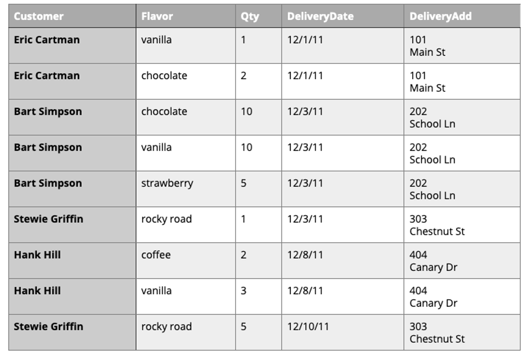
Is this table schema acceptable? No. This is an improvement because it enables querying on flavors and summing quantities. However, to calculate the gallons of vanilla ordered you would need to sum the values from three fields. Also the design would break down if a customer ordered more than three flavors.
Our third attempt:
Is this table schema acceptable? No. This design makes calculating the gallons of vanilla ordered much easier. Unfortunately it also produces a lot of redundant data and spreads a complete order from a single customer across multiple rows.
Our final attempt:
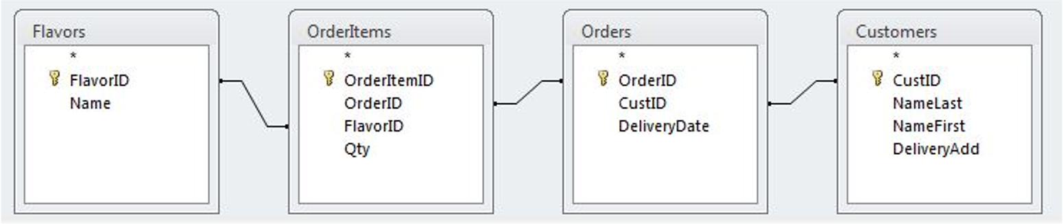
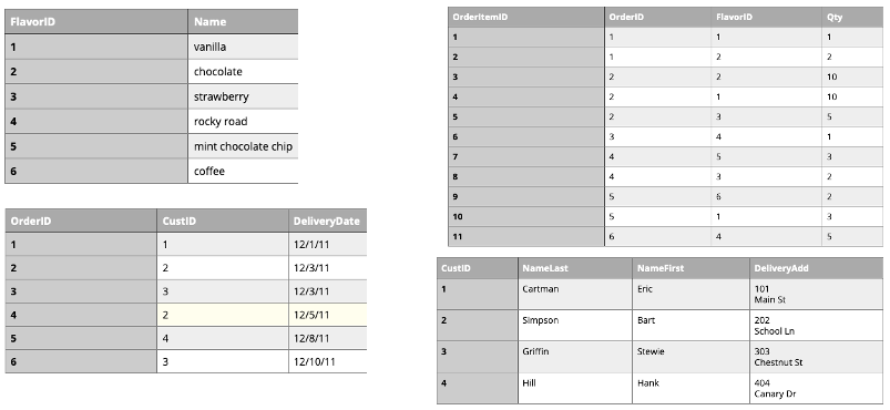
The tables in our database would look like this:
Is this table schema acceptable? Yes. This design separates our separate entities into four distinct tables, with the possibility of joining data to answer all the questions Jen and Barry have about their ice cream business.
An order placed would use the following data retrieval:
Map Design Principles
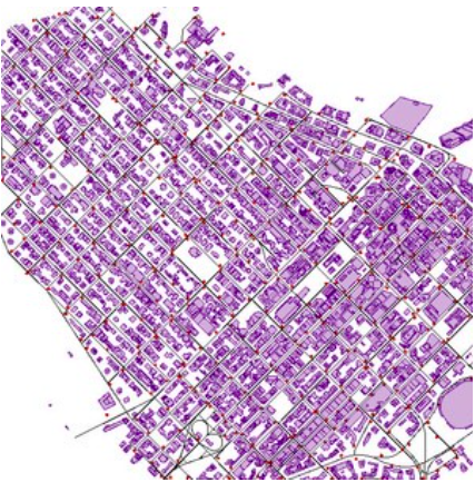
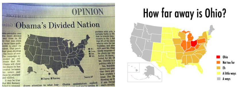
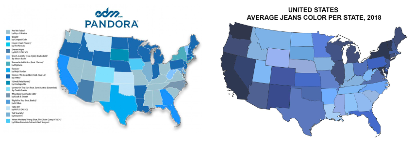
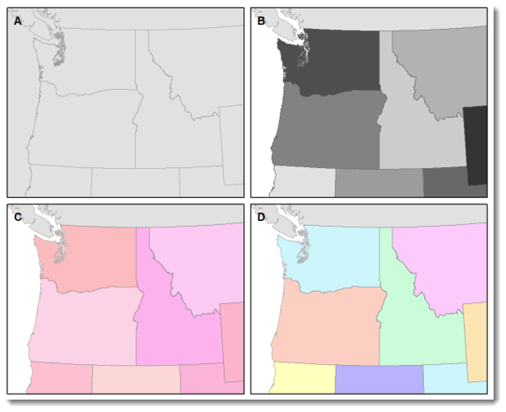
Are the following maps easy to read or helpful?
Visual Contrast
Visual contrast which relates to how map features and page elements contrast with each other and their background. A well-designed map with a high degree of visual contrast can result in a crisp, clean, sharp-looking map. The higher the contrast between features, the more something will stand out, usually the feature that is darker or brighter. A map that has low visual contrast can be used to promote a more subtle impression.
Legibility
Legibility depends on good decision-making for selecting symbols that are familiar and choosing appropriate sizes so that the results are effortlessly seen and easily understood. Geometric symbols are easier to read at smaller sizes; more complex symbols require larger amounts of space to be legible. Visual contrast and legibility are the basis for seeing. In addition to being able to distinguish features from one another and the background, the features need to be large enough to be seen and to be understood for your mind to decipher what you eyes are detecting.
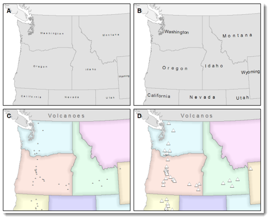
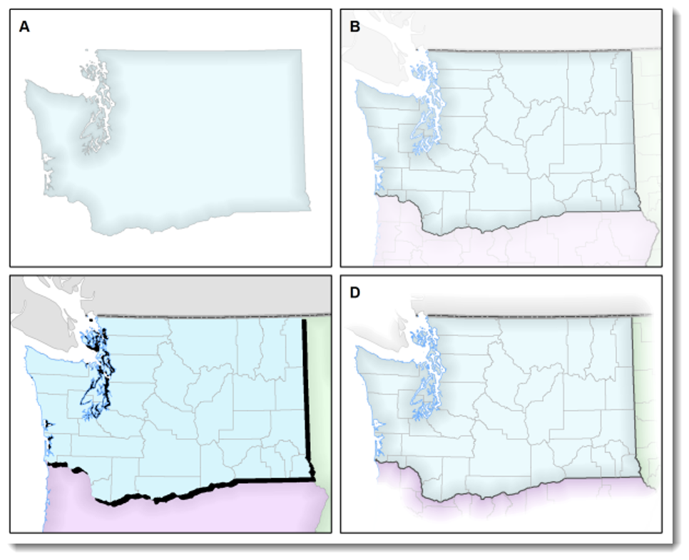
Figure-Ground
Figure-ground organization is the spontaneous separation of the figure in the foreground. This helps in the over-arching goal to make your map as legible, valuable, and accessible as possible. Take, for example, the image on the below. The figure-ground approach here is focused on county-level separation of the map.
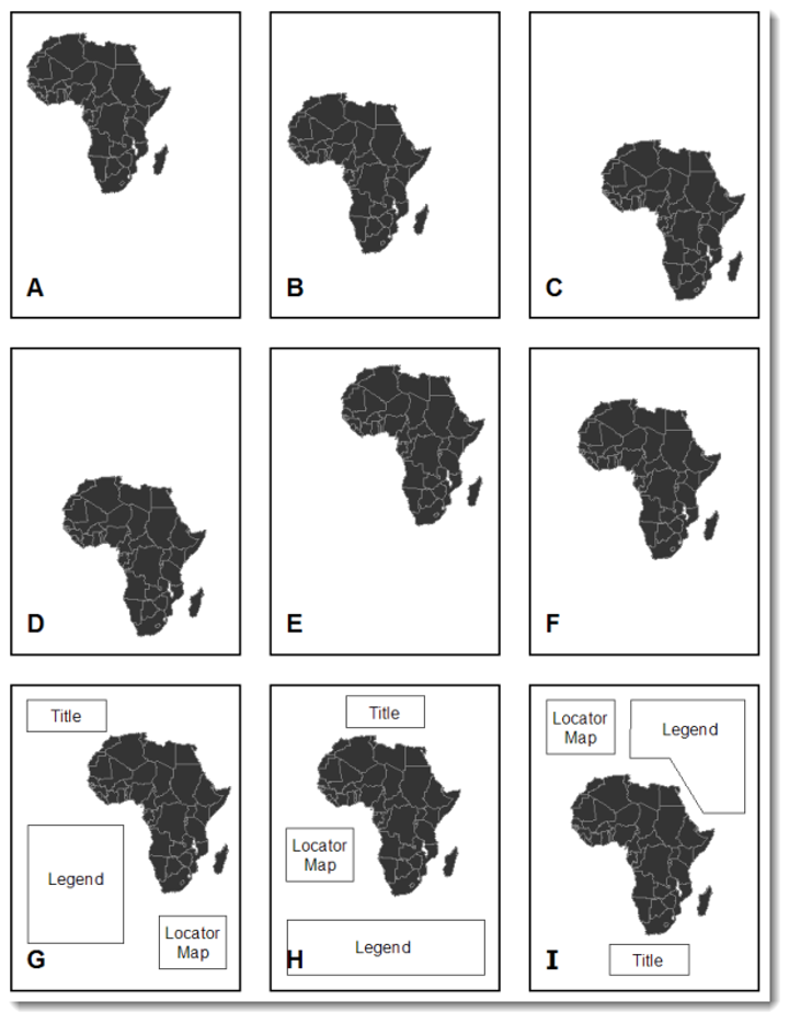
Hierarchical Organization
The internal graphic structuring of the map (and the page layout more generally) is fundamental to helping people read your map. Some page elements (e.g., the map) will seem more important than others (e.g., the title or legend). This visual layering of information within the map and on the page helps readers focus on what is important and enables them to identify patterns. Balance results from two primary factors, visual weight and visual direction.
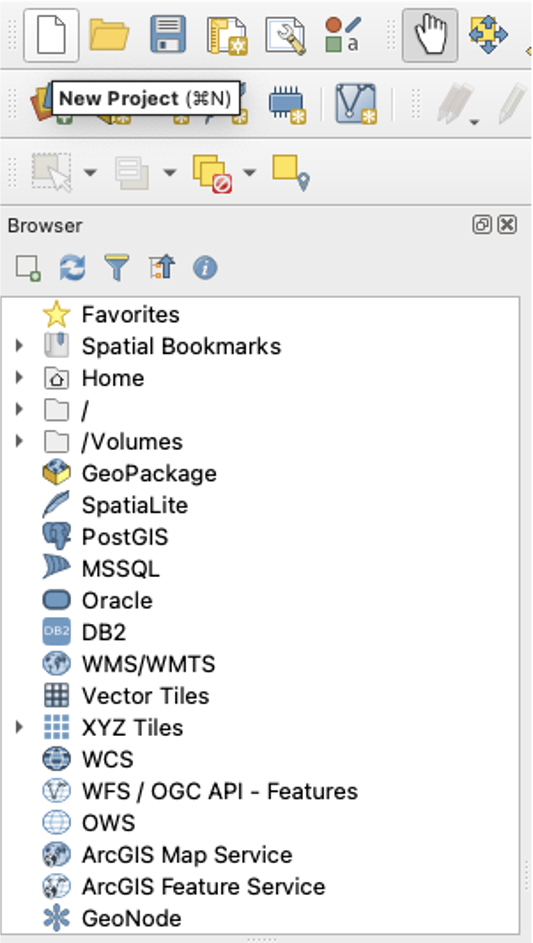
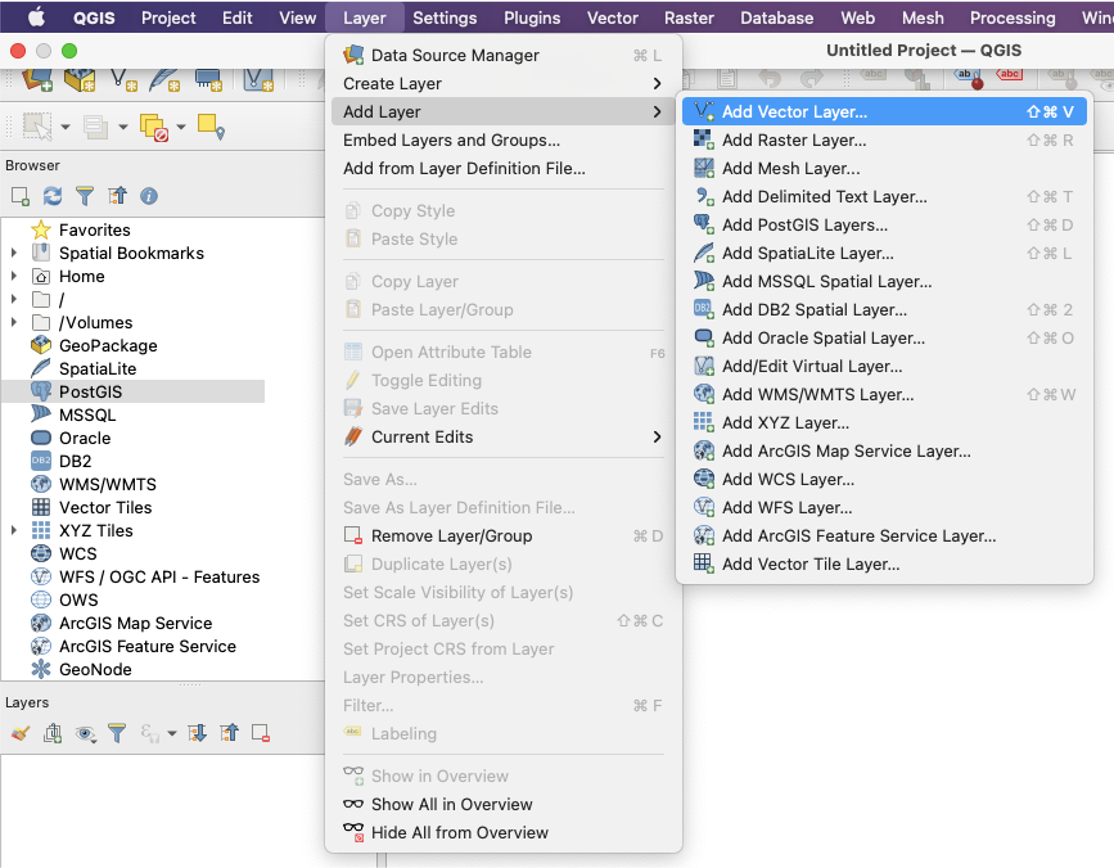
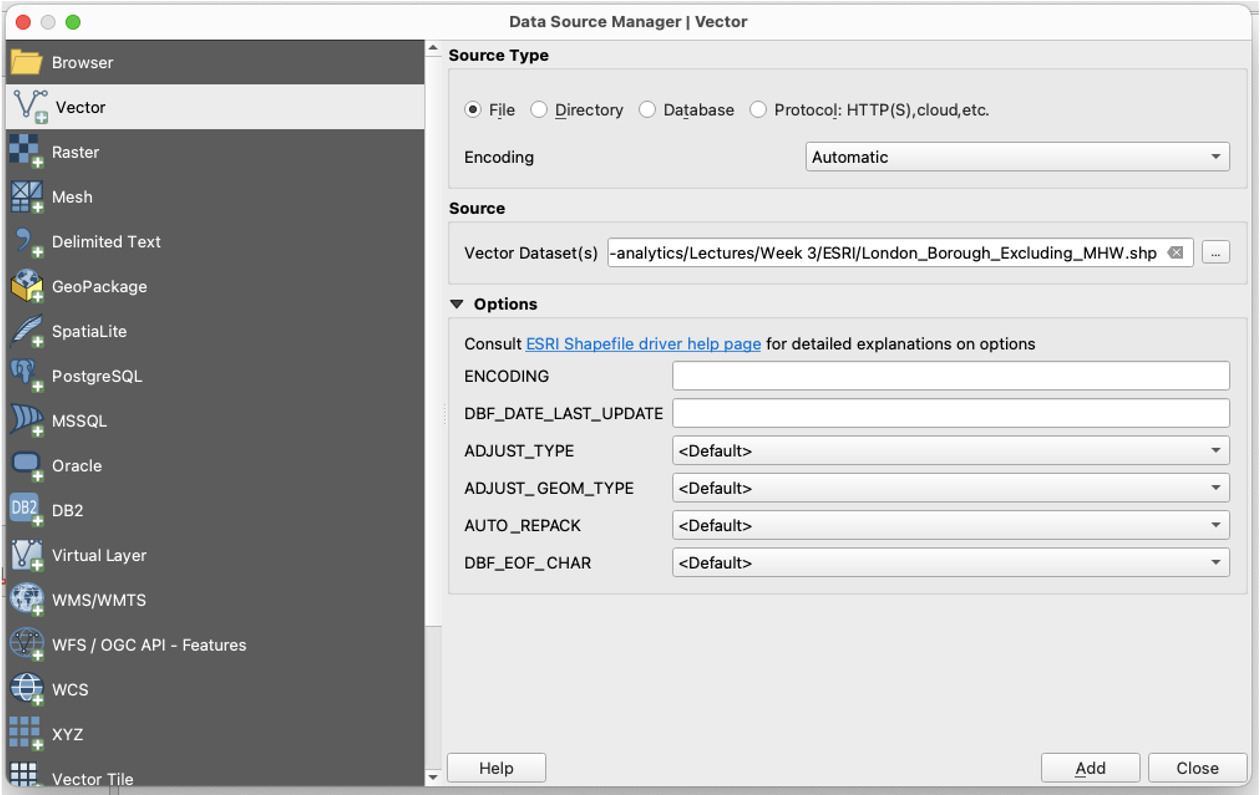
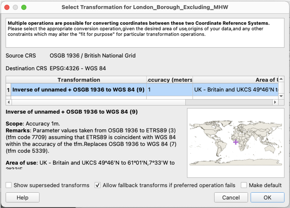
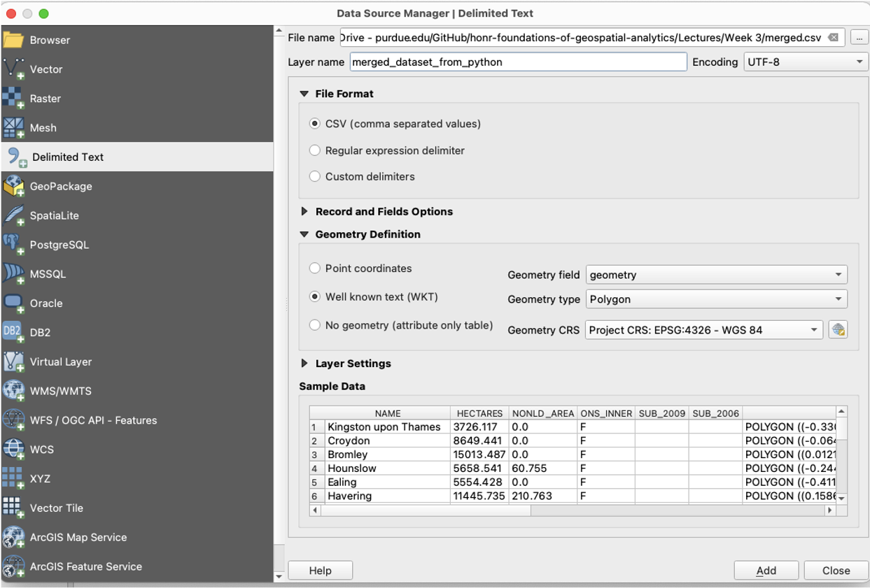
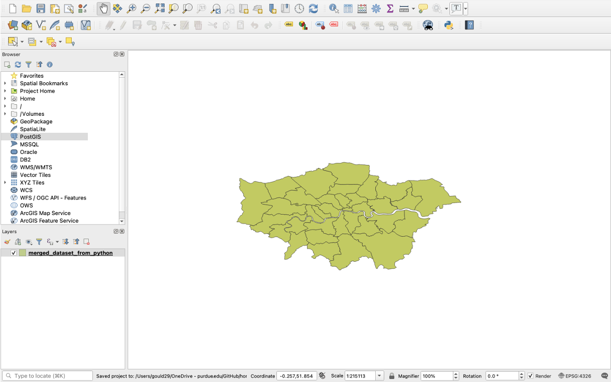
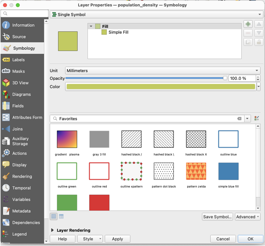
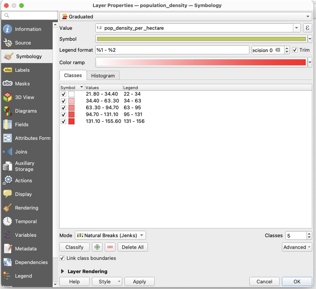
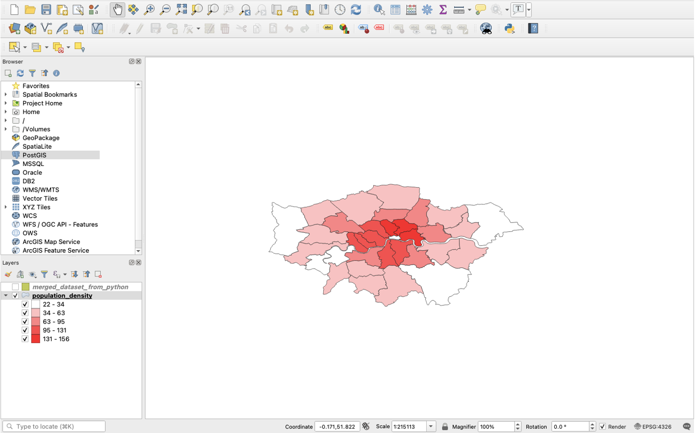
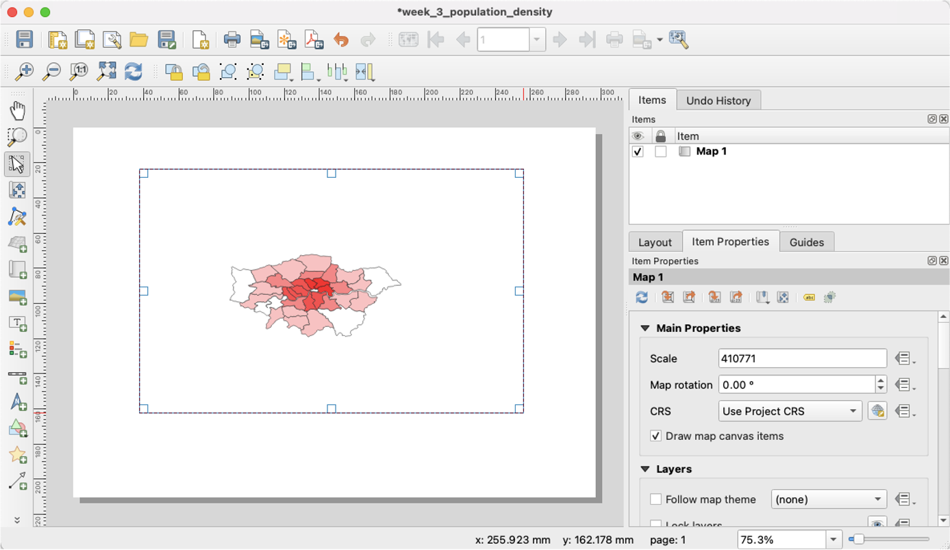
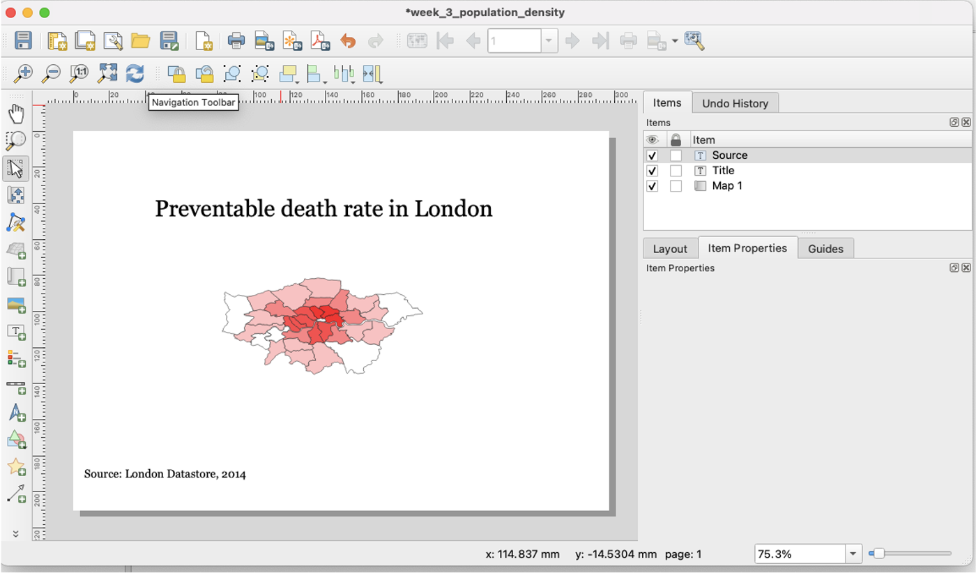
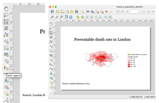
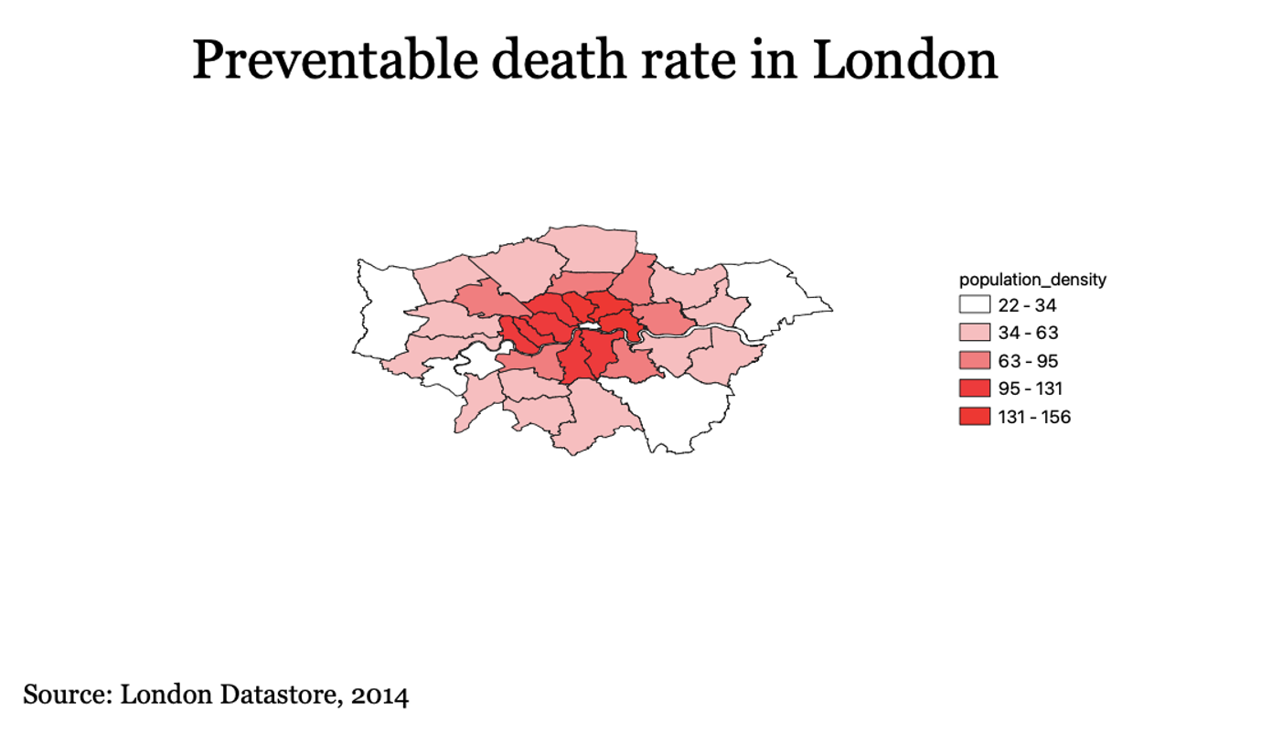
Visualizing Your First Map
We will visualize our first map using program called QGIS. QGIS is a free, open source map visualization program.
The data we are using are on preventable deaths in London, from the London Datastore.