STAT 19000: Project 2 — Fall 2020
Introduction to R using 84.51 examples
Introduction to R using NYC Yellow Taxi Cab examples
Motivation: The R environment is a powerful tool to perform data analysis. R is a tool that is often compared to Python. Both have their advantages and disadvantages, and both are worth learning. In this project we will dive in head first and learn the basics while solving data-driven problems.
Context: Last project we set the stage for the rest of the semester. We got some familiarity with our project templates, and modified and ran some R code. In this project, we will continue to use R within RStudio to solve problems. Soon you will see how powerful R is and why it is often a more effective tool to use than spreadsheets.
Scope: r, vectors, indexing, recycling
Dataset
The following questions will use the dataset found in Scholar:
/class/datamine/data/disney/metadata.csv
Questions
Question 1
Use the read.csv function to load /class/datamine/data/disney/metadata.csvinto a data.frame called myDF. Note that read.csv by default loads data into a data.frame. (We will learn more about the idea of a data.frame, but for now, just think of it like a spreadsheet, in which each column has the same type of data.) Print the first few rows of myDF using the head function (as in Project 1, Question 7).
-
R code used to solve the problem in an R code chunk.
Question 2
We’ve provided you with R code below that will extract the column WDWMAXTEMP of myDF into a vector. What is the 1st value in the vector? What is the 50th value in the vector? What type of data is in the vector? (For this last question, use the typeof function to find the type of data.)
our_vec <- myDF$WDWMAXTEMP-
R code used to solve the problem in an R code chunk.
-
The values of the first, and 50th element in the vector.
-
The type of data in the vector (using the
typeoffunction).
Question 3
Use the head function to create a vector called first50 that contains the first 50 values of the vector our_vec. Use the tail function to create a vector called last50 that contains the last 50 values of the vector our_vec.
You can access many elements in a vector at the same time. To demonstrate this, create a vector called mymix that contain the sum of each element of first50 being added to the analogous element of last50.
-
R code used to solve this problem.
-
The contents of each of the three vectors.
Question 4
In (3), we were able to rapidly add values together from two different vectors. Both vectors were the same size, hence, it was obvious which elements in each vector were added together.
Create a new vector called hot which contains only the values of myDF$WDWMAXTEMP which are greater than or equal to 80 (our vector contains max temperatures for days at Disney World). How many elements are in hot?
Calculate the sum of hot and first50. Do we get a warning? Read this and then explain what is going on.
-
R code used to solve this problem.
-
1-2 sentences explaining what is happening when we are adding two vectors of different lengths.
Question 5
Plot the WDWMAXTEMP vector from myDF.
-
R code used to solve this problem.
-
Plot of the
WDWMAXTEMPvector frommyDF.
Question 6
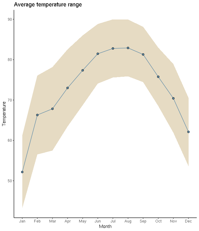
The following three pieces of code each create a graphic. The first two graphics are created using only core R functions. The third graphic is created using a package called ggplot. We will learn more about all of these things later on. For now, pick your favorite graphic, and write 1-2 sentences explaining why it is your favorite, what could be improved, and include any interesting observations (if any).
dat <- table(myDF$SEASON)
dotchart(dat, main="Seasons", xlab="Number of Days in Each Season")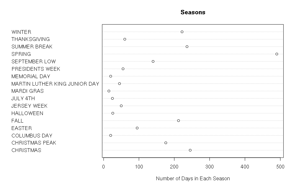
dat <- tapply(myDF$WDWMEANTEMP, myDF$DAYOFYEAR, mean, na.rm=T)
seasons <- tapply(myDF$SEASON, myDF$DAYOFYEAR, function(x) unique(x)[1])
pal <- c("#4E79A7", "#F28E2B", "#A0CBE8",  "#FFBE7D", "#59A14F", "#8CD17D", "#B6992D", "#F1CE63", "#499894", "#86BCB6", "#E15759", "#FF9D9A", "#79706E", "#BAB0AC", "#1170aa", "#B07AA1")
colors <- factor(seasons)
levels(colors) <- pal
par(oma=c(7,0,0,0), xpd=NA)
barplot(dat, main="Average Temperature", xlab="Jan 1 (Day 0) - Dec 31 (Day 365)", ylab="Degrees in Fahrenheit", col=as.factor(colors), border = NA, space=0)
legend(0, -30, legend=levels(factor(seasons)), lwd=5, col=pal, ncol=3, cex=0.8, box.col=NA)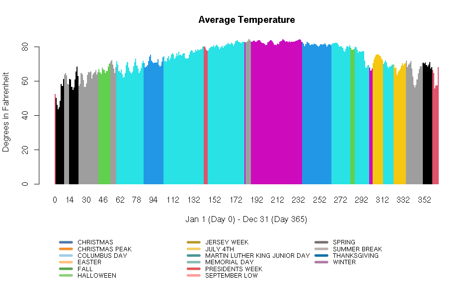
library(ggplot2)
library(tidyverse)
summary_temperatures <- myDF %>%
    select(MONTHOFYEAR,WDWMAXTEMP:WDWMEANTEMP) %>%
    group_by(MONTHOFYEAR) %>%
    summarise_all(mean, na.rm=T)
ggplot(summary_temperatures, aes(x=MONTHOFYEAR)) +
    geom_ribbon(aes(ymin = WDWMINTEMP, ymax = WDWMAXTEMP), fill = "#ceb888", alpha=.5) +
    geom_line(aes(y = WDWMEANTEMP), col="#5D8AA8") +
    geom_point(aes(y = WDWMEANTEMP), pch=21,fill = "#5D8AA8", size=2) +
    theme_classic() +
    labs(x = 'Month', y = 'Temperature', title = 'Average temperature range' ) +
    scale_x_continuous(breaks=1:12, labels=month.abb)