Introduction
Now that we know where the victim was found let’s see if we can use weather data to learn anything more.
Today’s session is all about exploratory data analysis or EDA.
Getting Weather Data
The first challenge we have is finding a place to get data. There are lots of organizations that make data available to anyone who is interested. This is called open-source data.
In coding languages, like Python, there are also packages that we can use. Packages group useful code together for easy use.
In this case we can use the meteostat Python package to get open-source weather data.
Practice Exercises
Before we run anything we need to import the packages for use in Python. The code below only needs to be run once and it will make the packages available for us to use.
from meteostat import Point, Daily, Stations
from datetime import datetime

import numpy as np
import matplotlib.pyplot as plt-
Now that we have them imported how do we get data for our location? We know the victim was found in the Memorial Mall.
Click to see solution
Reading through the meteostat documents we find that if we pass it a latitude and longitude we can get weather data.
We can use a similar function to check for any weather stations that are near a point.
We can use Google maps to find our latitude and longitude and then use the function to see if any weather data is available.
# Define our point of interest (location).
latitude = 38.889478
longitude = -77.036111

# Set a date range for our data.
start_date = datetime(2022, 1, 1)
end_date = datetime(2022, 6, 8)

stations = Stations()
stations = stations.nearby(latitude, longitude)

station_info = stations.fetch(1).reset_index()
print(station_info)
id name country region wmo icao latitude \ 0 72405 Washington National Airport US DC 72405 KDCA 38.85 longitude elevation timezone hourly_start hourly_end daily_start \ 0 -77.0333 5.0 America/New_York 1936-09-01 2022-07-10 1936-09-01 daily_end monthly_start monthly_end distance 0 2022-07-05 1936-01-01 2022-01-01 4396.493762
-
The fun part of EDA is that the process evolves as you learn more about the data. Looking at the data above we see a
distanceof 4,396. That seems far. We may want to know how long that is.Click to see solution
Looking through the meteostat documentation we can see that the
distancevalue is returned in meters.Using Google, we can find that 1 mile is roughly
0.000621371meters.# How far away is the station? meters_to_miles = 0.000621371 # Rounding mapes it a bit easier to read. meters = np.round(station_info['distance'][0], 2) miles = np.round(meters * meters_to_miles, 2) print("The weather station is {} meters or {} miles away from our point of interest.".format(meters, miles))The weather station is 4396.49 meters or 2.73 miles away from our point of interest.
-
That doesn’t seem too bad! Now that we know we have a weather station near our area we can pull the data.
Click to see solution
We can use the
idfrom our output previously to get data for the specific station.data = Daily("72405", start_date, end_date) data = data.fetch().reset_index() # This is a check we can add to make sure we are getting data. if len(data) == 0: print("No data found.") else: print("Good to go!")Good to go!
-
Now that we have data, we can dig in to its format to learn more.
Click to see solution
Most often when working on EDA it helps to print the data’s columns.
You can also check the meteostat documentation to learn more about the data we get back.
print(data.columns)Index(['time', 'tavg', 'tmin', 'tmax', 'prcp', 'snow', 'wdir', 'wspd', 'wpgt', 'pres', 'tsun'], dtype='object')After checking the columns, we can also print the first few rows of the data to see what it looks like.
print(data.head())time tavg tmin tmax prcp snow wdir wspd wpgt pres tsun 0 2022-01-01 13.8 11.7 18.9 11.2 0.0 188.0 7.6 NaN 1007.2 NaN 1 2022-01-02 15.3 7.8 17.2 3.3 0.0 265.0 15.5 NaN 1006.6 NaN 2 2022-01-03 3.2 -3.8 7.8 25.1 0.0 356.0 23.4 NaN 1019.6 NaN 3 2022-01-04 -1.3 -4.9 1.1 0.0 180.0 128.0 9.4 NaN 1029.7 NaN 4 2022-01-05 1.2 -2.7 5.0 0.0 100.0 195.0 14.4 NaN 1014.5 NaN
-
An important part of EDA is checking to make sure your data is valid. One easy check we can do is to make sure that our dates align with the dates in the data.
Click to see solution
start_date = data['time'].min()
end_date = data['time'].max()

print("Our data starts on {} and ends on {}.".format(start_date, end_date))
Our data starts on 2022-01-01 00:00:00 and ends on 2022-06-08 00:00:00.
Are there any other data checks that you would do?
Now that we have the data can we narrow down the timeframe for the murder?
What do we know so far?
-
The victim showed signs of being in water, but not submerged.
-
The victim was sunburned.
-
The victim was found under a large amount of tree debris.
Using these items let’s see if we can find interesting weather conditions.
-
-
We can start by looking at how wet it was.
Click to see solution
wettest_day = data['prcp'].max()

print("Our wettest day we had {} mm of rain".format(wettest_day))
Our wettest day we had 38.1 mm of rain
This is good to know, but it would probably be better to look at precipitation over time.
One of the ways we can do that is visually.
fig, ax1 = plt.subplots(1, 1, figsize=(15,8)) ax1.scatter(data['time'], data['prcp'], c='blue', alpha=0.25) ax1.plot(data['time'], data['prcp'], c='blue', linestyle='--') plt.title('Rain Over Time') plt.xlabel('Date') plt.ylabel('Precip') plt.show() plt.close('all')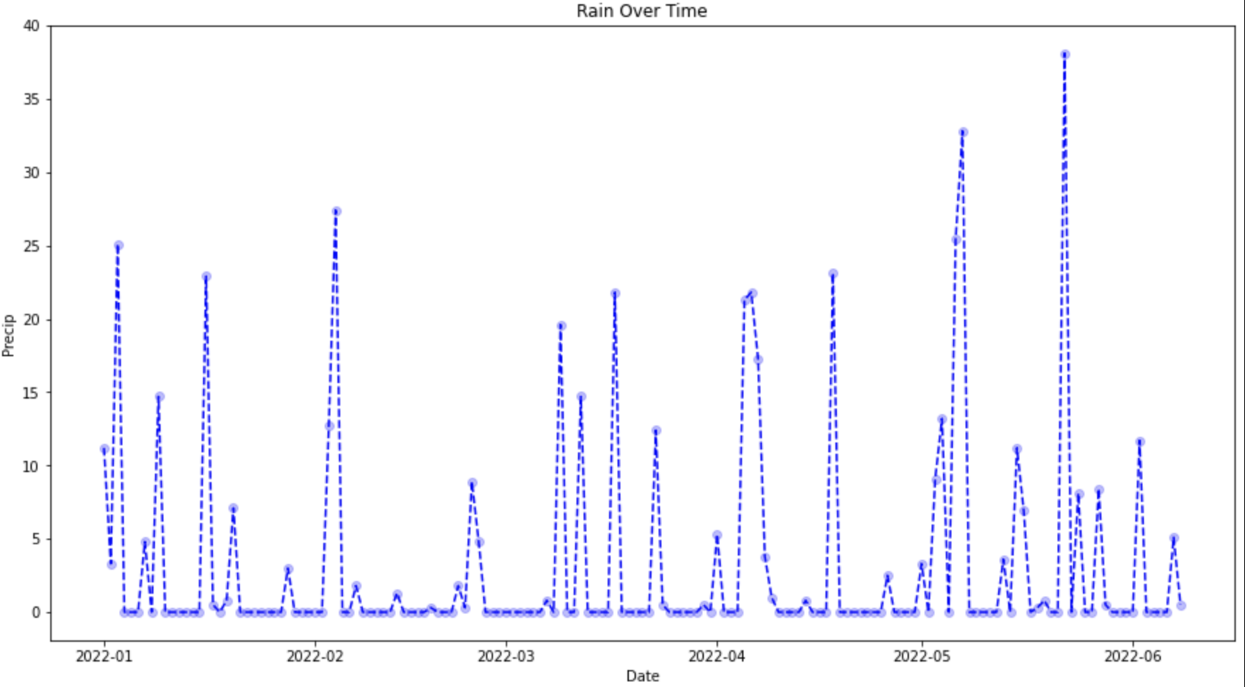 Figure 1. Precip Over Time
We can see some period of heavy precipitation, but I’m not sure there’s anything that stands out alone.
-
What if we look at period of rain followed by high amounts of sun?
Click to see solution
fig, ax1 = plt.subplots(1, 1, figsize=(15,8)) ax1.scatter(data['time'], data['prcp'], c='blue', alpha=0.25) ax1.plot(data['time'], data['prcp'], c='blue', linestyle='--', label='Precip') ax1.scatter(data['time'], data['tsun'], c='orange', alpha=0.25) ax1.plot(data['time'], data['tsun'], c='orange', linestyle='--', label='Sun') plt.xlabel('Date') plt.title('Rain and Sun') plt.legend() plt.show() plt.close('all')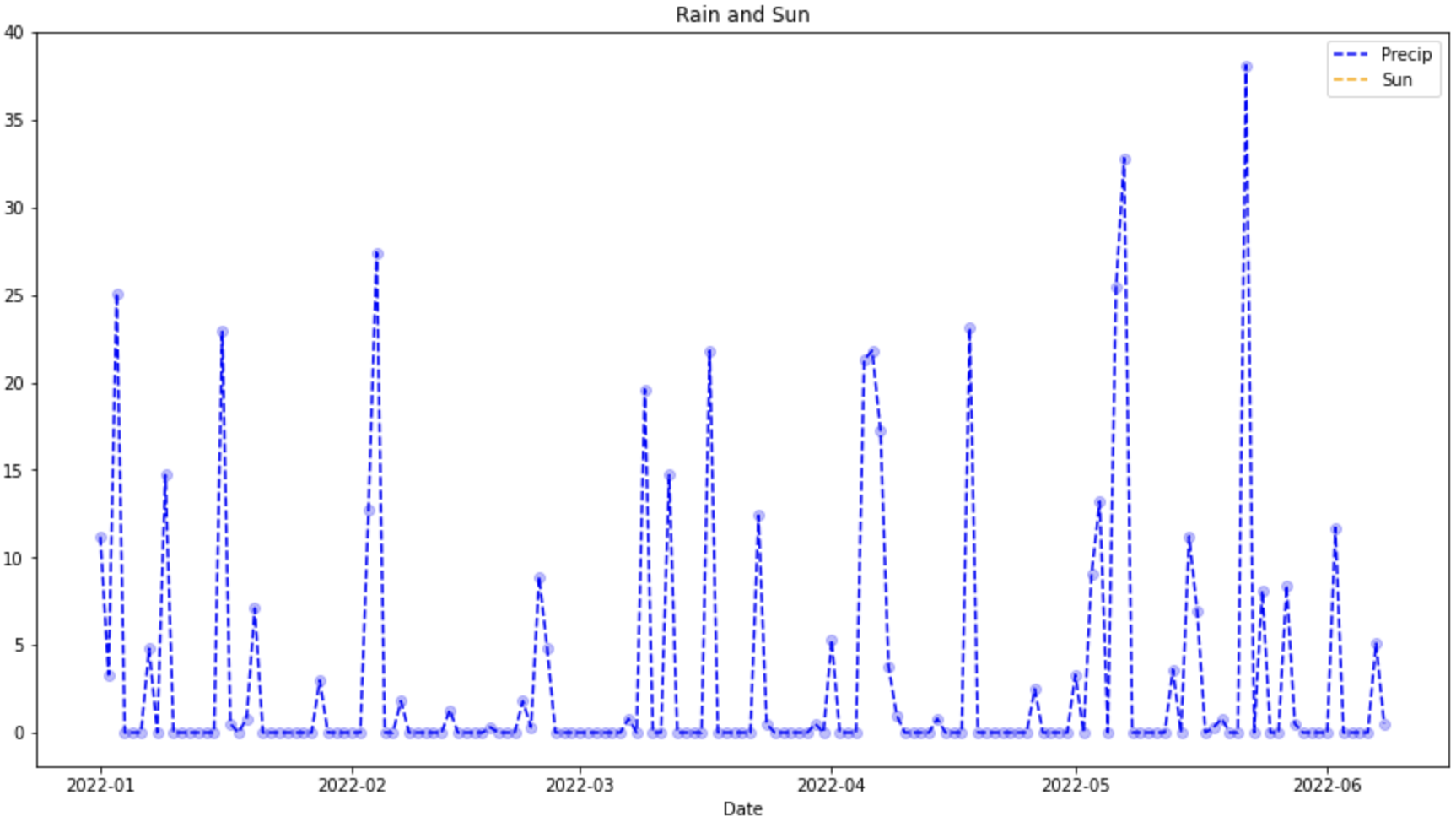 Figure 2. Precip and Sun Over Time
We can see the same precipitation line, but it looks like sun isn’t there.
-
We can check the
tsunvariable to see if it’s an issue with the data or with our code.Click to see solution
print(data['tsun'].max())nan
When we see
nanas the max value it means that Python couldn’t find any number values.You can think of
nanlikeNullor missing values.This happens all the time during EDA. Data is messy and we often don’t have the values that we would like.
-
Now that we know we don’t have sun data we can check wind to see what we find.
Click to see solution
fig, ax1 = plt.subplots(1, 1, figsize=(15,8)) ax1.scatter(data['time'], data['prcp'], c='blue', alpha=0.25) ax1.plot(data['time'], data['prcp'], c='blue', linestyle='--', label='Precip') ax1.scatter(data['time'], data['wspd'], c='grey', alpha=0.25) ax1.plot(data['time'], data['wspd'], c='grey', linestyle='--', label='Wind') plt.xlabel('Date') plt.title('Rain and Wind') plt.legend() plt.show() plt.close('all')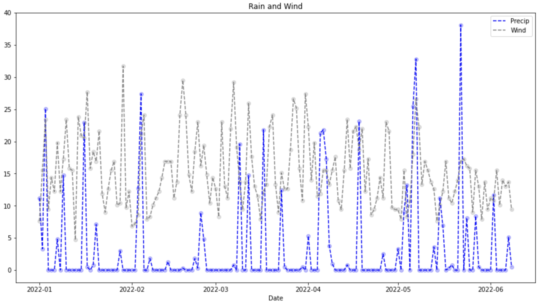 Figure 3. Precip and Wind Over Time
This is interesting to look at but is a bit hard to read. The wind data is noisy and has lots of peaks and valleys.
Often, it’s helpful to aggregate the data in some way to look at trends over time.
In this case, we can make some assumptions:
-
The coroner mentioned that the victim looked like they were partially in water for 3 or more days.
-
The victim was found under a broken branch. This would require a high wind speed.
-
-
Instead of looking at the raw precipitation data what if we look at an average over 3 days.
Click to see solution
data['rolling_precip'] = data['prcp'].rolling(3).sum()

print(data.head())
time tavg tmin tmax prcp snow wdir wspd wpgt pres tsun \ 0 2022-01-01 13.8 11.7 18.9 11.2 0.0 188.0 7.6 NaN 1007.2 NaN 1 2022-01-02 15.3 7.8 17.2 3.3 0.0 265.0 15.5 NaN 1006.6 NaN 2 2022-01-03 3.2 -3.8 7.8 25.1 0.0 356.0 23.4 NaN 1019.6 NaN 3 2022-01-04 -1.3 -4.9 1.1 0.0 180.0 128.0 9.4 NaN 1029.7 NaN 4 2022-01-05 1.2 -2.7 5.0 0.0 100.0 195.0 14.4 NaN 1014.5 NaN rolling_precip 0 NaN 1 NaN 2 39.6 3 28.4 4 25.1
Now we can graph our new variable.
fig, ax1 = plt.subplots(1, 1, figsize=(15,8)) ax1.scatter(data['time'], data['prcp'], c='blue', alpha=0.25) ax1.plot(data['time'], data['prcp'], c='blue', linestyle='--', label='Precip') ax1.scatter(data['time'], data['rolling_precip'], c='green', alpha=0.25) ax1.plot(data['time'], data['rolling_precip'], c='green', linestyle='--', label='Rolling Precip') plt.xlabel('Date') plt.title('Rolling Precip and Normal Precip') plt.legend() plt.show() plt.close('all')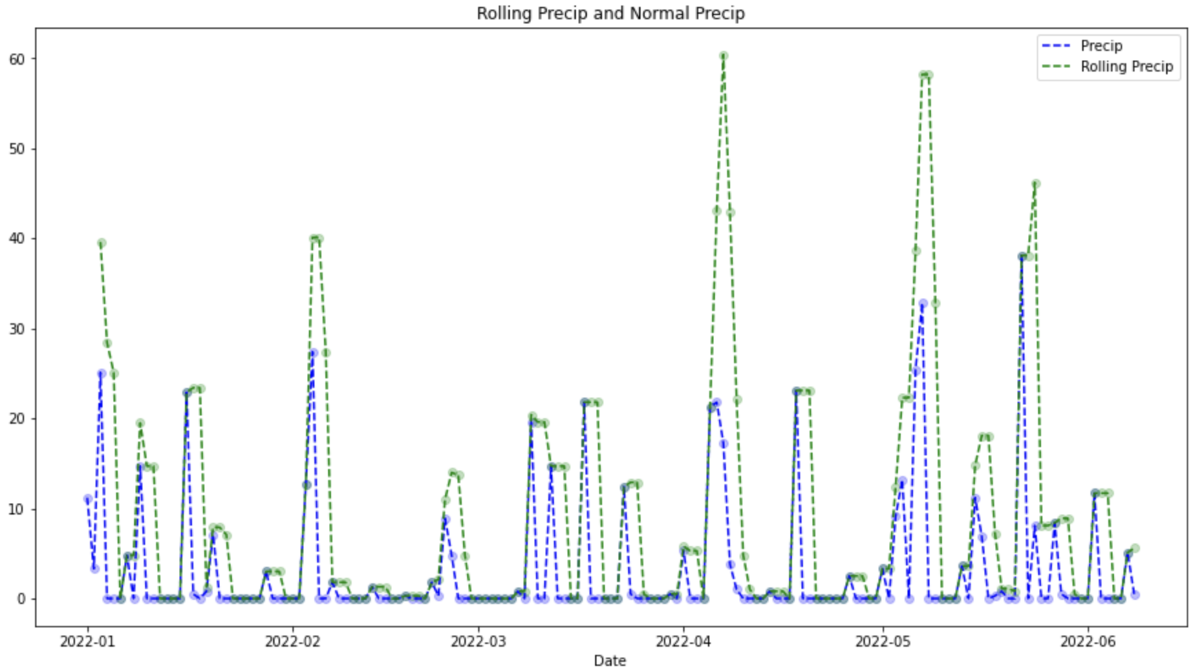 Figure 4. Average Precip and Wind Over Time
Looking at the graph we can see 3 period of very high precipitation. 1 in April and 2 that appear to be in May.
-
What if we look at high wind events during these times?
Click to see solution
fig, ax1 = plt.subplots(1, 1, figsize=(8,6)) ax1.hist(data['wspd'], bins=25) plt.title("Wind Speed") plt.xlabel("Wind") plt.show() plt.close('all')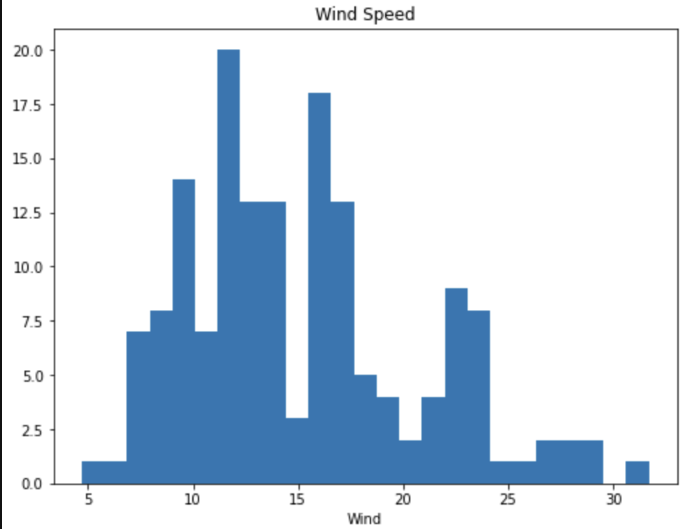 Figure 5. Wind Speed
Looking at the graph it looks like anything over 25 is a fast wind event. When did these events happen?
print(data.loc[data['wspd'] >= 25])time tavg tmin tmax prcp snow wdir wspd wpgt pres tsun \ 16 2022-01-17 2.8 1.1 5.6 0.5 30.0 252.0 27.7 NaN 993.4 NaN 28 2022-01-29 -2.2 -5.5 0.6 0.0 0.0 332.0 31.7 NaN 1012.6 NaN 48 2022-02-18 12.2 -0.5 20.0 0.3 0.0 303.0 29.5 NaN 1011.5 NaN 65 2022-03-07 21.1 12.2 26.7 0.8 0.0 208.0 29.2 NaN 1009.8 NaN 70 2022-03-12 5.1 -4.3 10.0 14.7 0.0 298.0 25.9 NaN 1004.6 NaN 85 2022-03-27 5.7 0.0 7.8 0.0 0.0 298.0 26.6 NaN 1010.2 NaN 86 2022-03-28 1.7 -2.1 5.6 0.0 0.0 316.0 25.2 NaN 1017.4 NaN 89 2022-03-31 16.2 10.6 23.9 0.0 0.0 181.0 27.4 NaN 1003.9 NaN 126 2022-05-07 12.1 8.3 12.8 32.8 0.0 32.0 26.6 NaN 1005.6 NaN rolling_precip 16 23.4 28 3.0 48 0.3 65 0.8 70 14.7 85 0.0 86 0.0 89 0.5 126 58.2Looking at these values it looks like we have two possibilities on 3/31 or 5/7.
-
We can graph these points one more time to see how they look.
Click to see solution
fig, ax1 = plt.subplots(1, 1, figsize=(15,8)) ax1.scatter(data['time'], data['rolling_precip'], c='green', alpha=0.25) ax1.plot(data['time'], data['rolling_precip'], c='green', linestyle='--', label='Rolling Precip') ax1.axvline(datetime(2022, 3, 31), c='red') ax1.axvline(datetime(2022, 5, 7), c='red') plt.xlabel('Date') plt.title('Rolling Precip with High Wind Events') plt.legend() plt.show() plt.close('all')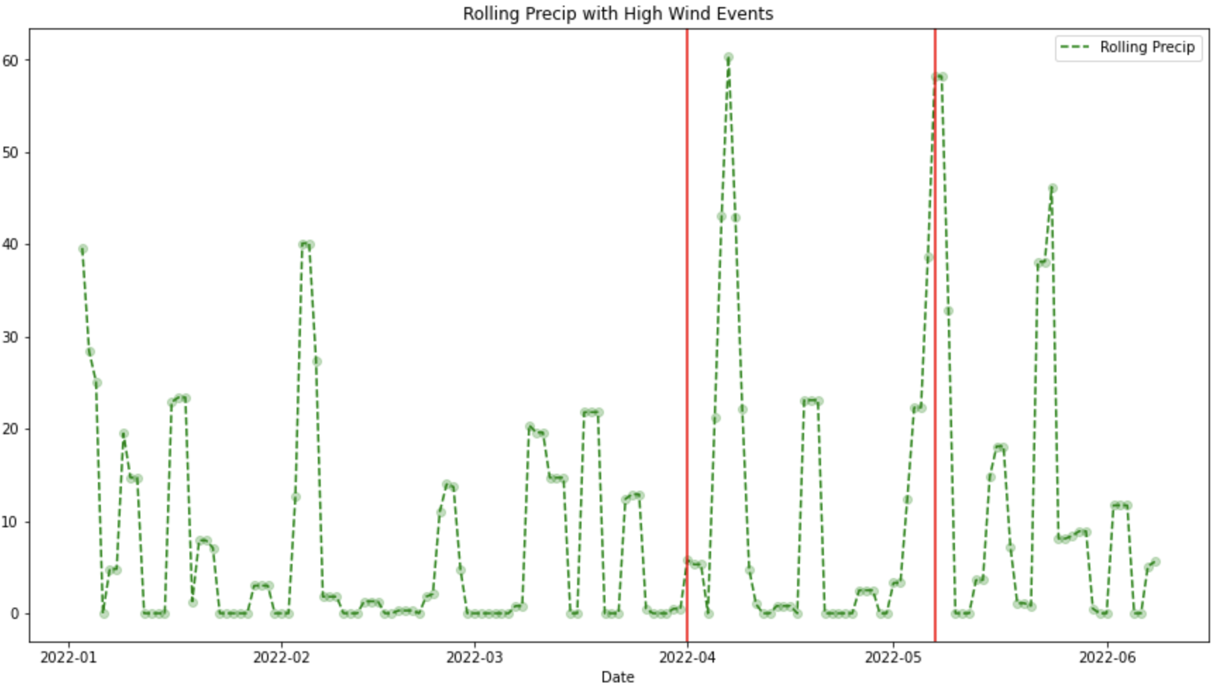 Figure 6. Precip with High Wind Speed
Looking at these graphs, May 7th looks like an interesting date!