Simple Linear Regression
Goal: The goal of this notebook is to give you a code playground to better understand the core components of a simple linear regression model.
You are encouraged to play with the code and build your own examples. Working in this way helps to understand what the model is really doing.
First question: What is linear regression?
-
Linear regression is a simple modeling technique that takes input (independent) variables and attempts to predict an output (dependent) variable.
-
Think taking minutes exercised per day (independent variable) and trying to predict time to run a mile (dependent variable).
-
-
Linear regression focuses on a continuous dependent variable (can take on any numeric value and isn’t ordered).
-
If you don’t understand categorical or continuous variables, it’s worth it to take some time and dive in deeper.
-
There are lots of great resources that can help you learn more about the different types of regression as well.
-
Second question: Why would we use linear regression?
-
Linear regression is a method that allows us to predict new values!
-
If the model can learn enough about the patterns in the existing data, it can attempt to predict new values.
-
Note: the model assumes that the predictions follow a similar specific pattern, both now and in the future. If they don’t, the model won’t do very well.
-
There are other modeling techniques that handle different data patterns.
-
-
Linear regression is also a core technique that many more advanced modeling types build off of.
Third question: How do we build said model?
-
We’ll go through what the model does in the following sections below, but at a high level, we attempt to fit a line to the data that we have.
-
Once we have a line that fits, the data we can attempt to predict new values.
For this excerise, we will work with /depot/datamine/data/youtube/USvideos.csv
Let’s read in the dataset in Python.
# Import pandas library
import pandas as pd
# Read the USvideos csv file in pandas
my_df = pd.read_csv("/depot/datamine/data/youtube/USvideos.csv")
Feel free to explore the dataset at this point. Just get yourself familiar with the data.
# Get the first five lines of the dataframe
my_df.head()
# Get the size of the dataframe
my_df.shape
Notice that in the tags column, tags are pipe symbol (|) separated. Suppose we want to know how many tags a video has, and we can do that by counting pipe symbols.
We want to check if there’s any video with no tags (i.e., empty string, null).
#check if any value is null
sum(pd.isna(my_df['tags']))

# check if any value is empty string
my_df[my_df['tags'] == ""].index
For the first line that checks for any na value, you should get an empty array or no value as your output.
For the second line that checks for any empty string, you should have 0 as your output.
Recall that in bool, False has an equivalent value of 0, and True has an equivalent value of 1.
Since there’s no na or empty string in the tags column, we can assume that a video without | has one tag.
For example,
Value |
Number of Pipe Symbol ( |
Number of Tags |
"tag1"|"tag2" |
1 |
2 |
"tag1"|"tag2"|"tag3"|"tag4" |
3 |
4 |
"tag1" |
0 |
1 |
We can add a new column to our dataframe representing the number of tags found for each video using a list comprehension.
# For each 'tag' value, we count how many pipe symbol is found (plus one)
# then we assign the value to the new column, 'num_tags'
my_df['num_tags'] = [x.count('|') + 1 for x in my_df['tags']]

# Print the first five lines in the 'num_tags' column
my_df['num_tags'][0:5]
Output: 0 1 1 4 2 23 3 27 4 14 Name: num_tags, dtype: int64
At this point, you’re very encouraged to create simple plots and calculate basic statistics (mean, mode, etc.). You can make a basic graph to see the number of videos generated on specific days to show trends. Or maybe find the most popular tags in the dataframe. Just get yourself comfortable with the data.
Come back here once you explored the data yourself for a little bit.
Let’s see which channels have highest amount of videos in the dataset, and we can simply use value_counts function.
# Count rows grouped by `channel_title`
my_df['channel_title'].value_counts
Output:
ESPN 203
The Tonight Show Starring Jimmy Fallon 197
TheEllenShow 193
Vox 193
Netflix 193
...
Hin Nya 1
PK Inventor 1
Commercials Funny 1
shoaib246 1
JanPaul123 1
Name: channel_title, Length: 2207, dtype: int64
So, we are only interested in videos generated by ESPN. We can create a subset from our dataframe.
# Keep 'True' rows which means the row does consist 'ESPN' and reset row numbers
my_subset = my_df[my_df['channel_title'] == 'ESPN'].reset_index(drop=True)
Okay, we have arrived at the point where we are sorta ready to create our linear regression model. For any model creation, it’s so important to explore and get yourself familiar with the data. It would be meaningless if you jump to the 'model creation' phase without any data exploration or cleaning. To create a meaningful model, we have to know our data and what information the data possibly offer.
Looking at the columns in my_subset, we are interested in the relationship between views and likes. Does the number of views have any correlation with the number of likes? For this exercise, views is our independent variable, and likes is our dependent variable.
Now, we want to create a histogram and a boxplot for the views column.
A boxplot is a great way to detect any outliers. Outliers are points with extreme values and often increase the data set’s variability. Removing the outliers can increase the accuracy of a linear regression model.
A histogram is a graphical representation of the distribution of the dataset. Similar to a barplot, a histogram will group the frequency of data values grouped by data values. Basically, it’s a frequency distribution.
We can make a simple histogram and boxplot for my_subset['views'] using the sns library.
import matplotlib.pyplot as plt
import seaborn as sns

plt.figure(figsize=(20,8))

plt.subplot(1,2,1)
plt.title('Distribution Plot')
sns.distplot(my_subset['views'])

plt.subplot(1,2,2)
plt.title('Boxplot for Number of Views')
sns.boxplot(y=my_subset['views'])

plt.show()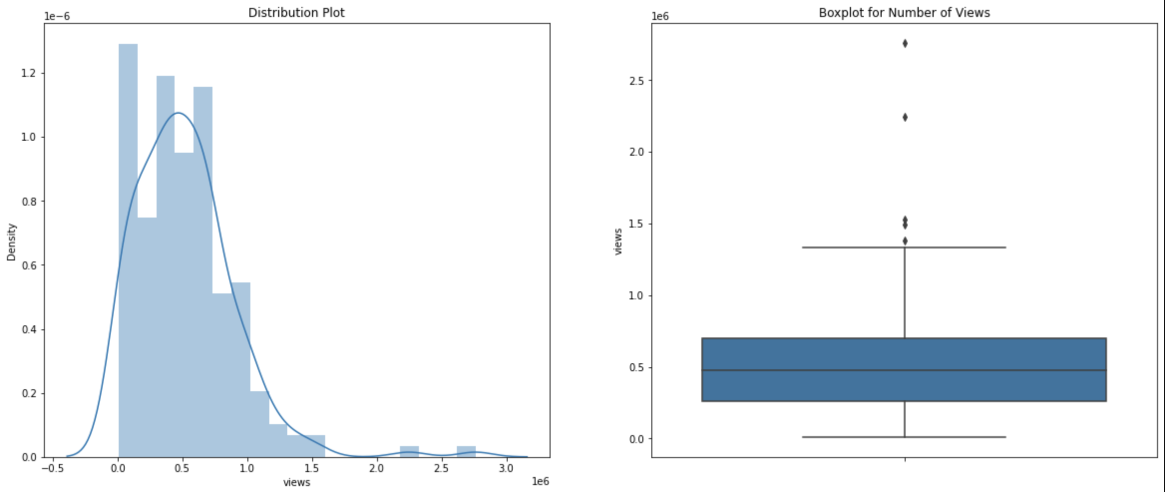
Our histogram is right-skewed which menas the frequency of observations lies more on the right side of the distribution.
You can gain some information from a boxplot. The data is sorted in increasing order, and they are divided into four sections called quartiles. First quartile is the first 25 percent of the dataset (25th percentile). The third quartile is the third 25 percent of the dataset (or 75th percentile). A solid box consists of the 'body' of the dataset. The box is the interquartile range (IQR) which means it consists of all the data between first quartile and third quartile. The line inside the box represents the median value of the dataset; the medium is the second quartile. Note that there are two lines attached to the box, and they are called 'whiskers'. The bars at the end of the whiskers represent the 'maximum' and 'minimum'.
The formulas that define the maximum and minimum of the boxplot are:
-
maximum = Quartile3 + 1.5*(IQR) = Quartile3 + 1.5*(Quartile3 - Quartile1)
-
minimum = Quartile1 - 1.5*(IQR) = Quartile1 - 1.5*(Quartile3 - Quartile1)
Data points outside the whisker range are considered outliers.
In our boxplot, we do have several outliers, and we want to remove them from the dataset.
You can calculate the quantiles by hand if you’re up for a challenge and then run the code below for verification. Or just run the line of code and trust the computer. Up to you.
Just FYI, there are several ways to calculate quartiles. So, don’t be surprised if some functions give you different quartiles values.
There are couple ways to find the quantiles. Here are two examples.
# Get quantiles using panda library
my_subset.views.quantile(q=[0.25,0.5,0.75])

# Get quantiles using numpy library
import numpy as np
np.percentile(my_subset.views,q=[25,50,75],interpolation='midpoint')
To make things a little bit easier, we’ll create variables to store the first and third quartile values.
# Assign third quartile to Quartile3 using pandas
Quartile3 = my_subset.views.quantile(q=[0.25,0.5,0.75])[0.75]
# Assign first quartile to Quartile3 using pandas
Quartile1 = my_subset.views.quantile(q=[0.25,0.5,0.75])[0.25]
Now, we can calculate our IQR, maximum, and minimum values.
# Calculate Interquartile Range
IQR = Quartile3 - Quartile1
# Caclculate the minimum
lower_bound = Quartile1 - 1.5*(IQR)
# Calculate the maximum
upper_bound = Quartile3 + 1.5*(IQR)
Now, we have calculated the values we need, and we can remove the outliers from our data.
# We want to keep the data that fall between the minimum and maximum values
normal_subset = my_subset[(my_subset['views'] >= lower_bound) & (my_subset['views'] <= upper_bound)]
Now, we can see the size of the new subset.
normal_subset.shapeOutput: (198, 17)
We have removed five data points from our dataset that are considered outliers.
If we plot our new dataset in both histogram and boxplot, we can see the improvement from the older dataset.
import seaborn as sns
import matplotlib.pyplot as plt

plt.figure(figsize=(20,8))

plt.subplot(1,2,1)
plt.title('Distribution Plot')
sns.distplot(normal_subset['views'])

plt.subplot(1,2,2)
plt.title('Boxplot for Number of Views')
sns.boxplot(y=normal_subset['views'])

plt.show()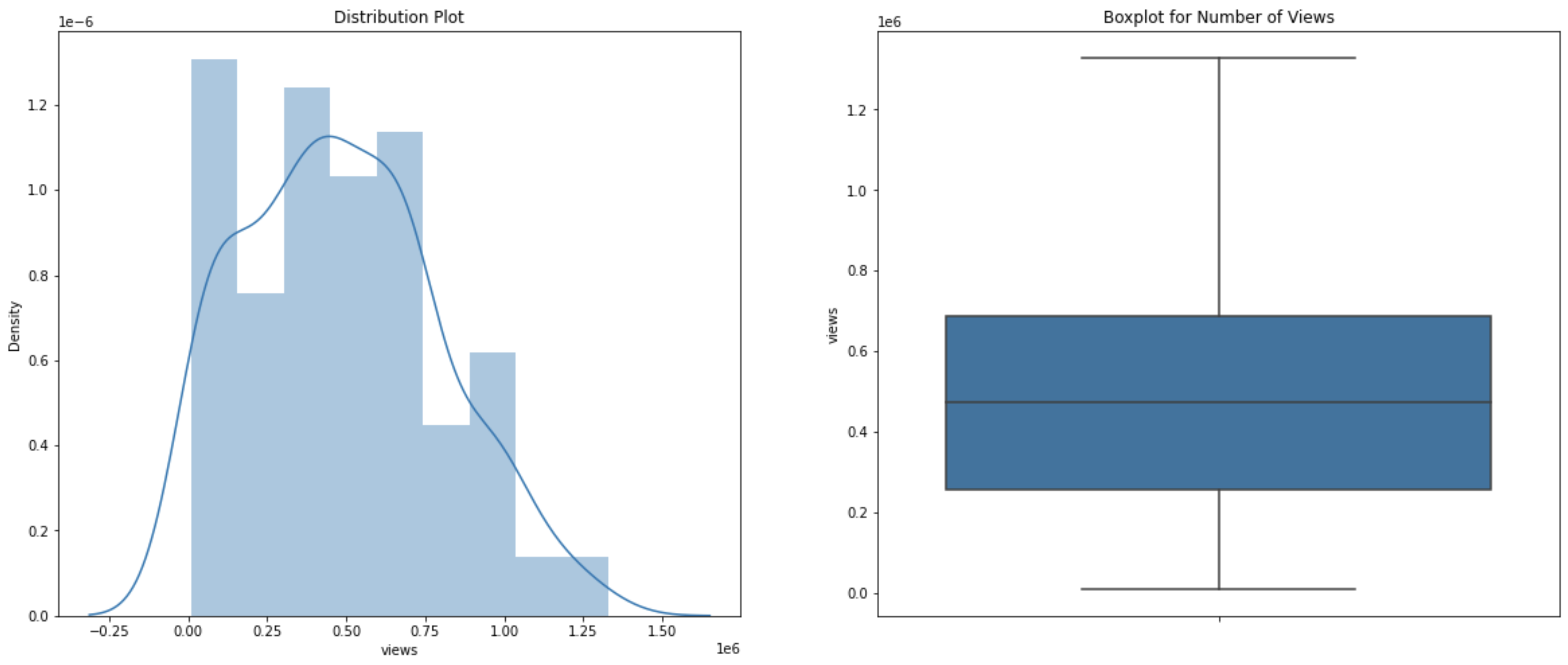
Let’s assign the views values to our X and the likes values to our Y.
# Views as X, our indepedent variable
X=normal_subset["views"].values.reshape(-1, 1)
# Likes as Y, our dependent variable
Y=normal_subset["likes"].values
We want to split our dataset into two different groups, train and test sets. The train set is used to train our linear regression model in order to find a best fit line, and the test set is used to test and evaluate the model. It’s up to you how you want to split the dataset.
For this exercise, I want to split the dataset where 70 percent of the dataset goes to the train set and 30 percent goes to the test set.
# Import train_test_split from sklearn.model_selection library
from sklearn.model_selection import train_test_split
# Split the dataset where 30 percent goes to the test set
X_train, X_test, y_train, y_test = train_test_split(X, Y, test_size=0.3)
Let’s make a linear regression!
# Import LinearRegression from sklearn.lienar_model library
from sklearn.linear_model import LinearRegression

lm = LinearRegression()
model = lm.fit(X_train, y_train)
Our best fit line can be found by this line of code.
print(model.coef_, model.intercept_)Output: [0.00775039] 578.5190614890898
With the information above, the equation for our best fit line is Y = 0.00775039*X + 578.5190614890898.
Let’s evaluate the model using the test set.
# Run the model using the X test set to get predicted likes values
predictions = lm.predict(X_test)
# Create a dataframe consisting test X values and both predicted and true test Y values
test=pd.DataFrame({"views":X_test.flatten(), "actual_likes":y_test.flatten(), "predicted_likes":predictions.flatten()})
# Calculate the error or the difference between predicted values and actual values
test["residuals"]=test["actual_likes"]-test["predicted_likes"]
We can plot the predicted likes values based on test views values.
#plot the predicted trend line
plt.title('Predicted Linear Regression')
plt.xlabel('Number of Views')
plt.ylabel('Actual Number of Likes')
plt.plot(X_test.flatten(),y_test.flatten(),'bo',X_test.flatten(), predictions.flatten())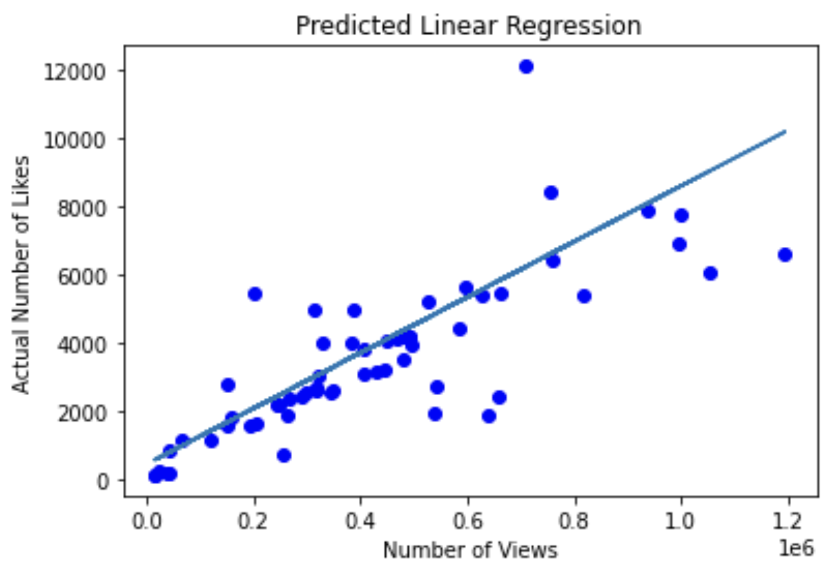
We can calculate our R_squared value. Note that there are multiple ways to score a linear regression.
print(model.score(X_test,y_test))Output: 0.7341605129436777
The value of 0.73 isn’t bad!
I hope this exercise is a good introduction to linear regressions.
Just a note, if you want to calculate correlation between two variables, you can simply run the line of code.
# find correlation between two variables
my_subset.corr()|
We want to be careful with correlations. Please see the website for some correlation examples that make no sense. |