matplotlib
When starting with Python, the most common plotting package is often matplotlib. It is an easy and straightforward plotting tool, with a surprising amount of depth. Like any package, it also has pluses and minuses.
Importing matplotlib for use in a project is pretty straightforward:
import matplotlib.pyplot as plt|
You do not have to include it as |
For those of us who aren’t familiar with MATLAB the pyplot functionality creates a plotting object. Once you have the object created you can change parameters, add visualizations, change color schemes, and otherwise update the plot. Once you are finished you can close the plotting object.
barplot
Barplots can take many forms. They are most often utilized when comparing change over time or comparisons between categories for a data set. As with many of the plotting types matplotlib has the built-in barplot function to create the visualizations.
import pandas as pd
import matplotlib.pyplot as plt

myDF = pd.read_csv("/anvil/projects/tdm/data/precip/precip.csv")
plt.bar(myDF['place'].iloc[:10], myDF['precip'].iloc[:10])
plt.show()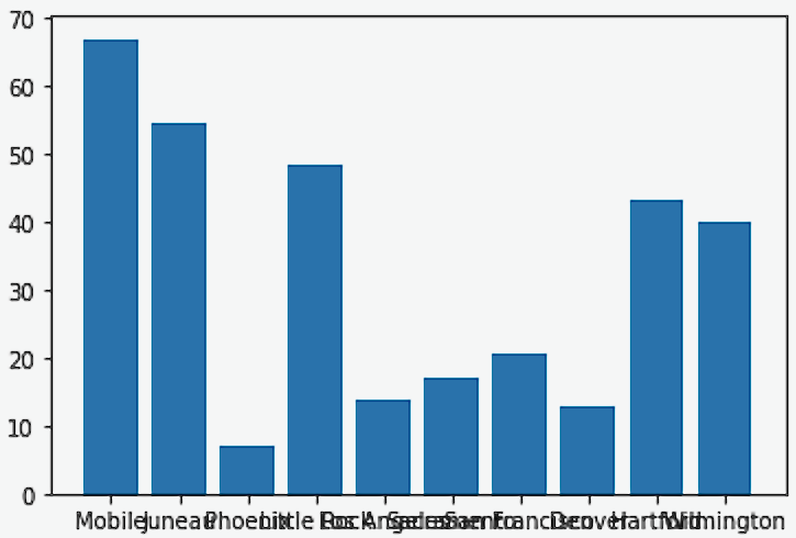
plt.close()As we can see in the first example, we have a bar plot but the x-axis labels are a bit hard to read. What if we turned the labels to be vertical?
import pandas as pd
import matplotlib.pyplot as plt
myDF = pd.read_csv("/anvil/projects/tdm/data/precip/precip.csv")
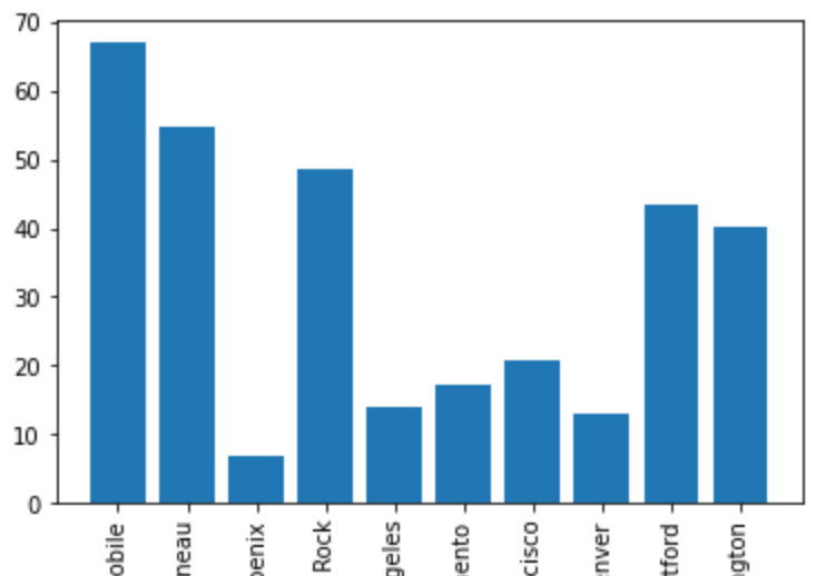
plt.bar(myDF['place'].iloc[:10], myDF['precip'].iloc[:10])
plt.xticks(myDF['place'].iloc[:10], rotation='vertical')
plt.show()
plt.close()Now in this case, since we are using Jupyter Lab, the axis labels fit neatly in the graph. However, in many cases the labels will end up looking like the plot below.
If we wanted to add some additional space to the bottom of the plot we could do so with the subplots_adjust argument.
import pandasf as pd
import matplotlib.pyplot as plt

myDF = pd.read_csv("/anvil/projects/tdm/data/precip/precip.csv")
plt.bar(myDF['place'].iloc[:10], myDF['precip'].iloc[:10])
plt.xticks(myDF['place'].iloc[:10], rotation='vertical')
plt.subplots_adjust(bottom=0.2)
plt.show()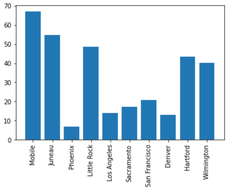
plt.close()In Jupyter Lab the difference may not be very apparent, but in other environments the subplots_adjust argument can be utilized to reshape your plotting object as needed.
Now that we have the x-axis labels adjusted, we can work on adding a title and a label for the y-axis.
import pandas as pd
import matplotlib.pyplot as plt

myDF = pd.read_csv("/anvil/projects/tdm/data/precip/precip.csv")
plt.bar(myDF['place'].iloc[:10], myDF['precip'].iloc[:10])
plt.xticks(myDF['place'].iloc[:10], rotation='vertical')
plt.subplots_adjust(bottom=0.3)
plt.title("Average Precipitation")
plt.ylabel("Inches of rain")
plt.show()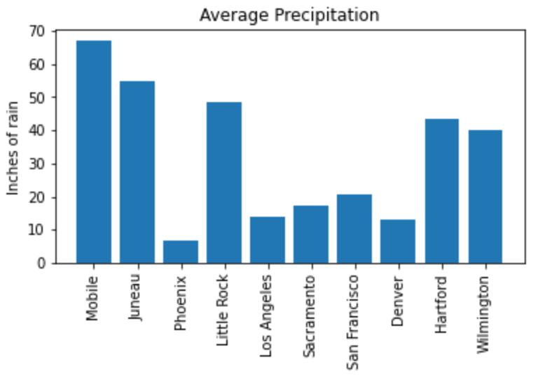
plt.close()We seem to have the basics of the plot set. The next most adjusted parameter is the color! How do we change the color?
import pandas as pd
import matplotlib.pyplot as plt

myDF = pd.read_csv("/anvil/projects/tdm/data/precip/precip.csv")
plt.bar(myDF['place'].iloc[:10], myDF['precip'].iloc[:10], color="#FF826B")
plt.xticks(myDF['place'].iloc[:10], rotation='vertical')
plt.subplots_adjust(bottom=0.3)
plt.title("Average Precipitation")
plt.ylabel("Inches of rain")
plt.show()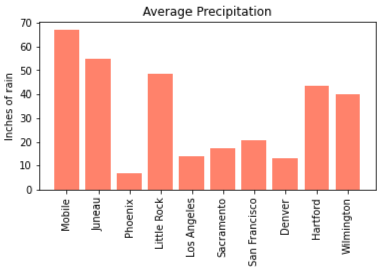
plt.close()
The example above is using an RGB or hex (red, green, blue) string. In this case, it is a way to indicate color values using letters and numbers. If you are interested to read further check out the matplotlib documentation for reference.
In addition to the hex colors, matplotlib has a set of named colors. These allow you to pass the color as a plain text name, but it does not allow the freedom of hex color customization.
Now that we know a bit more about choosing colors in matplotlib, can we color the different cities in our graph?
import pandas as pd
import matplotlib.pyplot as plt

myDF = pd.read_csv("/anvil/projects/tdm/data/precip/precip.csv")
colors = ("#8DD3C7", "#FFFFB3", "#BEBADA", "#FB8072", "#80B1D3", "#FDB462", "#B3DE69", "#FCCDE5", "#D9D9D9", "#BC80BD",)
plt.bar(myDF['place'].iloc[:10], myDF['precip'].iloc[:10], color=colors)
plt.xticks(myDF['place'].iloc[:10], rotation='vertical')
plt.subplots_adjust(bottom=0.3)
plt.title("Average Precipitation")
plt.ylabel("Inches of rain")
plt.show()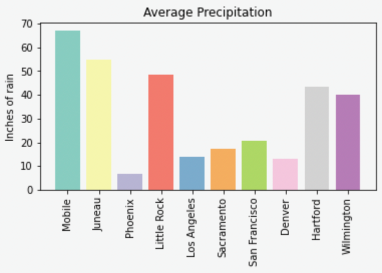
plt.close()Now we can dive a bit deeper into plot customization. What if instead of x-labels we wanted to add a legend to the plot?
import pandas as pd
import matplotlib.pyplot as plt

myDF = pd.read_csv("/anvil/projects/tdm/data/precip/precip.csv")
colors = ("#8DD3C7", "#FFFFB3", "#BEBADA", "#FB8072", "#80B1D3", "#FDB462", "#B3DE69", "#FCCDE5", "#D9D9D9", "#BC80BD",)
plt.bar(myDF['place'].iloc[:10], myDF['precip'].iloc[:10], color=colors)
plt.title("Average Precipitation")
plt.ylabel("Inches of rain")
labels = {place:color for place, color in zip(myDF['place'].iloc[:10].to_list(), colors[:10])}
print(labels){'Mobile': '#8DD3C7', 'Juneau': '#FFFFB3', 'Phoenix': '#BEBADA', 'Little Rock': '#FB8072', 'Los Angeles': '#80B1D3', 'Sacramento': '#FDB462', 'San Francisco': '#B3DE69', 'Denver': '#FCCDE5', 'Hartford': '#D9D9D9', 'Wilmington': '#BC80BD'}
handles = [plt.Rectangle((0,0),1,1, color=color) for label,color in labels.items()]
plt.legend(handles=handles, labels=labels.keys())
plt.show()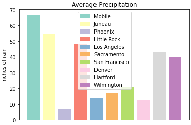
plt.close()It is not too bad, but just like with the x-axis labels above we have a little formatting to fix. We used subplots_adjust to modify the space at the bottom of the plot. In this case, we can pass the loc argument to the plt.legend() method in order to update the location. If you would like to learn more about the different loc locations, check out the matplotlib documentation.
import pandas as pd
import matplotlib.pyplot as plt

myDF = pd.read_csv("/anvil/projects/tdm/data/precip/precip.csv")
colors = ("#8DD3C7", "#FFFFB3", "#BEBADA", "#FB8072", "#80B1D3", "#FDB462", "#B3DE69", "#FCCDE5", "#D9D9D9", "#BC80BD",)
plt.bar(myDF['place'].iloc[:10], myDF['precip'].iloc[:10], color=colors)
plt.title("Average Precipitation")
plt.ylabel("Inches of rain")
labels = {place:color for place, color in zip(myDF['place'].iloc[:10].to_list(), colors[:10])}
plt.xticks('') #This removes the x-axis labels

handles = [plt.Rectangle((0,0),1,1, color=color) for label,color in labels.items()]
plt.legend(handles=handles, labels=labels.keys(), loc=1)
plt.show()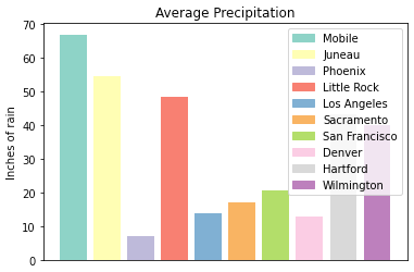
plt.close()This is improved, but we are still covering some of the data in the plot. Luckily matplotlib has a different function bbox_to_anchor that we can use to push the legend outside of the plot.
import pandas as pd
import matplotlib.pyplot as plt

myDF = pd.read_csv("/anvil/projects/tdm/data/precip/precip.csv")
colors = ("#8DD3C7", "#FFFFB3", "#BEBADA", "#FB8072", "#80B1D3", "#FDB462", "#B3DE69", "#FCCDE5", "#D9D9D9", "#BC80BD",)
plt.bar(myDF['place'].iloc[:10], myDF['precip'].iloc[:10], color=colors)
plt.title("Average Precipitation")
plt.ylabel("Inches of rain")
labels = {place:color for place, color in zip(myDF['place'].iloc[:10].to_list(), colors[:10])}
plt.xticks('')

handles = [plt.Rectangle((0,0),1,1, color=color) for label,color in labels.items()]
plt.legend(handles=handles, labels=labels.keys(), bbox_to_anchor=(1.35, 1))
plt.show()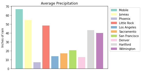
plt.close()In Jupyter Lab, this gives us what we are looking for! We have now moved the legend outside of the plot and everything is easy to view. Note depending on the environment that you are running the code in, you may have to play around with the bbox_to_anchor parameters, to make the legend fit. Also, if you can’t see all the text in the legend, trying adding subplots_adjust back to the code with the right= argument to adjust the plot sizing.
Just for a final customization, let’s make the legend border white (remove it).
import pandas as pd
import matplotlib.pyplot as plt

myDF = pd.read_csv("/anvil/projects/tdm/data/precip/precip.csv")
colors = ("#8DD3C7", "#FFFFB3", "#BEBADA", "#FB8072", "#80B1D3", "#FDB462", "#B3DE69", "#FCCDE5", "#D9D9D9", "#BC80BD",)
plt.bar(myDF['place'].iloc[:10], myDF['precip'].iloc[:10], color=colors)
plt.title("Average Precipitation")
plt.ylabel("Inches of rain")
labels = {place:color for place, color in zip(myDF['place'].iloc[:10].to_list(), colors[:10])}
plt.xticks('')

handles = [plt.Rectangle((0,0),1,1, color=color) for label,color in labels.items()]
plt.legend(handles=handles, labels=labels.keys(), bbox_to_anchor=(1.35, 1), edgecolor='white')
plt.show()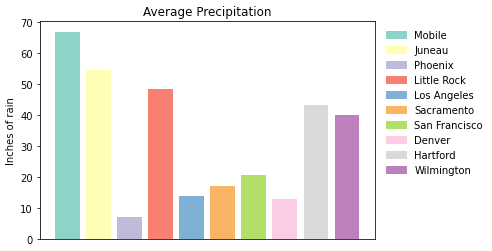
plt.close()This just starts to scratch the surface of what is possible with matplotlib but it does show the deep customization that is possible via the package.
boxplot
boxplot is a function that creates a boxplot. While that may not be very surprising, it is surprising how helpful boxplots can be in summarizing your data. Boxplots show a number of different measures related to the data such as quartiles, upper and lower bounds, and potential outliers. They can also he helpful to identify general trends between groups or over time. However, it should be noted there may be better plots for specific use cases.
To get started with simple boxplots, we can use matplotlib to gather some data.
import pandas as pd
import matplotlib.pyplot as plt

myDF = pd.read_csv("/anvil/projects/tdm/data/precip/precip.csv")
print(myDF.head())
place precip 0 Mobile 67.0 1 Juneau 54.7 2 Phoenix 7.0 3 Little Rock 48.5 4 Los Angeles 14.0
Now let’s say that (hypothetically) you have been put in charge of planning a major conference. Your boss dislikes two things, rain and cities, that don’t start with P or S… How can we visualize the difference between our options? It takes a bit of imagination to get there, but playing with the Python data is fun.
cities_starting_with_s = [c for c in myDF['place'] if list(c.lower())[0] == 's']
print(cities_starting_with_s)
['Sacramento', 'San Francisco', 'Sault Ste. Marie', 'St Louis', 'Sioux Falls', 'Salt Lake City', 'Seattle Tacoma', 'Spokane', 'San Juan']
cities_starting_with_p = [c for c in myDF['place'] if list(c.lower())[0] == 'p']
print(cities_starting_with_p)
['Phoenix', 'Peoria', 'Portland', 'Portland', 'Philadelphia', 'Pittsburg', 'Providence']
Now we can filter the data to our cities of interest for comparison.
possible_cities = myDF.loc[(myDF['place'].isin(cities_starting_with_p)) | (myDF['place'].isin(cities_starting_with_s))].copy()
print(possible_cities['place'].unique())
['Phoenix' 'Sacramento' 'San Francisco' 'Peoria' 'Portland' 'Sault Ste. Marie' 'St Louis' 'Philadelphia' 'Pittsburg' 'Providence' 'Sioux Falls' 'Salt Lake City' 'Seattle Tacoma' 'Spokane' 'San Juan']
Now we can create a variable to compare the two. We can have it set to 1 for S cities and 0 for the other entries.
possible_cities['s_city'] = np.where(possible_cities['place'].isin(cities_starting_with_s) == True, "s", "no_s")
print(possible_cities.head())
place precip s_city 2 Phoenix 7.0 no_s 5 Sacramento 17.2 s 6 San Francisco 20.7 s 17 Peoria 35.1 no_s 23 Portland 40.8 no_s
Now, after all that work, we can finally compare the precip values!
plt.boxplot(possible_cities['precip'])
plt.show()
plt.close()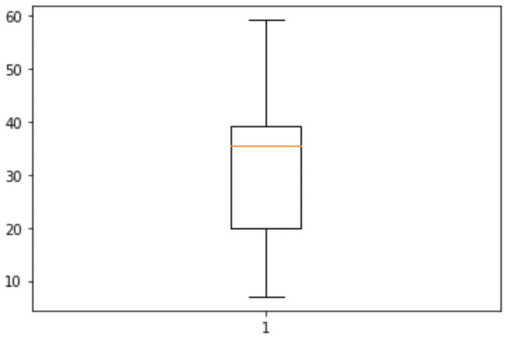
Well, on the bright side, it is technically a boxplot. (We did it!) However, it does not tell us much, and is not really a comparison between the two groups of cities. If we look at the official documentation we can see that the boxplot method makes a plot for each column of x or each vector in sequence x where x is our first argument. Because we passed precip as our x argument, it created a single boxplot for all the rows of data. With a bit of reformatting, we should be able to fix the issue.
formatted_data = possible_cities.pivot(columns='s_city', values='precip')
print(formatted_data.head())
s_city no_s s 2 7.0 NaN 5 NaN 17.2 6 NaN 20.7 17 35.1 NaN 23 40.8 NaN
plt.boxplot([formatted_data['no_s'], formatted_data['s']])
plt.show()
plt.close()
Hmmm, well we reformatted the columns in the way that we wanted, but the plot is not very helpful. It looks like the NaN values in the data are preventing matplotlib from working. Let’s see what happens if we remove the NaN values.
lt.boxplot([formatted_data['no_s'].dropna(), formatted_data['s'].dropna()])
plt.show()
plt.close()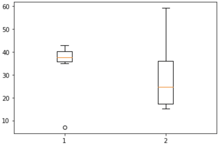
This looks much better! Now all we need to do is add some proper labels, instead of just 1 and 2.
plt.boxplot([formatted_data['no_s'].dropna(), formatted_data['s'].dropna()])
plt.title("Precip Comparison (Cities with S and cities with P)")
plt.xticks([1,2], ['P_city', 'S_city'])
plt.ylabel("Precip")
plt.show()
plt.close()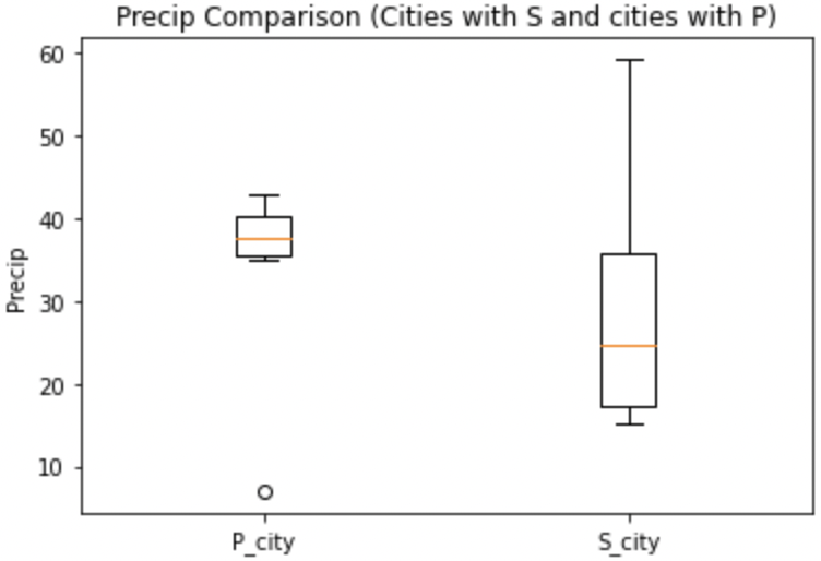
The plot is starting to take shape! In this case we can see that cities starting with S have lower median (horizontal orange line) precip, but also a much bigger range of precip values. If we were really doing analysis on this we may want to drill into the cities starting with S to find specific locations that have lower average precip values. However, this is just a code demo so let’s add some color!
boxes = plt.boxplot([formatted_data['no_s'].dropna(), formatted_data['s'].dropna()], patch_artist=True)

plt.title("Precip Comparison (Cities with S and cities with P)")
plt.xticks([1,2], ['P_city', 'S_city'])
plt.ylabel("Precip")

for box in boxes['boxes']:
    box.set(facecolor='#78D3CB')

plt.show()
plt.close()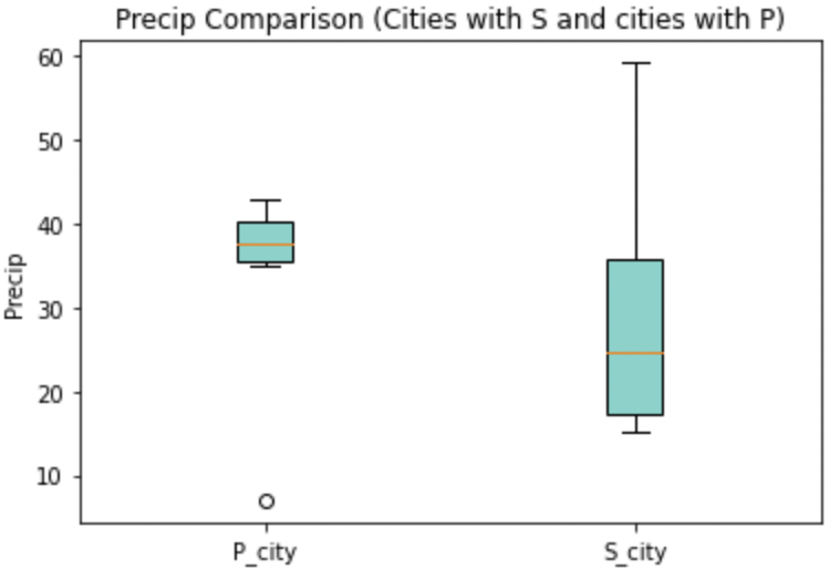
The color changed, but teal and orange might not be the most pleasing to the eye. We can change a few other components to make it a little better looking.
boxes = plt.boxplot([formatted_data['no_s'].dropna(), formatted_data['s'].dropna()], patch_artist=True)

plt.title("Precip Comparison (Cities with S and cities with P)")
plt.xticks([1,2], ['P_city', 'S_city'])
plt.ylabel("Precip")

plt.setp(boxes["boxes"], color="darkblue")
plt.setp(boxes['whiskers'], color="darkblue")
plt.setp(boxes['fliers'], color="darkgreen")
plt.setp(boxes['medians'], color="black")
plt.setp(boxes['caps'], color="darkblue")
for box in boxes['boxes']:
    box.set(facecolor='#78D3CB')

plt.show()
plt.close()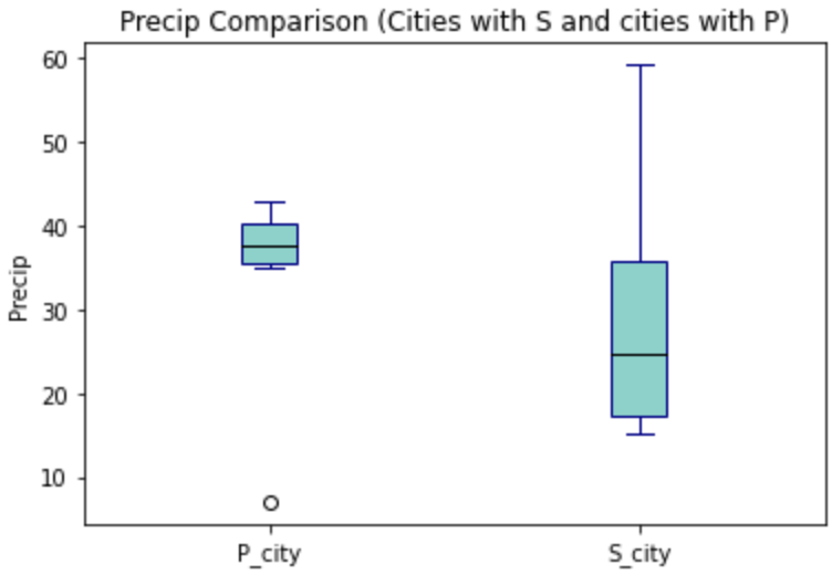
Now we have a good looking boxplot! Hopefully this demonstration showed how helpful boxplots can be when interpreting data. It also shows how matplotlib plots can be further customized, to fit the needs of the visualization!